页面怎么布局,当然是Grid ԅ(¯﹃¯ԅ)

序
这里先问大家一个小问题,各位用中文输入法打Grid会出现什么呢?
在讲述Grid布局之前,先聊聊前端目前比较流行布局方式,前端开发者应该都知道Flex布局,Flex布局真的非常好用
相较于原来的Float浮动布局时代,Flex布局做到了更优解
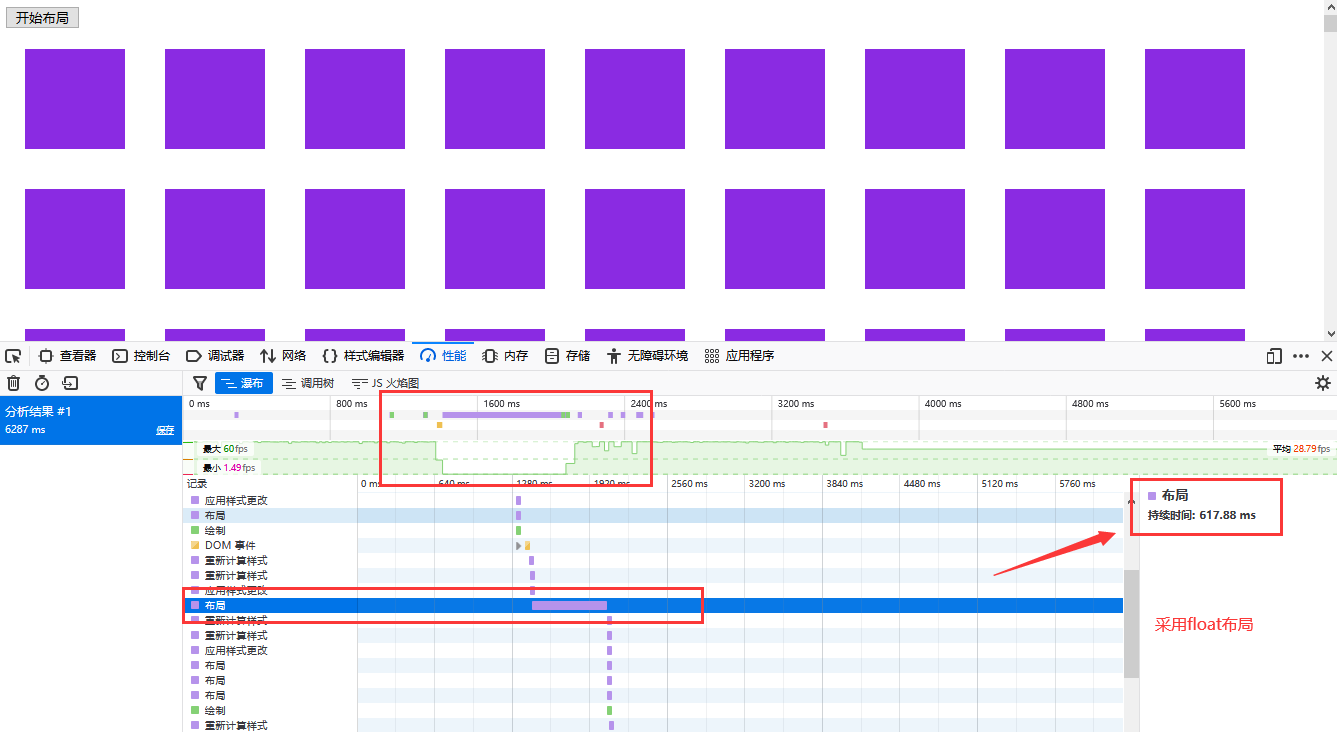
并且在性能上,Flex布局性能也远远比Float更高,同样,Grid也是
flex和float性能测试
float布局:
<style>
.test {
    width: 100px;
    height: 100px;
    margin: 20px;
    background-color: blueviolet;
    float: left;  /*float布局*/
}
</style>

<button onclick="start()"> 开始布局 </button>
<div id="app">
</div>
<script>
    function start() {
        var div = "<div class='test'></div>", dhtml = "";
        for (let i = 0; i < 10000; i++) {
            dhtml += div;
        }
        document.getElementById("app").innerHTML = dhtml;
    }
</script>
布局性能:
flex布局(修改一下CSS):
<style>
    #app {
        display: flex;
        flex-wrap: wrap;
    }
    .test {
        width: 100px;
        height: 100px;
        margin: 20px;
        background-color: blueviolet;
        /* float: left; */
    }
</style>
布局性能:
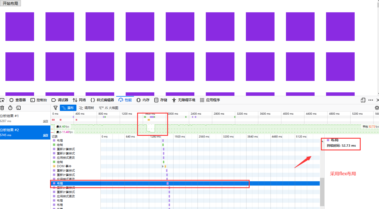
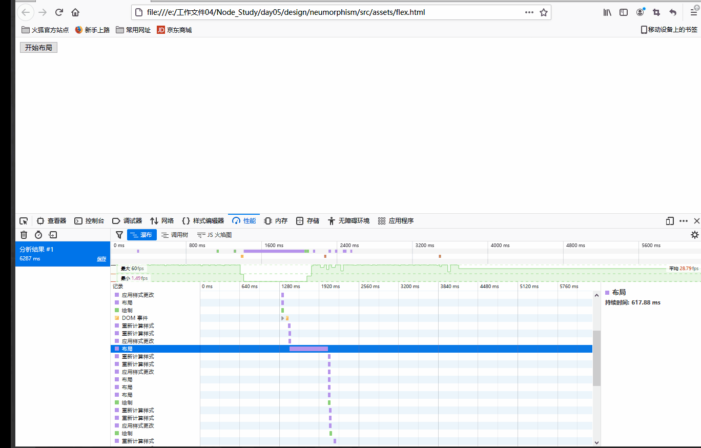
由上的布局时间可见,flex布局性能更优
正文开始
但是说了辣么多,今天的主角确不是Flex,而是在Flex之后兴起的另一种布局Grid
[加图 没想到吧]
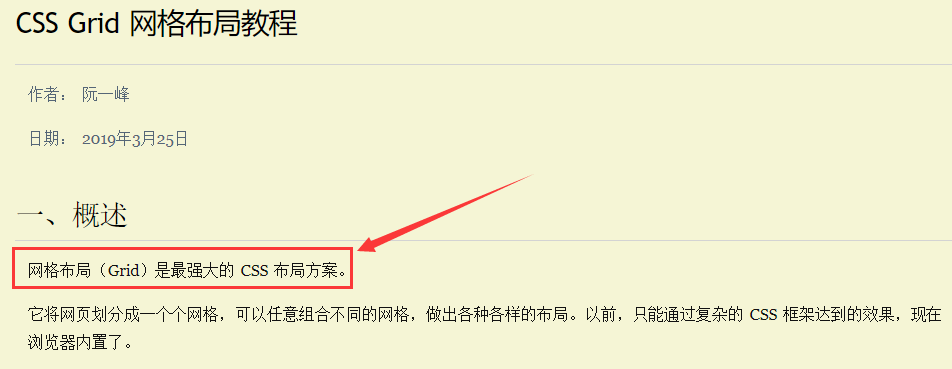
Grid被阮一峰大佬称为最强大的CSS布局方案 (哈哈哈,除了兼容性不行之外ㄟ( ▔, ▔ )ㄏ)
有理有据
因为本文是空城机边学边写的,所以推荐一些学习资料:
- https://developer.mozilla.org/zh-CN/docs/Glossary/Grid
- https://developer.mozilla.org/zh-CN/docs/Web/CSS/grid
- http://www.ruanyifeng.com/blog/2019/03/grid-layout-tutorial.html
首先,在正式说Grid前,先说说其缺点吧,那就是兼容性过低,这一点很关键,这是其没有得到大规模推广的主要原因,另外一点就是其学习更加复杂啦
( _ _)ノ|
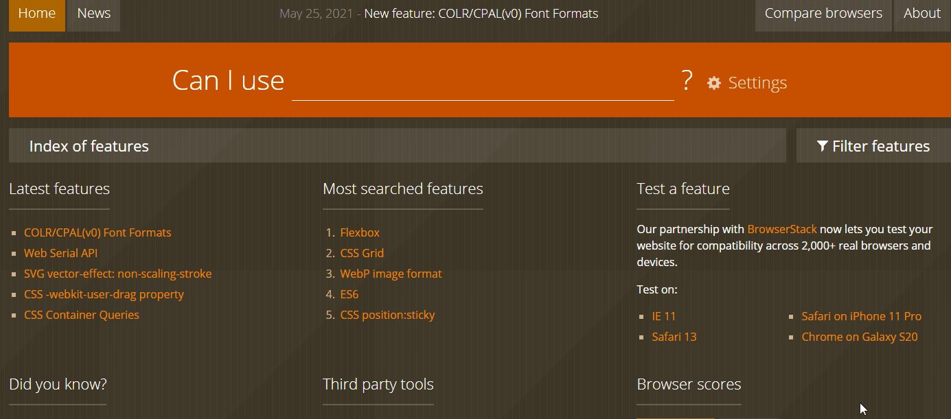
安利一个查询兼容性的网站: https://caniuse.com/
正如同某人说过的话,越高级的web技术对IE的兼容性越差。
Grid在IE浏览器中是不支持的,甚至在其他浏览器中版本需求条件也较高
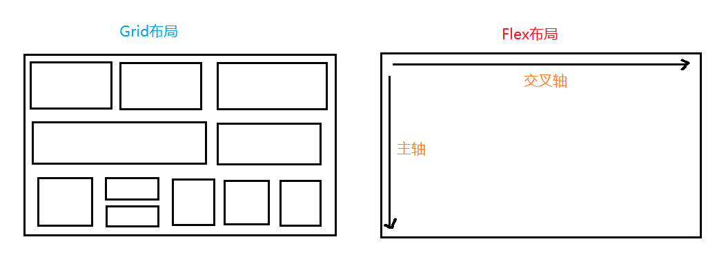
Gird 与 Flex区别
Grid属于网格式布局,相当于将页面划分为了一个个格子,可以当作二维布局
Flex属于轴线布局,沿着主轴和交叉轴进行布局,可以当成一维布局
下图可以很明显看出区别:
Grid将网页划分成一个个网格,可以任意组合不同的网格,做出各种各样的布局。以前,只能通过复杂的 CSS 框架达到的效果,现在浏览器内置了
Grid学习前置
在Grid学习前,首先要对网格状界面做一定了解
容器和项目
网格布局区域的区域被称为容器,在内部用网格定位的子元素被称为项目,Grid 布局只对项目生效
注意:项目只能是容器的顶层子元素,不包含项目的子元素 (我附庸的附庸不是我的附庸)

代码如下:
<style>
    .grids {
        display: grid;
        width: 400px;
        height: 400px;
    }
</style>
<div class="grids">
    <div class="gridson"></div>
    <div class="gridson"></div>
    <div class="gridson"></div>
    <div class="gridson"></div>
    <div class="gridson"></div>
</div>
行和列
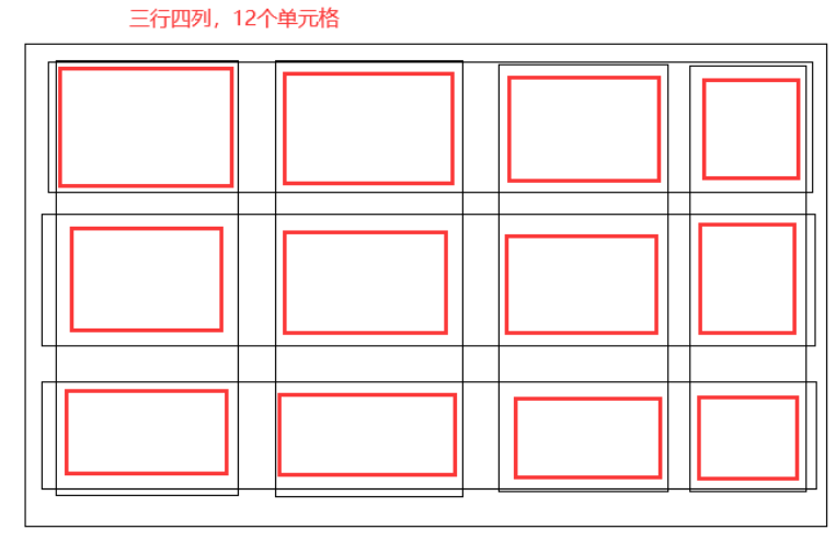
既然是表格布局,那肯定会存在行和列
容器里面的水平区域称为"行"(row),垂直区域称为"列"(column)
单元格
行和列的交叉区域,称为"单元格"(cell)
正常情况下,n行和m列会产生n x m个单元格
例子:
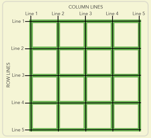
网格线
划分网格的线,称为"网格线"(grid line)。水平网格线划分出行,垂直网格线划分出列
正常情况下,n行有n + 1 根水平网格线,m列有m + 1 根垂直网格线
所有总的网格线就有n + m + 2 条
懒得画了 (o≖◡≖)
Grid学习使用
师爷说的好,饭要一口口吃,路要一步步走

所以先从最简单的grid布局开始吧
设置display
与flex类似,grid也需要在display中设置 – display: grid
display也可以设置成 – display: inline-grid;, 这样容器元素就从原来的块元素变成内联元素了
大家看到这,是不是有点眼熟,这就和 block 还有 inline-block很像
例子:
<style>
    .grids {
        display: grid;
        width: 400px;
        height: 400px;
    }
    .gridson:nth-child(1){
        background-color: aquamarine;
    }
    .gridson:nth-child(2){
        background-color: rgb(190, 201, 47);
    }
    .gridson:nth-child(3){
        background-color: rgb(179, 51, 121);
    }
    .gridson:nth-child(4){
        background-color: rgb(75, 28, 161);
    }
    .gridson:nth-child(5){
        background-color: green;
    }
    .gridson:nth-child(6){
        background-color: yellow;
    }
</style>
<div class="grids">
    <div class="gridson"></div>
    <div class="gridson"></div>
    <div class="gridson"></div>
    <div class="gridson"></div>
    <div class="gridson"></div>
    <div class="gridson"></div>
</div>
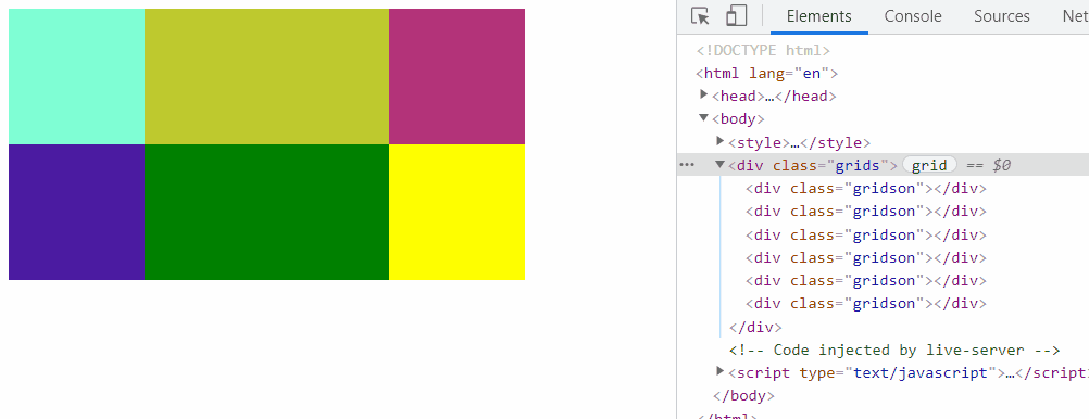
效果:

但是这样发现子元素gridson并没有变成并排的表格
行列属性
上文的例子中,六个项目子元素并没有变成我想要的上三下三表格布局,这是怎么一回事?
原来是我没有设置行列属性
- grid-template-columns 属性:定义每一列的列宽
- grid-template-rows 属性:定义每一行的行高
例子: 修改上面的grids容器元素的 css即可
.grids {
    display: inline-grid;
    /* width: 400px;
    height: 400px;*/
    grid-template-columns: 100px 180px 100px;
    grid-template-rows: 100px 100px ;
}
这样一定义,就连width和height都不用设置,容器元素会随着设置的行列宽高被撑开
设置行列宽高
设置行列宽高有三种方式:
1. 尺寸单位
2. 百分比
3. auto
4.fr
百分比
除了使用尺寸单位,也可以 使用百分比 (注意:使用百分比需要给容器设置宽高)
width: 400px;
height: 400px;
grid-template-columns: 30% 40% 30%;
grid-template-rows: 45% 55%;
atuo
设置宽高为auto时,也需要设置容器的大小,auto会自动平均分配剩余的大小
.grids {
    display: inline-grid;
    width: 400px;
    height: 200px;
    grid-template-columns:auto auto auto;
    grid-template-rows: 50px auto;
}

fr 关键字
网格布局提供了fr关键字(fraction 的缩写,意为"片段")。如果两列的宽度分别为1fr和2fr,就表示后者是前者的两倍。
这一点和Flex中的 flex-grow 很类似,使用fr关键字也要提前设置宽高
比如:
grid-template-columns:1fr 2fr 2fr;
repeat
在写比较重复的语句时,可以使用CSS 中的repeat()函数,此函数只能作用在grid-template-columns和grid-template-rows这两个CSS属性上
比如grid-template-columns: 100px 100px 100px;
可以替换成 grid-template-columns: repeat(3, 100px);
repeat函数第一个参数是重复次数,第二个参数是大小
第二个参数可以传入多个值,比如repeat(2, 100px 20px 80px);
设置行列间距
行列之间默认是无缝隙间距的,但是我们可以认为的制造
grid-row-gap 属性: 设置行与行的间隔(行间距)
grid-column-gap 属性: 设置列与列的间隔(列间距)
grid-gap 属性:是grid-column-gap和grid-row-gap的合并简写形式
例子:
.grids {
    display: inline-grid;
    width: 330px;
    grid-template-columns:repeat(3, 1fr);
    grid-template-rows: 100px 100px;
    grid-gap: 10px 15px;  /* 行列间距 */
}

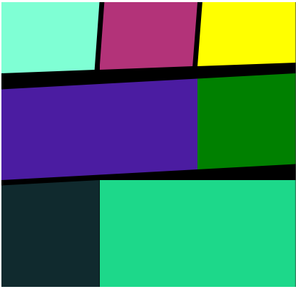
grid-template-areas合并单元格
使用grid-template-areas可以将单元格进行合并,然后页面布局显示更优
网格布局允许指定"区域"(area),一个区域由单个或多个单元格组成。grid-template-areas属性用于定义区域
如果定义一个九宫格,grid-template-areas属性可以如下设置 (在css中比较少见,像矩阵分布一样设置)
grid-template-areas: 'a b c'
                     'd e f'
                     'g h i';
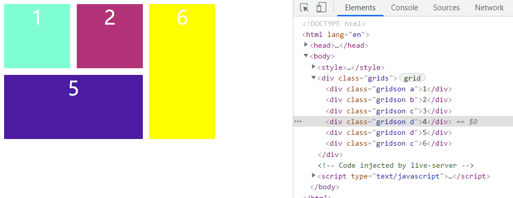
grid-template-area可以设置某一单元格,或者多个单元格设置成相同的class也可以
后一个单元格内容会覆盖掉前一个单元格内容
例子:
<style>
    .grids {
        display: inline-grid;
        width: 330px;
        grid-template-columns:repeat(3, 1fr);
        grid-template-rows: 100px 100px;
        grid-template-areas: 'a b c'
                   'd d c';
        grid-gap: 10px;
        text-align: center;
        font-size: 30px;
        color: #fff;
    }
    .a{
        background-color: aquamarine;
        grid-area: a;
    }
    .b{
        background-color: rgb(179, 51, 121);
        grid-area: b;
    }
    .d{
        background-color: rgb(75, 28, 161);
        grid-area: d;
    }
    .e{
        background-color: green;
        grid-area: e;
    }
    .c{
        background-color: yellow;
        grid-area: c;
    }
</style>
<div class="grids">
    <div class="gridson a">1</div>
    <div class="gridson b">2</div>
    <div class="gridson c">3</div>
    <div class="gridson d">4</div>
    <div class="gridson d">5</div>
    <div class="gridson c">6</div>
</div>
好累呀,关于Grid布局,其实还有很多的内容可以扩展开来将,但是空城机肝不动了,暂时封刀
有趣的布局示例
首先先进行排版布局
<style>
    .grids {
        display: inline-grid;
        width: 630px;
        grid-template-columns:repeat(3, 1fr);
        grid-template-rows: 180px 260px 240px;
        grid-template-areas: 'a b c'
                    'd d e'
                    'f g g';
        text-align: center;
        font-size: 30px;
        color: #fff;
        background-color: black;
    }
    .a{
        background-color: aquamarine;
        grid-area: a;
        clip-path: polygon(100% 0%, 95% 95%,0% 100%, 0% 00%, 95% 0%);
        background: url(./img/4.jpg) no-repeat;
        background-size: 100% 100%;
    }
    .b{
        background-color: rgb(179, 51, 121);
        grid-area: b;
        clip-path: polygon(100% 0%, 95% 90%,0% 95%, 5% 0%, 95% 0%);
        background: url(./img/2.jpg) no-repeat;
        background-size: 100% 100%;
    }
    .c{
        background-color: yellow;
        grid-area: c;
        clip-path: polygon(100% 0%, 100% 85%,0% 90%, 5% 0%, 95% 0%);
        background: url(./img/3.jpg) no-repeat;
        background-size: 100% 100%;
    }
    .d{
        background-color: rgb(75, 28, 161);
        grid-area: d;
        clip-path: polygon(100% 5%, 100% 90%,0% 100%, 0% 12%, 100% 5%);
        background: url(https://ss2.bdstatic.com/70cFvnSh_Q1YnxGkpoWK1HF6hhy/it/u=795934161,50379971&fm=11&gp=0.jpg) no-repeat;
        background-size: 100% 100%;
    }
    .e{
        background-color: green;
        grid-area: e;
        clip-path: polygon(100% 2%, 100% 85%,0% 90%, 0% 5%, 100% 2%);
        background: url(https://ss0.bdstatic.com/70cFvHSh_Q1YnxGkpoWK1HF6hhy/it/u=1110157243,2891229005&fm=26&gp=0.jpg) no-repeat;
        background-size: 100% 100%;
    }
    .f{
        background-color: rgb(16, 42, 46);
        grid-area: f;
        clip-path: polygon(100% 0%, 100% 100%, 0% 100%, 0% 5%, 100% 0%);
        background: url(./img/1.jpg) no-repeat;
        background-size: 100% 100%;
    }
    .g{
        background-color: rgb(29, 216, 138);
        grid-area: g;
        clip-path: polygon(100% 10%, 100% 100%, 0% 100%, 0% 0%, 100% 0%);
        background: url(./img/5.jpg) no-repeat;
        background-size: 100% 100%;
    }
</style>
<div class="grids">
    <div class="gridson a"></div>
    <div class="gridson b"></div>
    <div class="gridson c"></div>
    <div class="gridson d"></div>
    <div class="gridson e"></div>
    <div class="gridson f"></div>
    <div class="gridson g"></div>
</div>
效果:
搭建架子
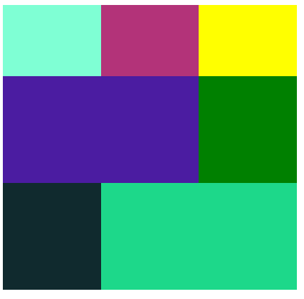
使用clip-path裁剪路径
给项目元素中添加图片
如果各位看官觉得写的还不错,可以在文章下方留下你们的足迹
- 点赞
- 收藏
- 关注作者
评论(0)