构建跨端推荐文章区域:Flutter × OpenHarmony 实战指南

构建跨端推荐文章区域:Flutter × OpenHarmony 实战指南
前言
在移动端和多终端应用中,推荐文章区域是提升用户留存和阅读体验的重要模块。本文将以 Flutter × OpenHarmony 跨端开发为例,手把手教你构建一个可横向滑动、带图片和渐变叠加的推荐文章区域。我们不仅提供完整实现代码,还对关键逻辑进行详细解析,让你快速掌握跨端 UI 构建方法。
背景
随着多端开发需求的增加,开发者希望能用一套代码同时适配手机、平板甚至智能设备。传统原生开发需要针对不同平台重复开发,成本高且维护复杂。而 Flutter × OpenHarmony 跨端方案,通过 Flutter 的 UI 渲染能力结合 OpenHarmony 的设备适配机制,实现一次开发、多端运行,既节省开发成本,也保证一致的用户体验。

Flutter × OpenHarmony 跨端开发介绍
-
Flutter:基于 Dart 的 UI 框架,拥有高性能渲染和丰富的组件库,支持 iOS、Android 以及 Web 等多端运行。
-
OpenHarmony:开源分布式操作系统,支持多种设备形态(手机、平板、IoT 设备等),提供统一的 API 接口。
-
跨端优势:
- 一套逻辑、多端复用
- 丰富的 UI 组件和动画效果
- 快速迭代和调试
在这个场景中,我们使用 Flutter 构建 UI,并通过 OpenHarmony 平台部署,实现跨端推荐文章展示。
开发核心代码(详细解析)
下面是核心实现部分,包含 推荐文章区域 和 推荐文章卡片 两个模块。
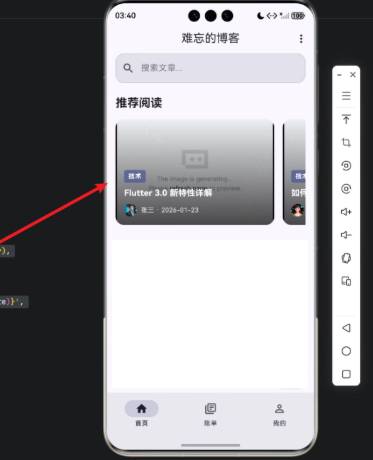
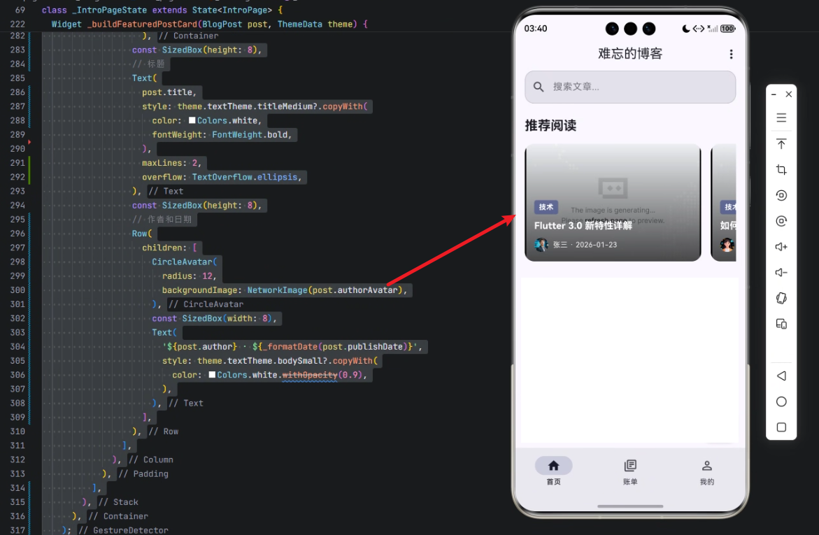
1. 构建推荐文章区域
/// 构建推荐文章区域
Widget _buildFeaturedPostsSection(ThemeData theme) {
  return Column(
    crossAxisAlignment: CrossAxisAlignment.start,
    children: [
      Text(
        '推荐阅读',
        style: theme.textTheme.titleLarge?.copyWith(fontWeight: FontWeight.bold),
      ),
      const SizedBox(height: 16),
      SizedBox(
        height: 200,
        child: ListView.builder(
          scrollDirection: Axis.horizontal,
          itemCount: _featuredPosts.length,
          itemBuilder: (context, index) {
            final post = _featuredPosts[index];
            return _buildFeaturedPostCard(post, theme);
          },
        ),
      ),
    ],
  );
}
解析:
Column:垂直排列标题和文章列表Text:显示区域标题ListView.builder:实现横向滑动文章列表itemBuilder:为每篇文章创建卡片
核心技巧:横向滑动列表使用
scrollDirection: Axis.horizontal,并配合固定高度SizedBox(height: 200)让列表高度统一。
2. 构建推荐文章卡片
/// 构建推荐文章卡片
Widget _buildFeaturedPostCard(BlogPost post, ThemeData theme) {
  return GestureDetector(
    onTap: () => _openPost(post),
    child: Container(
      width: 300,
      margin: const EdgeInsets.only(right: 16),
      decoration: BoxDecoration(
        borderRadius: BorderRadius.circular(16),
        color: theme.colorScheme.surfaceVariant,
      ),
      child: Stack(
        children: [
          // 文章图片
          ClipRRect(
            borderRadius: BorderRadius.circular(16),
            child: Image.network(
              post.featuredImage,
              width: 300,
              height: 200,
              fit: BoxFit.cover,
            ),
          ),
          // 渐变叠加
          Container(
            width: 300,
            height: 200,
            decoration: BoxDecoration(
              borderRadius: BorderRadius.circular(16),
              gradient: LinearGradient(
                begin: Alignment.topCenter,
                end: Alignment.bottomCenter,
                colors: [
                  Colors.transparent,
                  Colors.black.withOpacity(0.7),
                ],
              ),
            ),
          ),
          // 文章内容
          Padding(
            padding: const EdgeInsets.all(16),
            child: Column(
              mainAxisAlignment: MainAxisAlignment.end,
              crossAxisAlignment: CrossAxisAlignment.start,
              children: [
                // 分类标签
                if (post.categories.isNotEmpty)
                  Container(
                    padding: const EdgeInsets.symmetric(horizontal: 8, vertical: 4),
                    decoration: BoxDecoration(
                      borderRadius: BorderRadius.circular(4),
                      color: theme.colorScheme.primary.withOpacity(0.8),
                    ),
                    child: Text(
                      post.categories[0].name,
                      style: theme.textTheme.bodySmall?.copyWith(
                        color: theme.colorScheme.onPrimary,
                        fontWeight: FontWeight.bold,
                      ),
                    ),
                  ),
                const SizedBox(height: 8),
                // 标题
                Text(
                  post.title,
                  style: theme.textTheme.titleMedium?.copyWith(
                    color: Colors.white,
                    fontWeight: FontWeight.bold,
                  ),
                  maxLines: 2,
                  overflow: TextOverflow.ellipsis,
                ),
                const SizedBox(height: 8),
                // 作者和日期
                Row(
                  children: [
                    CircleAvatar(
                      radius: 12,
                      backgroundImage: NetworkImage(post.authorAvatar),
                    ),
                    const SizedBox(width: 8),
                    Text(
                      '${post.author} · ${_formatDate(post.publishDate)}',
                      style: theme.textTheme.bodySmall?.copyWith(
                        color: Colors.white.withOpacity(0.9),
                      ),
                    ),
                  ],
                ),
              ],
            ),
          ),
        ],
      ),
    ),
  );
}
解析:
-
GestureDetector:卡片可点击,触发
_openPost(post)打开文章 -
Container + BoxDecoration:设置卡片圆角和背景
-
Stack:叠加多层元素
- 图片层
Image.network - 渐变层
Container + LinearGradient增强文字可读性 - 内容层
Padding + Column显示分类标签、标题、作者信息
- 图片层
-
渐变叠加技巧:
Colors.transparent → Colors.black.withOpacity(0.7),让文字在图片上更清晰 -
作者信息:使用
CircleAvatar显示头像,右侧显示作者名和发布日期
核心技巧:使用
Stack结合渐变背景,轻松实现可读性强的图片卡片。
心得
通过 Flutter × OpenHarmony 的开发实践,我总结了几点经验:
- 组件复用:将文章卡片封装为
_buildFeaturedPostCard,便于在多个页面复用 - UI 分层:Stack + Gradient 实现视觉效果的同时保证可读性
- 跨端适配:OpenHarmony 的设备适配机制几乎无需改动 UI 代码即可在多设备运行
- 数据驱动:通过
_featuredPosts数组管理文章数据,UI 与数据解耦
总结
本文展示了如何基于 Flutter × OpenHarmony 构建一个推荐文章区域,从 UI 布局、组件封装到渐变叠加效果都进行了详细讲解。通过这种方式,开发者不仅能实现高可读性的横向滑动推荐卡片,还能轻松实现多端部署。
跨端开发时代,掌握 Flutter 与 OpenHarmony 的结合使用,将大幅提高开发效率和用户体验,是构建现代移动应用推荐模块的高效方案。

- 点赞
- 收藏
- 关注作者
评论(0)