Flutter笔记:Widgets Easier组件库(12)使用消息吐丝(Notify Toasts)

Visit me at CSDN: https://jclee95.blog.csdn.net
My WebSite:http://thispage.tech/
Email: 291148484@163.com.
Shenzhen China
Address of this article:https://blog.csdn.net/qq_28550263/article/details/138425637
HuaWei:https://bbs.huaweicloud.com/blogs/426808
组件库地址:
【介绍】:本文介绍Flutter的Widgets Easier组件库中:消息吐丝(Notify Toasts)的使用方法。
 ](https://jclee95.blog.csdn.net/)
本库是一个 Flutter 组件库,旨在提供用于Flutter开发的组件,使得开发者能够更简单地构建出更丰富地界面效果。项目地址为:
在你的Flutter项目中,运行下面的命令:
flutter pub add widgets_easier
即可安装最新版本的 Widgets Easier 库。
消息吐丝组件受到Element-Plus的Notification启发,并以一种适合于在Flutter上使用的方式进行封装。它提供了一种简单而灵活的方式来在你的应用中显示消息通知。通过自定义样式、动画效果和交互,你可以创建出符合应用设计风格的消息通知。
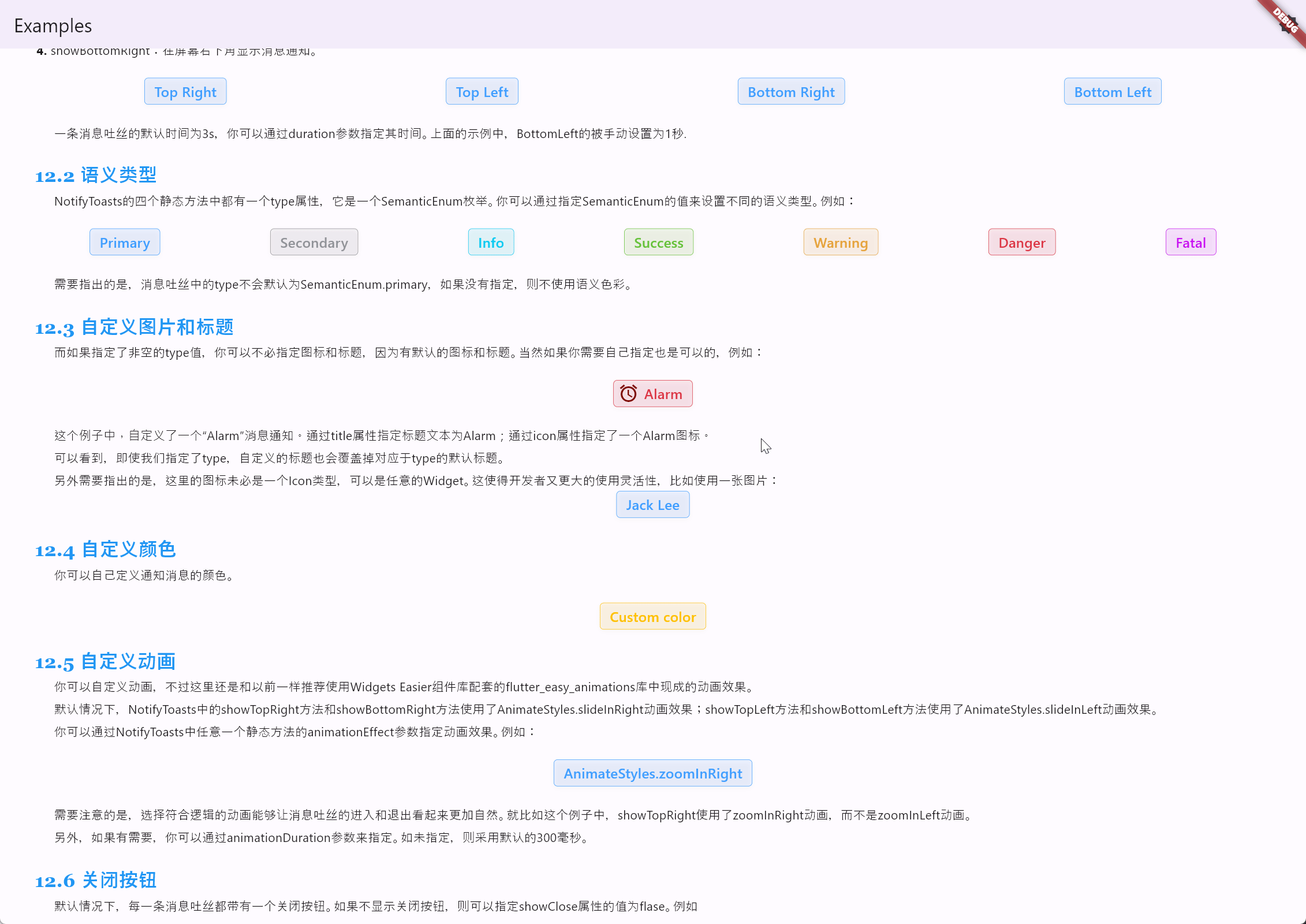
消息吐丝相关组件是通过 NotifyToasts 类提供的静态方法来掉用显示的。 NotifyToasts 类中有四个静态方法,对应于显示消息通知的四个方位:
- showTopLeft:在屏幕左上角显示消息通知;
- showTopRight:在屏幕右上角显示消息通知;
- showBottomLeft:在屏幕左下角显示消息通知;
- showBottomRight:在屏幕右下角显示消息通知。
例如:
Row(
  mainAxisAlignment: MainAxisAlignment.spaceAround,
  children: [
    SemanticButton(
      onTap: () => NotifyToasts.showTopRight(
        context,
        title: 'TopRight',
        message: 'Top Right Notification!',
      ),
      isOutlined: true,
      text: 'Top Right',
    ),
    SemanticButton(
      onTap: () => NotifyToasts.showTopLeft(
        context,
        title: 'TopLeft',
        message: 'Top Left Notification!',
      ),
      isOutlined: true,
      text: 'Top Left',
    ),
    SemanticButton(
      onTap: () => NotifyToasts.showBottomRight(
        context,
        title: 'BottomRight',
        message: 'Bottom Right Notification!',
      ),
      isOutlined: true,
      text: 'Bottom Right',
    ),
    SemanticButton(
      onTap: () => NotifyToasts.showBottomLeft(
        context,
        duration: const Duration(seconds: 1),
        title: 'BottomLeft',
        message: 'Bottom Left Notification!',
      ),
      isOutlined: true,
      text: 'Bottom Left',
    ),
  ],
),
代码的运行效果如下:
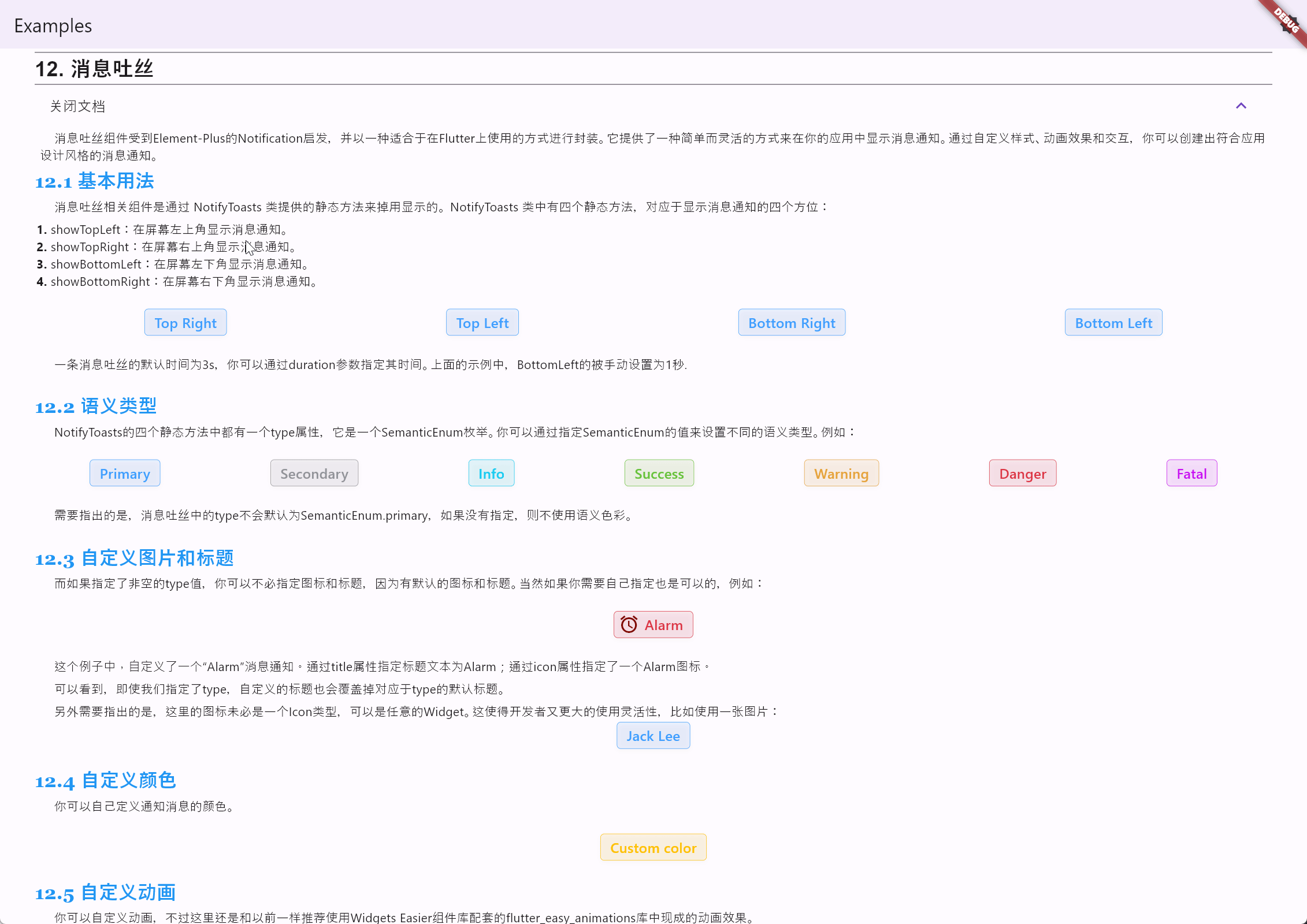
一条消息吐丝的默认时间为3s,你可以通过duration参数指定其时间。上面的示例中,Bottom Left 的被手动设置为1秒。
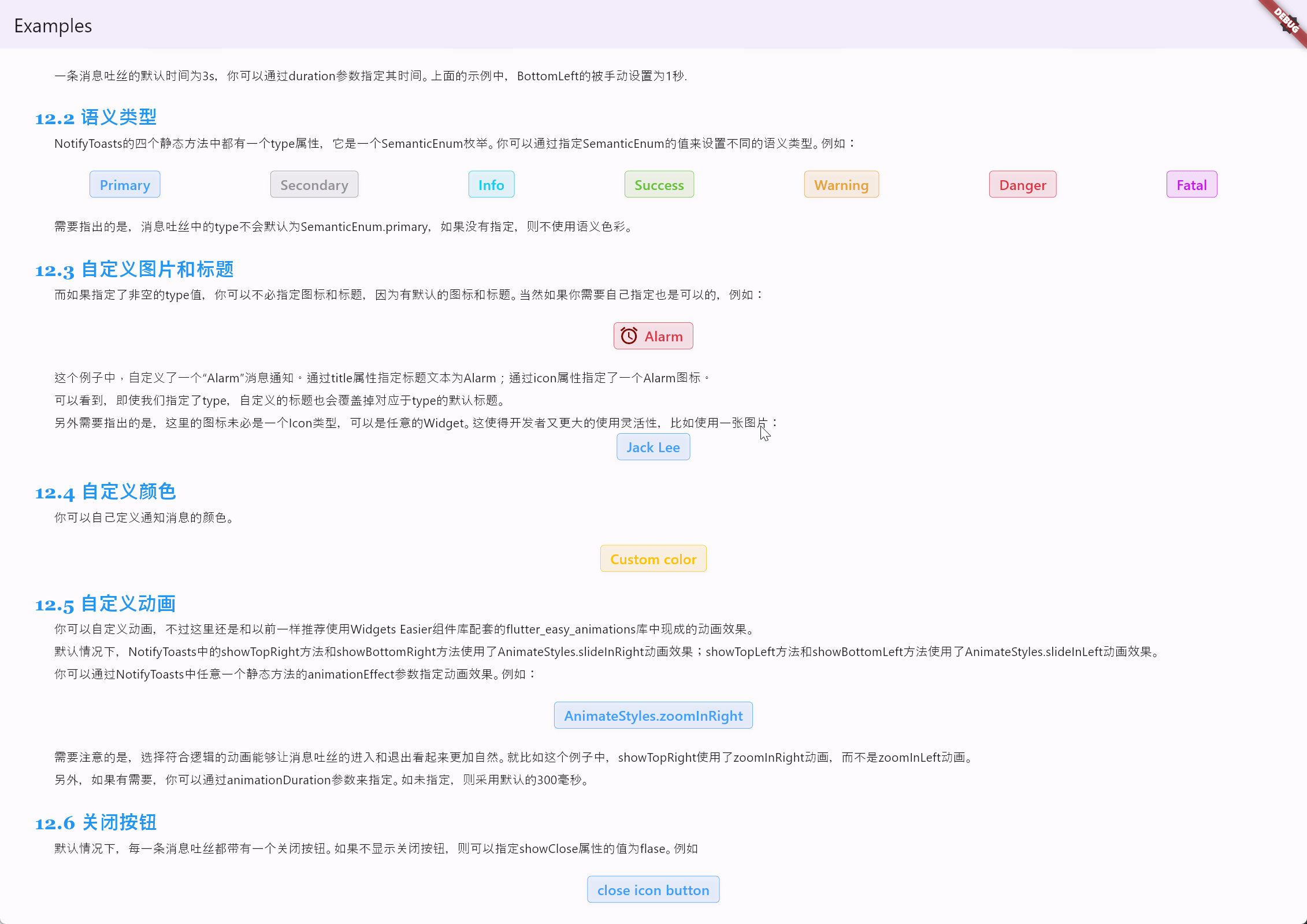
NotifyToasts的四个静态方法中都有一个type属性,它是一个SemanticEnum枚举。你可以通过指定SemanticEnum的值来设置不同的语义类型。例如:
Row(
  mainAxisAlignment: MainAxisAlignment.spaceAround,
  children: [
    SemanticButton(
      type: SemanticEnum.primary,
      onTap: () => NotifyToasts.showTopRight(
        context,
        type: SemanticEnum.primary,
        message: 'Here are some messages.',
      ),
      isOutlined: true,
      text: 'Primary',
    ),
    SemanticButton(
      type: SemanticEnum.secondary,
      onTap: () => NotifyToasts.showTopRight(
        context,
        type: SemanticEnum.secondary,
        message: 'Here are some messages.',
      ),
      isOutlined: true,
      text: 'Secondary',
    ),
    SemanticButton(
      type: SemanticEnum.info,
      onTap: () => NotifyToasts.showTopRight(
        context,
        type: SemanticEnum.info,
        message: 'Here are some messages.',
      ),
      isOutlined: true,
      text: 'Info',
    ),
    SemanticButton(
      type: SemanticEnum.success,
      onTap: () => NotifyToasts.showTopRight(
        context,
        type: SemanticEnum.success,
        message: 'Here are some messages.',
      ),
      isOutlined: true,
      text: 'Success',
    ),
    SemanticButton(
      type: SemanticEnum.warning,
      onTap: () => NotifyToasts.showTopRight(
        context,
        type: SemanticEnum.warning,
        message: 'Here are some messages.',
      ),
      isOutlined: true,
      text: 'Warning',
    ),
    SemanticButton(
      type: SemanticEnum.danger,
      onTap: () => NotifyToasts.showTopRight(
        context,
        type: SemanticEnum.danger,
        message: 'Here are some messages.',
      ),
      isOutlined: true,
      text: 'Danger',
    ),
    SemanticButton(
      type: SemanticEnum.fatal,
      onTap: () => NotifyToasts.showTopRight(
        context,
        type: SemanticEnum.fatal,
        message: 'Here are some messages.',
      ),
      isOutlined: true,
      text: 'Fatal',
    ),
  ],
)
代码的运行效果如下:
需要指出的是,消息吐丝中的type不会默认为SemanticEnum.primary,如果没有指定,则不使用语义色彩。
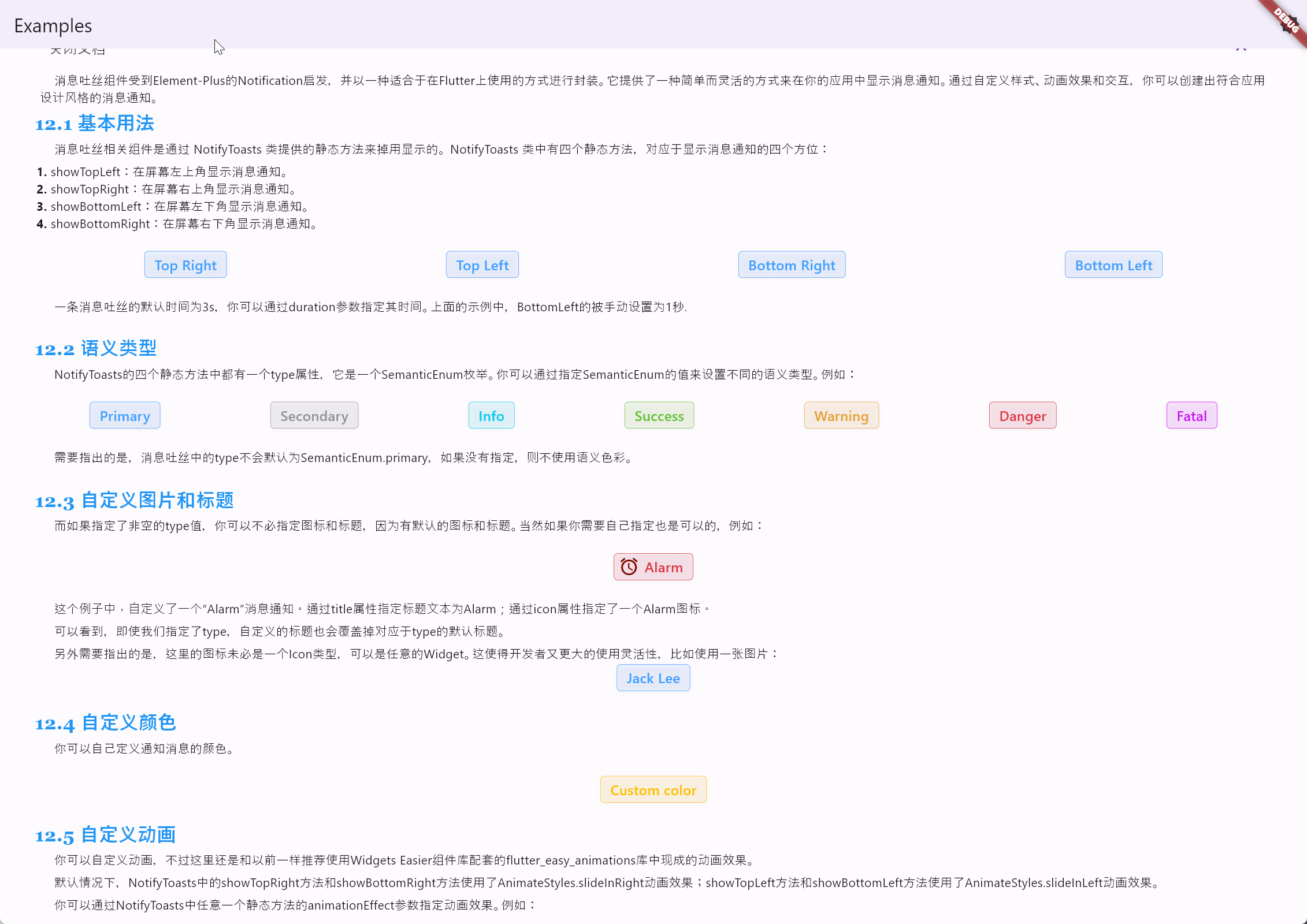
如果指定了非空的type值,你可以不必指定图标和标题,因为有默认的图标和标题。当然如果你需要自己指定也是可以的,例如:
SemanticButton(
  shrink: true,
  prefixIcon: const Icon(
    Icons.access_alarms,
    color: Color.fromARGB(255, 125, 8, 0),
  ),
  type: SemanticEnum.danger,
  onTap: () => NotifyToasts.showTopRight(
    context,
    title: 'Alarm',
    icon: const Icon(
      Icons.access_alarms,
      color: Color.fromARGB(255, 125, 8, 0),
    ),
    type: SemanticEnum.danger,
    message: 'Here are some messages.',
  ),
  isOutlined: true,
  text: 'Alarm',
)
代码的运行效果如下:
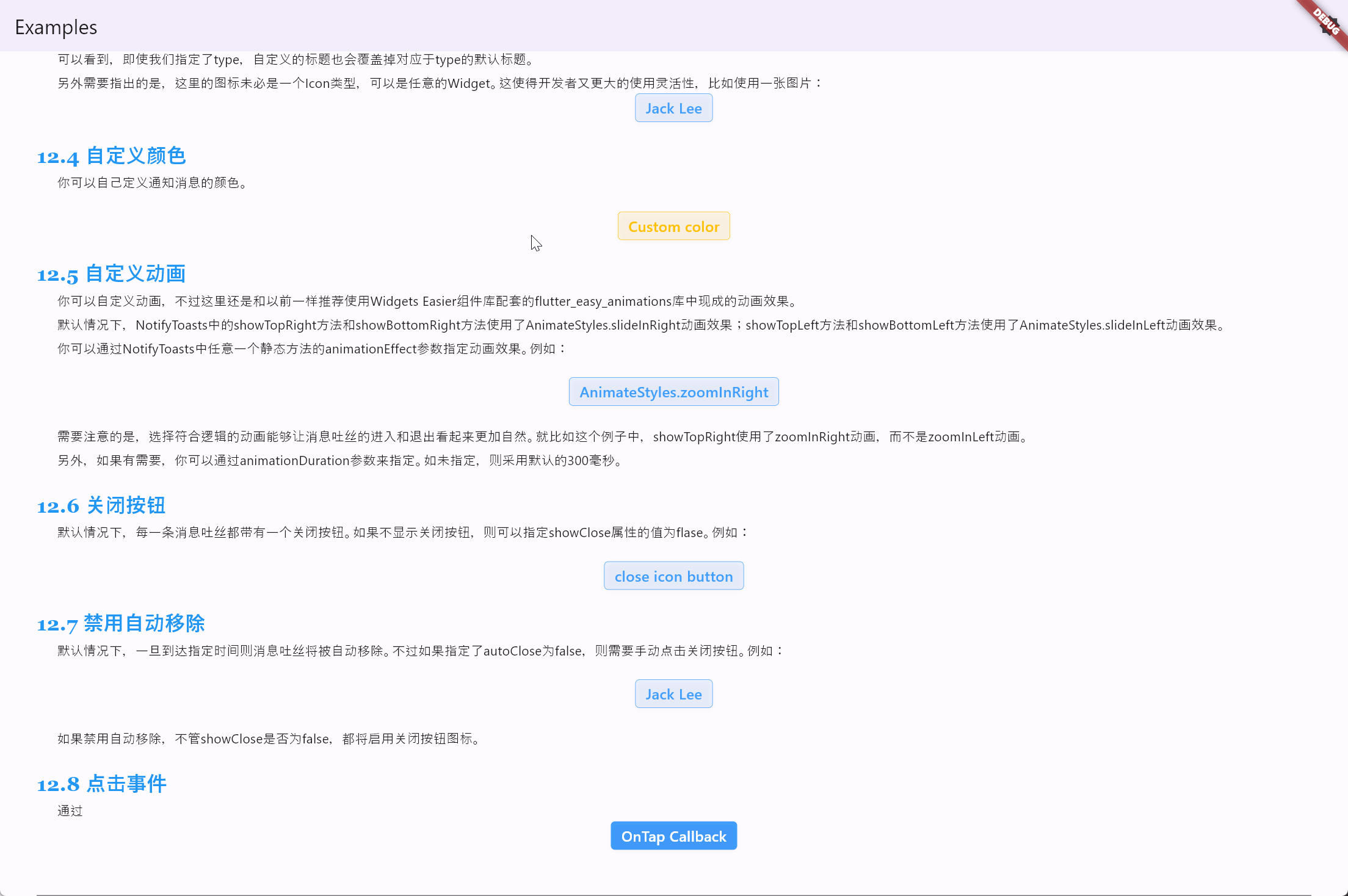
这个例子中,自定义了一个“Alarm”消息通知。通过title属性指定标题文本为Alarm;通过icon属性指定了一个Alarm图标。可以看到,即使我们指定了type,自定义的标题也会覆盖掉对应于type的默认标题。
另外需要指出的是,这里的图标未必是一个Icon类型,可以是任意的Widget。这使得开发者又更大的使用灵活性,比如使用一张图片:
SemanticButton(
  shrink: true,
  onTap: () => NotifyToasts.showTopRight(
    context,
    title: 'Jack Lee',
    icon: Picture(source: 'assets/jclee95.png'),
    message: 'JackLee, the author of this library, is a good boy.',
  ),
  isOutlined: true,
  text: 'Jack Lee',
)
代码的运行效果如下:
你可以自己定义通知消息的颜色。例如:
SemanticButton(
  shrink: true,
  color: Colors.amber,
  onTap: () => NotifyToasts.showTopRight(
    context,
    color: Colors.amber,
    title: 'Custom color',
    message: 'The currently defined color is Colors.amber.',
  ),
  isOutlined: true,
  text: 'Custom color',
)
代码的运行效果如下:
你可以自定义动画,不过这里还是和以前一样推荐使用Widgets Easier 组件库配套的flutter_easy_animations库中现成的动画效果。默认情况下,NotifyToasts中的showTopRight方法和showBottomRight方法使用了 AnimateStyles.slideInRight 动画效果;showTopLeft方法和showBottomLeft方法使用了AnimateStyles.slideInLeft动画效果。
你可以通过 NotifyToasts 中任意一个静态方法的 animationEffect 参数指定动画效果。例如:
SemanticButton(
  shrink: true,
  onTap: () => NotifyToasts.showTopRight(
    context,
    animationEffect: AnimateStyles.zoomInRight,
    title: 'Custom Animation',
    message: 'Use AnimateStyles.zoomInRight animation effect.',
  ),
  isOutlined: true,
  text: 'AnimateStyles.zoomInRight',
)
代码的运行效果如下:
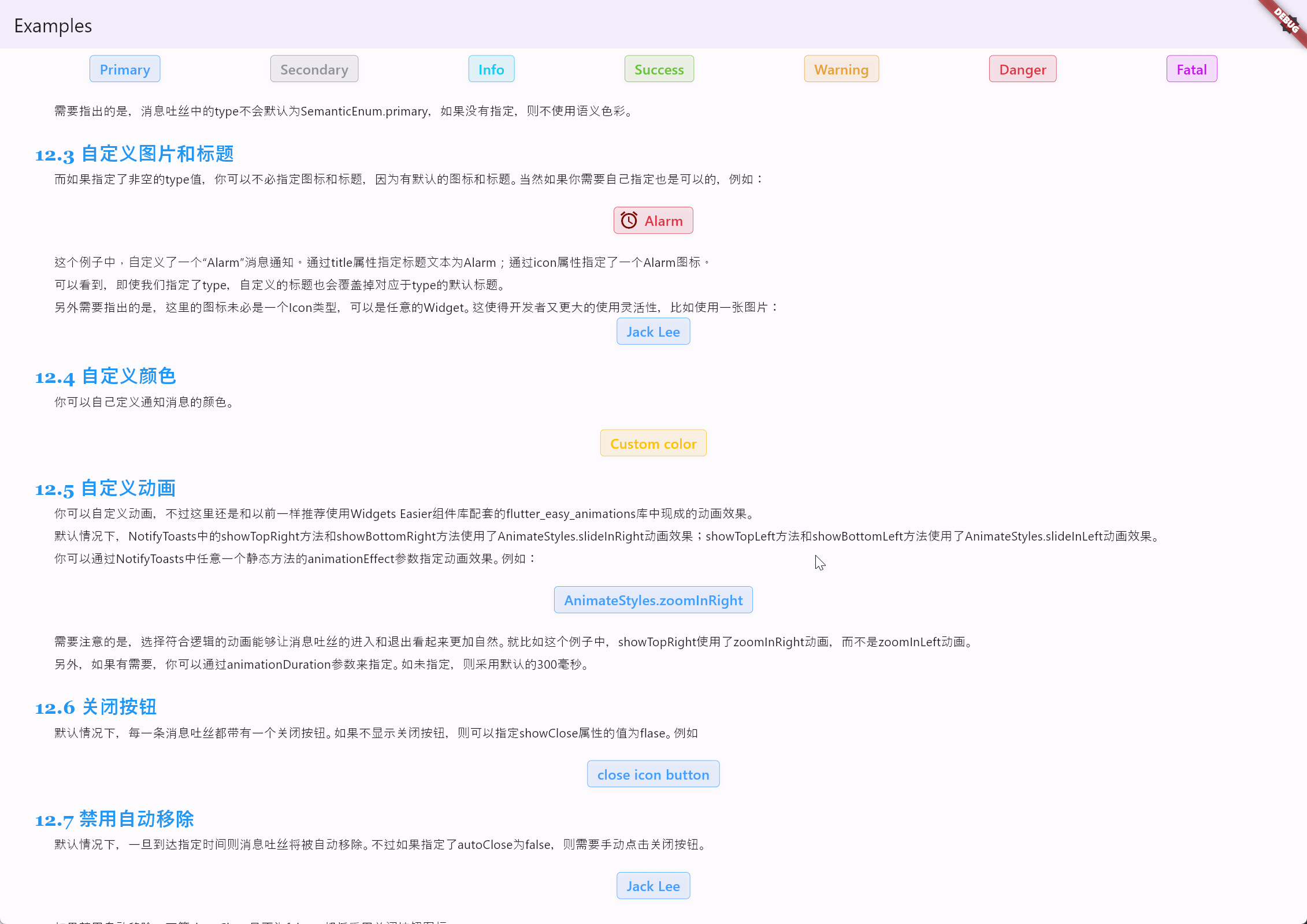
需要注意的是,选择符合逻辑的动画能够让消息吐丝的进入和退出看起来更加自然。就比如这个例子中,showTopRight使用了zoomInRight动画,而不是zoomInLeft动画。
另外,如果有需要,你可以通过animationDuration参数来指定。如未指定,则采用默认的300毫秒。
默认情况下,每一条消息吐丝都带有一个关闭按钮。如果不显示关闭按钮,则可以指定showClose属性的值为flase。例如:
SemanticButton(
  shrink: true,
  onTap: () => NotifyToasts.showTopRight(
    context,
    title: 'close icon button',
    showClose: false,
    message:
        'You can disable the close icon button by specifying the value of the showClose property as flase.',
  ),
  isOutlined: true,
  text: 'close icon button',
)
代码的运行效果如下:
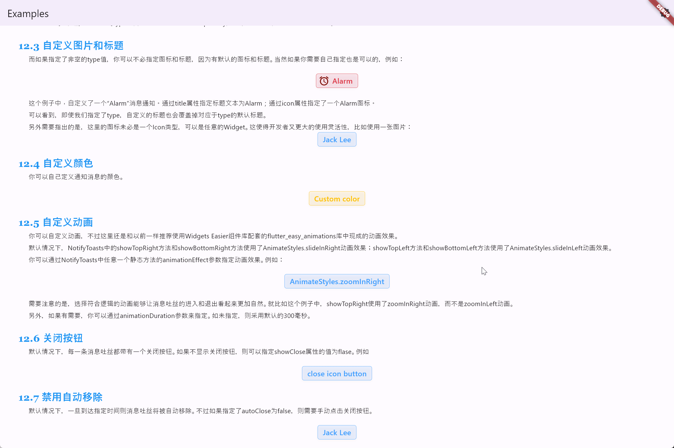
默认情况下,一旦到达指定时间则消息吐丝将被自动移除。不过如果指定了autoClose为false,则需要手动点击关闭按钮。例如:
SemanticButton(
  shrink: true,
  onTap: () => NotifyToasts.showTopRight(
    context,
    title: 'Jack Lee',
    autoClose: false,
    icon: Picture(source: 'assets/jclee95.png'),
    message: 'JackLee, the author of this library, is a good boy.',
  ),
  isOutlined: true,
  text: 'Jack Lee',
)
代码的运行效果如下:
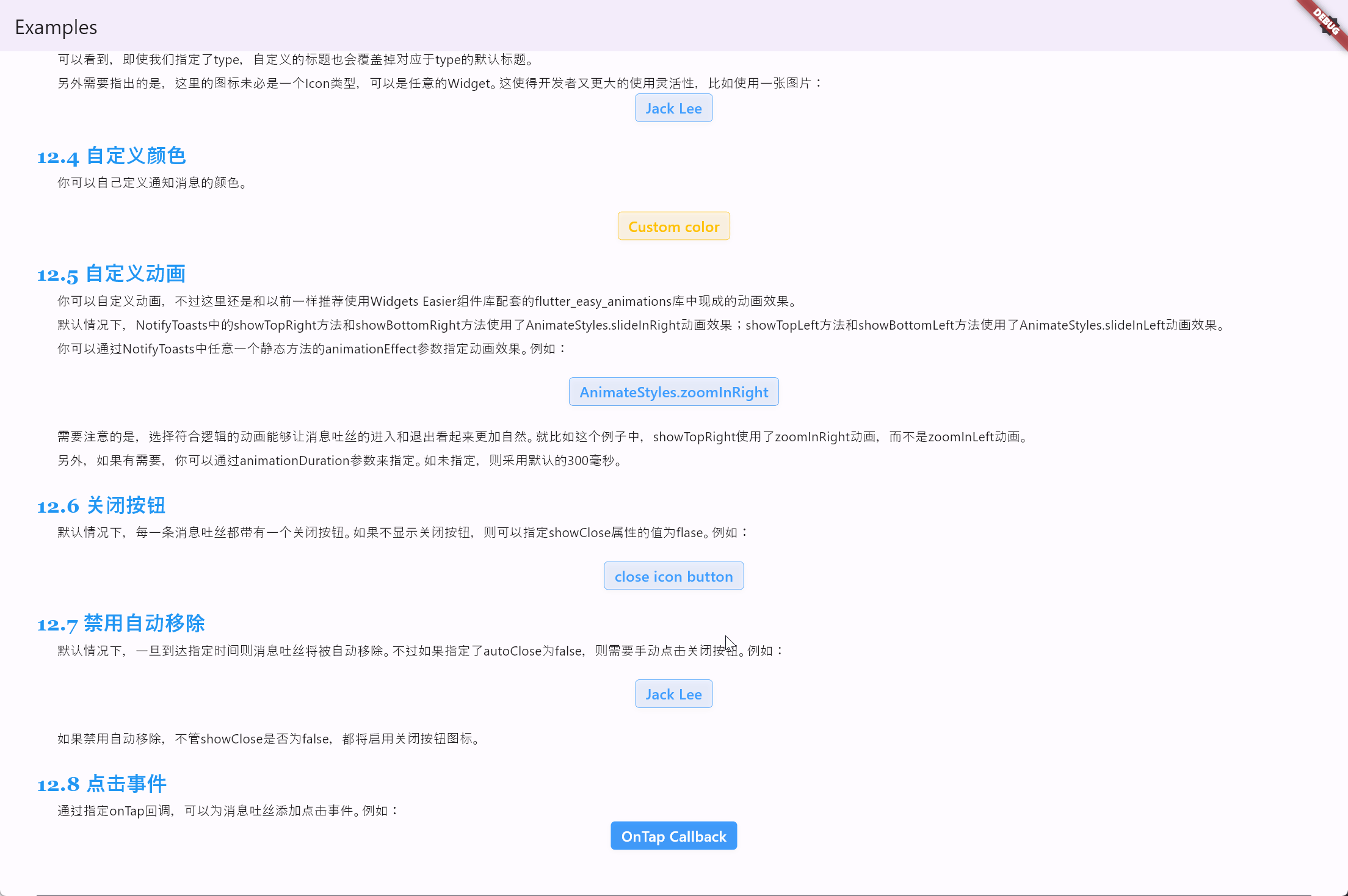
如果禁用自动移除,不管showClose是否为false,都将启用关闭按钮图标。
SemanticButton(
  shrink: true,
  onTap: () => NotifyToasts.showTopRight(
    context,
    autoClose: false,
    title: 'Click Login',
    message: 'Click the message toast to jump to the login page.',
    onTap: () => Navigator.of(context).pushNamed('/login'),
  ),
  text: 'OnTap Callback',
)
代码的运行效果如下:

- 点赞
- 收藏
- 关注作者
评论(0)