Flutter笔记:Widgets Easier组件库(3)使用按钮组

Visit me at CSDN: https://jclee95.blog.csdn.net
My WebSite:http://thispage.tech/
Email: 291148484@163.com.
Shenzhen China
Address of this article:https://blog.csdn.net/qq_28550263/article/details/138342814
HuaWei:https://bbs.huaweicloud.com/blogs/426715
组件库地址:
【介绍】:本文Flutter Widgets Easier组件库中按钮组件的基本用法。
注:文本中示例使用的 Gap 组件来源于第三方库gap,Gap(20)就相当于写成 SizedBox(width:20)或者SizedBox(height:20)等生成间隔。不喜欢这个组件的替换为SizedBox即可。
本库是一个 Flutter 组件库,旨在提供用于Flutter开发的组件,使得开发者能够更简单地构建出更丰富地界面效果。项目地址为:
在你的Flutter项目中,运行下面的命令:
flutter pub add widgets_easier
即可安装最新版本的 Widgets Easier 库。
SemanticButton 是一个高度可定制的按钮组件,支持多种视觉和交互效果。它允许开发者设置按钮的文本、图标、颜色、边框样式、阴影、以及交互时的视觉反馈。此外,按钮可以配置为带有前缀图标和后缀图标,增加按钮的表达力和功能性。
将SemanticButton 的语义枚举应用于按钮,可以获得色彩主题差异化的不同按钮。
例如:
SemanticButton(
  text: 'primary',
  type: SemanticEnum.primary,
  onTap: () {},
),
const Gap(10),
SemanticButton(
  text: 'secondary',
  type: SemanticEnum.secondary,
  onTap: () {},
),
const Gap(10),
SemanticButton(
  text: 'info',
  type: SemanticEnum.info,
  onTap: () {},
),
const Gap(10),
SemanticButton(
  text: 'success',
  type: SemanticEnum.success,
  onTap: () {},
),
const Gap(10),
SemanticButton(
  text: 'warning',
  type: SemanticEnum.warning,
  onTap: () {},
),
const Gap(10),
SemanticButton(
  text: 'danger',
  type: SemanticEnum.danger,
  onTap: () {},
),
const Gap(10),
SemanticButton(
  text: 'fatal',
  type: SemanticEnum.fatal,
  onTap: () {},

SemanticButton默认为普通按钮(非轮廓按钮)。通过设置SemanticButton类的isOutlined属性参数值为true,则按钮将一轮廓形式显示,例如:
SemanticButton(
  text: 'primary',
  type: SemanticEnum.primary,
  isOutlined: true,
  onTap: () {},
),
const Gap(10),
SemanticButton(
  text: 'secondary',
  type: SemanticEnum.secondary,
  isOutlined: true,
  onTap: () {},
),
const Gap(10),
SemanticButton(
  text: 'info',
  type: SemanticEnum.info,
  isOutlined: true,
  onTap: () {},
),
const Gap(10),
SemanticButton(
  text: 'success',
  type: SemanticEnum.success,
  isOutlined: true,
  onTap: () {},
),
const Gap(10),
SemanticButton(
  text: 'warning',
  type: SemanticEnum.warning,
  isOutlined: true,
  onTap: () {},
),
const Gap(10),
SemanticButton(
  text: 'danger',
  type: SemanticEnum.danger,
  isOutlined: true,
  onTap: () {},
),
const Gap(10),
SemanticButton(
  text: 'fatal',
  type: SemanticEnum.fatal,
  isOutlined: true,
  onTap: () {},
),

除了默认的实线轮廓外,还可以手动指定outlineStyle参数值设置伦托类型以及去轮廓。实线轮廓(OutlineStyle.solide)是默认的,因此这里不再重复给出例子。
Dotted 轮廓由一系列间隔相等的点组成,这些点连接在一起形成物体的边缘。通过指定outlineStyle: OutlineStyle.dotted,可以设置Dotted轮廓。例如:
SemanticButton(
  text: 'primary',
  type: SemanticEnum.primary,
  isOutlined: true,
  outlineStyle: OutlineStyle.dotted,
  onTap: () {},
),
const Gap(10),
SemanticButton(
  text: 'secondary',
  type: SemanticEnum.secondary,
  isOutlined: true,
  outlineStyle: OutlineStyle.dotted,
  onTap: () {},
),
const Gap(10),
SemanticButton(
  text: 'info',
  type: SemanticEnum.info,
  isOutlined: true,
  outlineStyle: OutlineStyle.dotted,
  onTap: () {},
),
const Gap(10),
SemanticButton(
  text: 'success',
  type: SemanticEnum.success,
  isOutlined: true,
  outlineStyle: OutlineStyle.dotted,
  onTap: () {},
),
const Gap(10),
SemanticButton(
  text: 'warning',
  type: SemanticEnum.warning,
  isOutlined: true,
  outlineStyle: OutlineStyle.dotted,
  onTap: () {},
),
const Gap(10),
SemanticButton(
  text: 'danger',
  type: SemanticEnum.danger,
  isOutlined: true,
  outlineStyle: OutlineStyle.dotted,
  onTap: () {},
),
const Gap(10),
SemanticButton(
  text: 'fatal',
  type: SemanticEnum.fatal,
  isOutlined: true,
  outlineStyle: OutlineStyle.dotted,
  onTap: () {},
),

Dashed 轮廓由一系列间隔的虚线组成,这些虚线连接在一起形成物体的边缘。通过指定outlineStyle: OutlineStyle.dashed,可以设置Dashed轮廓。例如:
SemanticButton(
  text: 'primary',
  type: SemanticEnum.primary,
  isOutlined: true,
  outlineStyle: OutlineStyle.dashed,
  onTap: () {},
),
const Gap(10),
SemanticButton(
  text: 'secondary',
  type: SemanticEnum.secondary,
  isOutlined: true,
  outlineStyle: OutlineStyle.dashed,
  onTap: () {},
),
const Gap(10),
SemanticButton(
  text: 'info',
  type: SemanticEnum.info,
  isOutlined: true,
  outlineStyle: OutlineStyle.dashed,
  onTap: () {},
),
const Gap(10),
SemanticButton(
  text: 'success',
  type: SemanticEnum.success,
  isOutlined: true,
  outlineStyle: OutlineStyle.dashed,
  onTap: () {},
),
const Gap(10),
SemanticButton(
  text: 'warning',
  type: SemanticEnum.warning,
  isOutlined: true,
  outlineStyle: OutlineStyle.dashed,
  onTap: () {},
),
const Gap(10),
SemanticButton(
  text: 'danger',
  type: SemanticEnum.danger,
  isOutlined: true,
  outlineStyle: OutlineStyle.dashed,
  onTap: () {},
),
const Gap(10),
SemanticButton(
  text: 'fatal',
  type: SemanticEnum.fatal,
  isOutlined: true,
  outlineStyle: OutlineStyle.dashed,
  onTap: () {},
),

通过指定outlineStyle: OutlineStyle.none,可以禁用轮廓。例如:
SemanticButton(
  text: 'primary',
  type: SemanticEnum.primary,
  isOutlined: true,
  outlineStyle: OutlineStyle.none,
  onTap: () {},
),
const Gap(10),
SemanticButton(
  text: 'secondary',
  type: SemanticEnum.secondary,
  isOutlined: true,
  outlineStyle: OutlineStyle.none,
  onTap: () {},
),
const Gap(10),
SemanticButton(
  text: 'info',
  type: SemanticEnum.info,
  isOutlined: true,
  outlineStyle: OutlineStyle.none,
  onTap: () {},
),
const Gap(10),
SemanticButton(
  text: 'success',
  type: SemanticEnum.success,
  isOutlined: true,
  outlineStyle: OutlineStyle.none,
  onTap: () {},
),
const Gap(10),
SemanticButton(
  text: 'warning',
  type: SemanticEnum.warning,
  isOutlined: true,
  outlineStyle: OutlineStyle.none,
  onTap: () {},
),
const Gap(10),
SemanticButton(
  text: 'danger',
  type: SemanticEnum.danger,
  isOutlined: true,
  outlineStyle: OutlineStyle.none,
  onTap: () {},
),
const Gap(10),
SemanticButton(
  text: 'fatal',
  type: SemanticEnum.fatal,
  isOutlined: true,
  outlineStyle: OutlineStyle.none,
  onTap: () {},
),

通过设置按钮ontap属性值可以指定一个函数作为按钮点击时间的回调函数。如果没有指定回调函数,或者指定onTap属性的值为null,则按钮状态成为禁用状态。例如:
对于桌面端或者Web平台,一个被禁用的按钮不仅无法被点击,而且在hover时,不会像正常按钮那样拥有海拔变化。图标上也从寿星图标转换为禁用图标。
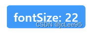
通过设置fontSize属性,可以指定文本的大小。例如:
SemanticButton(
  text: 'fontSize: 22',
  fontSize: 22,
  onTap: () {},
  shrink: true,
),
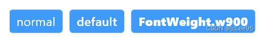
通过fontWeight属性,可以指定字体粗细程度,例如:
SemanticButton(
  text: 'normal',
  fontWeight: FontWeight.normal,
  onTap: () {},
),
const Gap(10),
SemanticButton(
  text: 'default',
  onTap: () {},
),
const Gap(10),
SemanticButton(
  text: 'FontWeight.w900',
  onTap: () {},
  fontWeight: FontWeight.w900,
),
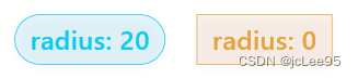
按钮圆角的默认值为4。再某些场景中,依据你的需求,可以手动调整按钮的圆角大小。例如:
SemanticButton(
  text: 'radius: 20',
  shrink: true,
  type: SemanticEnum.info,
  isOutlined: true,
  onTap: () {},
  radius: 20,
),
const Gap(20),
SemanticButton(
  text: 'radius: 0',
  shrink: true,
  type: SemanticEnum.warning,
  isOutlined: true,
  onTap: () {},
  radius: 0,
),
通过尺寸枚举,可以使用预设大小。例如:
SemanticButton(
  text: 'small',
  size: SizeEnum.small,
  type: SemanticEnum.info,
  onTap: () {},
),
const Gap(20),
SemanticButton(
  text: 'defaultSize',
  type: SemanticEnum.info,
  size: SizeEnum.defaultSize,
  onTap: () {},
),
const Gap(20),
SemanticButton(
  text: 'large',
  size: SizeEnum.large,
  type: SemanticEnum.info,
  onTap: () {},
),
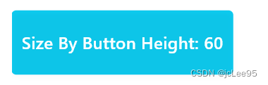
除了尺寸枚举,你还可以通过具体的数值来指定按钮的尺寸,一旦指定数值则枚举尺寸自动失效。一个通过数值指定尺寸的例子如:
SemanticButton(
  text: 'Size By Button Height: 60',
  type: SemanticEnum.info,
  height: 60,
  shrink: true,
  onTap: () {},
),
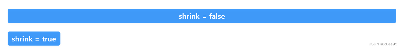
在 SemanticButton 组件中,shrink 参数用于控制按钮的收缩行为。当 shrink 设置为 true 时,按钮会根据其内容自适应宽度,而不是占据所有可用空间。这在某些情况下很有用,例如当你想要将多个按钮并排放置,并且希望每个按钮的宽度与其内容相匹配时。下面通过例子具体看一下 shrink 参数的作用。
- 当 shrink 设置为 false(默认值)时,按钮将占据其父容器提供的所有可用宽度;
- 在这种情况下,按钮的宽度由其父容器的约束决定,而不是由按钮的内容决定;
- 按钮内容(文本和图标)将在按钮的可用空间内居中对齐。
假设下面这个按钮在一个Column中,这一行没有其它部件:
SemanticButton(
  text: 'shrink = false',
  type: SemanticEnum.primary,
  onTap: () {},
),
下一节的截图展示效果对比。
- 当 shrink 设置为 true 时,按钮将根据其内容自适应宽度;
- 按钮的宽度将由其内容(文本和图标)的实际宽度决定,而不是占据所有可用空间;
- 这意味着按钮将收缩到恰好容纳其内容所需的宽度。
下面是一个shrink = true的例子,假设下面这个按钮在一个Column中,这一行没有其它部件:
SemanticButton(
  text: 'shrink = true',
  shrink: true,
  type: SemanticEnum.primary,
  onTap: () {},
),
两者的对比如下:
在 SemanticButton 中,可以通过 prefixIcon 属性添加一个前缀图标。这个图标显示在按钮文本的左侧,通常用于增强按钮的语义或者提供视觉提示。例如,一个电话图标可以用在“呼叫”按钮上,以直观地表明按钮的功能。
SemanticButton(
  text: "Call",
  onTap: () {},
  shrink: true,
  prefixIcon: Icon(Icons.phone),
  type: SemanticEnum.primary,
)
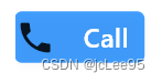
在上述代码中,Icon(Icons.phone) 作为 prefixIcon 被传递给 SemanticButton,使得用户可以直观地识别这是一个用于拨打电话的按钮。
与前缀图标类似,SemanticButton 也支持后缀图标,通过 suffixIcon 属性设置。后缀图标显示在按钮文本的右侧,适用于指示按钮的次要操作或额外的功能,如展开箭头或信息图标。
SemanticButton(
  text: "Options",
  onTap: () {},
  shrink: true,
  suffixIcon: Icon(Icons.arrow_drop_down),
  type: SemanticEnum.primary,
)
在这个例子中,Icon(Icons.arrow_drop_down) 被设置为 suffixIcon,表明这个按钮可能会展开更多的选项或菜单。
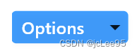
不论前缀图标还是后缀图标,类型都是Widget?,这意味着你可以灵活使用组件作为图标。通过这种方式,SemanticButton 的 prefixIcon 和 suffixIcon 属性为Flutter开发者提供了一种灵活的方法来设计更具表达性和功能性的用户界面。

- 点赞
- 收藏
- 关注作者
评论(0)