Python Matplotlib入门

Matplotlib_Study01
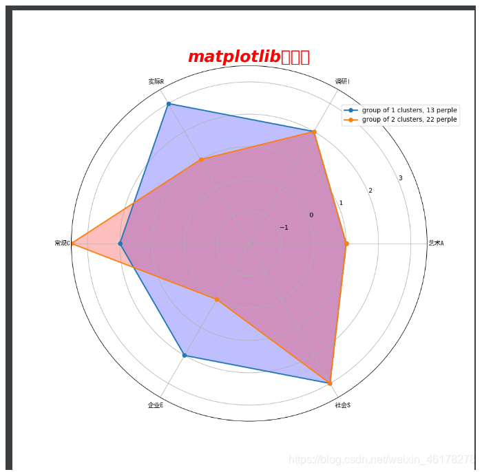
极坐标
雷达图
代码:
# 标签
labels = np.array(['艺术A', '调研I', '实际R', '常规C', '企业E', '社会S'])
# 数据个数
dataLenth = 6
# 数据
data = np.array([1, 4, 3, 6, 4, 8])

# 生成从0开始到6.28的6个并且不可能包括6.28 的一个数组
# 这里又将原数组赋给另一个变量跟之后的数组处理分开是因为在绘制标签时并不需要处理数组
angles1 = np.linspace(0, 2 * np.pi, dataLenth, endpoint=False)
print(angles1)
# 这里需要在数据中多添加一个数据跟第一个元素一致,实现闭合
data = np.concatenate((data, [data[0]]))  # 闭合
angles = np.concatenate((angles1, [angles1[0]]))  # 闭合

fig = plt.figure(figsize=(10, 10))
# 因为是雷达图 需要极坐标系,所以polar参数必须true
ax = fig.add_subplot(1, 1, 1, polar=True)  # polar参数!!
# 绘制线条,处理过的数组,o表示用圆点来表示节点
ax.plot(angles, data, '-o', linewidth=2)  # 画线
# 将框起来的数据使用颜色填充
ax.fill(angles, data, facecolor='b', alpha=0.25)  # 填充
# 设置标签,这里不需要处理的数组
ax.set_thetagrids(angles1 * 180 / np.pi, labels, fontproperties="SimHei")
# 设置title
ax.set_title("matplotlib雷达图", va='bottom', fontproperties="SimHei")

# 绘制第二条数据
ax.plot(angles, [1, 5, 1, 8, 0, 11, 1], '-o', linewidth=2)  # 画线
ax.fill(angles, [1, 5, 1, 8, 0, 11, 1], facecolor='r', alpha=0.25)  # 填充
# ax.set_thetagrids(angles1 * 180 / np.pi, labels, fontproperties="SimHei")

ax.set_rlim(0, 11)
#
ax.grid(True)
plt.legend(
    ['group of 1 clusters, %d perple' % sum(data[1:]), 'group of 2 clusters, %d perple' % sum([1, 5, 1, 8, 1, 6])],
    loc='upper right', bbox_to_anchor=(1.1, 0.9))
plt.show()
效果:
不能正常显示中文
from matplotlib.font_manager import FontProperties
myfont = FontProperties(fname=“C:\Windows\Fonts\simsun.ttc”, size=20)
通过改变matplotlib 使用matplotlib的字体管理器指定字体文件。
但是,为字体添加的大小,加粗,斜体的样式都没有效果。

总结:
在显示中文时,可以使用font_manager 模块来设置字体文件,但添加不了样式。
更改后
代码:
import numpy as np
import matplotlib.pyplot as plt
import matplotlib
from matplotlib.font_manager import FontProperties

# 设置字体文件
myfont = FontProperties(fname="C:\Windows\Fonts\simsun.ttc", style='italic', size=20, family='serif')
# matplotlib.rcParams['font.sans-serif'] = ['SimHei']  # 显示中文标签
# matplotlib.rcParams['axes.unicode_minus'] = False  # 这两行需要手动设置

# # 新建窗口
# fig = plt.figure(1)
# # 第一行第一列第一个,子图
# ax1 = fig.add_subplot(1, 1, 1, polar=True)
# theta=np.arange(0,2*np.pi,0.02)
# ax1.plot(theta,2*np.ones_like(theta),lw=2)
# ax1.plot(theta,theta/6,linestyle='--',lw=2)
# plt.show()

# =======自己设置开始============
# 标签
labels = np.array(['艺术A', '调研I', '实际R', '常规C', '企业E', '社会S'])
# 数据个数
dataLenth = 6
# 数据
data = np.array([1, 2, 3, 2, 2, 3])
# ========自己设置结束============

angles1 = np.linspace(0, 2 * np.pi, dataLenth, endpoint=False)
# print(angles1)
data = np.concatenate((data, [data[0]]))  # 闭合
angles = np.concatenate((angles1, [angles1[0]]))  # 闭合

fig = plt.figure(figsize=(10, 10))
ax = fig.add_subplot(1, 1, 1, polar=True)  # polar参数!!
ax.plot(angles, data, '-o', linewidth=2)  # 画线
ax.fill(angles, data, facecolor='b', alpha=0.25)  # 填充
ax.set_thetagrids(angles1 * 180 / np.pi, labels)
font = {
        # 'family': 'serif',
        'style': 'italic',
        'weight': 'bold',
        'color': 'red',
        'size': 25,
        # 'fontproperties': 'KaiTi'
        }
# 在使用时传入参数即可
ax.set_title("matplotlib嗷嗷嗷", loc='center', fontdict=font, fontproperties=myfont)

ax.plot(angles, [1, 2, 1, 3.5, 0, 3, 1], '-o', linewidth=2)  # 画线
ax.fill(angles, [1, 2, 1, 3.5, 0, 3, 1], facecolor='r', alpha=0.25)  # 填充
ax.set_thetagrids(angles1 * 180 / np.pi, labels, fontproperties='SimHei')
# 设置坐标轴刻度显示
ax.set_rlim(-2, 3.5, auto=False, emit=True)
ax.grid(True)
plt.legend(
    ['group of 1 clusters, %d perple' % sum(data[1:]), 'group of 2 clusters, %d perple' % sum([1, 5, 1, 8, 1, 6])],
    loc='upper right', bbox_to_anchor=(1.1, 0.9))
plt.show()
补充学习:
numpy
linspace
在指定的间隔内返回均匀间隔的数字
参数传递 (start, stop, num=50, endpoint=True, retstep=False, dtype=None)
从start开始,stop结束,会有num个数值返回。endpoint为True时一定包括stop,false时一定不包括。
concatenate
用于拼接 numpy数组。
参数传递 concatenate((array1, array2 …), axis=0 或 1)
axis默认会导致返回一维结果,axis=0行数增加,axis=1列数增加
matplotlib
设置legend 的位置
plt.legend(
[‘group of 1 clusters, %d perple’ % sum(data[1:]), ‘group of 2 clusters, %d perple’ % sum([1, 5, 1, 8, 1, 6])],
loc=‘upper right’, bbox_to_anchor=(1.1, 0.9))
loc 参数
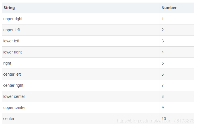
bbox_to_anchor被赋予的二元组中,num1用于控制legend的左右移动,值越大越向右边移动,num2用于控制legend的上下移动,值越大,越向上移动。用于微调图例的位置。
柱状图
代码:
import matplotlib.pyplot as plt
import numpy as np
import matplotlib

# 创建窗口,可以通过指定num为窗口指定ID
fig = plt.figure(figsize=(10, 10))
x_index = np.arange(1, 11, step=2)  # 柱的索引
x_data = ('A', 'B', 'C', 'D', 'E')
y1_data = (20, 35, 30, 35, 27)
y2_data = (25, 32, 34, 20, 25)
y3_data = (30, 21, 23, 15, 24)
bar_width = 0.35  # 定义一个数字代表每个独立柱的宽度

rects1 = plt.bar(x_index, y1_data, width=bar_width, alpha=0.4, color='b', label='legend1')  # 参数:左偏移、高度、柱宽、透明度、颜色、图例
rects2 = plt.bar(x_index + bar_width, y2_data, width=bar_width, alpha=0.5, color='r',
                 label='legend2')  # 参数:左偏移、高度、柱宽、透明度、颜色、图例
rects3 = plt.bar(x_index + 2*bar_width, y3_data, width=bar_width, alpha=0.5, color='g',
                 label='legend3')  # 参数:左偏移、高度、柱宽、透明度、颜色、图例
# 关于左偏移,不用关心每根柱的中心不中心,因为只要把刻度线设置在柱的中间就可以了
plt.xticks(x_index + 2*bar_width / 2, x_data)  # x轴刻度线
# 设置图像和边缘的距离,相比于tight_layout 更加精确
plt.subplots_adjust(left=0, bottom=0, right=1, top=1, hspace=0.1, wspace=0.1)
plt.legend()  # 显示图例
font = {
        # 'family': 'serif',
        'style': 'italic',
        'weight': 'bold',
        'color': 'red',
        'size': 25,
        # 'fontproperties': 'KaiTi'
        }
# 这里显示中文的问题跟昨天的一样,对于中文添加不上斜体的样式但可以添加颜色,字体大小。
plt.title("matplotlib柱状图", color='green', weight='bold', style='oblique', fontproperties='SimHei', fontsize=18)
plt.tight_layout()  # 自动控制图像外部边缘,此方法不能够很好的控制图像间的间隔
plt.show()
效果:

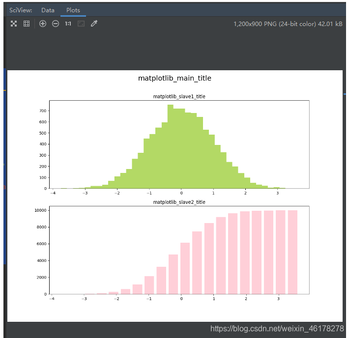
直方图
代码:
import matplotlib.pyplot as plt
import matplotlib
import numpy as np

fig, (ax0, ax1) = plt.subplots(nrows=2, figsize=(12, 9))
sigma = 1  # 标准差
mean = 0  # 均值
x = mean + sigma * np.random.randn(10000)  # 正态分布随机数
# 绘制直方图
ax0.hist(x, bins=40, density=False, stacked=False, histtype='bar', facecolor='yellowgreen',
         alpha=0.75)  # normed是否归一化,histtype直方图类型,facecolor颜色,alpha透明度
ax1.hist(x, bins=20, density=False, stacked=False, histtype='bar', facecolor='pink', alpha=0.75, cumulative=True,
         rwidth=0.8)  # bins柱子的个数,cumulative是否计算累加分布,rwidth柱子宽度
# 可以同时设置主图的标题和子图标题,实现主标题和副标题的效果
# 设置总图中的标题
plt.suptitle("matplotlib_main_title", fontsize=18)
# 设置子图标题
ax0.set_title('matplotlib_slave1_title')
ax1.set_title('matplotlib_slave2_title')

plt.show()  # 所有窗口运行
效果:
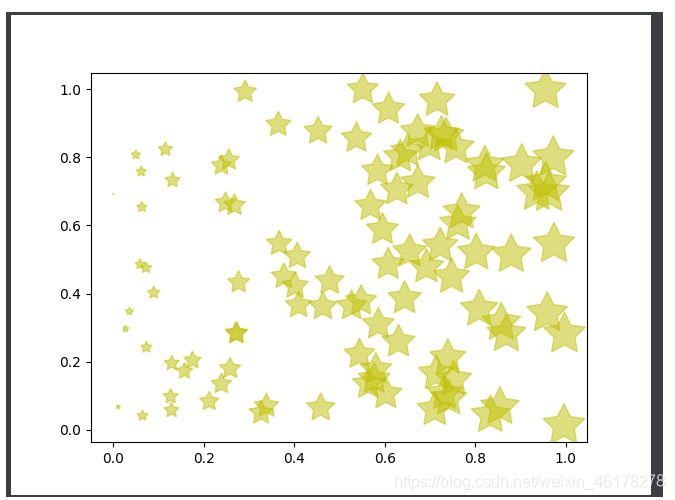
散点图
代码:
import matplotlib.pyplot as plt
import numpy as np
import matplotlib

fig = plt.figure()

ax = fig.add_subplot(1, 1, 1)

x = np.random.random(100)
print(x)
y = np.random.random(100)
print(y)
print(x*1000)
ax.scatter(x, y, s=x * 1000, c='y', marker=(5, 1), alpha=0.5, lw=1,
           facecolors='none')  # x横坐标,y纵坐标,s图像大小,c颜色,marker图片,lw图像边框宽度
# maker 支持'.'(点标记)、','(像素标记)、'o'(圆形标记)、'v'(向下三角形标记)、'^'(向上三角形标记)、'<'(向左三角形标记)、'>'(向右三角形标记)、'1'(向下三叉标记)、'2'(向上三叉标记)、'3'(向左三叉标记)、'4'(向右三叉标记)、's'(正方形标记)、'p'(五地形标记)、'*'(星形标记)、'h'(八边形标记)、'H'(另一种八边形标记)、'+'(加号标记)、'x'(x标记)、'D'(菱形标记)、'd'(尖菱形标记)、'|'(竖线标记)、'_'(横线标记)
# s 指示 散点的大小,c 指示颜色,lw指示散点边框宽度,alpha指示透明度
# edgecolors,指定散点边框的颜色。
plt.show()
效果:
补充:
ax.spines[‘top’].set_visible(False)
ax.spines[‘right’].set_visible(False)
可以通过以上代码,将grid 布局,非类目轴的图表的外框线去除。
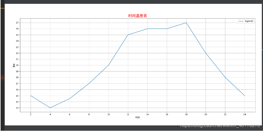
折线图
代码:
import matplotlib.pyplot as plt
from matplotlib import pyplot
import matplotlib

# 设置窗口大小
fig = plt.figure(figsize=(20, 8))

ax = fig.add_subplot(1, 1, 1)

x = range(2, 26, 2)
y = [15, 13, 14.5, 17, 20, 25, 26, 26, 27, 22, 18, 15]
# 设置坐标轴刻度显示,默认的过于粗糙
plt.xticks(x)  # 这里传入的x就是x轴的列表
plt.yticks(range(min(y), max(y) + 1))
# 设置坐标轴的标签显示
plt.xlabel('时间', fontproperties='SimHei')
plt.ylabel('温度', fontproperties='SimHei')
plt.title('时间温度表', fontproperties='SimHei', color='red', fontsize=18, style='italic')
# 是否显示网格(启用grid布局)
plt.grid()
# 绘制,设置图例表标签
pyplot.plot(x, y, label='legend1')
# 显示图例
plt.legend()
plt.show()
效果:
饼图
代码:
import matplotlib.pyplot as plt
import matplotlib

plt.rcParams['font.sans-serif'] = ['SimHei']  # 用来正常显示中文标签
fig = plt.figure()

ax = fig.add_subplot(1, 1, 1)

labels = ['娱乐', '育儿', '饮食', '房贷', '交通', '其它']
sizes = [2, 5, 12, 70, 2, 9]
explode = (0, 0, 0, 0.1, 0, 0)
ax.pie(sizes, explode=explode, labels=labels, autopct='%1.0f%%', shadow=True, startangle=150)
plt.title("饼图示例-8月份家庭支出")
plt.show()
效果:

补充:
ax.pie() 参数详解
pie(x, explode=None, labels=None, colors=None, autopct=None,
pctdistance=0.6, shadow=False, labeldistance=1.1, startangle=None,
radius=None, counterclock=True, wedgeprops=None, textprops=None,
center=(0, 0), frame=False, rotatelabels=False, hold=None, data=None)
x:每一块饼图的比例,为必填项,如果sum(x)>1,会将多出的部分进行均分;
labels : 每一块饼图外侧显示的说明文字;
explode : 每一块饼图 离开中心距离,默认值为(0,0),就是不离开中心;
colors:数组,可选参数,默认为:None;用来标注每块饼图的matplotlib颜色参数序列。如果为None,将使用当前活动环的颜色。
shadow :是否阴影,默认值为False,即没有阴影,将其改为True,显示结果如下图所示;
autopct :控制饼图内百分比设置,可以使用format字符串或者format function;
startangle :起始绘制角度,默认图是从x轴正方向逆时针画起,如设定startangle=90则从y轴正方向画起;
counterclock:指定指针方向;布尔值,可选参数,默认为:True,即逆时针。将值改为False即可改为顺时针。
labeldistance : label绘制位置,相对于半径的比例, 如<1则绘制在饼图内侧,默认值为1.1;
radius :控制饼图半径;浮点类型,可选参数,默认为:None。如果半径是None,将被设置成1。
pctdistance : 类似于labeldistance,指定autopct的位置刻度,默认值为0.6;
**textprops **:设置标签(labels)和比例文字的格式;字典类型,可选参数,默认值为:None。
将饼图显示为正圆形,plt.axis( );
词云
代码:
import matplotlib.pyplot as plt
import matplotlib
from wordcloud import WordCloud
import jieba
from imageio import imread

fig = plt.figure()

ax = fig.add_subplot(1, 1, 1)
# 读取文件内容
with open(r'C:\Users\Administrator\Desktop\wordcloud_test.txt', 'r') as f:
    text = f.read()
# 分词
wcsplit = jieba.lcut(text)
# 拼接成字符串
words = " ".join(wcsplit)
# 读取一张图片作为词云的背景
shape = imread(r'C:\Users\Administrator\Pictures\Saved Pictures\t.jpg')
# 创建wordcloud 对象
mywordcloud = WordCloud(
    font_path=r'C:\Windows\Fonts\simhei.ttf',  # 字体

    scale=8,

    margin=1,  # 页边距

    background_color='black',  # 背景色

    mask=shape,  # 形状

    max_words=1500,  # 包含的最大词量

    min_font_size=14,  # 最小的字体

    max_font_size=95,  # 最大字体

    random_state=4567
).generate(words)
# 显示图像
ax.imshow(mywordcloud)
# 去除坐标轴
ax.axis("off")
plt.show()
效果:

堆叠柱状图
代码:
import matplotlib.pyplot as plt
import matplotlib
import numpy as np

# 添加柱状图的具体数值
def auto_labels(res):
    for rect in res:
        height = rect.get_height()
        plt.text(rect.get_x() + rect.get_width() / 2. - 0.2, 1.03 * height, '%s' % float(height))

# label
labels = ['G1', 'G2', 'G3', 'G4', 'G5', 'G6']  # 级别
men_means = np.random.randint(20, 35, size=6)
women_means = np.random.randint(20, 35, size=6)
men_std = np.random.randint(1, 7, size=6)
women_std = np.random.randint(1, 7, size=6)
width = 0.35
# 画图
a = plt.bar(labels,  # 横坐标
        men_means,  # 柱⾼
        width,  # 线宽
        # yerr=0,  # 误差条
        label='Men')  # 标签
# 堆叠柱状图,再画
b = plt.bar(labels, women_means, width, bottom=men_means, label='Women')
# 设置两坐标轴标签
plt.ylabel('Scores')
plt.xlabel('Species')
plt.title('Scores by group and gender')
# auto_labels(a)
# 填写数值
auto_labels(b)
plt.legend()

plt.show()
效果:


- 点赞
- 收藏
- 关注作者
评论(0)