Android ShapeableImageView使用详解,告别shape、三方库

效果

前言
先来看一下ShapeableImageView是什么
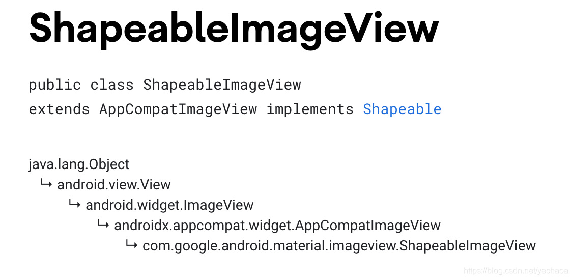
由上图可以看到ShapeableImageView也没有什么神秘的,不过是ImageView的一个子类而已,但是从效果图来看,在不写shape、不引入三方库的情况下,还是挺容易实现预期效果的,而且扩展性良好。
使用
引入material包
implementation 'com.google.android.material:material:1.2.1'
常规

<com.google.android.material.imageview.ShapeableImageView
    android:layout_width="wrap_content"
    android:layout_height="wrap_content"
    android:layout_margin="10dp"
    android:src="@mipmap/ic_avatar" />
- 和ImageView正常使用没有区别
圆角

<com.google.android.material.imageview.ShapeableImageView
    android:layout_width="wrap_content"
    android:layout_height="wrap_content"
    android:layout_margin="10dp"
    android:src="@mipmap/ic_avatar"
    app:shapeAppearance="@style/RoundedStyle" />
<!--ShapeableImageView 圆角-->
<style name="RoundedStyle">
    <item name="cornerFamily">rounded</item>
    <item name="cornerSize">10dp</item>
</style>
- 没有直接设置圆角的属性,需要用到
app:shapeAppearance,后面会说 - cornerFamily 角的处理方式,rounded圆角,cut裁剪
- cornerSize 圆角大小
圆

<com.google.android.material.imageview.ShapeableImageView
    android:layout_width="wrap_content"
    android:layout_height="wrap_content"
    android:layout_margin="10dp"
    android:src="@mipmap/ic_avatar"
    app:shapeAppearance="@style/CircleStyle" />
<!--ShapeableImageView 圆 -->
<style name="CircleStyle">
    <item name="cornerFamily">rounded</item>
    <item name="cornerSize">50%</item>
</style>
- 圆角的大小可以用百分比,也可以自己计算,比如宽高100dp,圆角50dp
描边

<com.google.android.material.imageview.ShapeableImageView
    android:layout_width="wrap_content"
    android:layout_height="wrap_content"
    android:layout_margin="10dp"
    android:padding="2dp"
    android:src="@mipmap/ic_avatar"
    app:shapeAppearance="@style/CircleStyle"
    app:strokeColor="@color/red"
    app:strokeWidth="4dp" />
- app:strokeColor 描边颜色
- app:strokeWidth 描边宽度
- 注意这里padding的数值是描边宽度的一半,后面会说
切角

<com.google.android.material.imageview.ShapeableImageView
    android:layout_width="wrap_content"
    android:layout_height="wrap_content"
    android:layout_margin="10dp"
    android:padding="2dp"
    android:src="@mipmap/ic_avatar"
    app:shapeAppearance="@style/CutStyle"
    app:strokeColor="@color/red"
    app:strokeWidth="4dp" />
<!--ShapeableImageView 切角 -->
<style name="CutStyle">
    <item name="cornerFamily">cut</item>
    <item name="cornerSize">10dp</item>
</style>
- cornerFamily:cut 处理模式变为裁剪
菱形

<com.google.android.material.imageview.ShapeableImageView
    android:layout_width="wrap_content"
    android:layout_height="wrap_content"
    android:layout_margin="10dp"
    android:padding="2dp"
    android:src="@mipmap/ic_avatar"
    app:shapeAppearance="@style/RhombusStyle"
    app:strokeColor="@color/red"
    app:strokeWidth="4dp" />
<!--ShapeableImageView 菱形 -->
<style name="RhombusStyle">
    <item name="cornerFamily">cut</item>
    <item name="cornerSize">50%</item>
</style>
- 同样,裁剪模式下圆角大小也可以计算
叶子

<com.google.android.material.imageview.ShapeableImageView
    android:layout_width="wrap_content"
    android:layout_height="wrap_content"
    android:layout_margin="10dp"
    android:padding="2dp"
    android:src="@mipmap/ic_avatar"
    app:shapeAppearance="@style/LeafStyle"
    app:strokeColor="@color/red"
    app:strokeWidth="4dp" />
<!--ShapeableImageView 叶子 -->
<style name="LeafStyle">
    <item name="cornerFamily">rounded</item>
    <item name="cornerSizeTopLeft">50%</item>
    <item name="cornerSizeBottomRight">50%</item>
</style>
- cornerSizeTopLeft 左上圆角
- cornerSizeBottomRight 右下圆角
- 以此类推,左上、左下、右上、右下等
半圆

<com.google.android.material.imageview.ShapeableImageView
    android:layout_width="wrap_content"
    android:layout_height="wrap_content"
    android:layout_margin="10dp"
    android:padding="2dp"
    android:src="@mipmap/ic_avatar"
    app:shapeAppearance="@style/SemicircleStyle"
    app:strokeColor="@color/red"
    app:strokeWidth="4dp" />
<!--ShapeableImageView 半圆 -->
<style name="SemicircleStyle">
    <item name="cornerFamily">rounded</item>
    <item name="cornerSizeTopLeft">50%</item>
    <item name="cornerSizeTopRight">50%</item>
</style>
六边形

<com.google.android.material.imageview.ShapeableImageView
    android:layout_width="wrap_content"
    android:layout_height="50dp"
    android:layout_margin="10dp"
    android:padding="2dp"
    android:scaleType="centerCrop"
    android:src="@mipmap/ic_avatar"
    app:shapeAppearance="@style/HexagonStyle"
    app:strokeColor="@color/red"
    app:strokeWidth="4dp" />
<!--ShapeableImageView 六边形 -->
<style name="HexagonStyle">
    <item name="cornerFamily">cut</item>
    <item name="cornerSizeTopLeft">50%</item>
    <item name="cornerSizeTopRight">50%</item>
    <item name="cornerSizeBottomLeft">50%</item>
    <item name="cornerSizeBottomRight">50%</item>
</style>
author:yechaoa
属性
关于xml属性,我也做了一个整理,属性不多,只有4个
| 属性 | 描述 |
|---|---|
| strokeWidth | 描边宽度 |
| strokeColor | 描边颜色 |
| shapeAppearance | 外观样式 |
| shapeAppearanceOverlay | 同上,叠加层 |
扩展
前面为了整体的排版,埋了几个伏笔,下面来一一解答。
会涉及到源码,但是经过去繁从简,看起来也非常轻松的。
shapeAppearance
Shape appearance overlay style reference for ShapeableImageView.
ShapeableImageView的形状外观覆盖样式参考。
前面可以看到我们设置圆角其实是用的style,那为什么不直接用attrs呢,不是更加直观方便吗,带着疑问来看看源码是怎么处理的。
直接看ShapeableImageView的次构造方法:
public class ShapeableImageView extends AppCompatImageView implements Shapeable {

  ...

  public ShapeableImageView(Context context, @Nullable AttributeSet attrs, int defStyle) {
    super(wrap(context, attrs, defStyle, DEF_STYLE_RES), attrs, defStyle);
    // Ensure we are using the correctly themed context rather than the context that was passed in.
    context = getContext();

    clearPaint = new Paint();
    clearPaint.setAntiAlias(true);
    clearPaint.setColor(Color.WHITE);
    clearPaint.setXfermode(new PorterDuffXfermode(Mode.DST_OUT));
    destination = new RectF();
    maskRect = new RectF();
    maskPath = new Path();
    TypedArray attributes =
        context.obtainStyledAttributes(
            attrs, R.styleable.ShapeableImageView, defStyle, DEF_STYLE_RES);

    strokeColor =
        MaterialResources.getColorStateList(
            context, attributes, R.styleable.ShapeableImageView_strokeColor);

    strokeWidth = attributes.getDimensionPixelSize(R.styleable.ShapeableImageView_strokeWidth, 0);

    borderPaint = new Paint();
    borderPaint.setStyle(Style.STROKE);
    borderPaint.setAntiAlias(true);
    shapeAppearanceModel =
        ShapeAppearanceModel.builder(context, attrs, defStyle, DEF_STYLE_RES).build();
    shadowDrawable = new MaterialShapeDrawable(shapeAppearanceModel);
    if (VERSION.SDK_INT >= VERSION_CODES.LOLLIPOP) {
      setOutlineProvider(new OutlineProvider());
    }
  }
}
常规操作,获取自定义属性。
关键的两行代码:
    shapeAppearanceModel = ShapeAppearanceModel.builder(context, attrs, defStyle, DEF_STYLE_RES).build();
    shadowDrawable = new MaterialShapeDrawable(shapeAppearanceModel);
也就是说我们给shapeAppearance设置的style,并不是ShapeableImageView自己来处理的,而是由ShapeAppearanceModel来构建的,然后又交给MaterialShapeDrawable来绘制的。
ShapeAppearanceModel
这个类就厉害了,有点像Flutter中的Decoration,可以构建出花里胡哨的效果。
来看ShapeAppearanceModel部分源码:
public class ShapeAppearanceModel {

  /** Builder to create instances of {@link ShapeAppearanceModel}s. */
  public static final class Builder {

    @NonNull
    private CornerTreatment topLeftCorner = MaterialShapeUtils.createDefaultCornerTreatment();

    @NonNull
    private CornerTreatment topRightCorner = MaterialShapeUtils.createDefaultCornerTreatment();

    @NonNull
    private CornerTreatment bottomRightCorner = MaterialShapeUtils.createDefaultCornerTreatment();

    @NonNull
    private CornerTreatment bottomLeftCorner = MaterialShapeUtils.createDefaultCornerTreatment();

    @NonNull private CornerSize topLeftCornerSize = new AbsoluteCornerSize(0);
    @NonNull private CornerSize topRightCornerSize = new AbsoluteCornerSize(0);
    @NonNull private CornerSize bottomRightCornerSize = new AbsoluteCornerSize(0);
    @NonNull private CornerSize bottomLeftCornerSize = new AbsoluteCornerSize(0);

    @NonNull private EdgeTreatment topEdge = MaterialShapeUtils.createDefaultEdgeTreatment();
    @NonNull private EdgeTreatment rightEdge = MaterialShapeUtils.createDefaultEdgeTreatment();
    @NonNull private EdgeTreatment bottomEdge = MaterialShapeUtils.createDefaultEdgeTreatment();
    @NonNull private EdgeTreatment leftEdge = MaterialShapeUtils.createDefaultEdgeTreatment();

    public Builder() {}
    ...
  }
  ...
}
可以看到有各种边和角的属性,这里注意两个点:
MaterialShapeUtils.createDefaultCornerTreatment()创建默认角的处理方式MaterialShapeUtils.createDefaultEdgeTreatment()创建默认边的处理方式
也就意味着,边和角除了默认,是可以自定义的,这就有极大的想象空间了,
比如这样:

// 代码设置 角和边
val shapeAppearanceModel2 = ShapeAppearanceModel.builder().apply {
    setAllCorners(RoundedCornerTreatment())
    setAllCornerSizes(50f)
    setAllEdges(TriangleEdgeTreatment(50f, false))
}.build()
val drawable2 = MaterialShapeDrawable(shapeAppearanceModel2).apply {
    setTint(ContextCompat.getColor(this@ShapeableImageViewActivity, R.color.colorPrimary))
    paintStyle = Paint.Style.FILL_AND_STROKE
    strokeWidth = 50f
    strokeColor = ContextCompat.getColorStateList(this@ShapeableImageViewActivity, R.color.red)
}
mBinding.text2.setTextColor(Color.WHITE)
mBinding.text2.background = drawable2
再比如这样:

// 代码设置 聊天框效果
val shapeAppearanceModel3 = ShapeAppearanceModel.builder().apply {
    setAllCorners(RoundedCornerTreatment())
    setAllCornerSizes(20f)
    setRightEdge(object : TriangleEdgeTreatment(20f, false) {
        // center 位置 , interpolation 角的大小
        override fun getEdgePath(length: Float, center: Float, interpolation: Float, shapePath: ShapePath) {
            super.getEdgePath(length, 35f, interpolation, shapePath)
        }
    })
}.build()
val drawable3 = MaterialShapeDrawable(shapeAppearanceModel3).apply {
    setTint(ContextCompat.getColor(this@ShapeableImageViewActivity, R.color.colorPrimary))
    paintStyle = Paint.Style.FILL
}
(mBinding.text3.parent as ViewGroup).clipChildren = false // 不限制子view在其范围内
mBinding.text3.setTextColor(Color.WHITE)
mBinding.text3.background = drawable3
MaterialShapeDrawable
源码(有删减):
public class MaterialShapeDrawable extends Drawable implements TintAwareDrawable, Shapeable {
...
  @Override
  public void draw(@NonNull Canvas canvas) {
    fillPaint.setColorFilter(tintFilter);
    final int prevAlpha = fillPaint.getAlpha();
    fillPaint.setAlpha(modulateAlpha(prevAlpha, drawableState.alpha));

    strokePaint.setColorFilter(strokeTintFilter);
    strokePaint.setStrokeWidth(drawableState.strokeWidth);

    final int prevStrokeAlpha = strokePaint.getAlpha();
    strokePaint.setAlpha(modulateAlpha(prevStrokeAlpha, drawableState.alpha));

    if (pathDirty) {
      calculateStrokePath();
      calculatePath(getBoundsAsRectF(), path);
      pathDirty = false;
    }

    maybeDrawCompatShadow(canvas);
    if (hasFill()) {
      drawFillShape(canvas);
    }
    if (hasStroke()) {
      drawStrokeShape(canvas);
    }
...
  static final class MaterialShapeDrawableState extends ConstantState {
    ...
    public MaterialShapeDrawableState(@NonNull MaterialShapeDrawableState orig) {
      shapeAppearanceModel = orig.shapeAppearanceModel;
      elevationOverlayProvider = orig.elevationOverlayProvider;
      strokeWidth = orig.strokeWidth;
      colorFilter = orig.colorFilter;
      fillColor = orig.fillColor;
      strokeColor = orig.strokeColor;
      tintMode = orig.tintMode;
      tintList = orig.tintList;
      alpha = orig.alpha;
      scale = orig.scale;
      shadowCompatOffset = orig.shadowCompatOffset;
      shadowCompatMode = orig.shadowCompatMode;
      useTintColorForShadow = orig.useTintColorForShadow;
      interpolation = orig.interpolation;
      parentAbsoluteElevation = orig.parentAbsoluteElevation;
      elevation = orig.elevation;
      translationZ = orig.translationZ;
      shadowCompatRadius = orig.shadowCompatRadius;
      shadowCompatRotation = orig.shadowCompatRotation;
      strokeTintList = orig.strokeTintList;
      paintStyle = orig.paintStyle;
      if (orig.padding != null) {
        padding = new Rect(orig.padding);
      }
    }
	...
  }
...
}
没什么特别的,你只需要知道除了可以设置描边之外,还可以设置背景、阴影等其他属性。
说明
ShapeAppearanceModel只能是实现Shapeable接口的View才可以设置,比如Chip、MaterialButtom等。- 而
MaterialShapeDrawable其实就是Drawable,是所有View都可以设置的。
描边问题
这里借github一张图

又是自定义view的常规操作,有一半画笔是在边界外面的,所以需要设置padding为strokeWidth的一半。
默认圆角问题
有细心的同学会发现啊,第一个常规的ShapeableImageView还是有一点圆角的,没错,属于默认的,跟踪一下源码来看一下:
<style name="Widget.MaterialComponents.ShapeableImageView" parent="android:Widget">
    <item name="strokeColor">@color/material_on_surface_stroke</item>
    <item name="shapeAppearance">?attr/shapeAppearanceMediumComponent</item>
</style>
第一个是颜色,很明显不是我们要找的,继续看shapeAppearanceMediumComponent
<attr format="reference" name="shapeAppearanceMediumComponent"/>
只是一个简单的属性,继续查找关联引用
    <item name="shapeAppearanceMediumComponent">
      @style/ShapeAppearance.MaterialComponents.MediumComponent
    </item>
又引用了一个style,继续看ShapeAppearance.MaterialComponents.MediumComponent这个style
<style name="ShapeAppearance.MaterialComponents.MediumComponent">
    <item name="cornerSize">@dimen/mtrl_shape_corner_size_medium_component</item>
</style>
哦豁,看到了熟悉的属性cornerSize,藏的还挺深,继续看看数值是多少
<dimen name="mtrl_shape_corner_size_medium_component">4dp</dimen>
默认4dp。
那如果不想要这个圆角怎么办呢,可以学习源码仿写一个,不过上面也看到了,有点绕,不如直接写个style搞定:
    <!--ShapeableImageView 去圆角-->
    <style name="Corner0Style">
        <item name="cornerSize">0dp</item>
    </style>
然后引用
app:shapeAppearance="@style/Corner0Style"
效果:

ok,到这里就差不多了,虽然还有很多相关知识点没有提及,但是也不少了,不如自己去尝试一番,慢慢消化。
Github
https://github.com/yechaoa/MaterialDesign
感谢
- ShapeableImageView 官方文档
- ShapeAppearanceModel 官方文档
- Android Material组件使用详解
- Android Notes|玩转 ShapeableImageView
- Material Components——Shape的处理
最后
写作不易,如果对你有一丢丢帮助或启发,感谢点赞支持 ^ - ^

- 点赞
- 收藏
- 关注作者
评论(0)