TextInputLayout使用详解

【摘要】
TextInputLayout 基础样式、错误提示、字数限制等等
效果图:
【2020-12-13】Theme切换到MaterialComponents之后,是有一些变化的,比如默认背景、...
TextInputLayout 基础样式、错误提示、字数限制等等
效果图:
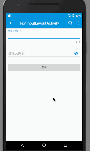
【2020-12-13】Theme切换到MaterialComponents之后,是有一些变化的,比如默认背景、默认padding等,具体改动可去github查看。
布局文件
    <android.support.design.widget.TextInputLayout
        android:id="@+id/til_name"
        android:layout_width="0dp"
        android:layout_height="wrap_content"
        android:layout_marginEnd="8dp"
        android:layout_marginStart="8dp"
        android:layout_marginTop="8dp"
        app:counterEnabled="true"
        app:counterMaxLength="3"
        app:counterOverflowTextAppearance="@style/MyOverflowText"
        app:errorEnabled="true"
        app:errorTextAppearance="@style/MyErrorText"
        app:hintTextAppearance="@style/MyHintText"
        app:layout_constraintEnd_toEndOf="parent"
        app:layout_constraintStart_toStartOf="parent"
        app:layout_constraintTop_toBottomOf="@+id/include">

        <android.support.design.widget.TextInputEditText
            android:id="@+id/et_name"
            android:layout_width="match_parent"
            android:layout_height="wrap_content"
            android:hint="@string/hint_name"
            android:theme="@style/MyEditText" />
    </android.support.design.widget.TextInputLayout>

    <android.support.design.widget.TextInputLayout
        android:id="@+id/til_password"
        android:layout_width="0dp"
        android:layout_height="wrap_content"
        android:layout_marginEnd="8dp"
        android:layout_marginStart="8dp"
        android:layout_marginTop="8dp"
        app:layout_constraintEnd_toEndOf="parent"
        app:layout_constraintStart_toStartOf="parent"
        app:layout_constraintTop_toBottomOf="@+id/til_name"
        app:passwordToggleEnabled="true"
        app:passwordToggleTint="@color/colorPrimary">

        <android.support.design.widget.TextInputEditText
            android:layout_width="match_parent"
            android:layout_height="wrap_content"
            android:hint="@string/hint_password"
            android:inputType="textPassword" />
    </android.support.design.widget.TextInputLayout>
- 1
- 2
- 3
- 4
- 5
- 6
- 7
- 8
- 9
- 10
- 11
- 12
- 13
- 14
- 15
- 16
- 17
- 18
- 19
- 20
- 21
- 22
- 23
- 24
- 25
- 26
- 27
- 28
- 29
- 30
- 31
- 32
- 33
- 34
- 35
- 36
- 37
- 38
- 39
- 40
- 41
- 42
- 43
- 44
- 45
- 46
1、修改默认样式
- style:
	<!--Floating label text style-->
    <style name="MyHintText" parent="TextAppearance.AppCompat.Small">
        <item name="android:textColor">@color/colorPrimary</item>
    </style>

    <!--Input field style-->
    <style name="MyEditText" parent="Theme.AppCompat.Light">
        <item name="colorControlNormal">@color/gray</item>
        <item name="colorControlActivated">@color/colorPrimary</item>
        <item name="android:textSize">18sp</item>
    </style>
- 1
- 2
- 3
- 4
- 5
- 6
- 7
- 8
- 9
- 10
- 11
- 然后分别设置
TextInputLayout:
app:hintTextAppearance="@style/MyHintText"
- 1
TextInputEditText:
android:theme="@style/MyEditText"
- 1
2、错误提示样式及代码设置
- style:
    <!--Error label text style-->
    <style name="MyErrorText" parent="TextAppearance.AppCompat.Small">
        <item name="android:textColor">@color/red</item>
    </style>
- 1
- 2
- 3
- 4
- 5
- 然后设置
    app:errorEnabled="true"
    app:errorTextAppearance="@style/MyErrorText"
- 1
- 2
代码控制,设置输入监听
mEtName.addTextChangedListener(mTextWatcher);

---------------------------------------------

private TextWatcher mTextWatcher = new TextWatcher() {
        @Override
        public void beforeTextChanged(CharSequence charSequence, int i, int i1, int i2) {

        }

        @Override
        public void onTextChanged(CharSequence charSequence, int i, int i1, int i2) {

        }

        @Override
        public void afterTextChanged(Editable editable) {
            if (mTilName.getEditText().getText().length() > mTilName.getCounterMaxLength())
                mTilName.setError("输入内容超过上限");//show
            else
                mTilName.setError(null);//hide
        }
    };
- 1
- 2
- 3
- 4
- 5
- 6
- 7
- 8
- 9
- 10
- 11
- 12
- 13
- 14
- 15
- 16
- 17
- 18
- 19
- 20
- 21
- 22
- 23
- 24
3、字数限制
- style:
    <!--Overflow label text style-->
    <style name="MyOverflowText" parent="TextAppearance.AppCompat.Small">
        <item name="android:textColor">@color/orange</item>
    </style>
- 1
- 2
- 3
- 4
- 然后设置
    app:counterEnabled="true"
    app:counterMaxLength="3"
    app:counterOverflowTextAppearance="@style/MyOverflowText"
- 1
- 2
- 3
根据单词字面意思都能看的懂吧,就不一一解释了吧。。
在上面的“错误提示”中,有一段判断是这样的
if (mTilName.getEditText().getText().length() > mTilName.getCounterMaxLength())
- 1
- mTilName是TextInputLayout,getEditText()方法可以获取子控件TextInputEditText。
- getCounterMaxLength()方法可以获取字数限制的最大值。
4、密码样式
- 先设置TextInputEditText
android:inputType="textPassword"
- 1
- 然后设置TextInputLayout
app:passwordToggleEnabled="true"
app:passwordToggleTint="@color/colorPrimary"
- 1
- 2
- app:passwordToggleTint是换图标的颜色
- 换图标是app:passwordToggleDrawable
app:passwordToggleDrawable="@drawable/ic_password"
- 1
github:
https://github.com/yechaoa/MaterialDesign
文章来源: blog.csdn.net,作者:yechaoa,版权归原作者所有,如需转载,请联系作者。
原文链接:blog.csdn.net/yechaoa/article/details/78699045

【版权声明】本文为华为云社区用户转载文章,如果您发现本社区中有涉嫌抄袭的内容,欢迎发送邮件进行举报,并提供相关证据,一经查实,本社区将立刻删除涉嫌侵权内容,举报邮箱:
cloudbbs@huaweicloud.com
- 点赞
- 收藏
- 关注作者
评论(0)