SVG 动画(animate、animateTransform、animateMotion)

参考 MDN开发文档 https://developer.mozilla.org/en-US/docs/Web/SVG/SVG_animation_with_SMIL
SMIL
As of Chrome 45.0, SMIL animations are deprecated in favor of CSS animations and Web animations.
Gecko 2.0 (Firefox 4 / Thunderbird 3.3 / SeaMonkey 2.1) introduced support for animating SVG using Synchronized Multimedia Integration Language (SMIL). SMIL allows you to:
- animate the numeric attributes of an element (x, y, …)
- animate transform attributes (translation or rotation)
- animate color attributes
- follow a motion path
This is done adding an SVG element like <animate> inside the SVG element to animate. Below are examples for the four different ways.
自Chrome 45.0起,SMIL动画就被废弃了,取而代之的是CSS动画和Web动画。
Gecko 2.0 (Firefox 4 / Thunderbird 3.3 / SeaMonkey 2.1) 介绍使用同步多媒体集成语言(SMIL)支持SVG动画。SMIL允许:
- 将元素的数值属性(x, y, …)作为动画
- 将变换属性(translation,rotation)作为动画
- 将颜色属性作为动画
- 按照运动轨迹移动
通过添加SVG动画元素,比如<animate>到SVG元素内部来实现动画,下面的例子演示了四种不同的动画方式。
animate
The following example animates the cx attribute of a circle. To do so, we add an <animate> element inside the <circle> element. The important attributes for <animate> are:
- attributeName
The name of the attribute to animate.- from
The initial value of the attribute.- to
The final value.- dur
The duration of the animation (for example, write ‘5s’ for 5 seconds).If you want to animate more attributes inside the same element, just add more <animate> elements.
下面的例子将圆的cx属性作为动画。为了实现这种效果,我们添加了一个<animate>元素到<circle>元素的内部。<animate> 比较重要的属性如下:
- attributeName
需要动画的属性名称 - from
属性的初始值 - to
终止值 - dur
动画的时间
如果你想要让该元素的更多属性具有动画效果,只要添加更多的<animate> 元素到该元素内部即可。
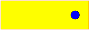
<svg xmlns="http://www.w3.org/2000/svg" width="300px" height="100px">
    <rect x="0" y="0" width="300" height="100" stroke="black" stroke-width="1" />
    <circle cx="0" cy="50" r="15" fill="blue" stroke="black" stroke-width="1">
        <animate attributeName="cx" from="0" to="100" dur="5s" repeatCount="indefinite" />
    </circle>
</svg>
- 1
- 2
- 3
- 4
- 5
- 6
animateTransform
The <animateTransform> element let you animate transform attributes. This new element is necessary because we are not animating a simple attribute like x which is just a number. Rotation attributes look like this: rotation(theta, x, y), where theta is the angle in degrees, and x and y are absolute positions. In the example below, we animate the center of the rotation and the angle.
<animateTransform>元素可以执行变换属性的动画。这个新的元素是必要的,因为我们不能用一个简单的数值的属性就像x来制作这种动画。旋转属性就像:rotation(theta, x, y),theta是一个角度,x和y是绝对坐标。在下面这个例子中我们绕着旋转中心旋转一定的角度。
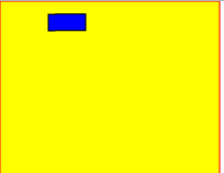
<svg xmlns="http://www.w3.org/2000/svg" width="300px" height="200px">
    <rect x="0" y="0" width="200" height="200" fill="yellow" stroke="red" stroke-width="1" />
    <rect x="20" y="50" width="15" height="34" fill="blue" stroke="black" stroke-width="1" transform="rotation">
        <!-- Rotate from 0 to 360 degrees, and move from 60 to 100 in the x direction. -->
        <!-- Keep doing this until the drawing no longer exists. -->
        <animateTransform attributeType="XML" attributeName="transform" begin="0s" dur="5s" type="rotate" from="20 60 60" to="360 100 60" repeatCount="indefinite" />
    </rect>
</svg>
- 1
- 2
- 3
- 4
- 5
- 6
- 7
- 8
animateMotion
The <animateMotion> element lets you animate an element position and rotation according to a path. The path is defined the same way as in <path>. You can set the attribute to define whether the object rotates following the tangent of the path.
<animateMotion>元素让你可以实现一个路径动画,并且根据路径进行旋转。路径使用和<path>相同的方式进行定义。你可以设置属性来定义对象是否根据路径的正切角度来旋转。
Example 1: Linear motion
In this example, a blue circle bounces between the left and right edges of a black box, over and over again, indefinitely. The animation here is handled by the <animateMotion> element. In this case, we’re establishing a path consisting of a MoveTo command to establish the starting point for the animation, then the Horizontal-line command to move the circle 300 pixels to the right, followed by the Z command, which closes the path, establishing a loop back to the beginning. By setting the value of the repeatCount attribute to indefinite, we indicate that the animation should loop forever, as long as the SVG image exists.
在这个例子中,一个蓝色的圆在黑盒的左右边缘之间来回的反弹,无限地重复着同样的动作。该动画是由<animateMotion>元素控制的。在这种情况下我们建立了一个路径,由MoveTo命令来创建动画的起始点,然后Horizontal-line命令来将圆向右移动300像素到右边,接着使用Z命令,关闭路径,建立一个环回路径。通过设置repeatCount属性为indefinite,我们可以指定只要SVG图片存在的话,动画是否永久循环。
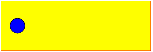
<svg xmlns="http://www.w3.org/2000/svg" width="300px" height="100px">
    <rect x="0" y="0" width="300" height="100" fill="yellow" stroke-width="1" stroke="red" />
    <circle cx="0" cy="50" r="15" fill="blue" stroke="black" stroke-width="1">
        <animateMotion path="M 0 0 H 300 Z" dur="3s" repeatCount="indefinite" />
    </circle>
</svg>
- 1
- 2
- 3
- 4
- 5
- 6
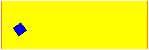
Example 2: Curved motion
Same example as before with a curved path and following the direction of the path.
和上面差不多的例子,只不过现在是沿着曲线和路径方向运动。
<svg width="300px" height="100px">
    <rect x="0" y="0" width="300" height="100" fill="yellow" stroke-width="1" stroke="red" />
    <rect x="0" y="0" width="20" height="20" fill="blue" stroke="black" stroke-width="1">
        <animateMotion path="M 250,80 H 50 Q 30,80 30,50 Q 30,20 50,20 H 250 Q 280,20,280,50 Q 280,80,250,80Z" dur="3s" repeatCount="indefinite" rotate="auto">
    </rect>
</svg>
- 1
- 2
- 3
- 4
- 5
- 6
文章来源: blog.csdn.net,作者:福州-司马懿,版权归原作者所有,如需转载,请联系作者。
原文链接:blog.csdn.net/chy555chy/article/details/53535581

- 点赞
- 收藏
- 关注作者
评论(0)