Android Text fieids

一、Text fieids
允许用户在 UI 中输入文本,TextInputLayout + TextInputEditText。

在 Text fieids 没出来(我不知道)前,想实现这个功能就需要自己自定义控件来实现这个功能。
几年前做个上面这种样式(filled 填充型)。需要多个控件组合 + 动画才能实现,而且需要处理的逻辑也很多。 了解到 Text fieids 那么你仅需 TextInputLayout + TextInputEditText 即可实现之前的 UI 效果,是不是美滋滋?一起来研究一下,现在用不上指不定啥时候就用上了。
「代码上一波,特别简单」
1.1 特性
-
确保文本字段看起来具有交互性
-
两种类型:填充型(filled)和轮廓型(outlined),默认
填充型 -
文本字段的状态(空白、有输入、错误等)应该一目了然
-
保持标签和错误消息简短且易于采取行动
-
文本字段通常出现在表单和对话框中
1.2 TextInputLayout
继承 LinearLayout ,包装 TextInputEditText、EditText 或子类的布局,以便在用户输入文本时隐藏提示时显示浮动标签。
-
显示错误文字(图标): setErrorEnabled(boolean) + setError(CharSequence) + setErrorIconDrawable
-
显示帮助文本:setHelperTextEnabled(boolean) + setHelperText(CharSequence)
-
setPlaceholderText(CharSequence) 显示占位符文本
-
显示字符计数器:setCounterEnabled(boolean) + setCounterMaxLength(int)
-
密码可见性/清除文本: setEndIconMode(int)
-
后缀文本:setSuffixText
-
前缀文本:setPrefixText

错误提示(样式文案)是在TextInputLayout中设置而不是TextInputEditText。
二、填充型(filled)
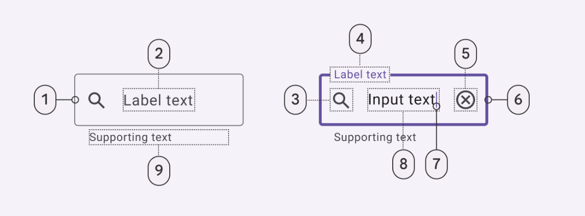
 图片摘自官网
-
容器(TextInputLayout)
-
前导图标(可选),例如密码的小锁子图标
-
标签文本(空态)
-
标签文本(已输入内容)
-
尾随图标 (可选)
-
光标
-
输入内容
-
提示文字 (可选)
-
底部横线 (未选中)
-
底部横线 (enabled选中)
支持的功能比较全,如果自己写这么一个控件还是比较复杂的,需要隐藏显示控件,处理各种状态,修改文字颜色。现在有这么个控件直接使用:真香。
三、轮廓型(outlined)
支持的点跟上面填充型(filled)差不多,可以借鉴一下。

- 点赞
- 收藏
- 关注作者
评论(0)