【愚公系列】2023年12月 HarmonyOS教学课程 009-ArkUI组件(GridRow/GridCol)

🏆 作者简介,愚公搬代码
🏆《头衔》:华为云特约编辑,华为云云享专家,华为开发者专家,华为产品云测专家,CSDN博客专家,CSDN商业化专家,阿里云专家博主,阿里云签约作者,腾讯云优秀博主,腾讯云内容共创官,掘金优秀博主,51CTO博客专家等。
🏆《近期荣誉》:2023年华为云十佳博主,2022年CSDN博客之星TOP2,2022年华为云十佳博主等。
🏆《博客内容》:.NET、Java、Python、Go、Node、前端、IOS、Android、鸿蒙、Linux、物联网、网络安全、大数据、人工智能、U3D游戏、小程序等相关领域知识。
🏆🎉欢迎 👍点赞✍评论⭐收藏
🚀一、GridRow/GridCol
🔎1.概述
栅格布局是一种通用的辅助定位工具,可以帮助开发人员解决多尺寸多设备的动态布局问题。通过将页面划分为等宽的列数和行数,栅格布局提供了可循的规律性结构,方便开发人员对页面元素进行定位和排版。此外,栅格布局还提供了一种统一的定位标注,帮助保证不同设备上各个模块的布局一致性,减少设计和开发的复杂度,提高工作效率。栅格布局还具有灵活的间距调整方法,可以满足特殊场景布局调整的需求。同时,自动换行和自适应功能使得栅格布局能够完成一对多布局,并自动适应不同设备上的排版。在栅格布局中,栅格容器组件GridRow与栅格子组件GridCol需要联合使用,共同构建出栅格布局场景。
🔎2.栅格容器GridRow
🦋2.1 栅格系统断点
| 断点名称 | 设备描述 |
|---|---|
| xs | 最小宽度类型设备 |
| sm | 小宽度类型设备 |
| md | 中等宽度类型设备 |
| lg | 大宽度类型设备 |
| xl | 特大宽度类型设备 |
| xxl | 超大宽度类型设备 |
在GridRow栅格组件中,开发者可以使用breakpoints自定义修改断点的取值范围,最多支持6个断点。除了默认的四个断点以外,还可以启用xl,xxl两个断点,支持六种不同尺寸(xs, sm, md, lg, xl, xxl)设备的布局设置。
定于如下:
breakpoints: {
  value: ['200vp', '300vp', '400vp', '500vp', '600vp'],
  reference: BreakpointsReference.WindowSize
}
案例如下:
@Entry
@Component
struct Index {
  @State bgColors: Color[] = [Color.Red, Color.Orange, Color.Yellow, Color.Green, Color.Pink, Color.Grey, Color.Blue, Color.Brown];
  build() {
    GridRow({
      breakpoints: {
        value: ['200vp', '300vp', '400vp', '500vp', '600vp'],
        reference: BreakpointsReference.WindowSize //断点切换参考物
      }
    }) {
      ForEach(this.bgColors, (color, index) => {
        GridCol({
          span: {
            xs: 2, // 在最小宽度类型设备上,栅格子组件占据的栅格容器2列。
            sm: 3, // 在小宽度类型设备上,栅格子组件占据的栅格容器3列。
            md: 4, // 在中等宽度类型设备上,栅格子组件占据的栅格容器4列。
            lg: 6, // 在大宽度类型设备上,栅格子组件占据的栅格容器6列。
            xl: 8, // 在特大宽度类型设备上,栅格子组件占据的栅格容器8列。
            xxl: 12 // 在超大宽度类型设备上,栅格子组件占据的栅格容器12列。
          }
        }) {
          Row() {
            Text(`${index}`)
          }.width("100%").height('50vp')
        }.backgroundColor(color)
      })
    }
  }
}

🦋2.2 布局的总列数
栅格布局的列数是指将页面宽度分为多少等分,一般情况下栅格布局的列数为12列,即将页面宽度分为12等分,每列所占宽度相等。这样可以方便地将页面元素放置到网格系统中,达到快速搭建页面的目的。同时,栅格布局的列数也可以根据具体的需求进行调整,并不一定非要是12列。
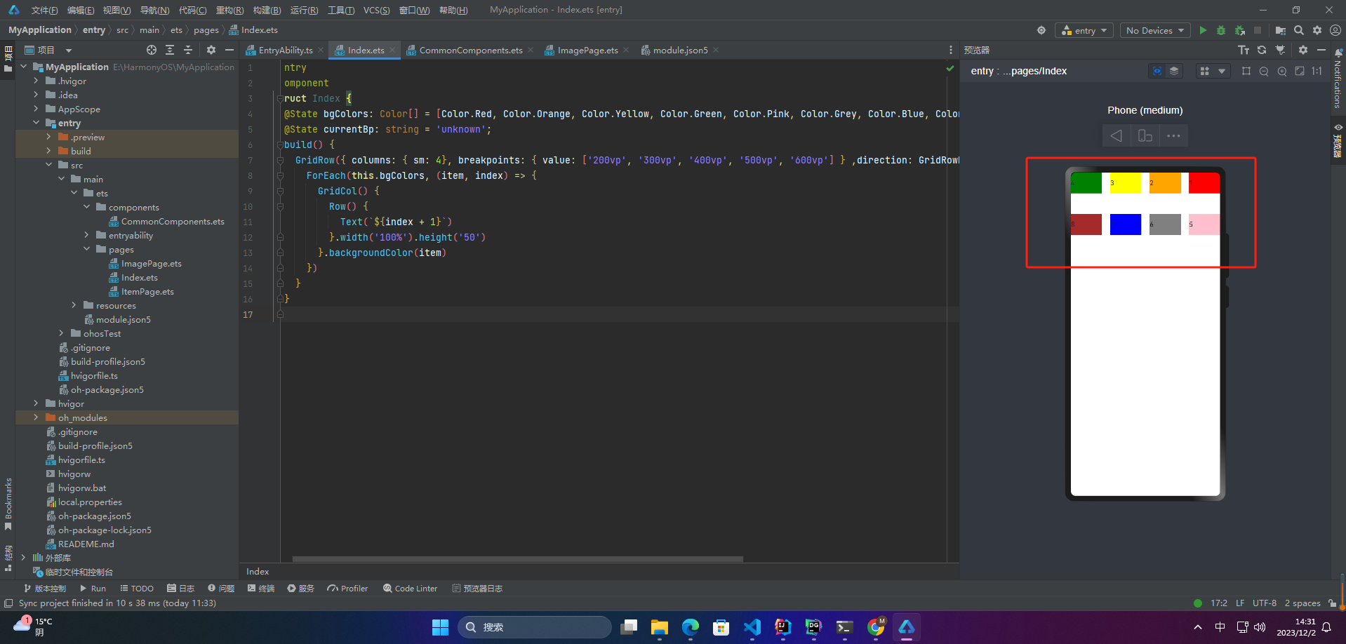
1、默认列数
columns默认值为12,即在未设置columns时,任何断点下,栅格布局被分成12列。
@Entry
@Component
struct Index {
  @State bgColors: Color[] = [Color.Red, Color.Orange, Color.Yellow, Color.Green, Color.Pink, Color.Grey, Color.Blue, Color.Brown];
  build() {
    GridRow() {
      ForEach(this.bgColors, (item, index) => {
        GridCol() {
          Row() {
            Text(`${index + 1}`)
          }.width('100%').height('50')
        }.backgroundColor(item)
      })
    }
  }
}

2、设置列数
当columns为自定义值,栅格布局在任何尺寸设备下都被分为columns列。
@Entry
@Component
struct Index {
  @State bgColors: Color[] = [Color.Red, Color.Orange, Color.Yellow, Color.Green, Color.Pink, Color.Grey, Color.Blue, Color.Brown];
  @State currentBp: string = 'unknown';
  build() {
    Row() {
      GridRow({ columns: 4 }) {
        ForEach(this.bgColors, (item, index) => {
          GridCol() {
            Row() {
              Text(`${index + 1}`)
            }.width('100%').height('50')
          }.backgroundColor(item)
        })
      }
      .width('100%').height('100%')
      .onBreakpointChange((breakpoint) => {
        this.currentBp = breakpoint
      })
    }
    .height(160)
    .border({ color: Color.Blue, width: 2 })
    .width('100%')
  }
}

3、公用
@Entry
@Component
struct Index {
  @State bgColors: Color[] = [Color.Red, Color.Orange, Color.Yellow, Color.Green, Color.Pink, Color.Grey, Color.Blue, Color.Brown];
  @State currentBp: string = 'unknown';
  build() {
    GridRow({ columns: { sm: 4, md: 8 }, breakpoints: { value: ['200vp', '300vp', '400vp', '500vp', '600vp'] } }) {
      ForEach(this.bgColors, (item, index) => {
        GridCol() {
          Row() {
            Text(`${index + 1}`)
          }.width('100%').height('50')
        }.backgroundColor(item)
      })
    }
  }
}
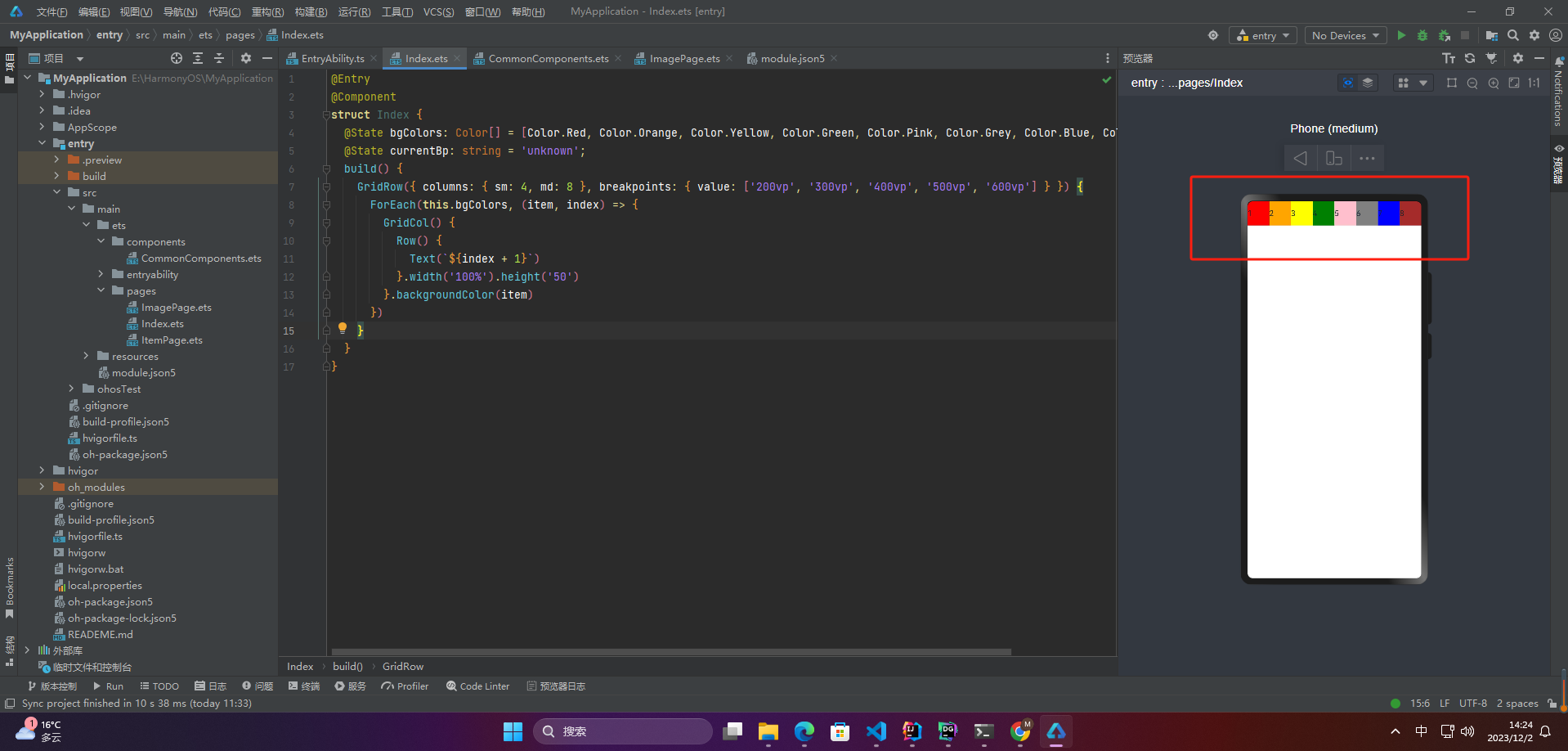
若只设置sm, md的栅格总列数,则较小的尺寸使用默认columns值12,较大的尺寸使用前一个尺寸的columns。这里只设置sm:4, md:8,则较小尺寸的xs:12,较大尺寸的参照md的设置,lg:8, xl:8, xxl:8。
🦋2.3 排列方向
可以通过设置GridRow的direction属性来指定栅格子组件在栅格容器中的排列方向。
该属性可以设置为
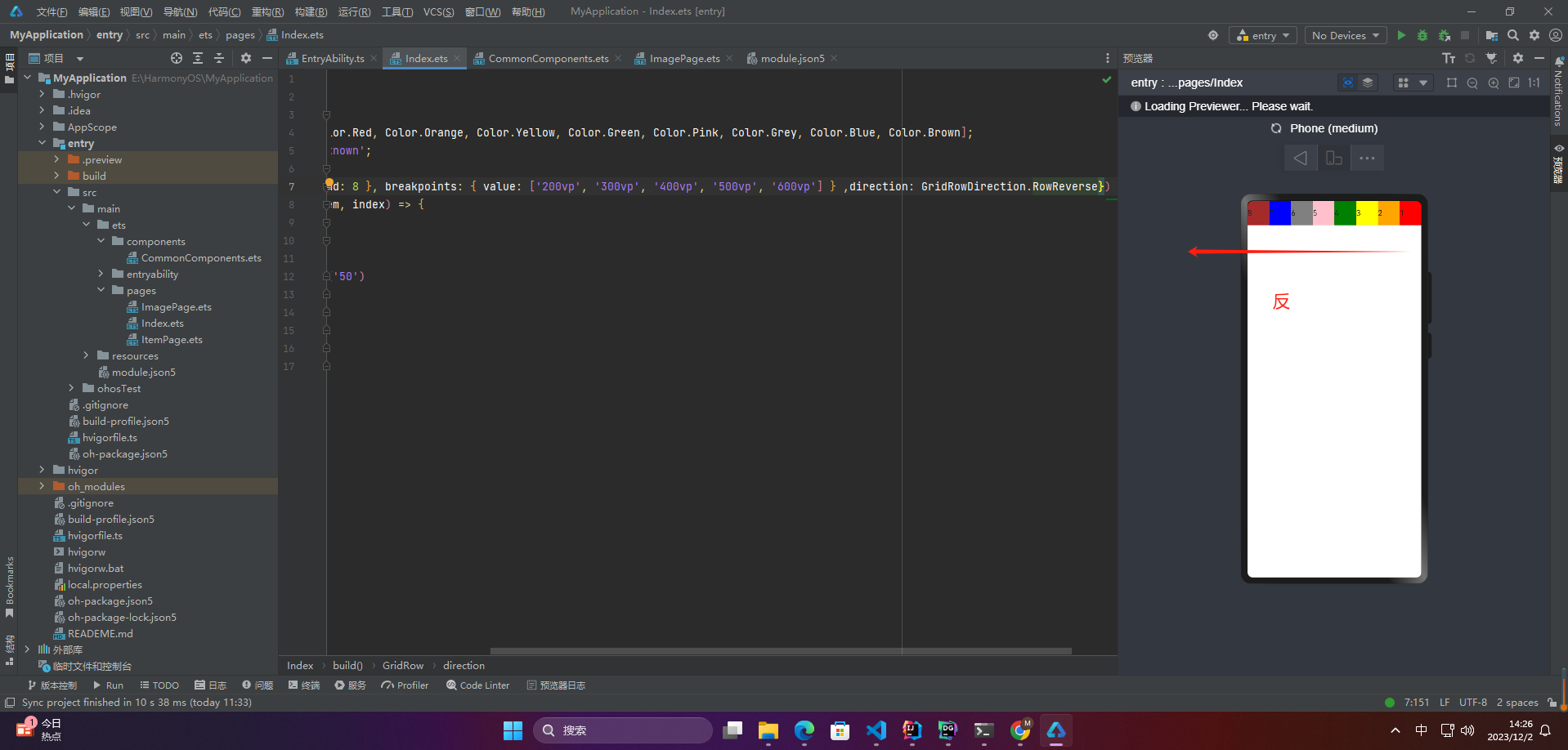
- GridRowDirection.Row(从左往右排列)
- GridRowDirection.RowReverse(从右往左排列)
@Entry
@Component
struct Index {
  @State bgColors: Color[] = [Color.Red, Color.Orange, Color.Yellow, Color.Green, Color.Pink, Color.Grey, Color.Blue, Color.Brown];
  @State currentBp: string = 'unknown';
  build() {
    GridRow({ columns: { sm: 4, md: 8 }, breakpoints: { value: ['200vp', '300vp', '400vp', '500vp', '600vp'] } ,direction: GridRowDirection.RowReverse}) {
      ForEach(this.bgColors, (item, index) => {
        GridCol() {
          Row() {
            Text(`${index + 1}`)
          }.width('100%').height('50')
        }.backgroundColor(item)
      })
    }
  }
}
🦋2.4 子组件间距
可以通过设置GridRow的gutter属性来指定栅格子组件在栅格容器中的排列方向。
该属性可以设置为
- 单个值
GridRow({ gutter: 10 }){}(X:10,Y:10) - 多个值
GridRow({ gutter: { x: 20, y: 50 } }){}(X:20,Y:50)
@Entry
@Component
struct Index {
  @State bgColors: Color[] = [Color.Red, Color.Orange, Color.Yellow, Color.Green, Color.Pink, Color.Grey, Color.Blue, Color.Brown];
  @State currentBp: string = 'unknown';
  build() {
    GridRow({ columns: { sm: 4}, breakpoints: { value: ['200vp', '300vp', '400vp', '500vp', '600vp'] } ,direction: GridRowDirection.RowReverse,gutter: { x: 20, y: 50 }}) {
      ForEach(this.bgColors, (item, index) => {
        GridCol() {
          Row() {
            Text(`${index + 1}`)
          }.width('100%').height('50')
        }.backgroundColor(item)
      })
    }
  }
}
🔎3.子组件GridCol
GridCol组件作为GridRow组件的子组件,通过给GridCol传参或者设置属性两种方式,设置span(占用列数),offset(偏移列数),order(元素序号)的值。
设置span。
GridCol({ span: 2 }){}
GridCol({ span: { xs: 1, sm: 2, md: 3, lg: 4 } }){}
GridCol(){}.span(2)
GridCol(){}.span({ xs: 1, sm: 2, md: 3, lg: 4 })
设置offset。
GridCol({ offset: 2 }){}
GridCol({ offset: { xs: 2, sm: 2, md: 2, lg: 2 } }){}
GridCol(){}.offset(2)
GridCol(){}.offset({ xs: 1, sm: 2, md: 3, lg: 4 })
设置order。
GridCol({ order: 2 }){}
GridCol({ order: { xs: 1, sm: 2, md: 3, lg: 4 } }){}
GridCol(){}.order(2)
GridCol(){}.order({ xs: 1, sm: 2, md: 3, lg: 4 })
🦋3.1 span
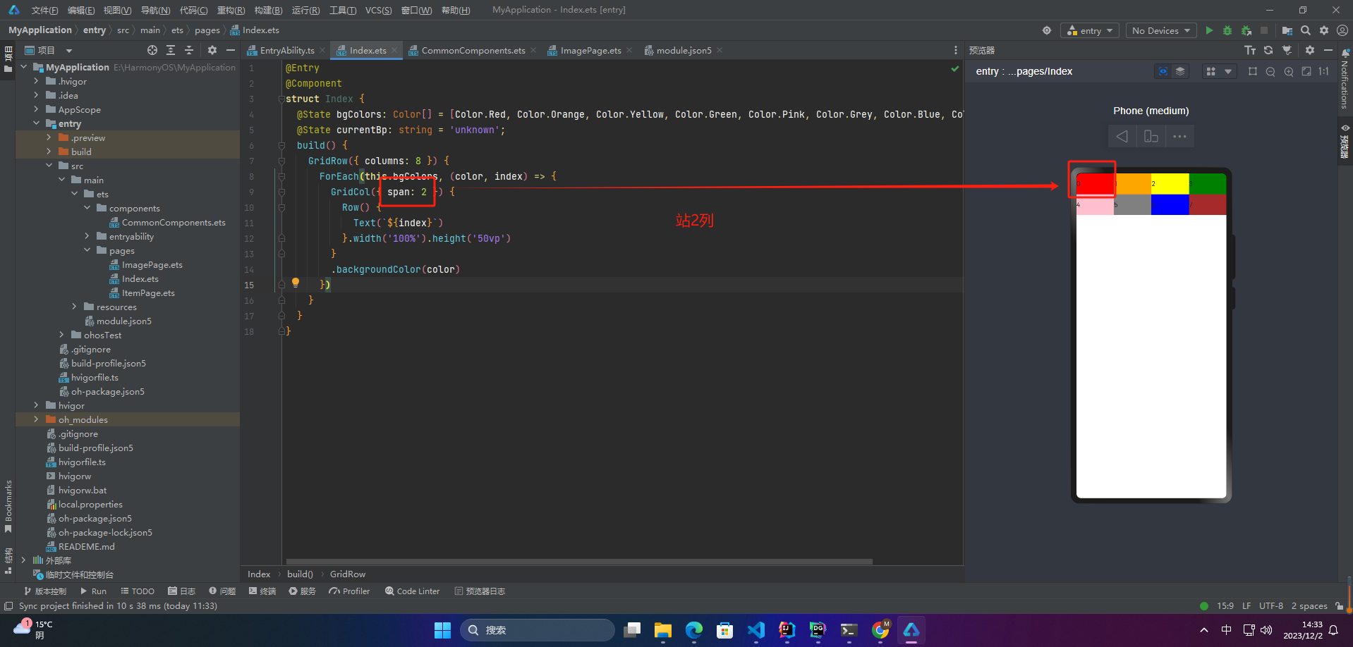
在栅格布局中,span属性表示某个元素或组件应该跨越的列数。例如,如果我们有一个包含12个列的栅格系统,我们可以使用span属性来指定一个元素应该占用多少列。
例如,如果我们希望一个元素占用3列,我们可以使用{ span: 3 },这将使元素跨越3列。同样,如果我们希望元素跨越整个栅格系统,我们可以使用{ span: 12 }。
在具体的代码实现中,不同的栅格系统可能会使用不同的方式实现span属性,但通常都会提供类似于{ span: 3 }的语法来指定元素所占据的列数。
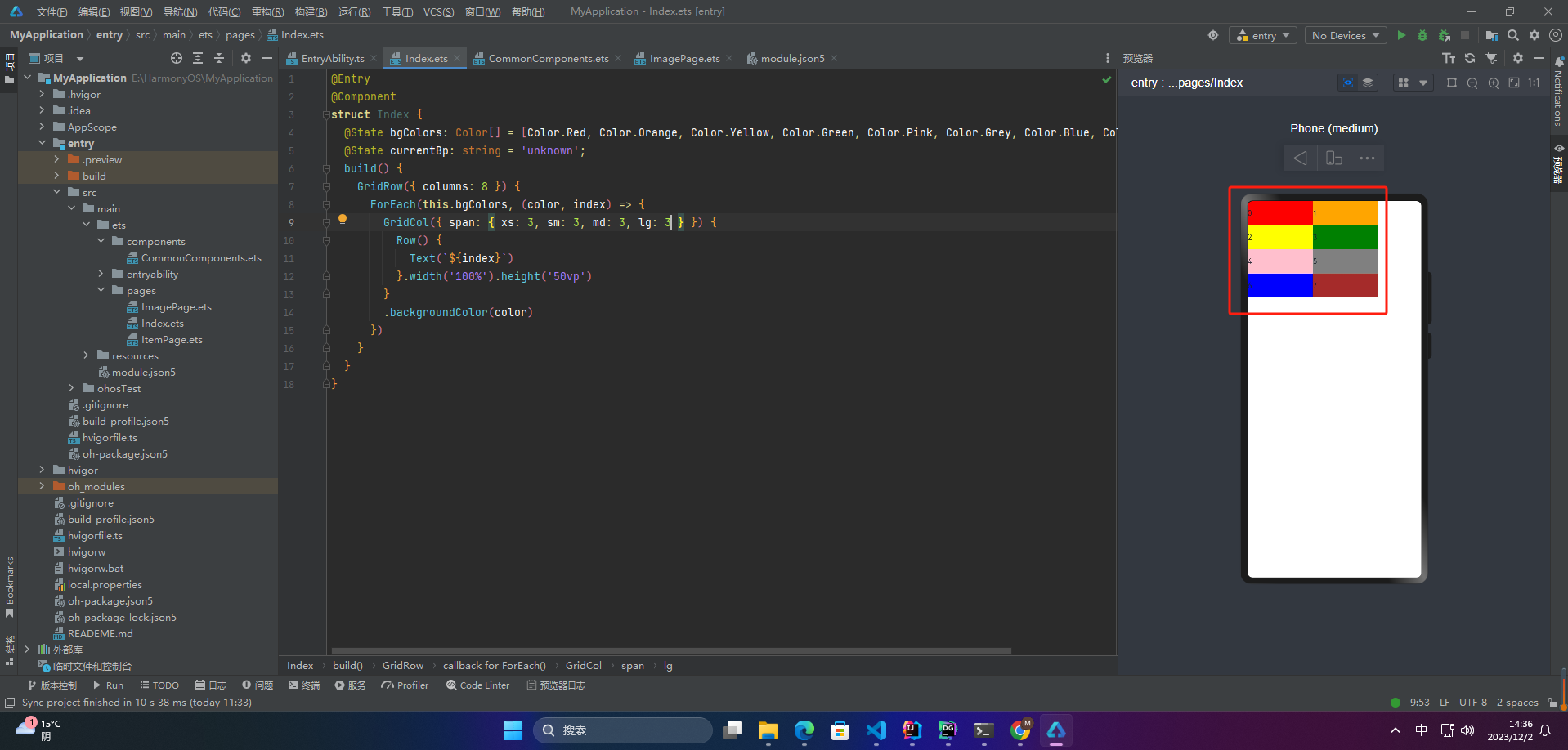
1、当类型为number时,子组件在所有尺寸设备下占用的列数相同。
@Entry
@Component
struct Index {
  @State bgColors: Color[] = [Color.Red, Color.Orange, Color.Yellow, Color.Green, Color.Pink, Color.Grey, Color.Blue, Color.Brown];
  @State currentBp: string = 'unknown';
  build() {
    GridRow({ columns: 8 }) {
      ForEach(this.bgColors, (color, index) => {
        GridCol({ span: 2 }) {
          Row() {
            Text(`${index}`)
          }.width('100%').height('50vp')
        }
        .backgroundColor(color)
      })
    }
  }
}
2、当类型为GridColColumnOption时,支持六种不同尺寸(xs, sm, md, lg, xl, xxl)设备中子组件所占列数设置,各个尺寸下数值可不同。
@State bgColors: Color[] = [Color.Red, Color.Orange, Color.Yellow, Color.Green, Color.Pink, Color.Grey, Color.Blue, Color.Brown];
...
GridRow({ columns: 8 }) {
  ForEach(this.bgColors, (color, index) => {
    GridCol({ span: { xs: 3, sm: 3, md: 3, lg: 3 } }) {
      Row() {
        Text(`${index}`)
      }.width('100%').height('50vp')
    }
    .backgroundColor(color)
  })
}
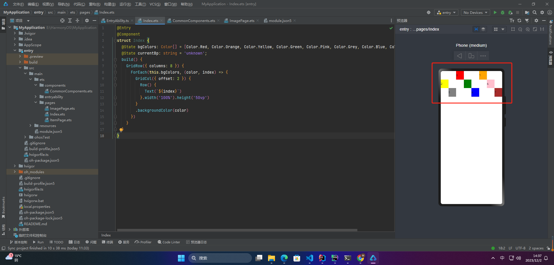
🦋3.2 offset
栅格布局的offset是指在栅格布局中,元素相对于其父元素的偏移量。使用offset可以将元素移动到栅格中的任意位置。在栅格布局中,通常使用偏移量来实现布局的灵活和自适应性。具体的偏移量取决于栅格的列数和元素所占的列数。通常,一般情况下,偏移量是通过给元素添加相应的类来实现的,例如:{ offset: 3 }表示元素在中等屏幕上向右偏移3个栅格。
1、当类型为number时,子组件偏移相同列数
@Entry
@Component
struct Index {
  @State bgColors: Color[] = [Color.Red, Color.Orange, Color.Yellow, Color.Green, Color.Pink, Color.Grey, Color.Blue, Color.Brown];
  @State currentBp: string = 'unknown';
  build() {
    GridRow({ columns: 8 }) {
      ForEach(this.bgColors, (color, index) => {
        GridCol({ offset: 2 }) {
          Row() {
            Text(`${index}`)
          }.width('100%').height('50vp')
        }
        .backgroundColor(color)
      })
    }
  }
}
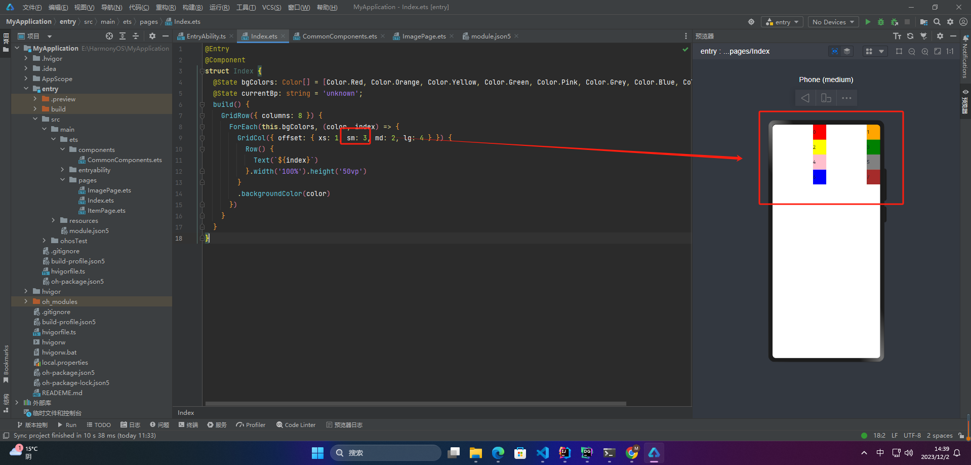
2、当类型为GridColColumnOption时,支持六种不同尺寸(xs, sm, md, lg, xl, xxl)设备中子组件所占列数设置,各个尺寸下数值可不同
@Entry
@Component
struct Index {
  @State bgColors: Color[] = [Color.Red, Color.Orange, Color.Yellow, Color.Green, Color.Pink, Color.Grey, Color.Blue, Color.Brown];
  @State currentBp: string = 'unknown';
  build() {
    GridRow({ columns: 8 }) {
      ForEach(this.bgColors, (color, index) => {
        GridCol({ offset: { xs: 1, sm: 3, md: 2, lg: 4 } }) {
          Row() {
            Text(`${index}`)
          }.width('100%').height('50vp')
        }
        .backgroundColor(color)
      })
    }
  }
}
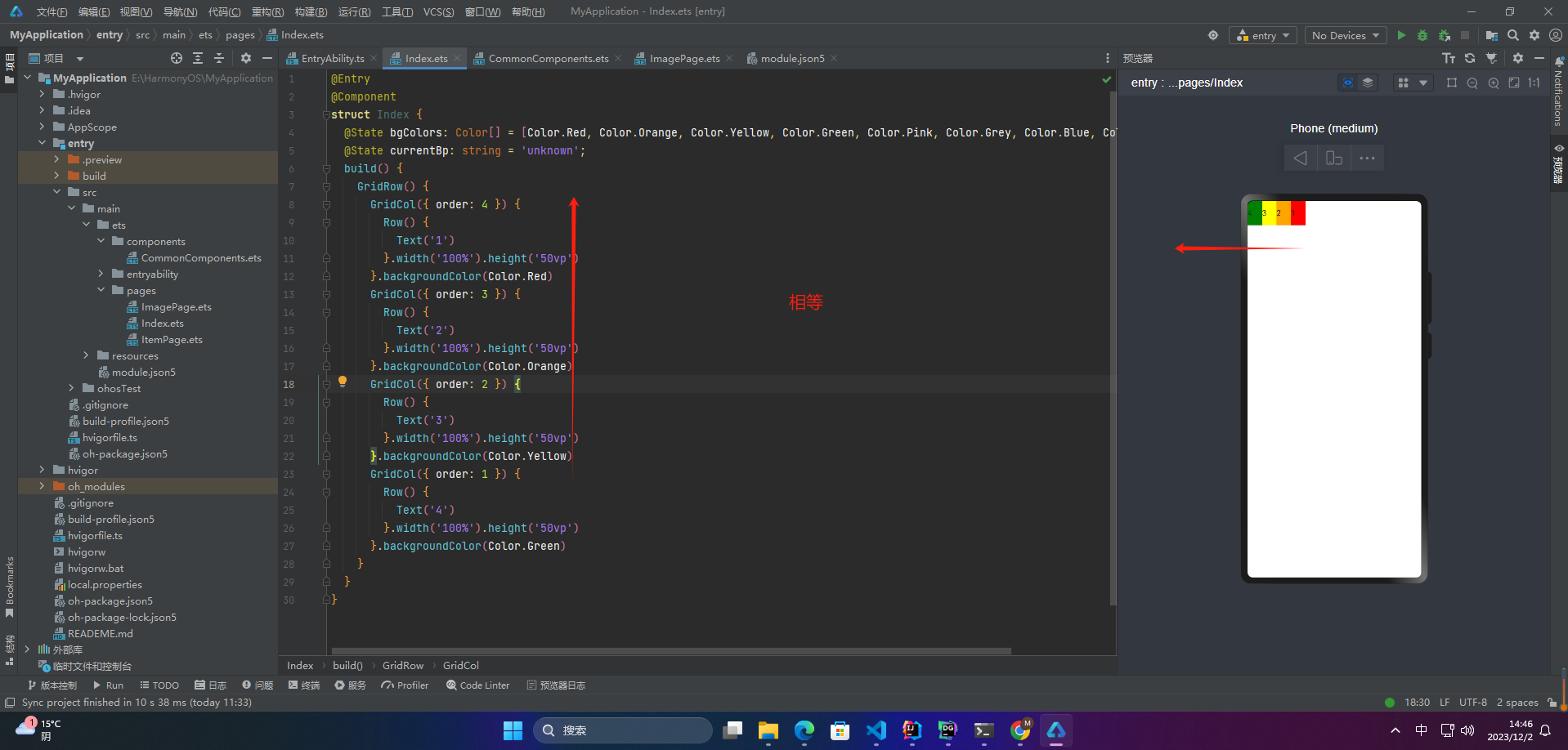
🦋3.3 order
栅格布局中,order属性用于指定网格项的显示顺序。默认情况下,网格项的显示顺序是按照它们在 HTML 代码中出现的顺序进行排列。通过设置 order 属性,可以改变网格项的显示顺序。
order 属性的值是一个整数,表示网格项的显示顺序。值越小的网格项越先显示,值相同的网格项按照它们在 HTML 代码中的顺序进行排列。若未设置该属性,则默认值为 0。
1、当类型为number时,子组件在任何尺寸下排序次序一致。
@Entry
@Component
struct Index {
  @State bgColors: Color[] = [Color.Red, Color.Orange, Color.Yellow, Color.Green, Color.Pink, Color.Grey, Color.Blue, Color.Brown];
  @State currentBp: string = 'unknown';
  build() {
    GridRow() {
      GridCol({ order: 4 }) {
        Row() {
          Text('1')
        }.width('100%').height('50vp')
      }.backgroundColor(Color.Red)
      GridCol({ order: 3 }) {
        Row() {
          Text('2')
        }.width('100%').height('50vp')
      }.backgroundColor(Color.Orange)
      GridCol({ order: 2 }) {
        Row() {
          Text('3')
        }.width('100%').height('50vp')
      }.backgroundColor(Color.Yellow)
      GridCol({ order: 1 }) {
        Row() {
          Text('4')
        }.width('100%').height('50vp')
      }.backgroundColor(Color.Green)
    }
  }
}
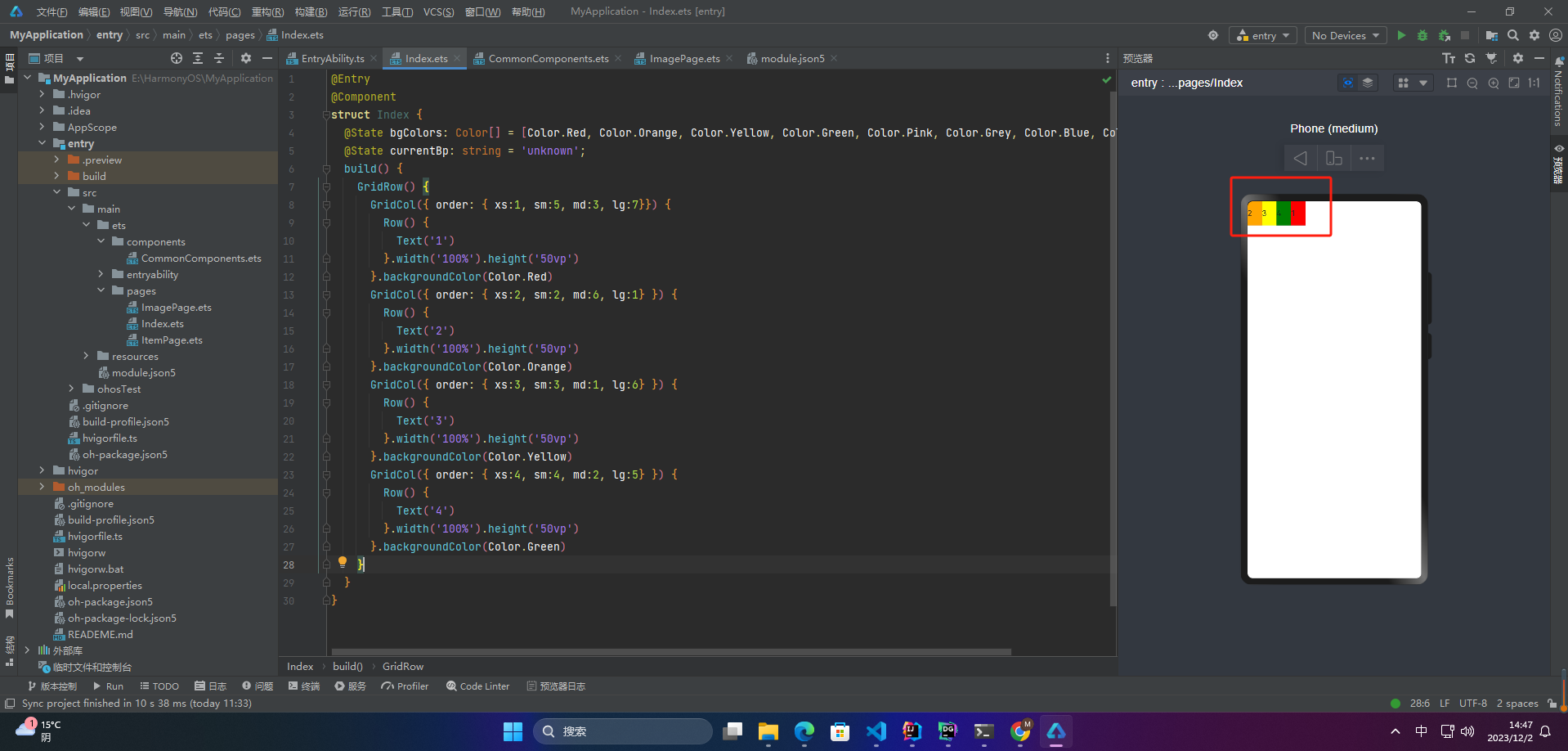
2、当类型为GridColColumnOption时,支持六种不同尺寸(xs, sm, md, lg, xl, xxl)设备中子组件排序次序设置。在xs设备中,子组件排列顺序为1234;sm为2341,md为3412,lg为2431。
@Entry
@Component
struct Index {
  @State bgColors: Color[] = [Color.Red, Color.Orange, Color.Yellow, Color.Green, Color.Pink, Color.Grey, Color.Blue, Color.Brown];
  @State currentBp: string = 'unknown';
  build() {
    GridRow() {
      GridCol({ order: { xs:1, sm:5, md:3, lg:7}}) {
        Row() {
          Text('1')
        }.width('100%').height('50vp')
      }.backgroundColor(Color.Red)
      GridCol({ order: { xs:2, sm:2, md:6, lg:1} }) {
        Row() {
          Text('2')
        }.width('100%').height('50vp')
      }.backgroundColor(Color.Orange)
      GridCol({ order: { xs:3, sm:3, md:1, lg:6} }) {
        Row() {
          Text('3')
        }.width('100%').height('50vp')
      }.backgroundColor(Color.Yellow)
      GridCol({ order: { xs:4, sm:4, md:2, lg:5} }) {
        Row() {
          Text('4')
        }.width('100%').height('50vp')
      }.backgroundColor(Color.Green)
    }
  }
}
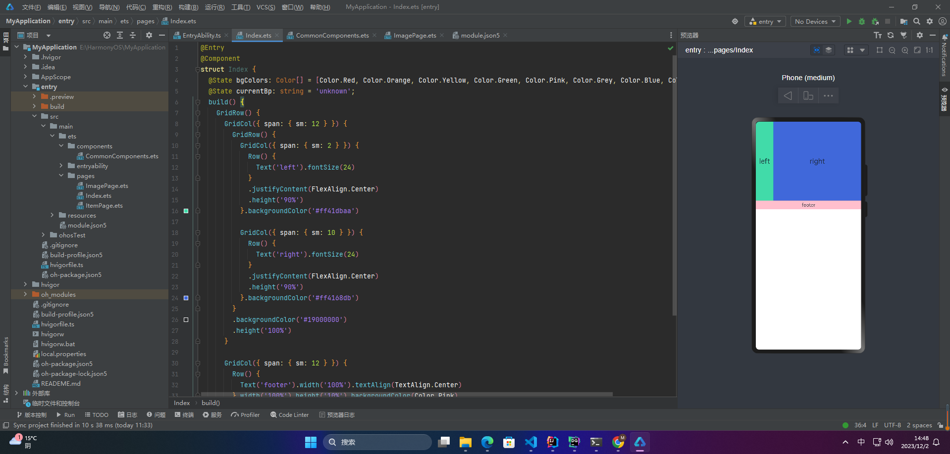
🔎4.栅格组件的嵌套使用
@Entry
@Component
struct Index {
  @State bgColors: Color[] = [Color.Red, Color.Orange, Color.Yellow, Color.Green, Color.Pink, Color.Grey, Color.Blue, Color.Brown];
  @State currentBp: string = 'unknown';
  build() {
    GridRow() {
      GridCol({ span: { sm: 12 } }) {
        GridRow() {
          GridCol({ span: { sm: 2 } }) {
            Row() {
              Text('left').fontSize(24)
            }
            .justifyContent(FlexAlign.Center)
            .height('90%')
          }.backgroundColor('#ff41dbaa')

          GridCol({ span: { sm: 10 } }) {
            Row() {
              Text('right').fontSize(24)
            }
            .justifyContent(FlexAlign.Center)
            .height('90%')
          }.backgroundColor('#ff4168db')
        }
        .backgroundColor('#19000000')
        .height('100%')
      }

      GridCol({ span: { sm: 12 } }) {
        Row() {
          Text('footer').width('100%').textAlign(TextAlign.Center)
        }.width('100%').height('10%').backgroundColor(Color.Pink)
      }
    }.width('100%').height(300)
  }
}
🚀感谢:给读者的一封信
亲爱的读者,
我在这篇文章中投入了大量的心血和时间,希望为您提供有价值的内容。这篇文章包含了深入的研究和个人经验,我相信这些信息对您非常有帮助。
如果您觉得这篇文章对您有所帮助,我诚恳地请求您考虑赞赏1元钱的支持。这个金额不会对您的财务状况造成负担,但它会对我继续创作高质量的内容产生积极的影响。
我之所以写这篇文章,是因为我热爱分享有用的知识和见解。您的支持将帮助我继续这个使命,也鼓励我花更多的时间和精力创作更多有价值的内容。
如果您愿意支持我的创作,请扫描下面二维码,您的支持将不胜感激。同时,如果您有任何反馈或建议,也欢迎与我分享。

再次感谢您的阅读和支持!
最诚挚的问候, “愚公搬代码”

- 点赞
- 收藏
- 关注作者
评论(0)