Flutter笔记:发布一个Flutter头像模块 easy_avatar

作者:李俊才 (jcLee95):https://blog.csdn.net/qq_28550263
邮箱 :291148484@163.com
本文地址:https://blog.csdn.net/qq_28550263/article/details/133912019
模块地址:https://pub.dev/packages/easy_avatar
(国内访问:https://pub-web.flutter-io.cn/packages/easy_avatar)
当你看到这篇文章的时候,先不要误以为笔者不知道 Flutter 中提供了一个 近乎与没有提供没太大区别的 CircleAvatar组件。对,它真的仅仅就是圆形头像——除非,你使用 Clip 类组件当然剪裁成一个你想要的样子。不过它的功能还是太弱了。其实,最初我想做的仅仅是淘宝消息的好友头像,这非常简单:

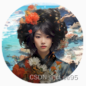
不过考虑到实际需求,和更多的项目场景,比如——图片缺失的处理方案、图片出错的错误方案、图片背景的处理方案,以及一些特殊效果。例如,有一张原始的头像是这样的:
配合下面的背景图:

经过简单配置,就可以得到下面爬出相框的效果:
另外,一些图片、背景的调整都是自动的,你要配置的可能真的很少。比如,当指定头像图片时,你不需要考虑时网络图片还是本地图片——通常在Flutter中,需要使用 Image 的两个不同构造函数,即 network 和 asset 来加载。但是这都处理好了,如果时网络地址,则直接传入 图片的 url 字符串;如果是 assets 下的静态资源图片,也可以直接传入资源位置字符串,并且都是通过 image 属性指定。
而且,你不需要考虑,网络地址或者本地资源是否有效,如果图像资源失效,将会更换为我画好的默认头像,看起来就像这样:
你可以使用 pub 包管理工具在你的项目中运行如下命令添加到你的 Flutter 项目中:
flutter pub add easy_avatar
这将在你的项目的 pubspec.yaml 中添加一行(并运行一个隐式的dart pub get):
dependencies:
  easy_avatar: ^1.0.0
版本号可能随时间变化。
重大变更:
- 从 v2.0.0 开始,废弃了 width 和 height 属性,取而代之的是 size 属性。
- 从 v2.0.0 开始,新增了文字头像功能。
The simplest example is to use the default avatar and default parameters:
最简单的例子是使用默认头像及默认参数:
const Avatar()
The effect of this code is as follows:
其运行效果如下:

你也可以指定一些头像参数,但是如果你指定一个错误的头像地址,将自动地使用默认头像,例如:
Avatar(
  size: 100,
  backgroundColor: Colors.indigo,
  borderRadius: 40,
  padding: EdgeInsets.all(20),
  image: 'https://example.com/avatar.jpg',
),
The effect of this code is as follows:
其运行效果如下:

如果要可以设置一个真实的网络图片URL作为头像,则它必须以http开头,例如:
const Avatar(
  size: 200,
  borderRadius: 100,
  image:
      'https://profile-avatar.csdnimg.cn/bb869bb0b79b48209c6206043890c985_qq_28550263.jpg',
),
The effect of this code is as follows:
其运行效果如下:

Oh, this is me. An active user of the open source community!
哦,这就是我了。一个开源社区的活跃用户!
Actually, you can also use animation, which doesn’t matter:
其实你还可以使用动图,这没关系的:
const Avatar(
  size: 200,
  margin: EdgeInsets.all(6),
  borderRadius: 60,
  image:
      'https://github.githubassets.com/images/mona-loading-dimmed.gif',
),
The effect of this code is as follows:
其运行效果如下:

If the avatar itself has a transparent background, you can see the default background color or background picture. Also, you can add an outer border for your avatar, such as:
如果头像本身是透明背景的,可以看到默认背景色 或 背景图片。并且,你还可以为你的头像添加外边框,例如:
Avatar(
  width: 200,
  height: 200,
  padding: const EdgeInsets.all(10),
  margin: const EdgeInsets.all(10),
  borderRadius: 80,
  backgroundColor: Colors.white, // 如不设置,则为灰色
  // 可以为你的头像添加边框
  border: Border.all(
    color: const Color.fromARGB(255, 0, 0, 0),
    width: 6.0,
    style: BorderStyle.solid,
    strokeAlign: BorderSide.strokeAlignInside,
  ),
  image:
      'https://gitee.com/jacklee1995/example-pictures/raw/master/asian/asian-girl-avatar.png',
),
The effect of this code is as follows:
其运行效果如下:
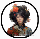
Next is an example of using a network picture as a background picture, which will cover the background color effect:
接下来是一个使用网络图片作为背景图的例子,这个网络图片将覆盖背景颜色效果:
const Avatar(
  width: 200,
  height: 200,
  margin: EdgeInsets.all(10),
  borderRadius: 80,
  backgroundImage:
      'https://gitee.com/jacklee1995/example-pictures/raw/master/scenery/jonathanvasquez8950_scenery_2f6031d1-c4fe-41d7-8abf-d1c9c40d9981.png',
  image:
      'https://gitee.com/jacklee1995/example-pictures/raw/master/asian/asian-girl-avatar.png',
),
The effect of this code is as follows:
其运行效果如下:
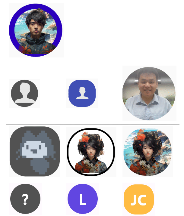
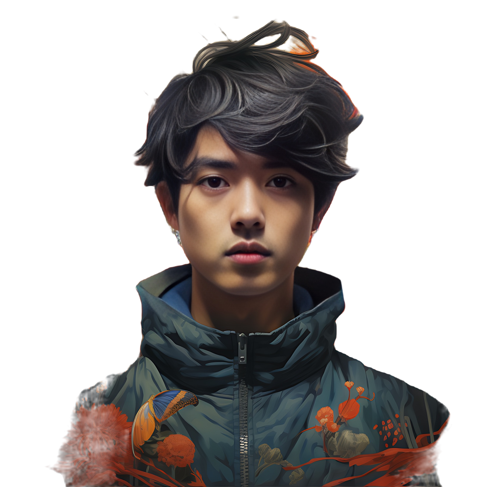
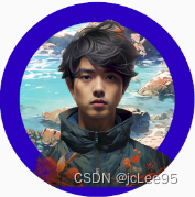
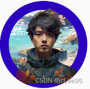
Now, let’s explore some special effects - Avatar out of the box.
The Avatar class provides an intermediate layer border property called interlayerBorder. Using this property instead of the border property will help you achieve the effect of characters coming out of the frame. Here’s an example code:
下面我们玩一点特效——人物出框。Avatar 类提供了一个中间层边框属性 interlayerBorder,通过该属性而不是 border 属性设置的边框将帮助你完成人物出框的效果。示例代码如下:
Avatar(
  width: 200,
  height: 200,
  interlayerBorder: Border.all(
    color: const Color.fromARGB(255, 255, 251, 3),
    width: 20.0,
    style: BorderStyle.solid,
    strokeAlign: BorderSide.strokeAlignInside,
  ),
  // margin: const EdgeInsets.all(6),
  borderRadius: 100,
  backgroundImage:
      'https://gitee.com/jacklee1995/example-pictures/raw/master/scenery/jonathanvasquez8950_scenery_2f6031d1-c4fe-41d7-8abf-d1c9c40d9981.png',
  image: 'assets/asian-boy-avatar.png', // 也可以使用本地图片资源
)
其效运行果如下:
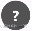
从 v2.0.0 开始,新增了文字头像功能。
从 v2.0.0 开始,添加了新的图层用于显示文字,但是必须使用 textMode 参数开启文字模式。如果没有指定文本,将显示为“?”号,否则显示为使用 text 参数所指定的文本。
examples:
例如:
const Avatar(textMode: true),
The effect of this code is as follows:
效果为:
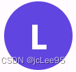
const Avatar(
  textMode: true, // 文字模式必须启用此参数
  text: 'Lee', // 默认仅仅使用一个字符
),
The effect of this code is as follows:
效果为:
If the text consists of more than one word, you need to specify the number of words through the wordsCount parameter to display more than one character:
如果文本由多个单词构成,需要通过 wordsCount 参数指定单词的数量以显示多个字符:
const Avatar(
  textMode: true,
  text: 'Jun Cai',
  borderRadius: 40,
  wordsCount: 2, // 单词数量,用于显示多个单词的首字符
),
The effect of this code is as follows:
效果为:

Let’s enjoy it!~
尽情探索吧!~
A widget that displays an avatar with various customization options.
此类是一个显示带有各种自定义选项的头像的组件。
This widget allows you to display avatars with custom dimensions, border radius, background color, and an optional background image. You can specify both network and local images for the avatar.
该组件允许您显示具有自定义尺寸、边框半径、背景颜色和可选背景图像的头像。可以为头像指定网络和本地图像。
Avatar(
  size: 150,
  borderRadius: 75,
  backgroundImage: 'https://example.com/avatar-background.jpg',
  backgroundColor: Colors.blue,
  image: 'assets/avatar.jpg',
  margin: EdgeInsets.all(10),
  padding: EdgeInsets.all(5),
)
Creates an Avatar widget.
创建Avatar组件。
-
size(double, optional): The size of the avatar. Default is 100.- 头像的尺寸。默认为100。
-
borderRadius(double, optional): The border radius of the avatar. Default is 50.- 头像的边框半径。默认为50。
-
backgroundImage(String, optional): The URL for the background image of the avatar.- 头像的背景图像的URL。
-
backgroundColor(Color, optional): The background color of the avatar ifbackgroundImageis not provided. Default is a gray color.- 如果没有提供
backgroundImage,则设置头像的背景颜色。默认为灰色。
- 如果没有提供
-
image(String, required): The image for the avatar, which can be either a network URL or a local asset path.- 用于设置头像的图像,可以是网络URL或本地资源路径。
-
text(String, required): The text for the avatar.- 文字头像的文本。
-
textMode(bool, optional): Whether to use text avatar mode. Default is false.- 是否启用文本头像模式,默认为 false。
-
upperCase(bool, optional): Use capital letters. Default is false.- 文本转大写,默认为 false。
-
wordsCount(int, optional): Number of words, used to display the first characters of multiple words.- 单词数量,用于显示多个单词的首字符。
-
margin(EdgeInsetsGeometry, optional): The margin around the entire avatar. Default is no margin.- 控制整个头像周围的边距。默认没有边距。
-
padding(EdgeInsetsGeometry, optional): The padding within the avatar, affecting only the avatar image. Default is no padding.- 应用于头像内部,仅影响头像图像的填充。默认没有填充。
-
border(Border, optional): The border for the avatar.- 头像的边框。
-
interlayerBorder(Border, optional): The interlayer border for the avatar.- 头像的中间层边框。
你可以在 Github 上报告错误:https://github.com/jacklee1995/flutter_easy_avatar/issues

- 点赞
- 收藏
- 关注作者
评论(0)