CSS学习笔记 08、过渡与动画(上)

@[toc]
前言
本篇博客是关于CSS的过渡与动画,若文章中出现相关问题,请指出!
所有博客文件目录索引:博客目录索引(持续更新)
一、过渡
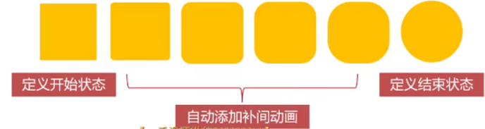
1.1、过渡的基本介绍(transition: transform 1s linear 0s;)
介绍transition及其属性
介绍:transition过渡属性是CSS浓墨重彩的特性,过渡可以为一个元素在不同样式之间变化自动添加"补间动画"。
- 兼容性:过渡从IE10开始兼容,移动端兼容良好。曾经网页动画特效使用js的定时器实现,现在逐步改为使用CSS3过渡。
- 优点:动画更细腻,内存开销小。
能够参与过渡的属性:
- 所有数值属性,如width、height、left、top、border-radius。
- 背景颜色(比较特殊,其非数值也可以),文字颜色。
- 所有变形(含2D、3D)。
语法:tranistion: width 1s linear 0s;。
- 第一个参数:指定要过渡的属性。(若是想要全部属性,则设置为
all,不要滥用,会引发效率问题!) - 第二个参数:动画的时长。(只能以s,秒为单位,没有ms单位)
- 第三个参数:变化速度曲线,常使用linear(常规)。
- 第四个参数:延迟指定时间后开始动画,一般设置为0s,立即触发。(s,秒不能省略,必须要写)
关于这四个小属性介绍:
| 属性 | 意义 |
|---|---|
| transition-property | 哪些属性要过滤 |
| transition-duration | 动画时间,以s为单位 |
| transition-timing-function | 动画变化曲线(缓动效果) |
| transition-delay | 延迟时机 |
书写时机:
<style>
    div{
        ...元素属性
        width: 10px;
        tranistion: width 1s linear 0s; //执行要过渡的属性
    }
    //触碰之后,原本元素中的指定过渡属性改变,那么就会执行过渡效果
    div:hover{
        width: 100px;
    }
</style>

<body>
    <div> </div>
</body>
属性过渡生效demo(7个示例)
示例描述
示例1:div的width进行过渡。
示例2:div内的p元素left过渡。
示例3:背景颜色过渡。
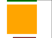
示例4:border-radius属性过渡。
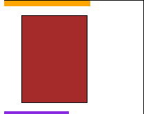
示例5:2D变形进行过渡—放大、旋转过渡。
示例6:3D变形进行x轴、y轴旋转360度。
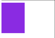
示例7:所有属性进行过渡如宽度,边框角度,颜色
效果展示:上面的示例都有展示效果

源码如下:
<style>
    * {
        padding: 0px;
        margin: 0px;
    }

    /* 示例1:width过渡 */
    div.one {
        width: 100px;
        height: 60px;
        border: 1px solid #000;
        background-color: red;
        /* 添加过渡属性 */
        transition: width 1s linear 0s;
        margin-bottom: 10px;
    }

    div:hover {
        width: 600px;
    }

    /* 示例2:left过渡 */
    div.second {
        width: 600px;
        height: 60px;
        border: 1px solid #000;
        margin-bottom: 10px;
    }

    div.second p {
        /* 使用相对定位,否则left属性过渡效果无效! */
        position: relative;
        width: 60px;
        height: 60px;
        background-color: blue;
        /* 对left进行过渡 */
        left: 0;
        transition: left 1s linear 0s;
    }

    /* 当触碰到div元素时,p的left属性生效 */
    div.second:hover p {
        left: 540px;
    }

    /* 示例3:对背景颜色进行过渡 */
    div.third {
        width: 100px;
        height: 100px;
        background-color: red;
        /* 设置背景颜色过渡 */
        transition: background-color 1s linear 0s;
        margin-bottom: 10px;
    }

    div.third:hover {
        background-color: rgb(36, 101, 199);
    }

    /* 示例4:对border-radius进行过渡 */
    div.fourth {
        width: 100px;
        height: 100px;
        background-color: green;
        /* 设置border-radius过渡 */
        border-radius: 0;
        transition: border-radius 1s linear 0s;
        margin-bottom: 10px;
    }

    div.fourth:hover {
        border-radius: 50%;
    }

    /* 示例5:2D变形,对放大、旋转进行过渡 */
    div.fifth {
        width: 100px;
        height: 100px;
        background-color: orange;
        /* 对放大、旋转过渡 */
        transform: scale(1) rotate(0deg);
        transition: transform 1s linear 0s;
        margin-bottom: 10px;
    }

    div.fifth:hover {
        transform: scale(1.5) rotate(360deg);
    }

    /* 示例6:3D变形,对X轴、Y轴进行翻转360度 */
    div.sixth {
        width: 75px;
        height: 100px;
        border: 1px solid #000;
        margin-left: 20px;
        margin-bottom: 10px;
        /* 设置perspective,令3D翻转生效 */
        perspective: 600px;
    }

    div.sixth p {
        width: 75px;
        height: 100px;
        background-color: brown;
        /* 对3D的x轴、y轴翻转同时进行过渡 */
        transform: rotateX(0) rotateY(0);
        transition: transform 1s linear 0s;
    }

    div.sixth:hover p {
        transform: rotateX(360deg) rotateY(360deg);
    }

    /*  示例7:对所有属性进行过渡  */
    div.seventh {
        width: 75px;
        height: 100px;
        background-color: blueviolet;
        border-radius: 0;
        /* 对所有的属性都进行过渡 */
        transition: all 1s linear 0s;
    }

    div.seventh:hover {
        width: 150px;
        background-color: red;
        border-radius: 50%;
    }
</style>

<body>
    <!-- 示例1:div的宽度进行过渡 -->
    <div class=" one">
    </div>
    <!-- 示例2:div中的p元素的left位置进行过渡 -->
    <div class="second">
        <p></p>
    </div>
    <!-- 示例3:background-color过渡效果 -->
    <div class="third"></div>
    <!-- 示例4:border-radius过渡 -->
    <div class="fourth"></div>
    <!-- 示例5:2D变形,对放大、旋转进行过渡 -->
    <div class="fifth"></div>
    <!-- 示例6:3D变形,对X轴、Y轴进行翻转360度 -->
    <div class="sixth">
        <p></p>
    </div>
    <!-- 示例7:对所有属性进行过渡 -->
    <div class="seventh"></div>

</body>
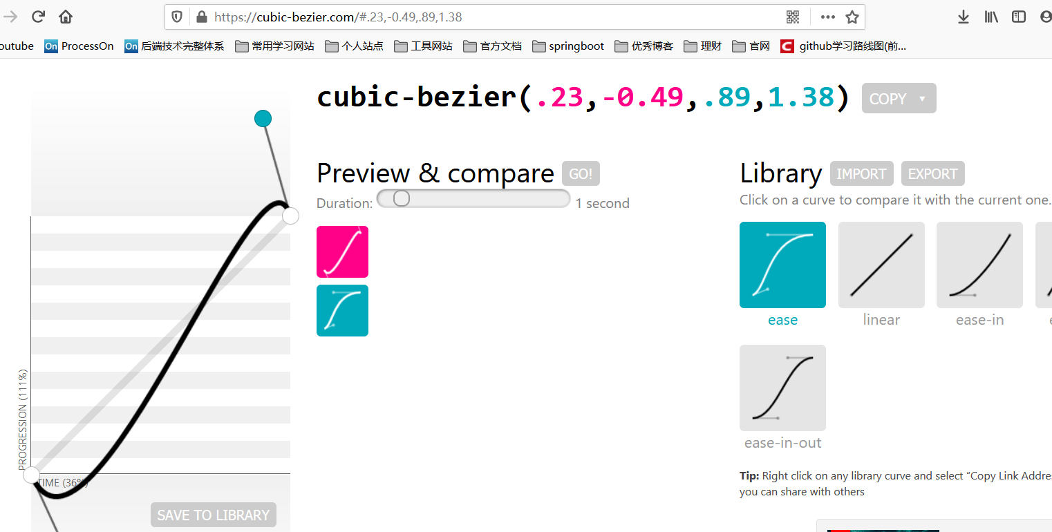
1.2、过渡的缓动效果(也就是1.1中第三个属性)
认识
transition-timing-function属性
transistion的第三个属性transition-timing-function就是缓动参数,也是变化速度曲线。
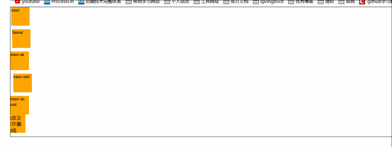
属性设置:包含五个属性,对应属性的速度曲线如下:快慢看其中的倾斜程度,其中linear是最平稳的
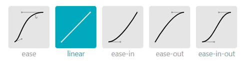
除了上面的五个关键字,你还可以自定义贝尔赛曲线:自定义贝尔赛曲线网站,可自由进行设置
效果演示
源代码:
<style>
    * {
        padding: 0px;
        margin: 0px;
    }

    body {
        font-size: small;
    }

    .box {
        border: 1px solid #000;
    }

    div.box p {
        position: relative;
        width: 50px;
        height: 50px;
        background-color: orange;
        margin-bottom: 10px;
        /* 设置过渡,属性为left */
        left: 0;
        transition: left 5s linear 0s;
    }

    div.box p:nth-child(5) {
        margin-bottom: 0;
    }

    /* 当触碰到外面盒子时就会触发过渡效果 */
    div.box:hover p {
        left: 750px;
    }

    /* 下面来设置不同的缓动效果 */
    div.box p:nth-child(1) {
        transition-timing-function: ease;
    }

    div.box p:nth-child(2) {
        transition-timing-function: linear;
    }

    div.box p:nth-child(3) {
        transition-timing-function: ease-in;
    }

    div.box p:nth-child(4) {
        transition-timing-function: ease-out;
    }

    div.box p:nth-child(5) {
        transition-timing-function: ease-in-out;
    }

    /* 自定义贝尔赛曲线 */
    div.box p:nth-child(6) {
        transition-timing-function: cubic-bezier(.23, -0.49, .89, 1.38);
    }
</style>

<body>
    <div class="box">
        <p>ease</p>
        <p>linear</p>
        <p>ease-in</p>
        <p>ease-out</p>
        <p>ease-in-out</p>
        <p>自定义贝尔赛曲线</p>
    </div>

</body>
1.3、实战案例
案例1:图片信息显示(使用到过渡)
效果展示
新增属性:opacity:指的是整个元素的不透明度。
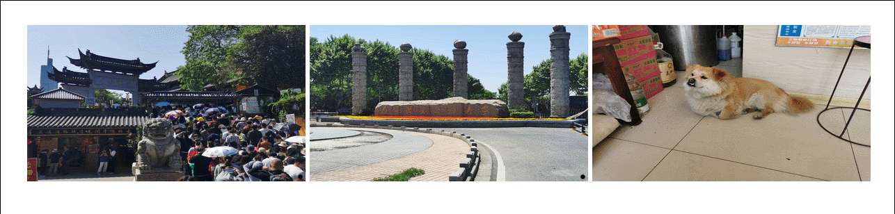
源代码及分析
三张图片排列在一行上:使用了ul li结构,存放在一个div中,接着对li元素进行左浮动!
主角信息框的显示:信息框使用div元素(绝对定位方式覆盖到图片上),使用到了一个关键属性opacity,对该属性使用过渡效果达到上图显示。
<style>
    * {
        padding: 0px;
        margin: 0px;
    }

    div.box {
        width: 970px;
        overflow: hidden;
        margin: 30px auto;
    }

    /* 每个图片的li */
    div.box ul li {
        float: left;
        margin-right: 5px;
        position: relative;
        width: 320px;
        height: 180px;
    }

    /* 设置高度 */
    div.box ul li img {
        width: 320px;
        height: 180px;
    }

    div.box ul li:nth-child(3) {
        margin-right: 0;
    }

    /* 每张图片的信息栏 */
    div.box ul li div {
        background-color: rgba(0, 0, 0, .5);
        color: white;
        border-radius: 3%;
        /* 绝对定位到每张图片的底部 */
        position: absolute;
        bottom: 0;
        left: 0;
        /* 默认整体的不透明度为0,即隐藏 */
        opacity: 0;
        /* 设置过渡效果 */
        transition: opacity 0.5s linear 0s;
    }

    /* 当每个照片被触碰到的时候,就会显示信息框 */
    div.box ul li img:hover+div {
        opacity: 1;
    }
</style>

<body>
    <div class="box">
        <ul>
            <li>
                <img src="./1.jpg" alt="">
                <div>南京鸡鸣寺</div>
            </li>
            <li>
                <img src="./2.jpg" alt="">
                <div>南京南京信息工程大学</div>
            </li>
            <li>
                <img src="./3.jpg" alt="">
                <div>小狗狗</div>
            </li>
        </ul>
    </div>

</body>
案例2:图标旋转与放大过渡
效果
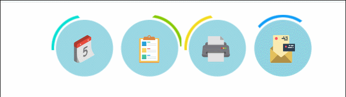
源码
其中有两个过渡效果:圆圈中的物体放大效果以及触碰圆圈时的旋转效果。
分析:
这四个部分使用ul、li结构组成,使用到了左浮动,每个图标的背景实际上使用了伪元素::before来创建的,并不是在li里面进行嵌套,在li元素中真正存放了对应的图标。
<style>
    * {
        padding: 0px;
        margin: 0px;
    }

    /* 外部大盒子 */
    div.box {
        width: 428px;
        height: 105px;
        /* border: 1px solid #000; */
        margin: 20px auto;
    }

    /* ul元素去样式 */
    div.box ul {
        list-style: none;
    }

    /* li元素 */
    div.box ul li {
        float: left;
        width: 105px;
        height: 105px;
        /* border: 1px solid #000; */
        /* 设置相对定位 */
        position: relative;
    }

    div.box ul li:nth-child(3) {
        padding-left: 5px;
    }

    /* 每个li元素设置伪元素 */
    div.box ul li::before {
        content: '';
        display: block;
        width: 105px;
        height: 105px;
        /* 设置旋转为过渡属性 */
        transform: rotate(0deg);
        transition: transform .5s ease 0s;
    }

    /* li元素中添加伪元素,该伪元素为对应的背景图 */
    div.box ul li:nth-child(1)::before {
        background-image: url(./images2/a_1.png);
    }

    div.box ul li:nth-child(2)::before {
        background-image: url(./images2/a_2.png);
    }

    div.box ul li:nth-child(3)::before {
        background-image: url(./images2/a_3.png);
    }

    div.box ul li:nth-child(4)::before {
        background-image: url(./images2/a_4.png);
    }

    /* 设置背景图片尺寸与属性 */
    div.box ul li img {
        width: 45px;
        height: 45px;
        /* 设置绝对定位 */
        position: absolute;
        top: 50%;
        left: 50%;
        margin-top: -20px;
        margin-left: -22px;
        /* 给变形属性设置过渡 */
        transition: transform .2s linear 0s;
    }

    /* 开始添加过渡效果 */
    /* li的伪元素设置旋转360度 */
    div.box ul li:hover::before {
        transform: rotate(360deg);
    }

    /* img属性设置为放大1.5倍 */
    div.box ul li img:hover {
        transform: scale(1.2);
    }
</style>

<body>
    <div class="box">
        <ul>
            <li><img src="./images2/icon1.svg" alt=""></li>
            <li><img src="./images2/icon2.svg" alt=""></li>
            <li><img src="./images2/icon3.svg" alt=""></li>
            <li><img src="./images2/icon4.svg" alt=""></li>
        </ul>
    </div>
</body>
资源素材


[外链图片转存失败,源站可能有防盗链机制,建议将图片保存下来直接上传(img-qN7i3aeH-1651797627812)(https://pictured-bed.oss-cn-beijing.aliyuncs.com/img/beifen-gitee/2021-5/20210606142307.svg)]
[外链图片转存失败,源站可能有防盗链机制,建议将图片保存下来直接上传(img-IvtVYFFO-1651797627813)(https://pictured-bed.oss-cn-beijing.aliyuncs.com/img/beifen-gitee/2021-5/20210606142317.svg)]
[外链图片转存失败,源站可能有防盗链机制,建议将图片保存下来直接上传(img-LS0kOHYS-1651797627813)(https://pictured-bed.oss-cn-beijing.aliyuncs.com/img/beifen-gitee/2021-5/20210606142333.svg)]
[外链图片转存失败,源站可能有防盗链机制,建议将图片保存下来直接上传(img-DipIJdLL-1651797627813)(https://pictured-bed.oss-cn-beijing.aliyuncs.com/img/beifen-gitee/2021-5/20210606142358.svg)]
案例3:图片3D翻面
效果展示
源码分析
准备材料:两张图片即可。


思路分析:两张图片中一张图片使用绝对定位,使其覆盖在另一张图上,之后对该绝对定位的图的transform属性进行过渡添加,一定要设置旋转点!
源码如下:
<style>
    * {
        padding: 0px;
        margin: 0px;
    }

    div.box {
        /* border: 1px solid #000; */
        position: relative;
        width: 102px;
        height: 102px;
        margin: 10px auto;
        /* 设置舞台 */
        perspective: 800px;
    }

    div.box img {
        width: 100px;
        height: 100px;
        border: 1px solid #000;
        border-radius: 50px;
    }

    div.box img.dog {
        /* 绝对定位 */
        position: absolute;
        bottom: 0;
        left: 0;
        /* 设置基准点 */
        transform-origin: 0 0;
        /* 设置过渡效果 */
        transition: transform 1s linear 0s;
    }

    /* 第1个小狗按照左侧x轴进行3D旋转 */
    div.box:hover img.dog {
        transform: rotateY(-180deg);
    }

    /* 设置第2个小狗狗按右侧y轴进行3D旋转 */
    div.box1 img.dog {
        transform-origin: 100% 0
    }

    div.box1:hover img.dog {
        transform: rotateY(180deg);
    }

    /* 设置第3个小姑按上侧x轴进行3D旋转 */
    div.box2 img.dog {
        transform-origin: 0 0
    }

    div.box2:hover img.dog {
        transform: rotateX(180deg);
    }
</style>

<body>
    <div class="box">
        <img src="./images2/cat.jpg" alt="">
        <img class="dog" src="./images2/dog.jpg" alt="">
    </div>

    <div class="box box1">
        <img src="./images2/cat.jpg" alt="">
        <img class="dog" src="./images2/dog.jpg" alt="">
    </div>

    <div class="box box2">
        <img src="./images2/cat.jpg" alt="">
        <img class="dog" src="./images2/dog.jpg" alt="">
    </div>

</body>

- 点赞
- 收藏
- 关注作者
评论(0)