【愚公系列】2022年08月 微信小程序-横向选项卡功能实现

【摘要】 前言横向选项卡(tabs)内容组之间进行导航切换。当前内容需要分成同层级结构的组,进行内容切换展示,用在表单或者标准列表界面的顶部。注意目前一个页面中仅支持使用一次 Tabs 组件。在基础库 2.x 版本下,内嵌 scroll-view 产生 scroll-view 无法滚动的情况,建议 scroll-view 阻止 touch 事件冒泡:catchTouchStart、catchTouc...
前言
横向选项卡(tabs)内容组之间进行导航切换。当前内容需要分成同层级结构的组,进行内容切换展示,用在表单或者标准列表界面的顶部。
注意
-
目前一个页面中仅支持使用一次 Tabs 组件。
-
在基础库 2.x 版本下,内嵌 scroll-view 产生 scroll-view 无法滚动的情况,建议 scroll-view 阻止 touch 事件冒泡:catchTouchStart、catchTouchMove。
-
Tabs 内部使用 transform 样式以进行轮播,会导致内嵌弹层显示问题,建议内部不嵌套包含弹层的组件或者使用 fallback 属性,以自己实现简单版的“轮播”,详见下方 fallback 的 demo。
一、横向选项卡(weui版)
| 属性名 | 类型 | 默认值 | 必选 | 描述 |
|---|---|---|---|---|
| tabs | Array | [] | yes | 数据项格式为{title} |
| tab-class | String | no | 选项卡样式 | |
| swiper-class | String | no | 内容区域刷卡器样式 | |
| active-class | String | no | 行为样式 | |
| tab-underline-color | String | #07c160 | no | 所选项目的下划线颜色 |
| tab-active-text-color | String | #000000 | no | 检查字体颜色 |
| tab-inactive-text-color | String | #000000 | no | 未选中的字体颜色 |
| tab-background-color | String | #ffffff | no | 选项卡背景色 |
| active-tab | Number | 0 | no | 激活选项卡索引 |
| duration | Number | 500 | no | 内容区交接持续时间 |
| Bindtablick | eventhandle | no | 触发时点击选项卡,e.detail={index} | |
| bindchange | eventhandle | no | 内容区域滚动原因选项卡更改时触发,以及.detail={index} |
1.安装包
npm install @ miniprogram-component-plus/tabs
2.使用
引用组件
"usingComponents": {
  "mp-tabs": "@miniprogram-component-plus/tabs/index"
}
Page({
/**
* 页面的初始数据
*/
data: {
active: 1,
arr:['1','2','3','4'],
tabs: [],
arr2: [],
activeTab: 0,
},
onLoad() {
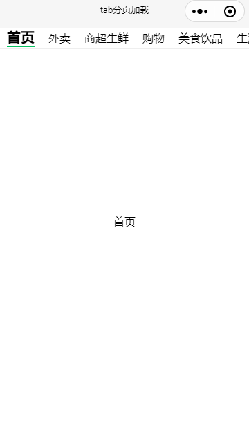
const titles = ['首页', '外卖', '商超生鲜', '购物', '美食饮品', '生活服务', '休闲娱乐', '出行']
const tabs = titles.map(item => ({ title: item }))
this.setData({ tabs })
this.setData({ arr2: ['11', '22', '33', '44'] })
},
onTabCLick(e) {
const index = e.detail.index
console.log('----------'+index);
this.setData({ activeTab: index })
},
onChange(e) {
const index = e.detail.index
console.log('----------'+index);
this.setData({ activeTab: index })
}
})
 <mp-tabs
  tabs="{{tabs}}"
  activeTab="{{activeTab}}"
  swiperClass="weui-tabs-swiper"
  bindtabclick="onTabCLick"
  bindchange="onChange"
  activeClass="tab-bar-title__selected"
>

  <block wx:for="{{tabs}}" wx:key="title">
    <view class="tab-content" slot="tab-content-{{index}}" > {{item.title}} </view>
  </block>

</mp-tabs>
.bgView {
  /* background-color: orange; */
  height: 500px;
  width: 100%;
}

.bg {
  /* background: red; */
  /* position: fixed;
  top: 0;
  height: 40px; */
}

page {
  height: 100%;
}

/* ------------ weui -------------- */
.weui-tabs-bar__wrp {
  border-bottom: 1px solid #eee;
  position: fixed;
  top: 0;
  height: 30px;
  z-index:9999;
}

.weui-tabs-swiper {
  margin-top: 30px;
  width: 100%;
  height: 500px;
}

.tab-content {
  width: 100%;
  height: 500px;
  display: flex;
  justify-content: center;
  align-items: center;
  box-sizing: border-box;
  /* padding: 40rpx; */
}

.weui-tabs-bar__title {
  margin: 0px 10px;
}

.tab-bar-title__selected {
  font-size: 20px;
  font-weight: bold;
}

【声明】本内容来自华为云开发者社区博主,不代表华为云及华为云开发者社区的观点和立场。转载时必须标注文章的来源(华为云社区)、文章链接、文章作者等基本信息,否则作者和本社区有权追究责任。如果您发现本社区中有涉嫌抄袭的内容,欢迎发送邮件进行举报,并提供相关证据,一经查实,本社区将立刻删除涉嫌侵权内容,举报邮箱:
cloudbbs@huaweicloud.com
- 点赞
- 收藏
- 关注作者
评论(0)