HTML5生日祝福网页代码【粉色生日快乐模板】HTML+CSS+JavaScript

【摘要】 这是程序员表白系列中的100款网站表白之一,旨在让任何人都能使用并创建自己的表白网站给心爱的人看。 此波共有100个表白网站,可以任意修改和使用,很多人会希望向心爱的男孩女孩告白,生性腼腆的人即使那个TA站在眼前都不敢向前表白。说不出口的话就用短视频告诉TA吧~制作一个表白网页告诉TA你的心意,演示如下。@TOC 一、网页介绍1 网页简介:基于 HTML+CSS+JavaScript 制作七...
这是程序员表白系列中的100款网站表白之一,旨在让任何人都能使用并创建自己的表白网站给心爱的人看。 此波共有100个表白网站,可以任意修改和使用,很多人会希望向心爱的男孩女孩告白,生性腼腆的人即使那个TA站在眼前都不敢向前表白。说不出口的话就用短视频告诉TA吧~制作一个表白网页告诉TA你的心意,演示如下。
@TOC
一、网页介绍
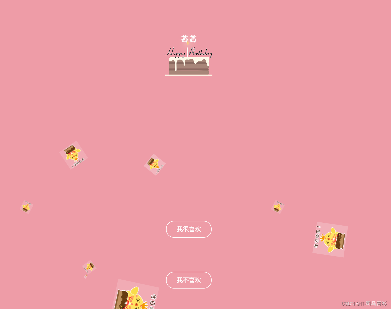
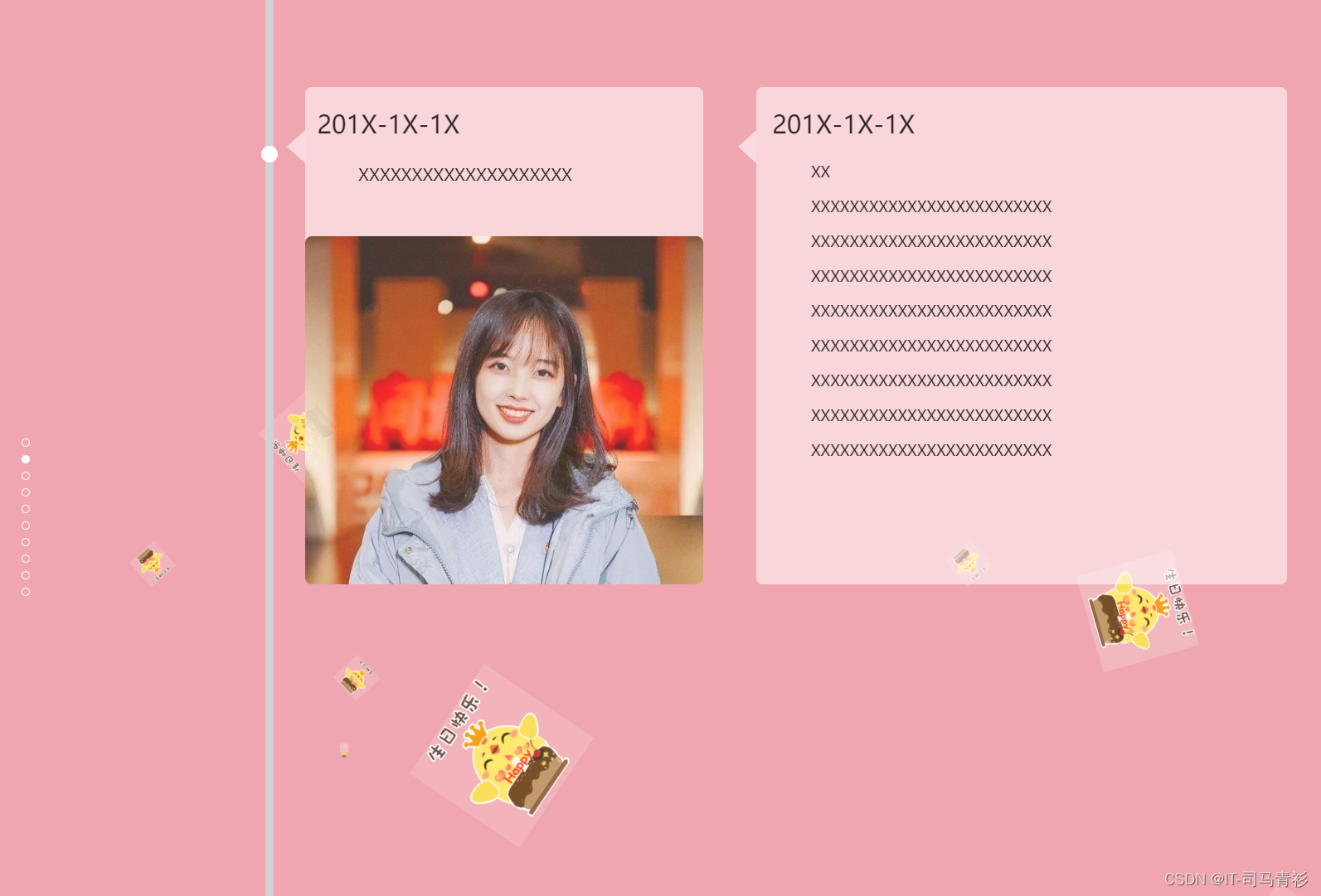
1 网页简介:基于 HTML+CSS+JavaScript 制作七夕情人节表白网页、生日祝福、七夕告白、 求婚、浪漫爱情3D相册、炫酷代码 ,快来制作一款高端的表白网页送(他/她)浪漫的告白,制作修改简单,可自行更换背景音乐,文字和图片即可使用
2.网页编辑:任意HTML编辑软件(如:Dreamweaver、HBuilder、Vscode 、Sublime 、Webstorm、Text 、Notepad++ 等任意html编辑软件进行运行及修改编辑等操作)。
一、网页效果
二、代码展示
1.HTML代码
代码如下(示例):以下仅展示部分代码供参考~
<!DOCTYPE html>
<html lang="zh">
<head>
<meta charset="UTF-8" />
<meta http-equiv="X-UA-Compatible" content="IE=edge,chrome=1" />
<meta name="viewport" content="width=device-width, initial-scale=1.0" />
<title>Happy Birthday</title>
<link rel="stylesheet" type="text/css" href="css/index.css" />
</head>
<body>
<div class="htmleaf-container">
<div class="wrapper">
<div class="container">
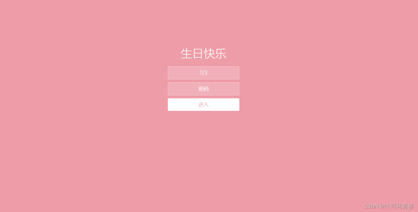
<h1>生日快乐</h1>
<form class="form">
<input
id="userName"
name="userName"
type="text"
placeholder="姓名"
/>
<input id="pwd" name="pwd" type="password" placeholder="密码" />
<button type="submit" id="login-button">进入</button>
</form>
</div>
<ul class="bg-bubbles">
<li>
<img src="./img/timg.gif" style="width: 100%; height: 100%" />
</li>
<li>
<img src="./img/timg.gif" style="width: 100%; height: 100%" />
</li>
<li>
<img src="./img/timg.gif" style="width: 100%; height: 100%" />
</li>
<li>
<img src="./img/timg.gif" style="width: 100%; height: 100%" />
</li>
<li>
<img src="./img/timg.gif" style="width: 100%; height: 100%" />
</li>
<li>
<img src="./img/timg.gif" style="width: 100%; height: 100%" />
</li>
<li>
<img src="./img/timg.gif" style="width: 100%; height: 100%" />
</li>
<li>
<img src="./img/timg.gif" style="width: 100%; height: 100%" />
</li>
<li>
<img src="./img/timg.gif" style="width: 100%; height: 100%" />
</li>
<li>
<img src="./img/timg.gif" style="width: 100%; height: 100%" />
</li>
</ul>
</div>
</div>
<audio src="music/1.mp3" autoplay="autoplay" loop="loop">
<script src="js/jquery-2.1.1.min.js" type="text/javascript"></script>
<script src="js/index.js" type="text/javascript"></script>
</body>
</html>
2.CSS代码
* {
  box-sizing: border-box;
  margin: 0;
  padding: 0;
  font-weight: 300;
}
body {
  font-family:"Microsoft YaHei";
  color: white;
  font-weight: 300;
}
body ::-webkit-input-placeholder {
  /* WebKit browsers */
  font-family:"Microsoft YaHei";
  color: white;
  font-weight: 300;
}
body :-moz-placeholder {
  /* Mozilla Firefox 4 to 18 */
  font-family:"Microsoft YaHei";
  color: white;
  opacity: 1;
  font-weight: 300;
}
body ::-moz-placeholder {
  /* Mozilla Firefox 19+ */
  font-family:"Microsoft YaHei";
  color: white;
  opacity: 1;
  font-weight: 300;
}
body :-ms-input-placeholder {
  /* Internet Explorer 10+ */
  font-family:"Microsoft YaHei";
  color: white;
  font-weight: 300;
}
.wrapper {
  background: #ee9ca7;
  background: -webkit-linear-gradient(top left, #ee9ca7 0%, #ee9ca7 100%);
  background: linear-gradient(to bottom right, #ee9ca7 0%, #ee9ca7 100%);
  background-color:rgba(255,255,255,0.9);
  position: absolute;
  top:0;
  left: 0;
  width: 100%;
  height: 100%;
  overflow: hidden;

}

.wrapper.form-success .container h1 {
  -webkit-transform: translateY(85px);
      -ms-transform: translateY(85px);
          transform: translateY(85px);
}
.container {
  max-width: 600px;
  margin: 0 auto;
  margin-top: 7%;
  padding: 80px 0;
  height: 400px;
  text-align: center;
}
.container h1 {
  font-size: 40px;
  -webkit-transition-duration: 1s;
          transition-duration: 1s;
  -webkit-transition-timing-function: ease-in-put;
          transition-timing-function: ease-in-put;
  font-weight: 200;
}
form {
  padding: 20px 0;
  position: relative;
  z-index: 2;
}
form input {
  -webkit-appearance: none;
     -moz-appearance: none;
          appearance: none;
  outline: 0;
  border: 1px solid rgba(255, 255, 255, 0.4);
  background-color: rgba(255, 255, 255, 0.2);
  width: 250px;
  border-radius: 3px;
  padding: 10px 15px;
  margin: 0 auto 10px auto;
  display: block;
  text-align: center;
  font-family: "Microsoft YaHei";
  font-size: 18px;
  color: white;
  -webkit-transition-duration: 0.25s;
          transition-duration: 0.25s;
  font-weight: 300;
}
form input:hover {
  background-color: rgba(255, 255, 255, 0.4);
}
form input:focus {
  background-color: white;
  width: 300px;
  color: #ee9ca7;
}
form button {
  -webkit-appearance: none;
     -moz-appearance: none;
          appearance: none;
  outline: 0;
  background-color: white;
  font-family: "Microsoft YaHei";
  border: 0;
  padding: 10px 15px;
  color: #ee9ca7;
  border-radius: 3px;
  width: 250px;
  cursor: pointer;
  font-size: 18px;
  -webkit-transition-duration: 0.25s;
          transition-duration: 0.25s;
}
form button:hover {
  background-color: #f5f7f9;
}
.bg-bubbles {
  position: absolute;
  top: 0;
  left: 0;
  width: 100%;
  height: 100%;
  z-index: 1;
}
.bg-bubbles li {
  position: absolute;
  list-style: none;
  display: block;
  width: 40px;
  height: 40px;
  background-color: rgba(255, 255, 255, 0.15);
  bottom: -160px;
  -webkit-animation: square 30s infinite;
  animation: square 30s infinite;
  -webkit-transition-timing-function: linear;
  transition-timing-function: linear;
}
.bg-bubbles li:nth-child(1) {
  left: 10%;
}
.bg-bubbles li:nth-child(2) {
  left: 20%;
  width: 80px;
  height: 80px;
  -webkit-animation-delay: 2s;
          animation-delay: 2s;
  -webkit-animation-duration: 17s;
          animation-duration: 17s;
}
.bg-bubbles li:nth-child(3) {
  left: 25%;
  -webkit-animation-delay: 4s;
          animation-delay: 4s;
}
.bg-bubbles li:nth-child(4) {
  left: 40%;
  width: 60px;
  height: 60px;
  -webkit-animation-duration: 22s;
          animation-duration: 22s;
  background-color: rgba(255, 255, 255, 0.25);
}
.bg-bubbles li:nth-child(5) {
  left: 70%;
}
.bg-bubbles li:nth-child(6) {
  left: 80%;
  width: 120px;
  height: 120px;
  -webkit-animation-delay: 3s;
          animation-delay: 3s;
  background-color: rgba(255, 255, 255, 0.2);
}
.bg-bubbles li:nth-child(7) {
  left: 32%;
  width: 160px;
  height: 160px;
  -webkit-animation-delay: 7s;
          animation-delay: 7s;
}
.bg-bubbles li:nth-child(8) {
  left: 55%;
  width: 20px;
  height: 20px;
  -webkit-animation-delay: 15s;
          animation-delay: 15s;
  -webkit-animation-duration: 40s;
          animation-duration: 40s;
}
.bg-bubbles li:nth-child(9) {
  left: 25%;
  width: 10px;
  height: 10px;
  -webkit-animation-delay: 2s;
          animation-delay: 2s;
  -webkit-animation-duration: 40s;
          animation-duration: 40s;
  background-color: rgba(255, 255, 255, 0.3);
}
.bg-bubbles li:nth-child(10) {
  left: 90%;
  width: 160px;
  height: 160px;
  -webkit-animation-delay: 11s;
          animation-delay: 11s;
}
@-webkit-keyframes square {
  0% {
    -webkit-transform: translateY(0);
            transform: translateY(0);
  }
  100% {
    -webkit-transform: translateY(-900px) rotate(600deg);
            transform: translateY(-900px) rotate(600deg);
  }
}
@keyframes square {
  0% {
    -webkit-transform: translateY(0);
            transform: translateY(0);
  }
  100% {
    -webkit-transform: translateY(-900px) rotate(600deg);
            transform: translateY(-900px) rotate(600deg);
  }
}
三、精彩专栏推荐:
看到这里了就 【点赞,好评,收藏】 三连 支持下吧,你的支持是我创作的动力。

【声明】本内容来自华为云开发者社区博主,不代表华为云及华为云开发者社区的观点和立场。转载时必须标注文章的来源(华为云社区)、文章链接、文章作者等基本信息,否则作者和本社区有权追究责任。如果您发现本社区中有涉嫌抄袭的内容,欢迎发送邮件进行举报,并提供相关证据,一经查实,本社区将立刻删除涉嫌侵权内容,举报邮箱:
cloudbbs@huaweicloud.com
- 点赞
- 收藏
- 关注作者
评论(0)