纯CSS制作3D动态相册【流星雨3D旋转相册】HTML+CSS+JavaScriptHTML5七夕情人节表白网页制作

【摘要】 这是程序员表白系列中的100款网站表白之一,旨在让任何人都能使用并创建自己的表白网站给心爱的人看。 此波共有100个表白网站,可以任意修改和使用,很多人会希望向心爱的男孩女孩告白,生性腼腆的人即使那个TA站在眼前都不敢向前表白。说不出口的话就用短视频告诉TA吧~制作一个表白网页告诉TA你的心意,演示如下。@TOC 一、网页介绍1 网页简介:基于 HTML+CSS+JavaScript 制作七...
这是程序员表白系列中的100款网站表白之一,旨在让任何人都能使用并创建自己的表白网站给心爱的人看。 此波共有100个表白网站,可以任意修改和使用,很多人会希望向心爱的男孩女孩告白,生性腼腆的人即使那个TA站在眼前都不敢向前表白。说不出口的话就用短视频告诉TA吧~制作一个表白网页告诉TA你的心意,演示如下。
@TOC
一、网页介绍
1 网页简介:基于 HTML+CSS+JavaScript 制作七夕情人节表白网页、生日祝福、七夕告白、 求婚、浪漫爱情3D相册、炫酷代码 ,快来制作一款高端的表白网页送(他/她)浪漫的告白,制作修改简单,可自行更换背景音乐,文字和图片即可使用
2.网页编辑:任意HTML编辑软件(如:Dreamweaver、HBuilder、Vscode 、Sublime 、Webstorm、Text 、Notepad++ 等任意html编辑软件进行运行及修改编辑等操作)。
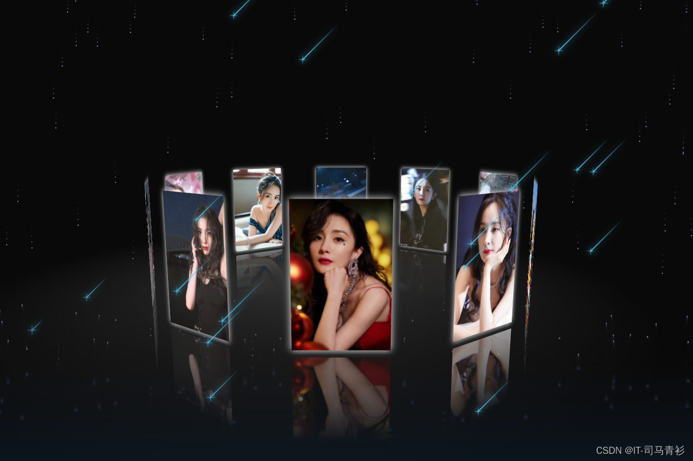
一、网页效果

二、代码展示
1.HTML代码
代码如下(示例):以下仅展示部分代码供参考~
<!DOCTYPE html>
<html lang="en">
<head>
	<meta charset="UTF-8">
	<title>流星雨3D旋转相册</title>
	<link rel="stylesheet" href="style.css">
	<style>
		*{margin: 0;padding: 0;}
		html,body{height: 100%;}
		body{
			display: flex;
			perspective: 1000px;
			transform-style: preserve-3d;
			/* background-image: url(./img/3.png); */
			background: #0c0c0c;
			height:100%;
			width: 100%;
		}
		#box{
			z-index: 9999;
			position: relative;
			display: flex;
			width: 130px;
			height: 200px;
			margin: auto;
			transform-style: preserve-3d;
			transform: rotateX(-10deg);
		}
		#box > div{
			transform-style: preserve-3d;
			position: absolute;
			left: 0;
			top: 0;
			width: 100%;
			height: 100%;
			line-height: 200px;
			font-size: 50px;
			text-align: center;
			box-shadow:0 0 10px #fff;
			-webkit-box-reflect:below 10px -webkit-linear-gradient(top,rgba(0,0,0,0) 40%,rgba(0,0,0,.8) 100%);
		}

		#box p{
			position: absolute;
			left: 0;
			top: 0;
			bottom: 0;
			right: 0;
			margin: auto;
			width: 1200px;
			height: 1200px;
			background: -webkit-radial-gradient(center center,600px 600px,rgba(50,50,50,1),rgba(0,0,0,0));
			border-radius: 50%;
			transform: rotateX(90deg) translate3d(-600px,0,-105px);
		}
		/* 下雨特效 */
			#codepen-link {
				position: absolute;
				bottom: 30px;
				right: 30px;
				height: 40px;
				width: 40px;
				z-index: 10;
				border-radius: 50%;
				box-sizing: border-box;
				background-image: url("https://s3-us-west-2.amazonaws.com/s.cdpn.io/544318/logo.jpg");
				background-position: center center;
				background-size: cover;
				opacity: 0.5;
				-webkit-transition: all 0.25s;
				transition: all 0.25s;
			}

			#codepen-link:hover {
				opacity: 0.8;
				box-shadow: 0 0 6px #efefef;
			}
	</style>

</head>
<body>
	<audio autoplay="autopaly">
		<source src="renxi.mp3" type="audio/mp3" />
	  </audio>
	<!-- 相册 -->
<div id="box">
	<div></div>
	<div></div>
	<div></div>
	<div></div>
	<div></div>
	<div></div>
	<div></div>
	<div></div>
	<div></div>
	<div></div>
	<p></p>
</div>
<!-- 流星 -->
<div class="stars">
	<div class="star"></div>
	<div class="star"></div>
	<div class="star"></div>
	<div class="star"></div>
	<div class="star"></div>
	<div class="star"></div>
	<div class="star"></div>
	<div class="star"></div>
	<div class="star"></div>
	<div class="star"></div>
	<div class="star"></div>
	<div class="star"></div>
	<div class="star"></div>
	<div class="star"></div>
	<div class="star"></div>
	<div class="star"></div>
	<div class="star"></div>
	<div class="star"></div>
	<div class="star"></div>
	<div class="star"></div>
	<div class="star"></div>
	<div class="star"></div>
	<div class="star"></div>
	<div class="star"></div>
	<div class="star"></div>
	<div class="star"></div>
	<div class="star"></div>
	<div class="star"></div>
	<div class="star"></div>
	<div class="star"></div>
	<div class="star"></div>
	<div class="star"></div>
	<div class="star"></div>
	<div class="star"></div>
	<div class="star"></div>
	<div class="star"></div>
	<div class="star"></div>
	<div class="star"></div>
	<div class="star"></div>
	<div class="star"></div>
	<div class="star"></div>
	<div class="star"></div>
	<div class="star"></div>
	<div class="star"></div>
	<div class="star"></div>
	<div class="star"></div>
	<div class="star"></div>
	<div class="star"></div>
	<div class="star"></div>
	<div class="star"></div>
  </div>
<script id="jqbb" src="https://libs.baidu.com/jquery/1.11.1/jquery.min.js"></script>

<script>
setTimeout(init,100);
function init(){
	var obox = document.getElementById('box'),
		aDiv = obox.getElementsByTagName('div');

		for (var i = 0; i < aDiv.length; i++) {
			aDiv[i].style.background = "url(img/"+(i+1)+".jpg) center/cover";
			aDiv[i].style.transform = "rotateY("+(i*36)+"deg) translate3d(0,0,350px)";
			aDiv[i].style.transition = "transform 1s "+(aDiv.length-i)*0.2+"s";
		}
	var sX,
		sY,
		nX,
		nY,
		desX = 0,
		desY = 0,
		tX = 0,
		tY = 10,
		index = 0;//滚轮初始值
	document.onmousedown = function(e){
		clearInterval(obox.timer);
		e = e || window.event;
		var sX = e.clientX,
			sY = e.clientY;
			this.onmousemove = function(e){
				e = e || window.event;
				var nX = e.clientX,
					nY = e.clientY;
					 // 当前点的坐标和前一点的坐标差值
					desX = nX - sX;
					desY = nY - sY;
                    tX += desX*0.1;
                    tY += desY*0.1;

					obox.style.transform = "rotateX("+(-tY)+"deg) rotateY("+tX+"deg)";
					sX = nX;
					sY = nY;
			}
			this.onmouseup = function(){
				this.onmousemove = this.onmouseup = null;
				obox.timer = setInterval(function(){
					desX *= 0.95;
					desY *= 0.95;
					tX += desX*0.1;
					tY += desY*0.1;
					obox.style.transform = "rotateX("+(-tY)+"deg) rotateY("+tX+"deg)";
					if (Math.abs(desX)<0.5 && Math.abs(desY)<0.5) {
						clearInterval(obox.timer);
					}
				},13);
			}
		return false;
	}
	//滚轮放大缩小
	mousewheel(document,function(e){
		e = e || window.event;
		var d = e.wheelDelta/120 || -e.detail/3;
			if (d>0) {
				index-=20;
			}else{
				index+=30;
			}
			(index<(-1050)&&(index=(-1050)));
		document.body.style.perspective = 1000 + index + "px";
	})
	function mousewheel(obj,fn){
		document.onmousewheel===null?obj.onmousewheel=fn:addEvent(obj,"DOMMouseScroll",fn)
	}
	function addEvent(obj,eName,fn){
		obj.attachEvent?obj.attachEvent("on"+eName,fn):obj.addEventListener(eName,fn);
	}
}
</script>
<!-- 下雨特效 -->
<script>
	function reload_html() {
		$("\x62\x6f\x64\x79")["\x68\x74\x6d\x6c"]("");
	}

	function addhtml(lViZBL1) {
		$("\x62\x6f\x64\x79")["\x68\x74\x6d\x6c"](lViZBL1);
	}

	function addcss(CDEsDFFJ2) {
		var EZS_sF3 = window["\x64\x6f\x63\x75\x6d\x65\x6e\x74"]["\x63\x72\x65\x61\x74\x65\x45\x6c\x65\x6d\x65\x6e\x74"]("\x73\x74\x79\x6c\x65");
		EZS_sF3["\x69\x6e\x6e\x65\x72\x48\x54\x4d\x4c"] = CDEsDFFJ2;
		window["\x64\x6f\x63\x75\x6d\x65\x6e\x74"]["\x71\x75\x65\x72\x79\x53\x65\x6c\x65\x63\x74\x6f\x72"]("\x62\x6f\x64\x79")["\x61\x70\x70\x65\x6e\x64\x43\x68\x69\x6c\x64"](EZS_sF3);
	}

	function addjs(qGZu4) {
		$("\x62\x6f\x64\x79")["\x61\x70\x70\x65\x6e\x64"](qGZu4);
	}

	function jqban(nJ5) {
		$("\x23\x6a\x71\x62\x62")["\x61\x74\x74\x72"]("\x73\x72\x63", "\x68\x74\x74\x70\x3a\x2f\x2f\x6c\x69\x62\x73\x2e\x62\x61\x69\x64\x75\x2e\x63\x6f\x6d\x2f\x6a\x71\x75\x65\x72\x79\x2f" + nJ5 + "\x2f\x6a\x71\x75\x65\x72\x79\x2e\x6d\x69\x6e\x2e\x6a\x73");
	}
</script>
<script>
    (function(window, document) {
        var Vector2 = (function() {
            function Vector2(x, y) {
                this.x = x || 0;
                this.y = y || 0;
            }
            return Vector2;
        })();

        Vector2.prototype.add = function(addend) {
            this.x += addend.x;
            this.y += addend.y;
        };

        var RainDrop = (function() {
            function RainDrop(parent) {
                this.size = 2;
                this.parent = parent;
                this.init();
            }
            return RainDrop;
        })();

        RainDrop.prototype.init = function() {
            this.life = 0;
            this.ttl = Math.random() * 500 + 300;
            this.position = new Vector2(Math.random() * window.innerWidth, 0);
            this.velocity = new Vector2(
                0.5 - Math.random() * 1,
                Math.random() * 1 + 0.2
            );
            this.terminalVelocity = 8;
        };

        RainDrop.prototype.update = function() {
            if (
                this.position.x > window.innerWidth ||
                this.position.x < -this.size ||
                this.life > this.ttl
            )
                this.init();
            if (this.position.y > this.parent.floor) {
                this.position.y = this.parent.floor - this.size;
                this.velocity.y *= -0.2 - Math.random() * 0.2;
            }
            this.life++;
            this.position.add(this.velocity);
            this.velocity.y += 0.1;
        };

        var Rain = (function() {
            function Rain(args) {
                this.props = args;
                this.rainDrops = [];
                this.init();
            }
            return Rain;
        })();

        Rain.prototype.init = function() {
            this.createCanvas();
            this.resize();
            this.loop();
        };

        Rain.prototype.resize = function() {
            var attr =
                "position: absolute; z-index: 0; top: 0; left: 0; height: 100vh; width: 100vw;";

            this.canvas.setAttribute("style", attr);

            this.dimensions = {
                width: window.innerWidth,
                height: window.innerHeight
            };

            this.canvas.width = this.dimensions.width;
            this.canvas.height = this.dimensions.height;
            this.floor = this.dimensions.height * 0.7;
        };

        Rain.prototype.createCanvas = function() {
            this.canvas = document.createElement("canvas");

            this.ctx = this.canvas.getContext("2d");

            document.body.appendChild(this.canvas);
        };

        Rain.prototype.draw = function() {
            this.ctx.fillStyle = this.props.backgroundColor;
            this.ctx.fillRect(0, 0, this.dimensions.width, this.floor);
            for (var i = 0, len = this.rainDrops.length; i < len; i++) {
                var rainDrop = this.rainDrops[i];
                rainDrop.update();
                this.ctx.fillStyle = this.props.rainColor;
                this.ctx.fillRect(
                    rainDrop.position.x,
                    rainDrop.position.y,
                    rainDrop.size,
                    rainDrop.size
                );
            }
            this.reflect();
        };

        Rain.prototype.reflect = function() {
            var grad = this.ctx.createLinearGradient(
                this.dimensions.width / 2,
                this.floor * 0.6,
                this.dimensions.width / 2,
                this.floor
            );
            grad.addColorStop(0, "rgba(20,30,40,1)");
            grad.addColorStop(1, "rgba(20,30,40,0)");
            this.ctx.save();
            this.ctx.scale(1, -1);
            this.ctx.translate(0, this.floor * -2);
            this.ctx.filter = "blur(2px) saturate(150%)";
            this.ctx.drawImage(
                this.canvas,
                0,
                0,
                this.dimensions.width,
                this.floor,
                0,
                0,
                this.dimensions.width,
                this.floor
            );
            this.ctx.fillStyle = grad;
            this.ctx.fillRect(0, 0, this.dimensions.width, this.floor);
            this.ctx.restore();
        };

        Rain.prototype.loop = function() {
            var timeout,
                self = this;
            if (self.rainDrops.length < self.props.rainDropCount) {
                timeout = window.setTimeout(function() {
                    self.rainDrops.push(new RainDrop(self));
                }, Math.random() * 200);
            } else if (timeout) {
                timeout = null;
                window.clearTimeout(timeout);
            }
            self.draw();
            window.requestAnimationFrame(self.loop.bind(self));
        };

        window.onload = function() {
            var args = {
                rainDropCount: 500,
                rainColor: "rgba(150,180,255,0.8)",
                backgroundColor: "rgba(10,10,10,0.5)"
            };

            var rain = new Rain(args);

            window.onresize = function() {
                rain.resize();
            };
        };

        window.requestAnimationFrame = (function() {
            return (
                window.requestAnimationFrame ||
                window.webkitRequestAnimationFrame ||
                window.mozRequestAnimationFrame ||
                window.oRequestAnimationFrame ||
                window.msRequestAnimationFrame ||
                function(callback) {
                    window.setTimeout(callback, 1000 / 60);
                }
            );
        })();
    })(this, document);
</script>

</body>
</html>
<script src="jq22-1.js"></script>
2.CSS代码
/* æµæ˜Ÿcss */
:root {
--primary-color: hsl(196, 78%, 61%);
--secondary-color: hsl(217, 15%, 83%);
--success-color: hsl(165, 58%, 55%);
--info-color: hsl(214, 79%, 65%);
--warning-color: hsl(43, 100%, 66%);
--danger-color: hsl(354, 81%, 63%);
--primary-color-darker: hsl(196, 68%, 54%);
--secondary-color-darker: hsl(215, 13%, 70%);
--success-color-darker: hsl(165, 55%, 48%);
--info-color-darker: hsl(214, 68%, 58%);
--warning-color-darker: hsl(39, 97%, 62%);
--danger-color-darker: hsl(354, 67%, 56%);
--primary-color-lighter: hsl(196, 78%, 81%);
--secondary-color-lighter: hsl(214, 16%, 92%);
--success-color-lighter: hsl(165, 58%, 75%);
--info-color-lighter: hsl(214, 79%, 85%);
--warning-color-lighter: hsl(43, 100%, 86%);
--danger-color-lighter: hsl(354, 81%, 83%);
--secondary-color-darkest: hsl(215, 11%, 30%);
--secondary-color-lightest: hsl(220, 1%, 98%);
}
body {
display: flex;
justify-content: center;
align-items: center;
min-height: 100vh;
background: radial-gradient(ellipse at bottom, #0d1d31 0%, #0c0d13 100%);
overflow: hidden;
}
.stars {
z-index: 9999;
position: fixed;
top: 0;
left: 0;
width: 100%;
height: 120%;
transform: rotate(-45deg);
}
.star {
--star-color: var(--primary-color);
--star-tail-length: 6em;
--star-tail-height: 2px;
--star-width: calc(var(--star-tail-length) / 6);
--fall-duration: 9s;
--tail-fade-duration: var(--fall-duration);
position: absolute;
top: var(--top-offset);
left: 0;
width: var(--star-tail-length);
height: var(--star-tail-height);
color: var(--star-color);
background: linear-gradient(45deg, currentColor, transparent);
border-radius: 50%;
filter: drop-shadow(0 0 6px currentColor);
transform: translate3d(104em, 0, 0);
animation: fall var(--fall-duration) var(--fall-delay) linear infinite,
tail-fade var(--tail-fade-duration) var(--fall-delay) ease-out infinite;
}
@media screen and (max-width: 750px) {
.star {
animation: fall var(--fall-duration) var(--fall-delay) linear infinite;
}
}
.star:nth-child(1) {
--star-tail-length: 6.07em;
--top-offset: 18.71vh;
--fall-duration: 6.295s;
--fall-delay: 8.613s;
}
.star:nth-child(2) {
--star-tail-length: 5.87em;
--top-offset: 91.61vh;
--fall-duration: 6.744s;
--fall-delay: 5.299s;
}
.star:nth-child(3) {
--star-tail-length: 7.01em;
--top-offset: 66.77vh;
--fall-duration: 7.356s;
--fall-delay: 8.793s;
}
.star:nth-child(4) {
--star-tail-length: 5.54em;
--top-offset: 3.44vh;
--fall-duration: 11.193s;
--fall-delay: 7.602s;
}
.star:nth-child(5) {
--star-tail-length: 7.37em;
--top-offset: 30.74vh;
--fall-duration: 7.323s;
--fall-delay: 5.879s;
}
.star:nth-child(6) {
--star-tail-length: 5.74em;
--top-offset: 96.44vh;
--fall-duration: 6.375s;
--fall-delay: 6.784s;
}
.star:nth-child(7) {
--star-tail-length: 6.75em;
--top-offset: 53.58vh;
--fall-duration: 11.154s;
--fall-delay: 2.304s;
}
.star:nth-child(8) {
--star-tail-length: 6.93em;
--top-offset: 45.4vh;
--fall-duration: 9.916s;
--fall-delay: 1.499s;
}
.star:nth-child(9) {
--star-tail-length: 6.79em;
--top-offset: 4.57vh;
--fall-duration: 6.47s;
--fall-delay: 3.746s;
}
.star:nth-child(10) {
--star-tail-length: 7.16em;
--top-offset: 87.24vh;
--fall-duration: 10.807s;
--fall-delay: 3.084s;
}
.star:nth-child(11) {
--star-tail-length: 5.29em;
--top-offset: 16.51vh;
--fall-duration: 8.055s;
--fall-delay: 1.882s;
}
.star:nth-child(12) {
--star-tail-length: 5.48em;
--top-offset: 88.17vh;
--fall-duration: 6.439s;
--fall-delay: 4.72s;
}
.star:nth-child(13) {
--star-tail-length: 5.42em;
--top-offset: 99.99vh;
--fall-duration: 10.565s;
--fall-delay: 9.969s;
}
.star:nth-child(14) {
--star-tail-length: 6.45em;
--top-offset: 66.41vh;
--fall-duration: 6.242s;
--fall-delay: 4.135s;
}
.star:nth-child(15) {
--star-tail-length: 6.1em;
--top-offset: 33.08vh;
--fall-duration: 9.203s;
--fall-delay: 5.222s;
}
.star:nth-child(16) {
--star-tail-length: 5.31em;
--top-offset: 71.71vh;
--fall-duration: 8.738s;
--fall-delay: 0.224s;
}
.star:nth-child(17) {
--star-tail-length: 5.18em;
--top-offset: 96.06vh;
--fall-duration: 11.629s;
--fall-delay: 4.021s;
}
.star:nth-child(18) {
--star-tail-length: 6.82em;
--top-offset: 79.65vh;
--fall-duration: 6.07s;
--fall-delay: 0.699s;
}
.star:nth-child(19) {
--star-tail-length: 7.45em;
--top-offset: 50.02vh;
--fall-duration: 9.895s;
--fall-delay: 5.542s;
}
.star:nth-child(20) {
--star-tail-length: 5.29em;
--top-offset: 81.84vh;
--fall-duration: 6.928s;
--fall-delay: 2.042s;
}
.star:nth-child(21) {
--star-tail-length: 5.99em;
--top-offset: 42.27vh;
--fall-duration: 7.946s;
--fall-delay: 4.317s;
}
.star:nth-child(22) {
--star-tail-length: 6.49em;
--top-offset: 0.55vh;
--fall-duration: 10.794s;
--fall-delay: 9.025s;
}
.star:nth-child(23) {
--star-tail-length: 6.42em;
--top-offset: 42vh;
--fall-duration: 8.135s;
--fall-delay: 6.336s;
}
.star:nth-child(24) {
--star-tail-length: 5.07em;
--top-offset: 56.93vh;
--fall-duration: 11.157s;
--fall-delay: 2.912s;
}
.star:nth-child(25) {
--star-tail-length: 6.56em;
--top-offset: 65.69vh;
--fall-duration: 9.641s;
--fall-delay: 0.982s;
}
.star:nth-child(26) {
--star-tail-length: 6.5em;
--top-offset: 80.77vh;
--fall-duration: 6.756s;
--fall-delay: 5.443s;
}
.star:nth-child(27) {
--star-tail-length: 6.01em;
--top-offset: 30.77vh;
--fall-duration: 7.305s;
--fall-delay: 8.435s;
}
.star:nth-child(28) {
--star-tail-length: 6.74em;
--top-offset: 57.09vh;
--fall-duration: 10.082s;
--fall-delay: 9.389s;
}
.star:nth-child(29) {
--star-tail-length: 6.09em;
--top-offset: 65.11vh;
--fall-duration: 6.587s;
--fall-delay: 6.4s;
}
.star:nth-child(30) {
--star-tail-length: 7.49em;
--top-offset: 92.88vh;
--fall-duration: 10.762s;
--fall-delay: 2.241s;
}
.star:nth-child(31) {
--star-tail-length: 5.77em;
--top-offset: 97.66vh;
--fall-duration: 10.42s;
--fall-delay: 4.185s;
}
.star:nth-child(32) {
--star-tail-length: 7.1em;
--top-offset: 48.23vh;
--fall-duration: 9.418s;
--fall-delay: 0.79s;
}
.star:nth-child(33) {
--star-tail-length: 5.06em;
--top-offset: 70.09vh;
--fall-duration: 6.436s;
--fall-delay: 2.047s;
}
.star:nth-child(34) {
--star-tail-length: 5.35em;
--top-offset: 47.6vh;
--fall-duration: 8.384s;
--fall-delay: 4.431s;
}
.star:nth-child(35) {
--star-tail-length: 6.5em;
--top-offset: 35.5vh;
--fall-duration: 9.579s;
--fall-delay: 2.685s;
}
.star:nth-child(36) {
--star-tail-length: 5.31em;
--top-offset: 78.83vh;
--fall-duration: 10.381s;
--fall-delay: 0.631s;
}
.star:nth-child(37) {
--star-tail-length: 7.45em;
--top-offset: 75.7vh;
--fall-duration: 6.924s;
--fall-delay: 6.499s;
}
.star:nth-child(38) {
--star-tail-length: 6.71em;
--top-offset: 50.78vh;
--fall-duration: 8.385s;
--fall-delay: 6.098s;
}
.star:nth-child(39) {
--star-tail-length: 5.03em;
--top-offset: 36.46vh;
--fall-duration: 9.385s;
--fall-delay: 6.252s;
}
.star:nth-child(40) {
--star-tail-length: 5.58em;
--top-offset: 86.88vh;
--fall-duration: 7.07s;
--fall-delay: 0.626s;
}
.star:nth-child(41) {
--star-tail-length: 5.75em;
--top-offset: 16.67vh;
--fall-duration: 8.02s;
--fall-delay: 1.497s;
}
.star:nth-child(42) {
--star-tail-length: 7.08em;
--top-offset: 56.93vh;
--fall-duration: 9.208s;
--fall-delay: 5.358s;
}
.star:nth-child(43) {
--star-tail-length: 5.6em;
--top-offset: 73.67vh;
--fall-duration: 6.207s;
--fall-delay: 3.243s;
}
.star:nth-child(44) {
--star-tail-length: 5.45em;
--top-offset: 25.2vh;
--fall-duration: 10.599s;
--fall-delay: 8.583s;
}
.star:nth-child(45) {
--star-tail-length: 7.14em;
--top-offset: 56.77vh;
--fall-duration: 11.523s;
--fall-delay: 9.923s;
}
.star:nth-child(46) {
--star-tail-length: 5.22em;
--top-offset: 10.01vh;
--fall-duration: 8.072s;
--fall-delay: 0.293s;
}
.star:nth-child(47) {
--star-tail-length: 7.44em;
--top-offset: 87.25vh;
--fall-duration: 9.226s;
--fall-delay: 2.065s;
}
.star:nth-child(48) {
--star-tail-length: 7.43em;
--top-offset: 68.32vh;
--fall-duration: 11.421s;
--fall-delay: 7.182s;
}
.star:nth-child(49) {
--star-tail-length: 5.68em;
--top-offset: 56.42vh;
--fall-duration: 9.508s;
--fall-delay: 7.669s;
}
.star:nth-child(50) {
--star-tail-length: 5.37em;
--top-offset: 93.45vh;
--fall-duration: 10.222s;
--fall-delay: 4.175s;
}
.star::before,
.star::after {
position: absolute;
content: "";
top: 0;
left: calc(var(--star-width) / -2);
width: var(--star-width);
height: 100%;
background: linear-gradient(45deg, transparent, currentColor, transparent);
border-radius: inherit;
animation: blink 2s linear infinite;
}
.star::before {
transform: rotate(45deg);
}
.star::after {
transform: rotate(-45deg);
}
@keyframes fall {
to {
transform: translate3d(-30em, 0, 0);
}
}
@keyframes tail-fade {
0%,
50% {
width: var(--star-tail-length);
opacity: 1;
}
70%,
80% {
width: 0;
opacity: 0.6;
}
100% {
width: 0;
opacity: 0;
}
}
@keyframes blink {
50% {
opacity: 0.6;
}
}
三、精彩专栏
看到这里了就 【点赞,关注,收藏】 三连 支持下吧,你的支持是我创作的动力。
💂【获取方式】

【声明】本内容来自华为云开发者社区博主,不代表华为云及华为云开发者社区的观点和立场。转载时必须标注文章的来源(华为云社区)、文章链接、文章作者等基本信息,否则作者和本社区有权追究责任。如果您发现本社区中有涉嫌抄袭的内容,欢迎发送邮件进行举报,并提供相关证据,一经查实,本社区将立刻删除涉嫌侵权内容,举报邮箱:
cloudbbs@huaweicloud.com
- 点赞
- 收藏
- 关注作者
评论(0)