开源一夏|ArkUI如何自定义弹窗(eTS)

【摘要】 自定义弹窗其实也是比较简单的,通过CustomDialogController类就可以显示自定义弹窗。接下来我们通过代码来看一下大家也都用过@Entry,@Component等弹窗的话,只要用@CustomDialog就可以先来预览一下我实现的效果:import CustomDialogExample from './customdialog'@Entry@Componentstruct ...
自定义弹窗其实也是比较简单的,通过CustomDialogController类就可以显示自定义弹窗。
接下来我们通过代码来看一下
大家也都用过@Entry,@Component等弹窗的话,只要用@CustomDialog就可以
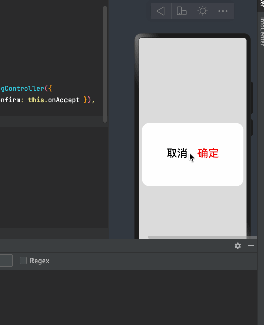
先来预览一下我实现的效果:
import CustomDialogExample from './customdialog'
@Entry
@Component
struct Index {
// 方式一:使用箭头函数
onAccept = () => {
console.info('确定')
this.dialogController.close();
}
dialogController: CustomDialogController = new CustomDialogController({
builder: CustomDialogExample({ cancel: this.onCancel, confirm: this.onAccept }),
alignment: DialogAlignment.Center,
cancel: () => {
console.log("cancel") // 点击蒙层的回调
},
autoCancel: true, // 允许点击蒙层关闭弹窗
customStyle: false // 使用自定义样式
})
onCancel() {
console.info('取消')
}
build() {
Column({}) {
Button(' 自定义弹窗')
.onClick(() => {
//打开弹窗
this.dialogController.open();
})
}.width("100%").height("100%").alignItems(HorizontalAlign.Center).justifyContent(FlexAlign.Center)
}
}/*
* Copyright (c) 2021 JianGuo Device Co., Ltd.
* Licensed under the Apache License, Version 2.0 (the "License");
* you may not use this file except in compliance with the License.
* You may obtain a copy of the License at
*
* http://www.apache.org/licenses/LICENSE-2.0
*
* Unless required by applicable law or agreed to in writing, software
* distributed under the License is distributed on an "AS IS" BASIS,
* WITHOUT WARRANTIES OR CONDITIONS OF ANY KIND, either express or implied.
* See the License for the specific language governing permissions and
* limitations under the License.
*/
//通过CustomDialogController类显示自定义弹窗。
@CustomDialog
struct CustomDialogExample {
controller: CustomDialogController
cancel: () => void
confirm: () => void
build() {
Flex({ justifyContent: FlexAlign.Center ,alignItems:ItemAlign.Center,alignContent:FlexAlign.Center}) {
Button('取消').fontSize(36)
.onClick(() => {
//方式二:关闭弹窗
this.controller.close()
this.cancel()
}).backgroundColor(0xffffff).fontColor(Color.Black)
Button('确定').fontSize(36)
.onClick(() => {
// this.controller.close()
this.confirm()
}).backgroundColor(0xffffff).fontColor(Color.Red)
}.margin({ bottom: 10 }).width("100%").height(200)
}
}
export default CustomDialogExample上面就是一个简单的自定义弹窗
接下来看一下它的有关属性
CustomDialogController 定义了 open() 和 close() 方法,它们说明如下:
-
open:打开对话框,如果对话框已经打开,则再次打开无效。
-
close:关闭对话框,如果对话框已经关闭,则再次关闭无效。
-
value:创建控制器需要的配置参数,
CustomDialogControllerOptions说明如下:
-
builder:创建自定义弹窗的构造器。
-
cancel:点击蒙层的事件回调。
-
autoCancel:是否允许点击遮障层退出。
-
alignment:弹窗在竖直方向上的对齐方式。
-
offset:弹窗相对
alignment所在位置的偏移量。 -
customStyle:弹窗容器样式是否自定义。
-
源码
declare interface CustomDialogControllerOptions {
/**
* Custom builder function.
* @since 7
*/
builder: any;
/**
* Defines the cancel function.
* @since 7
*/
cancel?: () => void;
/**
* Defines if use auto cancel when click on the outside of the dialog.
* @since 7
*/
autoCancel?: boolean;
/**
* Defines the dialog alignment of the screen.
* @since 7
*/
alignment?: DialogAlignment;
/**
* Defines the dialog offset.
* @since 7
*/
offset?: Offset;
/**
* Defines if use costom style.
* @since 7
*/
customStyle?: boolean;
/**
* Grid count of dialog.
* @since 8
*/
gridCount?: number;
}DialogAlignment的位置
| 名称 | 描述 |
|---|---|
| Top | 垂直顶部对齐。 |
| Center | 垂直居中对齐。 |
| Bottom | 垂直底部对齐。 |
| Default | 默认对齐。 |
| TopStart8+ | 左上对齐。 |
| TopEnd8+ | 右上对齐。 |
| CenterStart8+ | 左中对齐。 |
| CenterEnd8+ | 右中对齐。 |
| BottomStart8+ | 左下对齐。 |
| BottomEnd8+ | 右下对齐。 |
参考文档

【声明】本内容来自华为云开发者社区博主,不代表华为云及华为云开发者社区的观点和立场。转载时必须标注文章的来源(华为云社区)、文章链接、文章作者等基本信息,否则作者和本社区有权追究责任。如果您发现本社区中有涉嫌抄袭的内容,欢迎发送邮件进行举报,并提供相关证据,一经查实,本社区将立刻删除涉嫌侵权内容,举报邮箱:
cloudbbs@huaweicloud.com
- 点赞
- 收藏
- 关注作者
评论(0)