前端实现流星雨特效

【摘要】
目录
前言
效果图:
HTML
CSS
完整代码
前言
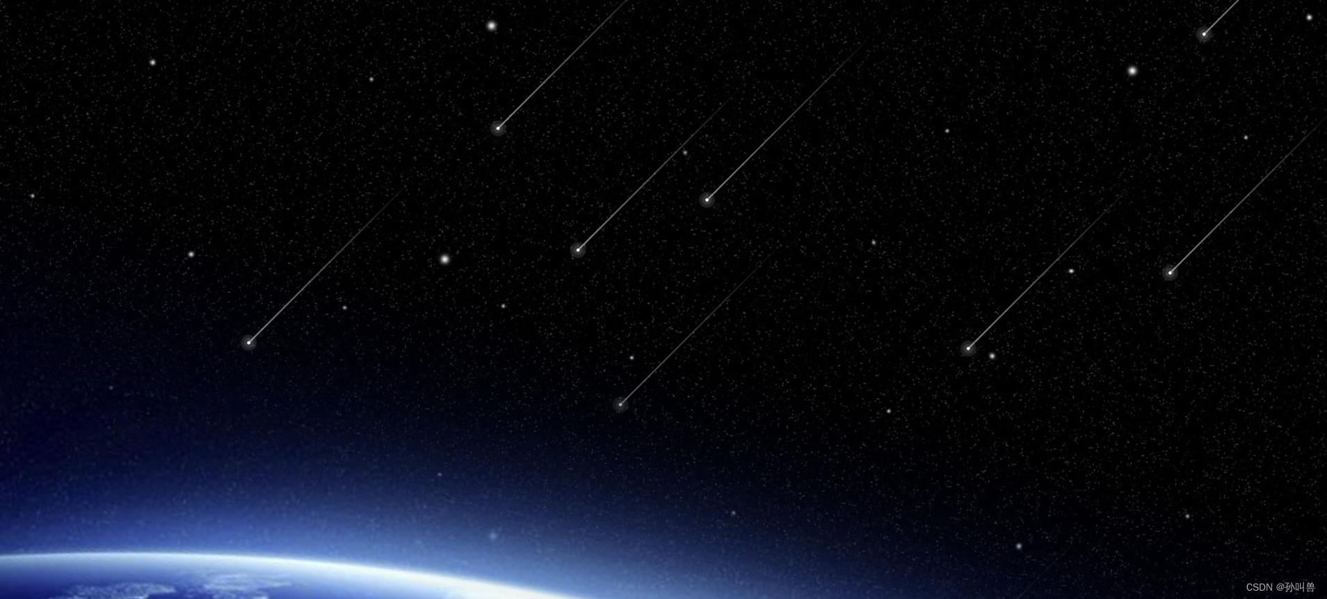
使用html+css实现简单得浏览器特效,在编译器用导入项目,直接在浏览器打开即可,效果十分得炫酷,十分得哇塞,女朋友直呼NB!
效果图:
HTML
<!DOCTYPE html><html lang="en"><...
目录
前言
使用html+css实现简单得浏览器特效,在编译器用导入项目,直接在浏览器打开即可,效果十分得炫酷,十分得哇塞,女朋友直呼NB!
效果图:
HTML
-
<!DOCTYPE html>
-
<html lang="en">
-
<head>
-
<meta charset="UTF-8">
-
<meta http-equiv="X-UA-Compatible" content="IE=edge">
-
<meta name="viewport" content="width=device-width, initial-scale=1.0">
-
<title>CSS Shooting Stars Animation</title>
-
<link rel="stylesheet" type="text/css" href="style.css">
-
</head>
-
<body>
-
<section>
-
<span></span>
-
<span></span>
-
<span></span>
-
<span></span>
-
<span></span>
-
<span></span>
-
<span></span>
-
<span></span>
-
<span></span>
-
<span></span>
-
<span></span>
-
<span></span>
-
</section>
-
</body>
-
</html>

CSS
-
*
-
{
-
margin: 0;
-
padding: 0;
-
box-sizing: border-box;
-
}
-
body
-
{
-
overflow: hidden;
-
}
-
section
-
{
-
position: absolute;
-
top: 0;
-
left: 0;
-
width: 100%;
-
height: 100vh;
-
background: url(bg.jpg);
-
background-position-x: center;
-
background-size: cover;
-
animation: animateBg 50s linear infinite;
-
}
-
@keyframes animateBg
-
{
-
0%,100%
-
{
-
transform: scale(1);
-
}
-
50%
-
{
-
transform: scale(1.2);
-
}
-
}
-
span
-
{
-
position: absolute;
-
top: 50%;
-
left: 50%;
-
width :4px;
-
height: 4px;
-
background: #fff;
-
border-radius: 50px;
-
box-shadow: 0 0 0 4px rgba(255,255,255,0.1),
-
0 0 0 8px rgba(255,255,255,0.1),
-
0 0 20px rgba(255,255,255,1);
-
animation: animate 3s linear infinite;
-
}
-
span::before
-
{
-
content: "";
-
position: absolute;
-
top: 50%;
-
transform: translateY(-50%);
-
width: 300px;
-
height: 1px;
-
background: linear-gradient(90deg,#fff,transparent);
-
}
-
@keyframes animate
-
{
-
0%
-
{
-
transform: rotate(315deg) translateX(0);
-
opacity: 1;
-
}
-
70%
-
{
-
opacity: 1;
-
}
-
100%
-
{
-
transform: rotate(315deg) translateX(-1000px);
-
opacity: 0;
-
}
-
}
-
span:nth-child(1)
-
{
-
top: 0;
-
right: 0;
-
animation-delay: 0;
-
animation-duration: 1s;
-
}
-
span:nth-child(2)
-
{
-
top: 0;
-
right: 80px;
-
left: initial;
-
animation-delay: 0.2s;
-
animation-duration: 3s;
-
}
-
span:nth-child(3)
-
{
-
top: 80px;
-
right: 0;
-
left: initial;
-
animation-delay: 0.4s;
-
animation-duration: 2s;
-
}
-
span:nth-child(4)
-
{
-
top: 0;
-
right: 180px;
-
left: initial;
-
animation-delay: 0.6s;
-
animation-duration: 1.5s;
-
}
-
span:nth-child(5)
-
{
-
top: 0;
-
right: 400px;
-
left: initial;
-
animation-delay: 0.8s;
-
animation-duration: 2.5s;
-
}
-
span:nth-child(6)
-
{
-
top: 0;
-
right: 600px;
-
left: initial;
-
animation-delay: 1s;
-
animation-duration: 3s;
-
}
-
span:nth-child(7)
-
{
-
top: 300px;
-
right: 0;
-
left: initial;
-
animation-delay: 1.2s;
-
animation-duration: 1.75s;
-
}
-
span:nth-child(8)
-
{
-
top: 0;
-
right: 700px;
-
left: initial;
-
animation-delay: 1.4s;
-
animation-duration: 1.25s;
-
}
-
span:nth-child(9)
-
{
-
top: 0;
-
right: 1000px;
-
left: initial;
-
animation-delay: 0.75s;
-
animation-duration: 2.25s;
-
}
-
span:nth-child(10)
-
{
-
top: 0;
-
right: 450px;
-
left: initial;
-
animation-delay: 2.75s;
-
animation-duration: 2.25s;
-
}
完整代码
小伙伴们赶紧下载体验吧!
文章来源: sunmenglei.blog.csdn.net,作者:孙叫兽,版权归原作者所有,如需转载,请联系作者。
原文链接:sunmenglei.blog.csdn.net/article/details/125881208

【版权声明】本文为华为云社区用户转载文章,如果您发现本社区中有涉嫌抄袭的内容,欢迎发送邮件进行举报,并提供相关证据,一经查实,本社区将立刻删除涉嫌侵权内容,举报邮箱:
cloudbbs@huaweicloud.com
- 点赞
- 收藏
- 关注作者
评论(0)