Flutter 从零开始 007 输入框

Material 组件库中提供了输入框组件TextField和表单组件Form。下面我们分别介绍一下。
1、TextField
TextField 用于文本输入,它提供了很多属性,我们先简单的介绍一下主要属性,然后通过几个实例来演示一下关键的属性
  const TextField({
    Key? key,
    this.controller,
    this.focusNode,
    this.decoration = const InputDecoration(),
    TextInputType? keyboardType,
    this.textInputAction,
    this.textCapitalization = TextCapitalization.none,
    this.style,
    this.strutStyle,
    this.textAlign = TextAlign.start,
    this.textAlignVertical,
    this.textDirection,
    this.readOnly = false,
    ToolbarOptions? toolbarOptions,
    this.showCursor,
    this.autofocus = false,
    this.obscuringCharacter = '•',
    this.obscureText = false,
    this.autocorrect = true,
    SmartDashesType? smartDashesType,
    SmartQuotesType? smartQuotesType,
    this.enableSuggestions = true,
    this.maxLines = 1,
    this.minLines,
    this.expands = false,
    this.maxLength,
    @Deprecated(
      'Use maxLengthEnforcement parameter which provides more specific '
      'behavior related to the maxLength limit. '
      'This feature was deprecated after v1.25.0-5.0.pre.',
    )
    this.maxLengthEnforced = true,
    this.maxLengthEnforcement,
    this.onChanged,
    this.onEditingComplete,
    this.onSubmitted,
    this.onAppPrivateCommand,
    this.inputFormatters,
    this.enabled,
    this.cursorWidth = 2.0,
    this.cursorHeight,
    this.cursorRadius,
    this.cursorColor,
    this.selectionHeightStyle = ui.BoxHeightStyle.tight,
    this.selectionWidthStyle = ui.BoxWidthStyle.tight,
    this.keyboardAppearance,
    this.scrollPadding = const EdgeInsets.all(20.0),
    this.dragStartBehavior = DragStartBehavior.start,
    this.enableInteractiveSelection = true,
    this.selectionControls,
    this.onTap,
    this.mouseCursor,
    this.buildCounter,
    this.scrollController,
    this.scrollPhysics,
    this.autofillHints = const <String>[],
    this.clipBehavior = Clip.hardEdge,
    this.restorationId,
    this.enableIMEPersonalizedLearning = true,
  })
controller:编辑框的控制器,通过它可以设置/获取编辑框的内容、选择编辑内容、监听编辑文本改变事件。大多数情况下我们都需要显式提供一个controller来与文本框交互。如果没有提供controller,则TextField内部会自动创建一个。
focusNode:用于控制TextField是否占有当前键盘的输入焦点。它是我们和键盘交互的一个句柄(handle)。
InputDecoration:用于控制TextField的外观显示,如提示文本、背景颜色、边框等。
keyboardType:用于设置该输入框默认的键盘输入类型,取值如下:
| TextInputType枚举值 | 含义 |
|---|---|
| text | 文本输入键盘 |
| multiline | 多行文本,需和maxLines配合使用(设为null或大于1) |
| number | 数字;会弹出数字键盘 |
| phone | 优化后的电话号码输入键盘;会弹出数字键盘并显示“* #” |
| datetime | 优化后的日期输入键盘;Android上会显示“: -” |
| emailAddress | 优化后的电子邮件地址;会显示“@ .” |
| url | 优化后的url输入键盘; 会显示“/ .” |
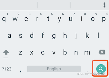
textInputAction:键盘动作按钮图标(即回车键位图标),它是一个枚举值,有多个可选值,全部的取值列表读者可以查看API文档,下面是当值为TextInputAction.search时,原生Android系统下键盘样式如图
style:正在编辑的文本样式。
textAlign: 输入框内编辑文本在水平方向的对齐方式。
autofocus: 是否自动获取焦点。
obscureText:是否隐藏正在编辑的文本,如用于输入密码的场景等,文本内容会用“•”替换。
maxLines:输入框的最大行数,默认为1;如果为null,则无行数限制。
maxLength和maxLengthEnforcement :maxLength代表输入框文本的最大长度,设置后输入框右下角会显示输入的文本计数。maxLengthEnforcement决定当输入文本长度超过maxLength时如何处理,如截断、超出等。
toolbarOptions:长按或鼠标右击时出现的菜单,包括 copy、cut、paste 以及 selectAll。
onChange:输入框内容改变时的回调函数;注:内容改变事件也可以通过controller来监听。
onEditingComplete和onSubmitted:这两个回调都是在输入框输入完成时触发,比如按了键盘的完成键(对号图标)或搜索键(🔍图标)。不同的是两个回调签名不同,onSubmitted回调是ValueChanged<String>类型,它接收当前输入内容做为参数,而onEditingComplete不接收参数。
inputFormatters:用于指定输入格式;当用户输入内容改变时,会根据指定的格式来校验。
enable:如果为false,则输入框会被禁用,禁用状态不接收输入和事件,同时显示禁用态样式(在其decoration中定义)。
cursorWidth、cursorRadius和cursorColor:这三个属性是用于自定义输入框光标宽度、圆角和颜色的。
示例:登录输入框
            TextField(
              autofocus: true,
              decoration: InputDecoration(
                labelText: "用户名",
                hintText: "用户账号",
                prefixIcon: Icon(Icons.person),
              ),
            ),

            TextField(
              decoration: InputDecoration(
                labelText: "密码",
                hintText: "登录密码",
                prefixIcon: Icon(Icons.lock),
              ),
              obscureText: true,
            ),
运行结果

获取输入内容
获取输入的内容有两种方法:
- 定义两个变量,用于保存用户名和密码,然后在onChange触发时,各自保存一下输入内容
- 通过controller 直接获取
第一种方法比较简单,我们介绍一下第二种方法
定义一个controller
  TextEditingController userController =
      TextEditingController(); //   用户名的controller
然后设置输入框controller:
            TextField(
              autofocus: true,
              controller: userController, //  设置controller
              decoration: InputDecoration(
                labelText: "用户名",
                hintText: "用户账号",
                prefixIcon: Icon(Icons.person),
              ),
            ),
通过点击事件,将获取的到值展示在按钮上面
            TextButton(
              onPressed: () {
                setState(() {
                  userLabel = userController.text;
                });
              },
              child: Text(userLabel),
            ),
监听文本变化
监听文本变化也有两种
1、设置onChange 回调,如:
            TextField(
              autofocus: true,
              onChanged: (value){
                print(value);
              },
            ),
2、通过controller 监听,如:
  @override
  void initState() {
    // TODO: implement initState
    super.initState();

    userController.addListener(() {
      print(userController.text);
    });
  }
onChange 是专门用于监听文本变化的,而controller 却还可以设置默认值、选择文本。
设置默认值,并从第三个字符开始选中后面的字符
    userController.text = "我是张三啊";
    userController.selection =
        TextSelection(baseOffset: 2, extentOffset: userController.text.length);
运行如下

控制焦点
焦点可以通过FocusNode和FocusScopeNode来控制,默认情况下,焦点由FocusScope来管理,它代表焦点控制范围,可以在这个范围内可以通过FocusScopeNode在输入框之间移动焦点、设置默认焦点等。我们可以通过FocusScope.of(context) 来获取Widget树中默认的FocusScopeNode。下面看一个示例,在此示例中创建两个TextField,第一个自动获取焦点,然后创建两个按钮:
点击第一个按钮可以将焦点从第一个TextField挪到第二个TextField。
点击第二个按钮可以关闭键盘。
我们要实现的效果如图:

代码如下
class _MyHomePageState extends State<MyHomePage> {
  FocusNode focusNode1 = FocusNode();
  FocusNode focusNode2 = FocusNode();
  FocusScopeNode? focusScopeNode;

  @override
  Widget build(BuildContext context) {
    return Scaffold(
        appBar: AppBar(
          title: Text(widget.title),
        ),
        body: Column(
          mainAxisAlignment: MainAxisAlignment.start,
          crossAxisAlignment: CrossAxisAlignment.center,
          children: [
            TextField(
              focusNode: focusNode1,
              decoration: InputDecoration(labelText: "第一个input"),
            ),
            SizedBox(
              height: 30,
            ),
            TextField(
              focusNode: focusNode2,
              decoration: InputDecoration(labelText: "第二个input"),
            ),
            SizedBox(
              height: 30,
            ),
            ElevatedButton(
              onPressed: () {
                FocusScope.of(context).requestFocus(focusNode2);
              },
              child: Text("移动焦点"),
            ),
            SizedBox(
              height: 30,
            ),
            ElevatedButton(
              onPressed: () {
                setState(() {
                  focusNode1.unfocus();
                  focusNode2.unfocus();
                });
              },
              child: Text("收回键盘"),
            ),
          ],
        ));
  }
}
FocusNode和FocusScopeNode还有一些其它的方法,详情可以查看API文档。
我们还可以监听焦点的变化
// 监听焦点变化
focusNode.addListener((){
   print(focusNode.hasFocus);
});
自动义样式
在开发过程中,我们经常需要自定义自己需要的文本输入框样式,下面我们一起来简单的了解一下
            Container(
              child: TextField(
                keyboardType: TextInputType.emailAddress,
                decoration: InputDecoration(
                  labelText: "Email",
                  hintText: "电子邮箱",
                  prefixIcon: Icon(Icons.email),
                  border: InputBorder.none,     //隐藏下划线
                ),
              ),
              decoration: BoxDecoration(
              //  自定义下滑线
                border: Border(
                  bottom: BorderSide(
                    color: Colors.red,
                    width: 1,
                  )
                )
              ),
            ),
运行结果如下

下一节我们学习一下 表单

- 点赞
- 收藏
- 关注作者
评论(0)