echarts配置项详细解释

【摘要】
echarts x轴的所有配置项基本都在这了(y轴同理)
axisLine:坐标轴轴线相关设置。
axisTick:坐标轴刻度相关设置。
axisLabel:坐标轴刻度标签的相关设置。
split...
echarts x轴的所有配置项基本都在这了(y轴同理)
axisLine:坐标轴轴线相关设置。
axisTick:坐标轴刻度相关设置。
axisLabel:坐标轴刻度标签的相关设置。
splitLine: 坐标轴在 grid 区域中的分隔线设置。
splitArea :坐标轴在 grid 区域中的分隔区域,默认不显示。
xAxis: {
    show: true,    // 是否显示x轴
    position: 'top',    // x轴的位置(top/bottom)
    type: 'category',    // 坐标轴类型,值category/value,与y轴呼应,若x轴配置category则y轴配置value
    nameRotate: 10,    // 坐标轴名字旋转,角度值
    inverse: false,    // 是否是反向坐标轴
    boundaryGap: ['20%', '20%'],    // 坐标轴两边留白策略,也可以使用布尔值,true居中
    splitNumber: 5,    // 坐标轴的分割段数(预估值)
    axisLine: {
        show: true,    // 是否显示坐标轴轴线
        symbol: ['none', 'arrow'],     // 轴线两端箭头,两个值,none表示没有箭头,arrow表示有箭头
        symbolSize: [10, 15],     // 轴线两端箭头大小,数值一表示宽度,数值二表示高度
        lineStyle: {
            color: '#333',    // 坐标轴线线的颜色
            width: '5',    // 坐标轴线线宽
            type: 'solid',    // 坐标轴线线的类型(solid实线类型;dashed虚线类型;dotted点状类型)
        },
    },
    axisTick: {
        show: true,    // 是否显示坐标轴刻度
        inside: true,     // 坐标轴刻度是否朝内,默认朝外
        length: 5,    // 坐标轴刻度的长度
        lineStyle: {
            color: '#FFF',     // 刻度线的颜色
            width: 10,    // 坐标轴刻度线宽
            type: 'solid',    // 坐标轴线线的类型(solid实线类型;dashed虚线类型;dotted点状类型)
        },
    },
    axisLabel: {
        show: true,     // 是否显示刻度标签
        interval: '0',    // 坐标轴刻度标签的显示间隔,在类目轴中有效.0显示所有
        inside: true,   // 刻度标签是否朝内,默认朝外
        rotate: 90,   // 刻度标签旋转的角度,在类目轴的类目标签显示不下的时候可以通过旋转防止标签之间重叠;旋转的角度从-90度到90度
        margin: 10,    // 刻度标签与轴线之间的距离
        // formatter 刻度标签的内容格式器,支持字符串模板和回调函数两种形式
        color: '#FFF',     // 刻度标签文字的颜色
        fontStyle: 'normal',    // 字体的风格(normal无样式;italic斜体;oblique倾斜字体)
        // 字体的粗细(normal无样式;bold加粗;bolder加粗再加粗;lighter变细;数字定义粗细也可以取值范围100至700)
        fontWeight: 'normal',
        fontSize: '20',    // 文字字体大小
        align: 'left',     // 文字水平对齐方式,默认自动(left/center/right)
        verticalAlign: 'left',    // 文字垂直对齐方式,默认自动(top/middle/bottom)
        lineHeight: '50',    // 行高
        backgroundColor: 'red', // 文字块背景色,例:#123234, red, rgba(0,23,11,0.3)
    },
    splitLine: {
        show: true,    // 是否显示分隔线。默认数值轴显示,类目轴不显示
        interval: '0',    // 坐标轴刻度标签的显示间隔,在类目轴中有效.0显示所有
        // color分隔线颜色,可设置单个颜色,也可设置颜色数组,分隔线会按数组中颜色顺序依次循环设置颜色
        color: ['#ccc'],
        width: 3, // 分隔线线宽
        type: 'solid', // 坐标轴线线的类型(solid实线类型;dashed虚线类型;dotted点状类型)
    },
    splitArea: {
        show: true, // 是否显示分隔区域
        interval: '0', // 坐标轴刻度标签的显示间隔,在类目轴中有效.0显示所有
        areaStyle: {
            // color分隔区域颜色。分隔区会按数组中颜色顺序依次循环设置颜色。默认是一个深浅的间隔色
            color: ['rgba(250,250,250,0.3)','rgba(200,200,200,0.3)'],
            opacity: 1, // 图形透明度。支持从0到1的数字,为0时不绘制该图形
        },
    },
    data: {
        textStyle: {
            color: '#FFF', // 文字的颜色
            fontStyle: 'normal', // 文字字体的风格(normal无样式;italic斜体;oblique倾斜字体)
            // 字体的粗细(normal无样式;bold加粗;bolder加粗再加粗;lighter变细;数字定义粗细也可以取值范围100至700)
            fontWeight: 'normal',
            fontSize: '20', // 文字字体大小
            align: 'left', // 文字水平对齐方式,默认自动(left/center/right)
            verticalAlign: 'left', // 文字垂直对齐方式,默认自动(top/middle/bottom)
            lineHeight: '50',  // 行高
            backgroundColor: 'red', // 文字块背景色,例:#123234, red, rgba(0,23,11,0.3)
        },
    },
}
- 1
- 2
- 3
- 4
- 5
- 6
- 7
- 8
- 9
- 10
- 11
- 12
- 13
- 14
- 15
- 16
- 17
- 18
- 19
- 20
- 21
- 22
- 23
- 24
- 25
- 26
- 27
- 28
- 29
- 30
- 31
- 32
- 33
- 34
- 35
- 36
- 37
- 38
- 39
- 40
- 41
- 42
- 43
- 44
- 45
- 46
- 47
- 48
- 49
- 50
- 51
- 52
- 53
- 54
- 55
- 56
- 57
- 58
- 59
- 60
- 61
- 62
- 63
- 64
- 65
- 66
- 67
- 68
- 69
- 70
- 71
- 72
- 73
- 74
- 75
- 76
- 77
title配置
title: {
  show: true,    // 是否显示标题组件,(true/false)
  text: '',   // 主标题文本,支持使用\n换行
  textAlign:'auto',    //整体水平对齐(包括text和subtext)
  textVerticalAlign:'auto',//整体的垂直对齐(包括text和subtext)
  padding:0,    // 标题内边距 写法如[5,10]||[ 5,6, 7, 8] ,
  left:'auto',    // title组件离容器左侧距离,写法如'5'||'5%'
  right:'auto',    //'title组件离容器右侧距离
  top:'auto',    // title组件离容器上侧距离
  bottom:'auto',    // title组件离容器下侧距离
  borderColor: '',     // 标题边框颜色
  borderWidth: 1,    // 边框宽度(默认单位px)
  textStyle: {    // 标题样式
    color: '',    //字体颜色
    fontStyle: '',    //字体风格
    fontSize: 14,    //字体大小
    fontWeight: 400,    //字体粗细
    fontFamily: '',    //文字字体
    lineHeight: ''    //字体行高
    align:'center',//文字水平对齐方式(left/right)
    verticalAlign:'middle',//文字垂直对齐方式(top/bottom)
  },
  subtext: '',    // 副标题
  subtextStyle: {    // 副标题样式
    color: '#ccc',
    fontStyle:'normal',
    fontWeight:'normal',
    fontFamily:'sans-serif',
    fontSize:18,
    lineHeight:18,
    }
}
- 1
- 2
- 3
- 4
- 5
- 6
- 7
- 8
- 9
- 10
- 11
- 12
- 13
- 14
- 15
- 16
- 17
- 18
- 19
- 20
- 21
- 22
- 23
- 24
- 25
- 26
- 27
- 28
- 29
- 30
- 31
- 32
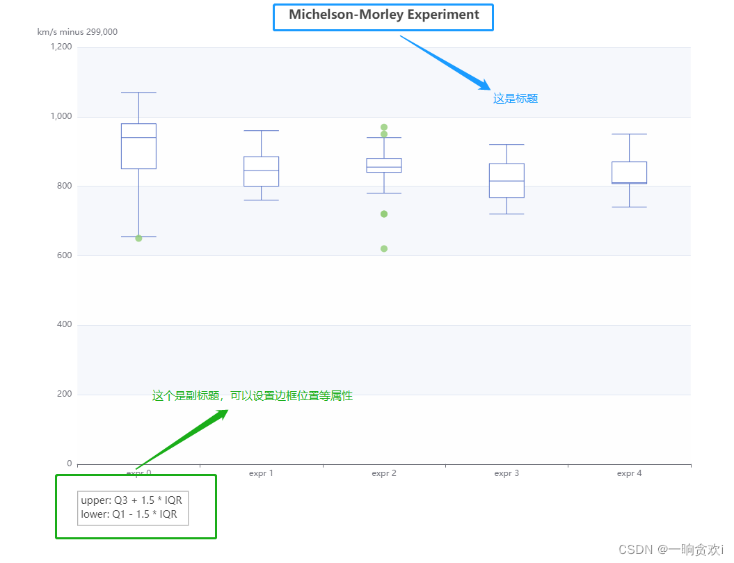
  title: [
    { // 标题
      text: 'Michelson-Morley Experiment',
      left: 'center'
    },
    { // 副标题
      text: 'upper: Q3 + 1.5 * IQR \nlower: Q1 - 1.5 * IQR',     // '/n'代表换行
      borderColor: '#999',
      borderWidth: 1, // 边框宽度(默认单位px)
      textStyle: { // 标题样式
        fontSize: 14
      },
      left: '10%', // 位置
      top: '90%' // 位置
    }
  ],
- 1
- 2
- 3
- 4
- 5
- 6
- 7
- 8
- 9
- 10
- 11
- 12
- 13
- 14
- 15
- 16
- 17
tooltip提示框组件配置项
axisPointer:坐标轴指示器配置项
label:坐标轴指示器的文本标签
lineStyle:axisPointer.type为line时有效
shadowStyle:axisPointer.type为shadow时有效
crossStyle:axisPointer.type为cross时有效。
textStyle:提示框浮层的文本样式
tooltip: {
    show: true,  //是否显示提示框组件
    trigger: 'item',  //触发类型,属性值:item数据项触发/axis坐标轴触发/none不触发
    axisPointer: {
        type: 'line',  //指示器类型,属性值:line直线/shadow阴影/none/cross十字准星
        axis: 'auto',  //指示器坐标轴,属性值:x/y/radius/angle
        snap: true,  //坐标轴指示器是否自动吸附到点上。默认自动判断,布尔值
        z: 0,  //坐标轴指示器z值,控制图形的前后顺序,属性值:number
        label: {
            show: false,  //是否显示文本标签
            precision: 'auto',  //文本标签中数值小数点精度。默认根据当前轴的值自动判断
            formatter: {},  //文本标签文字格式化器
            margin: 3,  //label距离轴的距离
            color: '#fff',
            fontStyle: '',
            fontWeight: '',
            fontFamily: '',
            fontSize: 12,
            lineHeigh: 20,
            width: 20,
            height: 100,
            textBorderColor: '',  //文字本身描边颜色
            textBorderWidth: ,  //文字本身描边宽度
            textBorderType: 'solid',  //文字本身描边类型,属性值:solid/dashed/dotted/number/array
            textBorderDashOffset: 0,  //虚线偏移量,搭配textBorderType指定dashed/array实现虚线效果
            textShadowColor: 'transparent',  //文字本身阴影颜色
            textShadowBlur: 0,  //文字本身的阴影长度
            textShadowOffsetX: 0,  //文字本身的阴影 X 偏移
            textShadowOffsetY: 0,  //文字本身的阴影 Y 偏移
            overflow: 'none',  //文字超出宽度是否截断或换行,配置width时有效,truncate/break/breakAll
            ellipsis: '',  //在overflow配置为'truncate'的时候,可以通过该属性配置末尾显示的文本
            padding: 0,
            backgroundColor: 'auto',  //背景颜色,默认是和axis.axisLine.lineStyle.color 相同
            borderColor: '',  //文本标签的边框颜色
            borderWidth: 0,  //文本标签的边框宽度
            shadowBlur: 3,  //图形阴影模糊大小,配合shadowColor,shadowOffsetX,shadowOffsetY设置阴影效果
            shadowColor: #aaa,  //阴影颜色,支持的格式同color
            shadowOffsetX: 0,  //阴影水平方向上的偏移距离
            shadowOffsetY: 0  //阴影垂直方向上的偏移距离
        },
        lineStyle: {
            color: #555,  /颜色/
            width: 1,  //线宽
            type: solid,  //线的类型,属性值:solid/dashed/dotted/number/array
            dashOffset: 0,  //虚线偏移量,搭配type指定dashed/array实现虚线效果
            cap: 'butt',  //线段末端的绘制,butt方形/round圆形/square也是方形效果与butt不同
            join: 'bevel',  //设置2个长度不为0的相连部分(线段,圆弧,曲线)如何连接在一起的属性,bevel默认/round/miter
            miterLimit: 10,  //设置斜接面限制比例,只有当join为miter才有效,属性值:10默认值/number
            shadowBlur: 10,  //阴影模糊大小,该属性配合shadowColor/shadowOffsetX/shadowOffsetY一起设置图形的阴影效果
            shadowColor: '',  //阴影颜色,支持的格式同color
            shadowOffsetX: 0,  //阴影水平方向上的偏移距离
            shadowOffsetY: 0,  //阴影垂直方向上的偏移距离
            opacity: 1  //图形透明度。支持从 0 到 1 的数字,为 0 时不绘制该图形
        },
        shadowStyle: {
            color: '#fff',  /颜色,文章链接如下  Echart图表之颜色color配置项大全/
            shadowBlur: 10,
            shadowColor: '',
            shadowOffsetX: 0,
            shadowOffsetY: 0,
            opacity: 1
        },
        crossStyle: {
            color: '#fff',  /颜色,/
            shadowBlur: 10,
            shadowColor: '',
            shadowOffsetX: 0,
            shadowOffsetY: 0,
            opacity: 1
        },
        animation: line,  //是否开启动画
        animationThreshold: 2000,  //是否开启动画的阈值
        animationDuration: 1000,  //初始动画的时长,支持回调函数
        animationEasing: 'cubicOut',  //初始动画的缓动效果
        animationDelay: 0,  //初始动画的延迟,支持回调函数
        animationDurationUpdate: 200,  //数据更新动画的时长,支持回调函数
        animationEasingUpdate: exponentialOut,  //数据更新动画的缓动效果
    },
    showContent: true,  //是否显示提示框浮层,默认显示
    alwaysShowContent: false,  //是否永远显示提示框内容
    triggerOn: 'mousemove|click',  //提示框触发条件,mousemove/click/mousemove|click/none。none时可通过action.tooltip.showTip和action.tooltip.hideTip来手动触发和隐藏。也可通过axisPointer.handle来触发或隐藏
    showDelay: 0,  //浮层显示的延迟,默认0ms
    hideDelay: 100,  //浮层隐藏的延迟
    enterable: false,  //鼠标是否可进入提示框浮层中,默认为false
    renderMode: 'html',  //浮层的渲染模式,html默认/richText富文本形式
    confine: false,  //是否将 tooltip 框限制在图表的区域内
    appendToBody: false,  //是否将组件DOM节点添加为HTML的<body>子节点。只有当renderMode为html有意义
    className: 'echarts-tooltip echarts-tooltip-dark',  //指定tooltip的DOM节点CSS类,只在html模式下生效
    transitionDuration: 0.4,  //提示框浮层的移动动画过渡时间,单位是s
    position: [],  //提示框浮层的位置
    formatter: ()=>{},  /提示框浮层内容格式器,用这个可以修改提示框默认内容/
    valueFormatter: (value: number | string) => string,  //数值显示部分的格式化回调函数
    backgroundColor: '',  //背景颜色,格式同color
    borderColor: '',  //提示框浮层边框颜色,格式同color
    borderWidth: 0,  //提示框浮层的边框宽
    padding: 5,
    textStyle: {
        color: '#fff',  /颜色,文章链接如下  Echart图表之颜色color配置项大全/
        fontStyle: '',
        fontWeight: '',
        fontFamily: '',
        fontSize: 14,
        lineHeight : 20,
        width: 220,
        height: 20,
        textBorderColor: '',  //文字本身的描边颜色
        textBorderWidth: '',  //文字本身的描边宽度
        textBorderType: 'solid',  //文字本身描边类型,属性值:solid/dashed/dotted/number/array
        textBorderDashOffset: 0,  //虚线偏移量,可搭配textBorderType指定dashed/array实现灵活的虚线效果
        textShadowColor: 'transparent',  //文字本身阴影颜色
        textShadowBlur: 0,  //文字本身阴影长度
        textShadowOffsetX: 0,  //文字本身阴影 X 偏移
        textShadowOffsetY: 0,  //文字本身阴影 Y 偏移
        overflow: 'none',  //文字超出宽度是否截断或者换行,配置width时有效,属性值:truncate/break/breakAll
        ellipsis: '',  //在overflow配置为'truncate'的时,该属性配置末尾显示文本
        rich: {},  //自定义富文本样式
    },
    extraCssText: 'box-shadow: 0 0 3px rgba(0, 0, 0, 0.3);',  //额外附加到浮层的 css 样式
    order: 'seriesAsc'  //多系列提示框浮层排列顺序,seriesAsc默认/seriesDesc/valueAsc/valueDesc
}
- 1
- 2
- 3
- 4
- 5
- 6
- 7
- 8
- 9
- 10
- 11
- 12
- 13
- 14
- 15
- 16
- 17
- 18
- 19
- 20
- 21
- 22
- 23
- 24
- 25
- 26
- 27
- 28
- 29
- 30
- 31
- 32
- 33
- 34
- 35
- 36
- 37
- 38
- 39
- 40
- 41
- 42
- 43
- 44
- 45
- 46
- 47
- 48
- 49
- 50
- 51
- 52
- 53
- 54
- 55
- 56
- 57
- 58
- 59
- 60
- 61
- 62
- 63
- 64
- 65
- 66
- 67
- 68
- 69
- 70
- 71
- 72
- 73
- 74
- 75
- 76
- 77
- 78
- 79
- 80
- 81
- 82
- 83
- 84
- 85
- 86
- 87
- 88
- 89
- 90
- 91
- 92
- 93
- 94
- 95
- 96
- 97
- 98
- 99
- 100
- 101
- 102
- 103
- 104
- 105
- 106
- 107
- 108
- 109
- 110
- 111
- 112
- 113
- 114
- 115
- 116
- 117
- 118
- 119
- 120
toolbox工具栏组件配置项
toolbox: {
    id: '',  //组件ID,默认不指定。指定则可用于在option或者API中引用组件
    show: true,  //是否显示
    orient: 'horizontal',  //icon的布局朝向,属性值:horizontal默认/vertical
    itemSize: 15,  //icon大小
    itemGap: 8,  //icon每项之间的间隔。横向布局时为水平间隔,纵向布局时为纵向间隔
    showTitle: true,  //是否在鼠标hover的时候显示标题
    feature: {
        saveAsImage: {
            type: 'png',  //保存图片格式。若renderer类型在初始化图表时被设为canvas(默认),则支持png(默认)/jpg;若renderer类型在初始化图表时被设为svg,则只支持svg
            name: '',  //保存文件名称,默认使用title.text
            backgroundColor: 'auto',  //保存图片背景色
            connectedBackgroundColor: '#fff',  //若图表使用echarts.connect对多个图表进行联动,则在导出图片时会导出这些联动的图表。该配置项决定了图表与图表之间间隙处的填充色
            excludeComponents: ['toolbox'],  //保存为图片时忽略的组件列表,默认忽略工具栏
            show: true,
            title: '',
            icon: '',  //自定义图标
            //保存为图片icon样式设置。由于icon的文本信息只在hover时显示,所以文字相关配置项在emphasis下设置
            iconStyle: {
                color: none,  /颜色,参考下面/
                borderColor: #666,
                borderWidth: 1,
                borderType: 'solid',
                borderDashOffset: 0,  //设置虚线偏移量,搭配borderType实现灵活的虚线效果
                borderCap: 'butt',  //指定线段末端绘制方式,属性值:butt/round/square
                borderJoin: 'bevel',  //设置2个长度不为0的相连部分(线段,圆弧,曲线)如何连接在一起的属性(长度为0的变形部分,其指定的末端和控制点在同一位置,会被忽略),属性值:bevel/round/miter
                borderMiterLimit: 10,  //设置斜接面限制比例,只有当borderJoin为miter时才有效
                shadowBlur: '',  //图形阴影模糊大小。该属性配合shadowColor/shadowOffsetX/shadowOffsetY一起设置图形的阴影效果
                shadowColor: '',  //阴影颜色。支持的格式同color
                shadowOffsetX: 0,  //阴影水平方向上的偏移距离
                shadowOffsetY: 0,  //阴影垂直方向上的偏移距离
                opacity: 1  //图形透明度
            },
            emphasis: {
                iconStyle: {
                    color: '',  /图形颜色,参考下面/
                    borderColor: none,  //图形描边颜色。支持的颜色格式同color
                    borderWidth: 0,  //描边线宽。为 0 时无描边
                    borderType: 'solid',  //描边类型,属性值:solid默认/dashed/dotted/number/array
                    borderDashOffset: 0,  //设置虚线偏移量,搭配borderType实现灵活的虚线效果
                    borderCap: 'butt',  //指定线段末端绘制方式,属性值:butt默认/round/square
                    borderJoin: 'bevel',  //上面有解释
                    borderMiterLimit: 10,
                    shadowBlur: '',
                    shadowColor: '',
                    shadowOffsetX: 0,
                    shadowOffsetY: 0,
                    opacity: 1,
                    textPosition: 'bottom',  //文本位置,属性值:left/right/top/bottom
                    textFill: '#000',  //文本颜色,若未设定,则依次取图标 emphasis 时的填充色、描边色,若都不存在,则为'#000'
                    textAlign: 'center',  //文本对齐方式,属性值:left/center/right
                    textBackgroundColor: '',  //文本区域填充色
                    textBorderRadius: 0,  //文本区域圆角大小
                    textPadding: 0  //文本区域内边距
                }
            },
            pixelRatio: 1  //保存图片分辨率比例。默认跟容器相同大小,若需保存更高分辨率图片,可以设置为大于 1 的值
        },
        restore: {
            show: true,
            title: '还原',
            icon: 'image://url',  //图标,'image://url'或'path://'或本地引入'image://'+require('./DCSP.png')
            iconStyle: {},  //还原icon样式设置,同上feature.saveAsImage.iconStyle配置
            emphasis: {}  //强调hover触发,同上feature.saveAsImage.emphasis.iconStyle配置
        },
        dataView: {
            show: true,
            title: '数据视图',
            icon: '',  //用法同feature.restore.icon
            iconStyle: {},  //数据视图icon样式设置,同上feature.saveAsImage.iconStyle配置
            emphasis: {},  //强调hover触发,同上feature.saveAsImage.emphasis.iconStyle配置
            readOnly: false,  //是否不可编辑(只读)
            optionToContent: function() {},  //自定义dataView展现函数。用以取代默认的textarea使用更丰富的数据编辑
            contentToOption: (container:HTMLDomElement, option:Object) => Object,  //在使用optionToContent情况下,如果支持数据编辑后的刷新,需要自行通过该函数实现组装option逻辑
            lang: ['数据视图', '关闭', '刷新'],  //数据视图上有三个话术,默认['数据视图', '关闭', '刷新']
            backgroundColor: '#fff',  //数据视图浮层背景色
            textareaColor: '#fff',  //数据视图浮层文本输入区背景色
            textareaBorderColor: '#333',  //数据视图浮层文本输入区边框颜色
            textColor: '#000',  //文本颜色
            buttonColor: '#c23531',  //按钮颜色
            buttonTextColor: '#fff'  //按钮文本颜色
        },
        dataZoom: {  /这个有两个icon图标,所以基本都必须分开配置/
            show: true,
            title: {  //缩放和还原的标题文本
                zoom: '区域缩放',
                back: '区域缩放还原'
            },
            icon: {  //同上feature.saveAsImage.icon配置
                zoom: '',
                back: ''
            },
            iconStyle: {},  //数据区域缩放icon样式设置,同上feature.saveAsImage.iconStyle配置
            emphasis: {},  //强调hover触发,同上feature.saveAsImage.emphasis.iconStyle配置
            filterMode: 'filter',  //与 dataZoom.filterMode 含义和取值相同
            xAxisIndex: '',  //指定哪些xAxis被控制。若缺省则控制所有的x轴。若设置为false则不控制任何x轴。如若置成3则控制axisIndex为3的x轴。若设置为[0, 3]则控制axisIndex为0和3的x轴。
            yAxisIndex: '',  //参考xAxisIndex,控制y轴
            brushStyle: {}  //刷选框样式,同上feature.saveAsImage.iconStyle配置
        },
        magicType: {
            show: true,
            type: ['line', 'bar'],  //启用的动态类型,包括line、bar、stack
            title: {
                line: '切换为折线图',
                bar: '切换为柱状图',
                stack: '切换为堆叠',
                tiled: '切换为平铺',
            },
            icon: {  //同上feature.saveAsImage.icon配置
                line: '',
                bar: '',
                stack: ''
            },
            iconStyle: {},  //动态类型切换,同上feature.saveAsImage.iconStyle配置
            emphasis: {},  //强调hover触发,同上feature.saveAsImage.emphasis.iconStyle配置
            option: {  //各个类型的专有配置项。在切换到某类型的时候会合并相应的配置项
                line: {},
                bar: {},
                stack: {}
            },
            seriesIndex: {  //各个类型对应的系列的列表
                line: [],
                bar: []
            }
        },
        brush: {  //选框组件的控制按钮。也可以不在这里指定,而是在 brush.toolbox 中指定。
            type:,  //使用的按钮,属性值:rect/polygon/lineX/lineY/keep/clear
            icon: {  //同上feature.saveAsImage.icon配置
                rect: '',
                polygon: '',
                lineX: '',
                lineY: '',
                keep: '',
                clear: ''
            },
            title: {
                rect: '矩形选择',
                polygon: '圈选',
                lineX: '横向选择',
                lineY: '纵向选择',
                keep: '保持选择',
                clear: '清除选择'
            }
        },
        myTool: {  /这个比较常用,自定义icon与功能/
            show: true,
            title: '',
            icon: '',
            onclick: function() {}  //根据需要添加触发条件与方法
        }
    },
    iconStyle: {},  //公用的 icon 样式设置。同上feature.saveAsImage.iconStyle配置
    emphasis: {},  //强调hover触发,同上feature.saveAsImage.emphasis.iconStyle配置
    zlevel: 0,  //所有图形zlevel值。zlevel用于 Canvas 分层
    z: 2,  //组件的所有图形的z值。控制图形的前后顺序
    left: 'auto',
    top: 'auto',
    right: 'auto',
    bottom: 'auto',
    width: 'auto',
    height: 'auto',
    tooltip: {}  /工具箱tooltip配置,配置项同tooltip/
}
- 1
- 2
- 3
- 4
- 5
- 6
- 7
- 8
- 9
- 10
- 11
- 12
- 13
- 14
- 15
- 16
- 17
- 18
- 19
- 20
- 21
- 22
- 23
- 24
- 25
- 26
- 27
- 28
- 29
- 30
- 31
- 32
- 33
- 34
- 35
- 36
- 37
- 38
- 39
- 40
- 41
- 42
- 43
- 44
- 45
- 46
- 47
- 48
- 49
- 50
- 51
- 52
- 53
- 54
- 55
- 56
- 57
- 58
- 59
- 60
- 61
- 62
- 63
- 64
- 65
- 66
- 67
- 68
- 69
- 70
- 71
- 72
- 73
- 74
- 75
- 76
- 77
- 78
- 79
- 80
- 81
- 82
- 83
- 84
- 85
- 86
- 87
- 88
- 89
- 90
- 91
- 92
- 93
- 94
- 95
- 96
- 97
- 98
- 99
- 100
- 101
- 102
- 103
- 104
- 105
- 106
- 107
- 108
- 109
- 110
- 111
- 112
- 113
- 114
- 115
- 116
- 117
- 118
- 119
- 120
- 121
- 122
- 123
- 124
- 125
- 126
- 127
- 128
- 129
- 130
- 131
- 132
- 133
- 134
- 135
- 136
- 137
- 138
- 139
- 140
- 141
- 142
- 143
- 144
- 145
- 146
- 147
- 148
- 149
- 150
- 151
- 152
- 153
- 154
- 155
- 156
- 157
- 158
- 159
- 160
- 161
- 162
- 163
文章来源: zimug.blog.csdn.net,作者:字母哥哥,版权归原作者所有,如需转载,请联系作者。
原文链接:zimug.blog.csdn.net/article/details/125241594

【版权声明】本文为华为云社区用户转载文章,如果您发现本社区中有涉嫌抄袭的内容,欢迎发送邮件进行举报,并提供相关证据,一经查实,本社区将立刻删除涉嫌侵权内容,举报邮箱:
cloudbbs@huaweicloud.com
- 点赞
- 收藏
- 关注作者
评论(0)