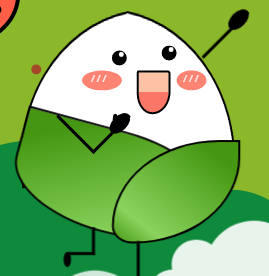
700行无用 纯 CSS 祝考生 金榜高粽!《1_bit 的无用 CSS 代码 》

今天才想起来这回事,没办法就急急忙忙的赶工一下,接下来我就画一下这个海报试试手了:

一、背景制作
1.1 准备工作
先给整个网页制作一个布局吧,直接 flex 搞定,并且使其居中 justify-content、align-items 都要赋值为 center:
body {
    display: flex;
    justify-content: center;
    align-items: center;
    height: 100vh;
    width: 100vw;
}
接下来直接创建一个 div ,给予一个 demo 样式:
<body>
    <div 那么这个demo 样式如下:


```css
.demo {
    height: 400px;
    width: 1200px;
    position: relative;
    background-color: #8bb72b;
    overflow: hidden;
}
那么此刻咱们需要做的准备工作就搞定了,那么接下来咱们就在这个框内画东西:

1.2 背景云朵
首先咱们就先画一个云朵吧,云朵就在粽子的脚底下,制作起来很简单;哦,提一下,为了简单(主要是懒),就直接在 style 标签中添加样式吧。
我们先看一下一个云朵的样子:
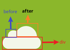
这个云呢一看就知道就是一个 div 给予一个圆角,随后再来一个 before 和 after 不就搞定了?
所以现在咱们创建一个 cloud 样式,并且设置 before 和 after 的样式:
.cloud:after,
.cloud:before {
    content: "";
    position: absolute;
    background-color: white;
    border-radius: 50%;
}

.cloud:after {
    width: 50px;
    height: 50px;
    top: -54%;
    left: 14%;
}

.cloud:before {
    width: 100px;
    height: 100px;
    top: -90%;
    right: 10%;
}
after 和 before 大小不一样,所以我设置的宽高也是不一的,但总有一个大或者一个小;不过一定要记住设置圆角否则你的云就是这样:

突然感觉这个云很像一个坦克,看来坦克我也会画了。
绘制好云后你可以再设置两个样式,当然你也可以用子元素选择器为多个云设置不一样的大小、位置信息,在这里图方便,我就直接给予了两个样式:
.cloud1 {
    transform: scale(1);
    opacity: 0.8;
    left: 100px;
    top: 410px;
    z-index: 1;
}

.cloud2 {
    left: 260px;
    top: 360px;
    transform: scale(1.1);
    opacity: 0.9;
    z-index: 1;
}
这两个样式给予的透明度 opacity 是为了使云彩更加的“缥缈”,当然你也可以再加一些阴影,这样看起来更加真实,并且其中的 scale 可以帮助你调整云朵大小,再或者你可以使用 rotate 等其他方法转动一下角度都行。
最后我添加两个 div,包裹在一个 div 中方便分类(可能我的风格不是前端风格,不要在意):
<div class="demo">
    <div class="cloud-main">
        <div class="cloud cloud1"></div>
        <div class="cloud cloud2"></div>
    </div>
</div>
1.3 背景圈圈圈
云朵增加完了咱们就开水增加这些背景上的“圈圈圈”吧:
这些圈圈圈你可以用背景渐变来做,在这里我就直接画了,也就是一个 div 设置好圆角然后 left、top、bottom 调一下位置,说起来是真的简单,就不再赘述这里了,直接写上样式:
.circle {
    position: absolute;
    height: 400px;
    width: 1200px;
}

.circle1,
.circle2,
.circle3,
.circle4,
.circle5,
.circle6,
.circle7,
.circle8 {
    position: absolute;
    border-radius: 100%;
    background-color: #0f893c;
}

.circle1 {
    height: 300px;
    width: 300px;
    bottom: -130px;
}

.circle2 {
    height: 150px;
    width: 150px;
    bottom: -30px;
    left: 270px
}

.circle3 {
    height: 30px;
    width: 30px;
    bottom: 10px;
    left: 430px
}

.circle4 {
    height: 60px;
    width: 60px;
    bottom: 10px;
    left: 530px
}

.circle5 {
    height: 160px;
    width: 260px;
    bottom: -130px;
    left: 530px
}

.circle6 {
    height: 60px;
    width: 160px;
    bottom: -30px;
    left: 730px
}

.circle7 {
    height: 60px;
    width: 160px;
    bottom: -30px;
    left: 780px
}

.circle8 {
    height: 160px;
    width: 160px;
    bottom: -80px;
    left: 880px
}
/*黄色圈*/

.y-circle1,
.y-circle2,
.y-circle3,
.y-circle4 {
    position: absolute;
    border-radius: 100%;
    background-color: #cdd622;
}

.y-circle1 {
    height: 60px;
    width: 60px;
    bottom: 180px;
    left: 880px
}

.y-circle2 {
    height: 30px;
    width: 30px;
    bottom: 280px;
    left: 780px
}

.y-circle3 {
    height: 10px;
    width: 10px;
    bottom: 380px;
    left: 720px
}

.y-circle4 {
    height: 20px;
    width: 20px;
    bottom: 290px;
    left: 680px
}
因为每一个圆圈圈都有不同的大小,所以就写了多个样式用于调整他们的大小、位置等,突然发现还不如用渐变方便,但是写都写了,那就贴上吧;接着咱们在 html 中添加元素:
<div class="circle">
    <div class="circle1"></div>
    <div class="circle2"></div>
    <div class="circle3"></div>
    <div class="circle4"></div>
    <div class="circle5"></div>
    <div class="circle6"></div>
    <div class="circle7"></div>
    <div class="circle8"></div>
    <div class="y-circle1"></div>
    <div class="y-circle2"></div>
    <div class="y-circle3"></div>
    <div class="y-circle4"></div>
</div>
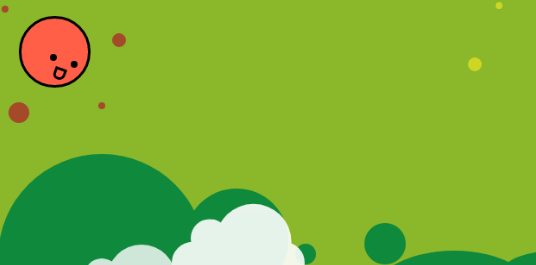
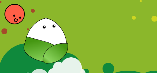
此时整个背景效果如下:

是不是感觉好像有点意思了?那我们接着往下。
二、添加角色元素
2.1 添加小太阳
首先咱们可以分析一下这个小太阳:

我们可以明显的知道小太阳这个角色和本身太阳的区别,那就是有了表情;没有表情的太阳和有表情的太阳完全不是同一个“东西”,这差距就像 “喜欢吃辣的人看到了豆腐无感,看到了麻婆豆腐就控制不了自己” ,所以关键点就是表情的制作。
虽然有表情和没表情的观感不一样,但是本质一个圆还是要画的,那么这个太阳还有周围的红色小点阳光,肯定是在一个父容器之下,那么此时咱们先给他们的父容器设置一个样式吧:
/*太阳*/
.sun {
    position: absolute;
    height: 150px;
    width: 150px;
}
在这里我定义了这个父容器的布局以及宽高,那么接下来咱们就开始定义这个太阳的主体,直接设置一个元素圆角值给满随后稍微定一下位置即可:
.sun-body {
    position: absolute;
    height: 95px;
    width: 95px;
    background-color: #ff5f47;
    border-radius: 100%;
    border: 4px black solid;
    left: 30px;
    top: 30px;
}
那么主体有了,就到眼睛了,很明显眼睛就是豆豆眼,直接一个元素圆角,设置背景色为黑解决:
.sun-eye {
    position: absolute;
    height: 10px;
    width: 10px;
    background-color: black;
    border-radius: 100%;
}
那么此时太阳的眼睛有一个左有一个右,所以需要设置两个样式用于控制眼睛的位置,此时我们还需要注意到,接下来要绘制的粽子的眼睛也是有左右的,所以在这里需要设置样式限制在 sun-body 之下,那么这两个样式如下:
.sun-body>.eye-left {
    top: 60px;
    left: 70px;
}

.sun-body>.eye-right {
    top: 50px;
    left: 40px;
}
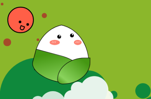
此时页面效果如下:

此时的太阳面无表情,不懂的还以为是少了一个洞的保龄球,所以表情还是很重要的,接着添加一个 smile 样式让太阳笑看人生,那这个样式怎么做呢?毕竟这个嘴巴是就等于一个雪糕棒的样子:

那我们就先开始画一个雪糕吧,就直接写一个 smile 样式,等下再改就好了;雪糕也是一个矩形,那么直接先给予一个矩形吧
.sun-body>.smile {
    position: absolute;
    width: 100px;
    height: 100px;
    background-color: #fdc2a6 50%;
    top: 70px;
    left: 245px;
    border: 4px black solid;
}
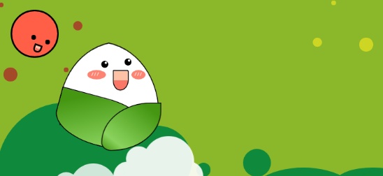
效果如下:
那剩下的不就是给下面两个圆角变圆不就好了?真是恍然大悟,直接给予样式:
border-top-left-radius: 8%;
border-top-right-radius: 16%;
border-bottom-left-radius: 80%;
border-bottom-right-radius: 90%;

那么再给这个嘴巴转一下:
transform: rotate(20deg);

如果你想做一些效果还可以沿着垂直方向变换一下,都可以。那么接下来直接定位,并且给予背景色就完成了:
.sun-body>.smile {
    position: absolute;
    width: 10px;
    height: 10px;
    background-color: #fdc2a6 50%;
    top: 70px;
    left: 45px;
    border: 4px black solid;
    border-top-left-radius: 8%;
    border-top-right-radius: 16%;
    border-bottom-left-radius: 80%;
    border-bottom-right-radius: 90%;
    transform: rotate(20deg);
}

最后再加一些阳光,阳光就是圆嘛,很简单的,所以直接写好样式:
.sunshine-top-left,
.sunshine-top-right,
.sunshine-bottom-left,
.sunshine-bottom-right {
    position: absolute;
    background-color: #a54a29;
    border-radius: 100%;
}

.sunshine-top-left {
    height: 10px;
    width: 10px;
    left: -30px;
    top: -20px;
}

.sunshine-top-right {
    height: 20px;
    width: 20px;
    left: 130px;
    top: 20px;
}

.sunshine-bottom-left {
    height: 30px;
    width: 30px;
    left: -20px;
    top: 120px;
}

.sunshine-bottom-right {
    height: 10px;
    width: 10px;
    left: 110px;
    top: 120px;
}
再调用即可:
<div class="sun-body">
    <div class="sun-eye eye-left"></div>
    <div class="sun-eye eye-right"></div>
    <div class="smile"></div>
    <div class="sunshine-top-left"></div>
    <div class="sunshine-top-right"></div>
    <div class="sunshine-bottom-left"></div>
    <div class="sunshine-bottom-right"></div>
</div>
2.2 添加粽子
2.2.1 粽子 body
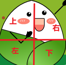
粽子的话就是里面的白花花的米和外面两块叶子和简单的四肢:
做起来是挺简单的,叶子的话纹路我没有添加,可以简便加上去就好了,首先我们制作里面白花花的糯米和绿油油的叶子部分。
其实这个部分我是分为了上、右、下、左四个部分制作的:
并且再考虑这些部分都是同一个物体,所以也需要一个容器对其进行包裹,首先给予一个容器样式:
.rice-dumplings {
    height: 400px;
    width: 400px;
    position: absolute;
    transform: scale(0.5);
    left: 0;
}
接着先制作粽子的左半部分,其实左半部分也就是一个半圆进行变换而来, 左右两边的样式本质上是一致的,所以直接给予粽子上部分左右两边相同的样式:
.rice-dumplings-body-left-top,
.rice-dumplings-body-right-top {
    position: absolute;
    background-color: #ffffff;
    height: 300px;
    width: 300px;
    border-top-left-radius: 100%;
    border: 4px black solid;
    border-right: 0px;
}
在上面的样式中,由于右边编剧是有边框线的,直接去掉即可,所以使用了代码 border-right: 0px;。
接着给予左右两边不一样的变换以及位置信息:
.rice-dumplings-body-left-top {
    left: 25px;
    top: 25px;
    transform: rotateY(30deg) rotate(-10deg);
}

.rice-dumplings-body-right-top {
    left: 235px;
    top: 25px;
    transform: rotateY(210deg) rotate(-10deg);
}
这个时候就应该给这个目前来说像半个饭团的东西一点“遮羞布”了,也就是两张叶子。
这两张叶子的制作方式相似,也就是给圆角然后进行旋转即可,在这里需要注意的是不同大小、角度的叶子变换效果不一样,可以适当的调整效果,并且其内部的叶子纹路也可以通过渐变制作,在这里我是用了渐变色,也可以使用阴影为其添加层次感:
.rice-dumplings-body-left-bottom,
.rice-dumplings-body-right-bottom {
    position: absolute;
    background: linear-gradient(to bottom right, #459712 15%, #8ad35d 80%, #459712 100%);
    border-top-left-radius: 0%;
    border: 4px black solid;
}

.rice-dumplings-body-left-bottom {
    height: 200px;
    width: 400px;
    top: 240px;
    left: 50px;
    border-bottom-left-radius: 100%;
    border-bottom-right-radius: 100%;
    border-top-right-radius: 100%;
    transform: rotate(15deg);
}

.rice-dumplings-body-right-bottom {
    height: 200px;
    width: 250px;
    top: 260px;
    left: 250px;
    border-bottom-left-radius: 100%;
    border-bottom-right-radius: 20%;
    border-top-right-radius: 100%;
    transform: rotateY(180deg);
}
接着在代码中进行调用:
<div class="rice-dumplings">
    <div class="rice-dumplings-body">
        <div class="rice-dumplings-body-left-top"></div>
        <div class="rice-dumplings-body-right-top"></div>
        <div class="rice-dumplings-body-left-bottom"></div>
        <div class="rice-dumplings-body-right-bottom"></div>
    </div>
</div>
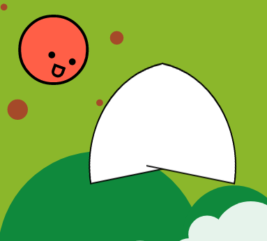
此时效果如下:
2.2.2 粽子 face
接着咱们开始制作这个粽子的脸部,这个脸部也需要在一个容器之内,所以继续设置一个父容器:
.rice-dumplings-face {
    position: absolute;
}
接着制作这个脸部的眼睛,这个眼睛可以看到其内部还有一个亮点:
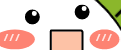
这个亮点制作其实就是一个缩小版的白色圆点而已,所以现在就知道这个怎么做了,直接设置两个黑点和两个白点,使其在近似的位置就解决了:
.rice-dumplings-face {
    position: absolute;
}

.rice-dumplings-eye {
    position: absolute;
    height: 30px;
    width: 30px;
    border-radius: 100%;
    background-color: black;
}

.eye-left {
    left: 250px;
    top: 80px;
}

.eye-right {
    left: 350px;
    top: 70px;
}

.rice-dumplings-eye>.light {
    position: absolute;
    height: 10px;
    width: 10px;
    border-radius: 100%;
    background-color: white;
}

.rice-dumplings-eye>.postion {
    right: 20%;
    top: 10%;
}

.rice-dumplings-eye>.right {
    right: 20%;
    top: 10%;
}
以上样式中 light 为亮点,创建一个基础样式后再创建左右样式进行调用就可以了:
<div class="rice-dumplings-face">
    <div class="rice-dumplings-eye eye-left">
        <div class="light postion"></div>
    </div>
    <div class="rice-dumplings-eye eye-right">
        <div class="light postion"></div>
    </div>
</div>
接着制作两个小脸蛋,也就是一个宽度大于高度的椭圆,设置其 before 文本为“///” 颜色为白就完美解决:
/*脸颊*/

.cheek {
    position: absolute;
    top: 120px;
    background-color: #fd8373;
    border-radius: 100%;
}

.cheek::before {
    position: absolute;
    content: "/ / /";
    color: white;
    left: 23%;
    top: 13%;
}

.cheek-left {
    height: 40px;
    width: 80px;
    left: 190px;
}

.cheek-right {
    height: 40px;
    width: 60px;
    left: 380px;
}
接着嘴巴的样式跟太阳的一样,在这里只需要设置对应的渐变色一半为红色一半为粉红色即可:
.smile {
    position: absolute;
    width: 60px;
    height: 80px;
    background: linear-gradient( #fdc2a6 50%, #fa7768 50%);
    top: 120px;
    left: 300px;
    border: 4px black solid;
    border-top-left-radius: 8%;
    border-top-right-radius: 16%;
    border-bottom-left-radius: 80%;
    border-bottom-right-radius: 90%;
}
由于其本身太阳也是相同样式,所以背景色也应用到了太阳嘴巴之中,都是同一款嘴型。
2.2.3 粽子四肢
粽子的四肢制作那就更简单了,直接设置一个 div 留有边框,去掉其他边框之后使用 before 或者 after 做手掌或者脚掌部分就可以了:
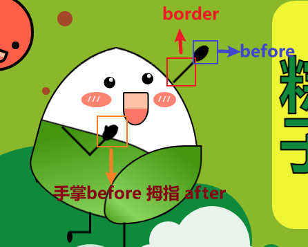
此时我们给予样式,调整好位置即可:
/*四肢*/
.arm-left {
    position: absolute;
    height: 100px;
    width: 100px;
    border: 6px black solid;
    border-top: 0px;
    border-left: 0px;
    transform: rotate(45deg);
    left: 160px;
    top: 160px;
}

.arm-left::before {
    position: absolute;
    content: "";
    height: 50px;
    width: 30px;
    right: -15%;
    border-radius: 100%;
    background-color: black;
}

.arm-left::after {
    position: absolute;
    content: "";
    height: 20px;
    width: 10px;
    right: 8%;
    top: 15%;
    border-radius: 100%;
    background-color: black;
    transform: rotate(-45deg);
}

.arm-right {
    position: absolute;
    height: 130px;
    width: 100px;
    border-right: 6px black solid;
    left: 390px;
    top: -52px;
    transform: rotate(45deg);
}

.arm-right::before {
    position: absolute;
    content: "";
    height: 50px;
    width: 30px;
    right: -15%;
    border-radius: 100%;
    background-color: black;
}

.leg-left {
    position: absolute;
    height: 50px;
    width: 50px;
    border: 6px black solid;
    border-top: 0px;
    border-left: 0px;
    left: 160px;
    top: 435px;
}

.leg-left::before {
    position: absolute;
    content: "";
    height: 30px;
    width: 15px;
    left: -15%;
    bottom: -30px;
    border-radius: 100%;
    background-color: black;
}

.leg-right {
    position: absolute;
    height: 100px;
    width: 50px;
    border-right: 6px black solid;
    left: 250px;
    top: 463px;
}

.leg-right::before {
    position: absolute;
    content: "";
    height: 30px;
    width: 15px;
    right: -35%;
    bottom: -10px;
    border-radius: 100%;
    background-color: black;
    transform: rotate(-90deg);
}
四肢位置代码比较简单,就是给予不同的边框位置并且旋转即可,然后 before 和 after 就是一个圆嘛,拿上背景色放到合适位置就可以了。
粽子角色该部分 html 如下:
<div class="rice-dumplings">
    <div class="rice-dumplings-body">
        <div class="rice-dumplings-body-left-top"></div>
        <div class="rice-dumplings-body-right-top"></div>
        <div class="rice-dumplings-body-left-bottom"></div>
        <div class="rice-dumplings-body-right-bottom"></div>
    </div>
    <div class="rice-dumplings-face">
        <div class="rice-dumplings-eye eye-left">
            <div class="light postion"></div>
        </div>
        <div class="rice-dumplings-eye eye-right">
            <div class="light postion"></div>
        </div>
        <div class="cheek cheek-left"></div>
        <div class="cheek cheek-right"></div>
        <div class="smile"></div>
    </div>
    <div class="limbs">
        <div class="arm-left"></div>
        <div class="arm-right"></div>
        <div class="leg-left"></div>
        <div class="leg-right"></div>
    </div>
</div>
三、所有内容
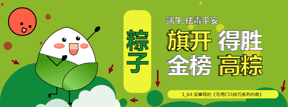
最后加上文字后效果如下:
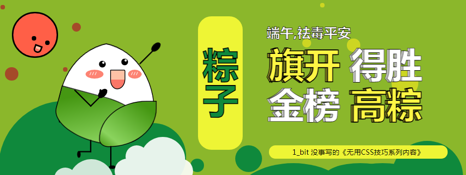
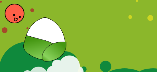
由于文字部分其样式就是很基础了,在此没必要赘述了,在最后我祝各位考生 金榜高粽!
最后在这里附加上所有代码:
完整代码:
<!DOCTYPE html>
<html lang="en">
<head>
<meta charset="UTF-8">
<meta http-equiv="X-UA-Compatible" content="IE=edge">
<meta name="viewport" content="width=device-width, initial-scale=1.0">
<title>Demo test</title>
<style>
body {
height: 100vh;
width: 100vw;
}
.demo-area {
height: 400px;
width: 1200px;
position: relative;
background-color: #8bb72b;
overflow: hidden;
}
body {
display: flex;
justify-content: center;
align-items: center;
height: 100vh;
width: 100vw;
}
.rice-dumplings {
height: 400px;
width: 400px;
position: absolute;
transform: scale(0.5);
left: 0;
}
.rice-dumplings-body-left-top,
.rice-dumplings-body-right-top {
position: absolute;
background-color: #ffffff;
height: 300px;
width: 300px;
border-top-left-radius: 100%;
border: 4px black solid;
border-right: 0px;
}
.rice-dumplings-body-left-top {
left: 25px;
top: 25px;
transform: rotateY(30deg) rotate(-10deg);
}
.rice-dumplings-body-right-top {
left: 235px;
top: 25px;
transform: rotateY(210deg) rotate(-10deg);
}
.rice-dumplings-body-left-bottom,
.rice-dumplings-body-right-bottom {
position: absolute;
background: linear-gradient(to bottom right, #459712 15%, #8ad35d 80%, #459712 100%);
border-top-left-radius: 0%;
border: 4px black solid;
}
.rice-dumplings-body-left-bottom {
height: 200px;
width: 400px;
top: 240px;
left: 50px;
border-bottom-left-radius: 100%;
border-bottom-right-radius: 100%;
border-top-right-radius: 100%;
transform: rotate(15deg);
}
.rice-dumplings-body-right-bottom {
height: 200px;
width: 250px;
top: 260px;
left: 250px;
border-bottom-left-radius: 100%;
border-bottom-right-radius: 20%;
border-top-right-radius: 100%;
transform: rotateY(180deg);
}
.rice-dumplings-face {
position: absolute;
}
.rice-dumplings-eye {
position: absolute;
height: 30px;
width: 30px;
border-radius: 100%;
background-color: black;
}
.eye-left {
left: 250px;
top: 80px;
}
.eye-right {
left: 350px;
top: 70px;
}
.rice-dumplings-eye>.light {
position: absolute;
height: 10px;
width: 10px;
border-radius: 100%;
background-color: white;
}
.rice-dumplings-eye>.postion {
right: 20%;
top: 10%;
}
.rice-dumplings-eye>.right {
right: 20%;
top: 10%;
}
.smile {
position: absolute;
width: 60px;
height: 80px;
background: linear-gradient( #fdc2a6 50%, #fa7768 50%);
top: 120px;
left: 300px;
border: 4px black solid;
border-top-left-radius: 8%;
border-top-right-radius: 16%;
border-bottom-left-radius: 80%;
border-bottom-right-radius: 90%;
}
.cheek {
position: absolute;
top: 120px;
background-color: #fd8373;
border-radius: 100%;
}
.cheek::before {
position: absolute;
content: "/ / /";
color: white;
left: 23%;
top: 13%;
}
.cheek-left {
height: 40px;
width: 80px;
left: 190px;
}
.cheek-right {
height: 40px;
width: 60px;
left: 380px;
}
.arm-left {
position: absolute;
height: 100px;
width: 100px;
border: 6px black solid;
border-top: 0px;
border-left: 0px;
transform: rotate(45deg);
left: 160px;
top: 160px;
}
.arm-left::before {
position: absolute;
content: "";
height: 50px;
width: 30px;
right: -15%;
border-radius: 100%;
background-color: black;
}
.arm-left::after {
position: absolute;
content: "";
height: 20px;
width: 10px;
right: 8%;
top: 15%;
border-radius: 100%;
background-color: black;
transform: rotate(-45deg);
}
.arm-right {
position: absolute;
height: 130px;
width: 100px;
border-right: 6px black solid;
left: 390px;
top: -52px;
transform: rotate(45deg);
}
.arm-right::before {
position: absolute;
content: "";
height: 50px;
width: 30px;
right: -15%;
border-radius: 100%;
background-color: black;
}
.leg-left {
position: absolute;
height: 50px;
width: 50px;
border: 6px black solid;
border-top: 0px;
border-left: 0px;
left: 160px;
top: 435px;
}
.leg-left::before {
position: absolute;
content: "";
height: 30px;
width: 15px;
left: -15%;
bottom: -30px;
border-radius: 100%;
background-color: black;
}
.leg-right {
position: absolute;
height: 100px;
width: 50px;
border-right: 6px black solid;
left: 250px;
top: 463px;
}
.leg-right::before {
position: absolute;
content: "";
height: 30px;
width: 15px;
right: -35%;
bottom: -10px;
border-radius: 100%;
background-color: black;
transform: rotate(-90deg);
}
/*太阳*/
.sun {
position: absolute;
height: 150px;
width: 150px;
}
.sun-body {
position: absolute;
height: 95px;
width: 95px;
background-color: #ff5f47;
border-radius: 100%;
border: 4px black solid;
left: 30px;
top: 30px;
}
.sun-eye {
position: absolute;
height: 10px;
width: 10px;
background-color: black;
border-radius: 100%;
}
.sun-body>.eye-left {
top: 60px;
left: 70px;
}
.sun-body>.eye-right {
top: 50px;
left: 40px;
}
.sun-body>.smile {
position: absolute;
width: 10px;
height: 10px;
background-color: #fdc2a6 50%;
top: 70px;
left: 45px;
border: 4px black solid;
border-top-left-radius: 8%;
border-top-right-radius: 16%;
border-bottom-left-radius: 80%;
border-bottom-right-radius: 90%;
transform: rotate(20deg);
}
.sunshine-top-left,
.sunshine-top-right,
.sunshine-bottom-left,
.sunshine-bottom-right {
position: absolute;
background-color: #a54a29;
border-radius: 100%;
}
.sunshine-top-left {
height: 10px;
width: 10px;
left: -30px;
top: -20px;
}
.sunshine-top-right {
height: 20px;
width: 20px;
left: 130px;
top: 20px;
}
.sunshine-bottom-left {
height: 30px;
width: 30px;
left: -20px;
top: 120px;
}
.sunshine-bottom-right {
height: 10px;
width: 10px;
left: 110px;
top: 120px;
}
.circle {
position: absolute;
height: 400px;
width: 1200px;
}
.circle1,
.circle2,
.circle3,
.circle4,
.circle5,
.circle6,
.circle7,
.circle8 {
position: absolute;
border-radius: 100%;
background-color: #0f893c;
}
.circle1 {
height: 300px;
width: 300px;
bottom: -130px;
}
.circle2 {
height: 150px;
width: 150px;
bottom: -30px;
left: 270px
}
.circle3 {
height: 30px;
width: 30px;
bottom: 10px;
left: 430px
}
.circle4 {
height: 60px;
width: 60px;
bottom: 10px;
left: 530px
}
.circle5 {
height: 160px;
width: 260px;
bottom: -130px;
left: 530px
}
.circle6 {
height: 60px;
width: 160px;
bottom: -30px;
left: 730px
}
.circle7 {
height: 60px;
width: 160px;
bottom: -30px;
left: 780px
}
.circle8 {
height: 160px;
width: 160px;
bottom: -80px;
left: 880px
}
/*黄色圈*/
.y-circle1,
.y-circle2,
.y-circle3,
.y-circle4 {
position: absolute;
border-radius: 100%;
background-color: #cdd622;
}
.y-circle1 {
height: 60px;
width: 60px;
bottom: 180px;
left: 880px
}
.y-circle2 {
height: 30px;
width: 30px;
bottom: 280px;
left: 780px
}
.y-circle3 {
height: 10px;
width: 10px;
bottom: 380px;
left: 720px
}
.y-circle4 {
height: 20px;
width: 20px;
bottom: 290px;
left: 680px
}
/* 云朵 */
.cloud {
position: absolute;
width: 175px;
height: 55px;
background-color: white;
border-radius: 100px;
box-shadow: 0 1px 5px 0px rgba(50, 50, 50, 0.05);
}
.cloud:after,
.cloud:before {
content: "";
position: absolute;
background-color: white;
}
.cloud:after {
width: 50px;
height: 50px;
border-radius: 50%;
top: -54%;
left: 14%;
}
.cloud:before {
width: 100px;
height: 100px;
border-radius: 50%;
top: -90%;
right: 10%;
}
.cloud1 {
transform: scale(1);
opacity: 0.8;
left: 100px;
top: 410px;
z-index: 1;
}
.cloud2 {
left: 260px;
top: 360px;
transform: scale(1);
opacity: 0.9;
z-index: 1;
}
/* 文本内容 */
.stroke {
-webkit-text-stroke: 1px black;
}
.text1 {
position: absolute;
color: white;
font-size: 30px;
left: 600px;
top: 30px;
}
.text2,
.text3,
.text4 {
position: absolute;
color: white;
font-size: 80px;
top: 40px;
}
.text5,
.text6,
.text7 {
position: absolute;
color: white;
font-size: 80px;
top: 130px;
}
.text2,
.text5 {
left: 600px;
}
.text3,
.text6 {
left: 603px;
}
.text4,
.text7 {
left: 605px;
}
.text2>.span1,
.text3>.span1,
.text4>.span1,
.text5>.span1,
.text6>.span1,
.text7>.span1 {
color: #fff644;
-webkit-text-stroke: 2px black;
}
.rice-dumplings-text {
background-color: #eef535;
height: 300px;
width: 100px;
position: absolute;
left: 380px;
top: 40px;
border-radius: 30px;
color: #0f893c;
writing-mode: vertical-rl;
text-align: center;
line-height: 100px;
font-size: 80px;
-webkit-text-stroke: 2px black;
}
/*C*/
.C {
position: absolute;
top: 330px;
left: 605px;
height: 30px;
width: 400px;
background-color: #eef535;
border-radius: 30px;
text-align: center;
line-height: 30px;
}
</style>
</head>
<body>
<div class="demo-area">
<div class="cloud-main">
<div class="cloud cloud1"></div>
<div class="cloud cloud2"></div>
</div>
<div class="circle">
<div class="circle1"></div>
<div class="circle2"></div>
<div class="circle3"></div>
<div class="circle4"></div>
<div class="circle5"></div>
<div class="circle6"></div>
<div class="circle7"></div>
<div class="circle8"></div>
<div class="y-circle1"></div>
<div class="y-circle2"></div>
<div class="y-circle3"></div>
<div class="y-circle4"></div>
</div>
<div class="sun">
<div class="sun-body">
<div class="sun-eye eye-left"></div>
<div class="sun-eye eye-right"></div>
<div class="smile"></div>
<div class="sunshine-top-left"></div>
<div class="sunshine-top-right"></div>
<div class="sunshine-bottom-left"></div>
<div class="sunshine-bottom-right"></div>
</div>
</div>
<div class="rice-dumplings">
<div class="rice-dumplings-body">
<div class="rice-dumplings-body-left-top"></div>
<div class="rice-dumplings-body-right-top"></div>
<div class="rice-dumplings-body-left-bottom"></div>
<div class="rice-dumplings-body-right-bottom"></div>
</div>
<div class="rice-dumplings-face">
<div class="rice-dumplings-eye eye-left">
<div class="light postion"></div>
</div>
<div class="rice-dumplings-eye eye-right">
<div class="light postion"></div>
</div>
<div class="smile"></div>
<div class="cheek cheek-left"></div>
<div class="cheek cheek-right"></div>
</div>
<div class="limbs">
<div class="arm-left"></div>
<div class="arm-right"></div>
<div class="leg-left"></div>
<div class="leg-right"></div>
</div>
</div>
<div class="text">
<h2 class="rice-dumplings-text">
粽子
</h2>
<h2 class="stroke text1">
端午,祛毒平安
</h2>
<h1 class="stroke text2">
<span class="span1">旗开</span>
<span>得胜</span>
</h1>
<h1 class="stroke text3">
<span class="span1">旗开</span>
<span>得胜</span>
</h1>
<h1 class="stroke text4">
<span class="span1">旗开</span>
<span>得胜</span>
</h1>
<!--换个词-->
<h1 class="stroke text5">
<span>金榜</span>
<span class="span1">高粽</span>
</h1>
<h1 class="stroke text6">
<span>金榜</span>
<span class="span1">高粽</span>
</h1>
<h1 class="stroke text7">
<span>金榜</span>
<span class="span1">高粽</span>
</h1>
</div>
<div class="C">
<span> 1_bit 没事写的《无用CSS技巧系列内容》</span>
</div>
</div>
</body>
</html>
- 点赞
- 收藏
- 关注作者
评论(0)