Jetpack Compose-TextField

【摘要】 TextFieldTextField@Composablefun TextField( value: String, onValueChange: (String) -> Unit, modifier: Modifier = Modifier, enabled: Boolean = true, readOnly: Boolean = false, text...
TextField
@Composable
fun TextField(
    value: String,
    onValueChange: (String) -> Unit,
    modifier: Modifier = Modifier,
    enabled: Boolean = true,
    readOnly: Boolean = false,
    textStyle: TextStyle = LocalTextStyle.current,
    label: @Composable (() -> Unit)? = null,
    placeholder: @Composable (() -> Unit)? = null,
    leadingIcon: @Composable (() -> Unit)? = null,
    trailingIcon: @Composable (() -> Unit)? = null,
    isError: Boolean = false,
    visualTransformation: VisualTransformation = VisualTransformation.None,
    keyboardOptions: KeyboardOptions = KeyboardOptions.Default,
    keyboardActions: KeyboardActions = KeyboardActions(),
    singleLine: Boolean = false,
    maxLines: Int = Int.MAX_VALUE,
    interactionSource: MutableInteractionSource = remember { MutableInteractionSource() },
    shape: Shape =
        MaterialTheme.shapes.small.  (bottomEnd = ZeroCornerSize, bottomStart = ZeroCornerSize),
    colors: TextFieldColors = TextFieldDefaults.textFieldColors()
)
Filled TextField 比 Outlined TextField 有更多的视觉效果,可以让它们在被其他内容和组件包围时显得更加突出。
注意
Filled TextField 和 Outlined TextField 都是按照 Material Design 来设计的,所以里面的一些间距是固定的,当你使用 Modifier.size() 等之类的方法尝试去修改它很可能会有以下的效果
TextField(
    value = text,
    onValueChange = {
        text = it
    },
    modifier = Modifier.height(20.dp)
)

如果你想自定义一个 TextField 的高度,以及其他的自定义效果,你应该使用
一个简单的 TextField 使用的例子是这样的:
import androidx.compose.runtime.*
@Composable
fun TextFieldDemo() {
var text by remember{ mutableStateOf("")}
TextField(
value = text,
onValueChange = {
text = it
}
)
}
1. singleLine 参数
使用 singleLine 参数可以将 TextField 设置成只有一行
设置了 singleLine 再设置 maxLines 将无效
@Composable
fun TextFieldDemo() {
var text by remember{ mutableStateOf("")}
TextField(
value = text,
onValueChange = {
text = it
},
singleLine = true
)
}
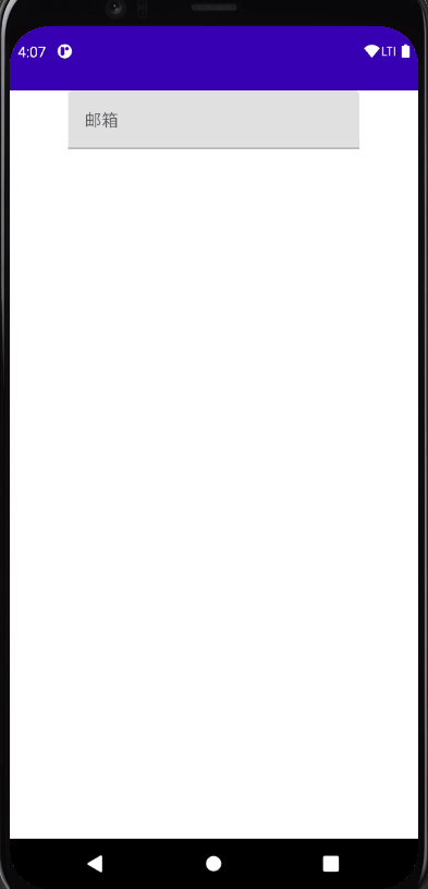
2. label 参数
label 标签可以运用在 TextField 中,当聚焦的时候会改变字体大小
@Composable
fun TextFieldDemo() {
var text by remember{ mutableStateOf("")}
Column(
modifier = Modifier
.fillMaxWidth(),
horizontalAlignment = Alignment.CenterHorizontally
) {
TextField(
value = text,
onValueChange = {
text = it
},
singleLine = true,
label = {
Text("邮箱")
}
)
}
}
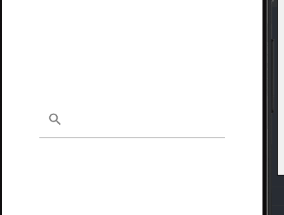
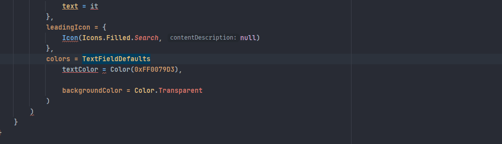
3. leadingIcon 参数
leadingIcon 参数可以在 TextField 前面布置 lambda 表达式所接收到的东西
TextField(
    value = text,
    onValueChange = {
        text = it
    },
    leadingIcon = {
        Icon(Icons.Filled.Search, null)
    },
)

虽然名字上叫做 leadingIcon,但是 leadingIcon 接收来自一个 @Composable 函数的 lambda 表达式,
我们也可以在里面填入 Text 函数
TextField(
    value = text,
    onValueChange = {
        text = it
    },
    leadingIcon = {
        Text("联系人")
    },
)

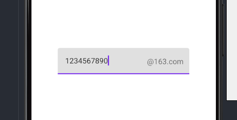
4. trailingIcon 参数
trailingIcon 参数可以在 TextField 尾部布置 lambda 表达式所接收到的东西
TextField(
    value = text,
    onValueChange = {
        text = it
    },
    trailingIcon = {
        Text("@163.com")
    },
)
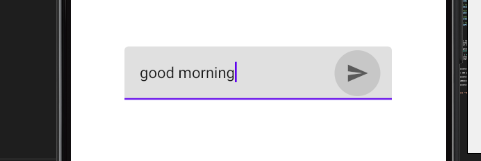
trailingIcon = {
    IconButton(onClick = {

    }){
        Icon(Icons.Filled.Send, null)
    }
},
5. Color 参数
@Composable
fun textFieldColors(
// 输入的文字颜色
textColor: Color = LocalContentColor.current. (LocalContentAlpha.current),
// 禁用 TextField 时,已有的文字颜色
disabledTextColor: Color = textColor. (ContentAlpha.disabled),
// 输入框的背景颜色,当设置为 Color.Transparent 时,将透明
backgroundColor: Color = MaterialTheme.colors.onSurface. (alpha = BackgroundOpacity),
// 输入框的光标颜色
cursorColor: Color = MaterialTheme.colors.primary,
// 当 TextField 的 isError 参数为 true 时,光标的颜色
errorCursorColor: Color = MaterialTheme.colors.error,
// 当输入框处于焦点时,底部指示器的颜色
focusedIndicatorColor: Color = MaterialTheme.colors.primary. (alpha = ContentAlpha.high),
// 当输入框不处于焦点时,底部指示器的颜色
unfocusedIndicatorColor: Color = MaterialTheme.colors.onSurface. (alpha = UnfocusedIndicatorLineOpacity),
// 禁用 TextField 时,底部指示器的颜色
disabledIndicatorColor: Color = unfocusedIndicatorColor. (alpha = ContentAlpha.disabled),
// 当 TextField 的 isError 参数为 true 时,底部指示器的颜色
errorIndicatorColor: Color = MaterialTheme.colors.error,
// TextField 输入框前头的颜色
leadingIconColor: Color = MaterialTheme.colors.onSurface. (alpha = IconOpacity),
// 禁用 TextField 时 TextField 输入框前头的颜色
disabledLeadingIconColor: Color = leadingIconColor. (alpha = ContentAlpha.disabled),
// 当 TextField 的 isError 参数为 true 时 TextField 输入框前头的颜色
errorLeadingIconColor: Color = leadingIconColor,
// TextField 输入框尾部的颜色
trailingIconColor: Color = MaterialTheme.colors.onSurface. (alpha = IconOpacity),
// 禁用 TextField 时 TextField 输入框尾部的颜色
disabledTrailingIconColor: Color = trailingIconColor. (alpha = ContentAlpha.disabled),
// 当 TextField 的 isError 参数为 true 时 TextField 输入框尾部的颜色
errorTrailingIconColor: Color = MaterialTheme.colors.error,
// 当输入框处于焦点时,Label 的颜色
focusedLabelColor: Color = MaterialTheme.colors.primary. (alpha = ContentAlpha.high),
// 当输入框不处于焦点时,Label 的颜色
unfocusedLabelColor: Color = MaterialTheme.colors.onSurface. (ContentAlpha.medium),
// 禁用 TextField 时,Label 的颜色
disabledLabelColor: Color = unfocusedLabelColor. (ContentAlpha.disabled),
// 当 TextField 的 isError 参数为 true 时,Label 的颜色
errorLabelColor: Color = MaterialTheme.colors.error,
// Placeholder 的颜色
placeholderColor: Color = MaterialTheme.colors.onSurface. (ContentAlpha.medium),
// 禁用 TextField 时,placeholder 的颜色
disabledPlaceholderColor: Color = placeholderColor. (ContentAlpha.disabled)
)
调用方法
TextField(
    value = text,
    onValueChange = {
        text = it
    },
    leadingIcon = {
        Icon(Icons.Filled.Search, null)
    },
    colors = TextFieldDefaults.textFieldColors(
        textColor = Color(0xFF0079D3),
        backgroundColor = Color.Transparent
    )
)
在你使用 IDE 智能补全的时候可能遇到这种情况
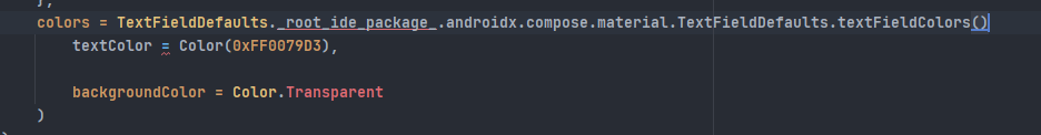
解决方法如下,手动打完函数名
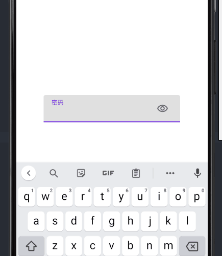
6. visualTransformation 参数
visualTransformation 可以帮助我们应用输入框的显示模式
var text by remember{mutableStateOf("")}
var passwordHidden by remember{ mutableStateOf(false)}
TextField(
value = text,
onValueChange = {
text = it
},
trailingIcon = {
IconButton(
onClick = {
passwordHidden = !passwordHidden
}
){
Icon(painterResource(id = R.drawable.visibility), null)
}
},
label = {
Text("密码")
},
visualTransformation = if(passwordHidden) PasswordVisualTransformation() else VisualTransformation.None
)

【声明】本内容来自华为云开发者社区博主,不代表华为云及华为云开发者社区的观点和立场。转载时必须标注文章的来源(华为云社区)、文章链接、文章作者等基本信息,否则作者和本社区有权追究责任。如果您发现本社区中有涉嫌抄袭的内容,欢迎发送邮件进行举报,并提供相关证据,一经查实,本社区将立刻删除涉嫌侵权内容,举报邮箱:
cloudbbs@huaweicloud.com
- 点赞
- 收藏
- 关注作者
评论(0)