Jetpack Compose-Text【下】

6. 可点击的 Text
有的时候也许您需要将文本当作按钮,那么只需要添加 Modifier.clickable 即可
代码如下:
@Composable
fun TextDemo() {
    Text(
        text = "确认编辑",
        modifier = Modifier.clickable(
            onClick = {
                  // TODO
            },
        )
    )
}
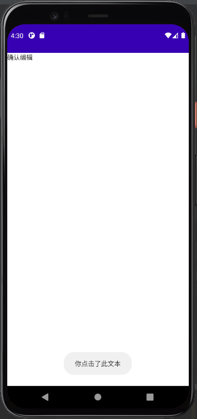
取消点击波纹
但是我们会发现,clickable 有自带的波纹效果,如果我们想要取消的话,只需要添加两个参数即可:
@Composable
fun TextDemo() {
// 获取 context
val context = LocalContext.current
Text(
text = "确认编辑",
modifier = Modifier.clickable(
onClick = {
// 通知事件
Toast.makeText(context, "你点击了此文本", Toast.LENGTH_LONG).show()
},
indication = null,
interactionSource = MutableInteractionSource()
)
)
}
效果如下:
7. 特定的文字显示
如果我们想让一个 Text 语句中使用不同的样式,比如粗体提醒,特殊颜色
则我们需要使用到 AnnotatedString
AnnotatedString 是一个数据类,其中包含了:
-
一个
Text的值 -
一个
SpanStyleRange的List,等同于位置范围在文字值内的内嵌样式 -
一个
ParagraphStyleRange的List,用于指定文字对齐、文字方向、行高和文字缩进样式
inline fun <R : Any> AnnotatedString.Builder.withStyle(
    style: SpanStyle,
    block: AnnotatedString.Builder.() -> crossinline R
): R
一个简单的代码演示:
@Composable
fun TextDemo() {
    Column(
        modifier = Modifier.fillMaxWidth(),
        horizontalAlignment = Alignment.CenterHorizontally
    ) {
        Text(
            buildAnnotatedString {
                append("你现在观看的章节是 ")
                withStyle(style = SpanStyle(fontWeight = FontWeight.W900)) {
                    append("Text")
                }
            }
        )
    }
}
效果如下:

8. 文字超链接?(ClickableText)
在第 6部分我们已经介绍了可以通过 AnnotatedString 来完成在一个 Text 中给不同的文字应用不同的样式
在第 5部分我们已经介绍了可以通过 Modifier.Clickable() 来完成检测 Text 的点击
但是 Modifier.Clickable() 无法检测 Text 中的部分点击,那如果我们需要检测一个 Text 中的部分点击事件该怎么办呢?就像我们经常在 App 底下看到的用户协议等
其实很简单,Compose 也给我们准备了 ClickableText,来看看如何使用吧!
package com.example.composestudy
import android.content.ContentValues.TAG
import android.os.Bundle
import android.util.Log
import androidx.activity.ComponentActivity
import androidx.activity.compose.setContent
import androidx.compose.foundation.layout.Column
import androidx.compose.foundation.layout.Spacer
import androidx.compose.foundation.layout.fillMaxWidth
import androidx.compose.foundation.layout.padding
import androidx.compose.foundation.text.ClickableText
import androidx.compose.material.MaterialTheme
import androidx.compose.material.Text
import androidx.compose.runtime.Composable
import androidx.compose.ui.Alignment
import androidx.compose.ui.Modifier
import androidx.compose.ui.graphics.Color
import androidx.compose.ui.text.SpanStyle
import androidx.compose.ui.text.TextStyle
import androidx.compose.ui.text.buildAnnotatedString
import androidx.compose.ui.text.font.FontWeight
import androidx.compose.ui.text.style.TextOverflow
import androidx.compose.ui.text.withStyle
import androidx.compose.ui.tooling.preview.Preview
import androidx.compose.ui.unit.dp
import androidx.compose.ui.unit.sp
class MainActivity : ComponentActivity() {
override fun onCreate(savedInstanceState: Bundle?) {
super.onCreate(savedInstanceState)
setContent {
TextDemo()
}
}
}
@Composable
fun TextDemo() {
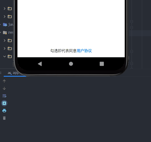
val text = buildAnnotatedString {
append("勾选即代表同意")
withStyle(
style = SpanStyle(
color = Color(0xFF0E9FF2),
fontWeight = FontWeight.Bold
)
) {
append("用户协议")
}
}
ClickableText(
text = text,
onClick = { offset ->
Log.d(TAG, "Hi,你按到了第 $offset 位的文字")
}
)
}
@Preview(name = "Light Mode")
@Composable
fun PreviewMessageCard() {
TextDemo()
} 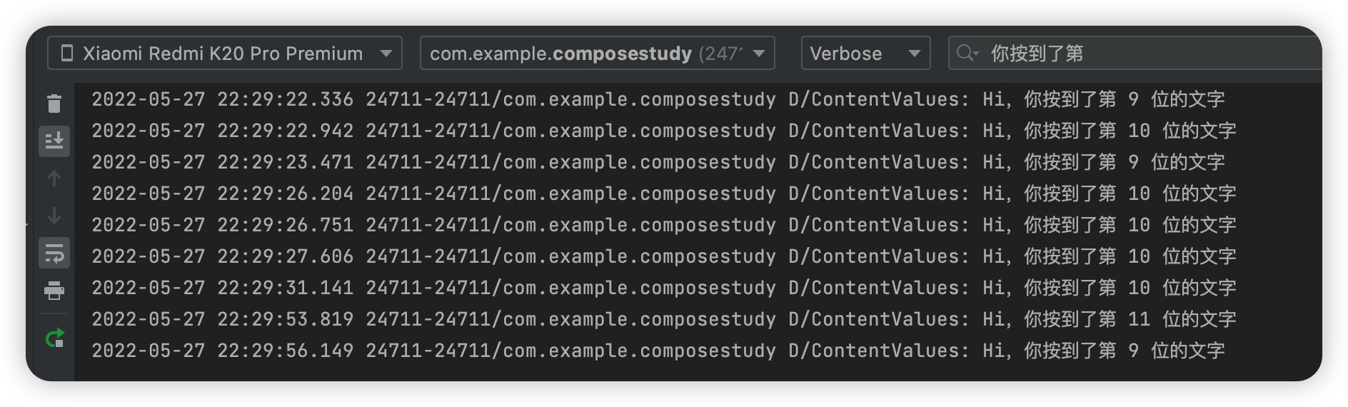
但是...怎么才能检测用户协议这四个字符的点击事件呢?
也不用怕,Compose 还在 buildAnnotatedString 和 ClickableText 中引入了相应的方法
先来看看代码吧!
val annotatedText = buildAnnotatedString {
append("勾选即代表同意")
pushStringAnnotation(
tag = "tag",
annotation = "一个用户协议啦啦啦,内容内容"
)
withStyle(
style = SpanStyle(
color = Color(0xFF0E9FF2),
fontWeight = FontWeight.Bold
)
) {
append("用户协议")
}
pop()
}
ClickableText(
text = annotatedText,
onClick = { offset ->
annotatedText.getStringAnnotations(
tag = "tag", start = offset,
end = offset
).firstOrNull()?.let { annotation ->
Log.d(TAG, "你已经点到 ${annotation.item} 啦")
}
}
)
在上面的代码中
-
多了一个
pushStringAnnotation()方法,它会将给定的注释附加到任何附加的文本上,直到相应的pop被调用 -
getStringAnnotations()方法是查询附加在这个AnnotatedString上的字符串注释。注释是附加在AnnotatedString上的元数据,例如,在我们的代码中"tag"是附加在某个范围上的字符串元数据。注释也与样式一起存储在Range中
小试牛刀
那么,你已经学会了如何自定义 Text 中的样式和点击事件,来尝试做出一个这样的效果?
实现的代码可以通过以下的方式来查看
package com.example.composestudy
import android.content.ContentValues.TAG
import android.os.Bundle
import android.util.Log
import androidx.activity.ComponentActivity
import androidx.activity.compose.setContent
import androidx.compose.foundation.layout.*
import androidx.compose.foundation.text.ClickableText
import androidx.compose.material.AlertDialog
import androidx.compose.material.Button
import androidx.compose.material.MaterialTheme
import androidx.compose.material.Text
import androidx.compose.runtime.*
import androidx.compose.ui.Alignment
import androidx.compose.ui.Modifier
import androidx.compose.ui.graphics.Color
import androidx.compose.ui.res.stringResource
import androidx.compose.ui.semantics.Role.Companion.Button
import androidx.compose.ui.text.SpanStyle
import androidx.compose.ui.text.TextStyle
import androidx.compose.ui.text.buildAnnotatedString
import androidx.compose.ui.text.font.FontWeight
import androidx.compose.ui.text.style.TextOverflow
import androidx.compose.ui.text.withStyle
import androidx.compose.ui.tooling.preview.Preview
import androidx.compose.ui.unit.dp
import androidx.compose.ui.unit.sp
class MainActivity : ComponentActivity() {
override fun onCreate(savedInstanceState: Bundle?) {
super.onCreate(savedInstanceState)
setContent {
TextDemo()
}
}
}
@Composable
fun TextDemo() {
var content by remember{ mutableStateOf("")}
val openDialog = remember { mutableStateOf(false) }
val annotatedText = buildAnnotatedString {
append("勾选即代表同意")
pushStringAnnotation(
tag = "tag",
annotation = stringResource(id = R.string.content)
)
withStyle(
style = SpanStyle(
color = Color(0xFF0E9FF2),
fontWeight = FontWeight.Bold
)
) {
append("用户协议")
}
pop()
}
Box(
modifier = Modifier
.fillMaxSize()
.padding(bottom = 15.dp),
contentAlignment = Alignment.BottomCenter
){
ClickableText(
text = annotatedText,
onClick = { offset ->
annotatedText.getStringAnnotations(
tag = "tag", start = offset,
end = offset
).firstOrNull()?.let { annotation ->
openDialog.value = true
content = annotation.item
}
}
)
}
if(openDialog.value){
AlertDialog(
onDismissRequest = {
openDialog.value = false
},
title = {
Box(Modifier.fillMaxWidth(),contentAlignment = Alignment.Center){
Text(
text = "用户协议",
style = MaterialTheme.typography.h6,
)
}
},
text = {
Text(content)
},
confirmButton = {
Button(
onClick = {
openDialog.value = false
}
){
Text("确认")
}
},
dismissButton = {
Button(
onClick = {
openDialog.value = false
}
){
Text("取消")
}
}
)
}
}
@Preview(name = "Light Mode")
@Composable
fun PreviewMessageCard() {
TextDemo()
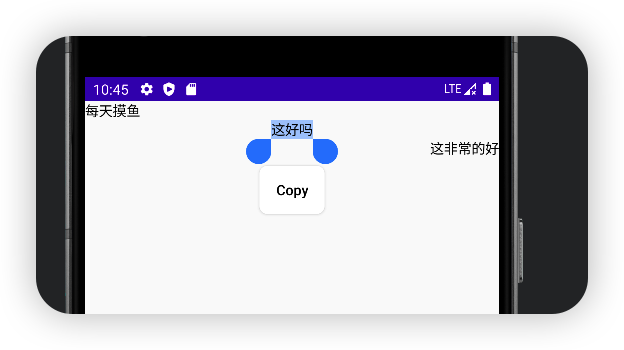
}9. 文字复制
默认情况下 Text 并不能进行复制等操作,我们需要设置 SelectionContainer 来包装 Text
package com.example.composestudy
import android.os.Bundle
import androidx.activity.ComponentActivity
import androidx.activity.compose.setContent
import androidx.compose.foundation.layout.Column
import androidx.compose.foundation.layout.fillMaxWidth
import androidx.compose.foundation.text.selection.SelectionContainer
import androidx.compose.material.Text
import androidx.compose.runtime.Composable
import androidx.compose.ui.Modifier
import androidx.compose.ui.text.style.TextAlign
import androidx.compose.ui.tooling.preview.Preview
class MainActivity : ComponentActivity() {
override fun onCreate(savedInstanceState: Bundle?) {
super.onCreate(savedInstanceState)
setContent {
TextDemo()
}
}
}
@Composable
fun TextDemo() {
SelectionContainer {
Column{
Text(
text = "每天摸鱼",
modifier = Modifier.fillMaxWidth(),
textAlign = TextAlign.Left
)
Text(
text = "这好吗",
modifier = Modifier.fillMaxWidth(),
textAlign = TextAlign.Center
)
Text(
text = "这非常的好",
modifier = Modifier.fillMaxWidth(),
textAlign = TextAlign.Right
)
}
}
}
@Preview(name = "Light Mode")
@Composable
fun PreviewMessageCard() {
TextDemo()
}
10. 文字强调效果
文字根据不同情况来确定文字的强调程度,以突出重点并体现出视觉上的层次感。
Material Design 建议采用不同的不透明度来传达这些不同的重要程度,你可以通过 LocalContentAlpha 实现此功能。
您可以通过为此 CompositionLocal 提供一个值来为层次结构指定内容 Alpha 值。(CompositionLocal 是一个用于隐式的传递参数的组件,后续会提到)
package com.example.composestudy
import android.os.Bundle
import androidx.activity.ComponentActivity
import androidx.activity.compose.setContent
import androidx.compose.foundation.layout.Column
import androidx.compose.material.ContentAlpha
import androidx.compose.material.LocalContentAlpha
import androidx.compose.material.Text
import androidx.compose.runtime.Composable
import androidx.compose.runtime.CompositionLocalProvider
import androidx.compose.ui.tooling.preview.Preview
class MainActivity : ComponentActivity() {
override fun onCreate(savedInstanceState: Bundle?) {
super.onCreate(savedInstanceState)
setContent {
TextDemo()
}
}
}
@Composable
fun TextDemo() {
Column() {
// 将内部 Text 组件的 alpha 强调程度设置为高
// 注意: MaterialTheme 已经默认将强调程度设置为 high
CompositionLocalProvider(LocalContentAlpha provides ContentAlpha.high) {
Text("这里是high强调效果")
}
// 将内部 Text 组件的 alpha 强调程度设置为中
CompositionLocalProvider(LocalContentAlpha provides ContentAlpha.medium) {
Text("这里是medium强调效果")
}
// 将内部 Text 组件的 alpha 强调程度设置为禁用
CompositionLocalProvider(LocalContentAlpha provides ContentAlpha.disabled) {
Text("这里是禁用后的效果")
}
}
}
@Preview(name = "Light Mode")
@Composable
fun PreviewMessageCard() {
TextDemo()
}
这是运行效果:
这张图可以很好的说明这个效果
11. 文字水平位置
一般情况下,Text 不会水平居中,如果你在 Row, Column, Box 这些 Composable 里面想要实现居中的效果,你可以在 Text 外围写一个 Box, Row, Column 等
像这样:
Column {
    Text("123")
    Text("456")
    Box(
        modifier = Modifier.fillMaxWidth(),
        contentAlignment = Alignment.Center
    ) {
        Text("789")
    }
}
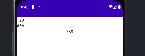
水平靠左: Alignment.Start
水平靠右: Alignment.End
如果你的 Column 有 Modifier.fillMaxWidth() 的属性或者指定了宽度/大小,那么你可以直接在 Text 里面写 Modifier.align(Alignment.CenterHorizontally) 来让 Text 处于水平居中的位置
12. 更多

- 点赞
- 收藏
- 关注作者
评论(0)