Flutter:如何从头开始创建自定义图标选择器

【摘要】 Flutter:如何从头开始创建自定义图标选择器下面的示例向您展示了如何在 Flutter 中从头开始创建自定义图标选择器。无需安装任何第三方包,图标选择器将尽可能整洁且极其灵活(您可以按照自己的方式进行设计),而不必担心将 Flutter 更新到新版本时出现不兼容问题。应用预览我们要制作的图标将显示为对话框。当您单击一个图标时,该图标将被选中。或者,您可以使用关闭按钮关闭对话框而不进行任何...
下面的示例向您展示了如何在 Flutter 中从头开始创建自定义图标选择器。无需安装任何第三方包,图标选择器将尽可能整洁且极其灵活(您可以按照自己的方式进行设计),而不必担心将 Flutter 更新到新版本时出现不兼容问题。
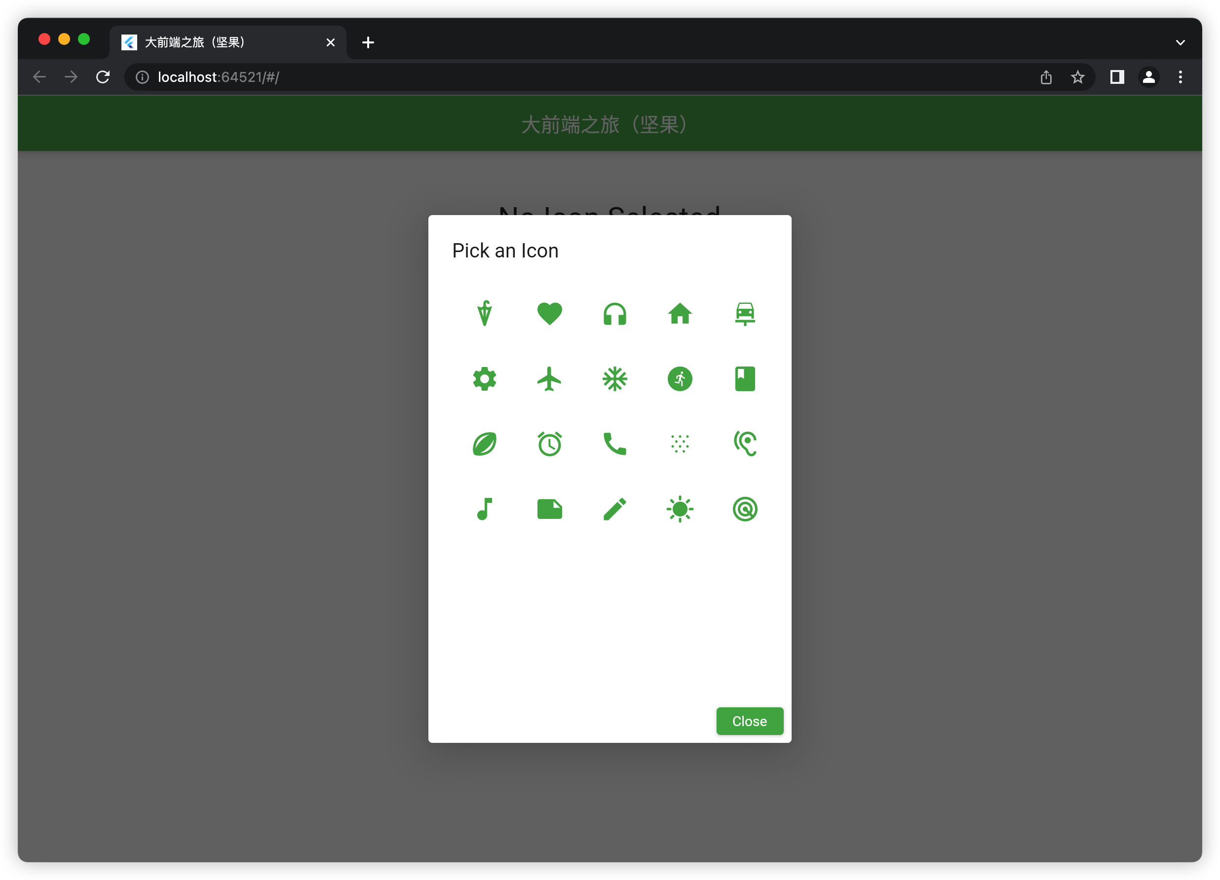
应用预览
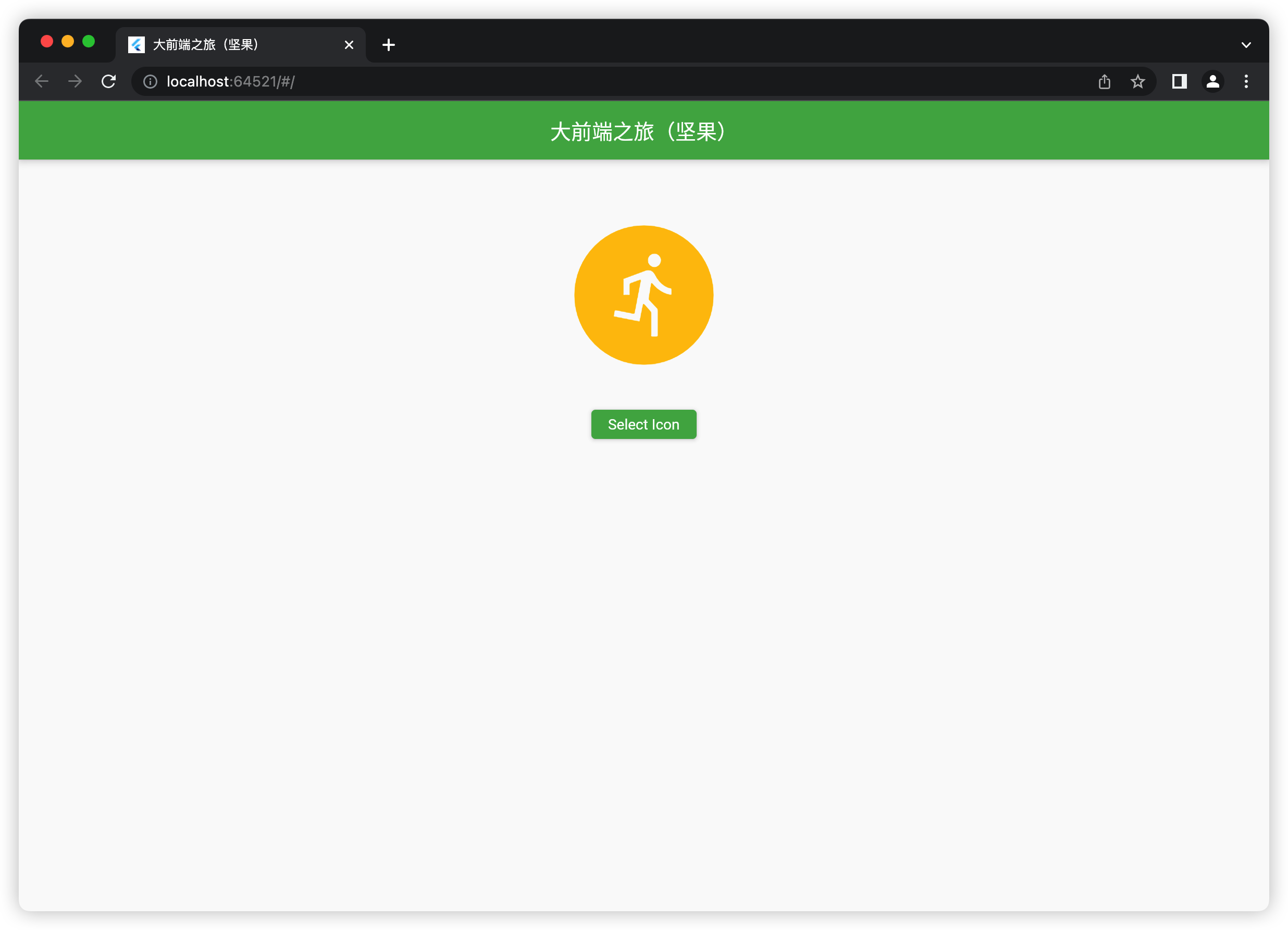
我们要制作的图标将显示为对话框。当您单击一个图标时,该图标将被选中。或者,您可以使用关闭按钮关闭对话框而不进行任何选择
显示的图标是来自 Flutter 的素材图标。您可以添加或删除您想要的任何材料图标。此外,先前选择的图标将以蓝色突出显示。其他图标为绿色。
一个快速的演示价值超过一千字,让我们开始。
编写代码
1.在项目的lib文件夹中,创建一个名为custom_icon_picker.dart的新文件。此文件存储我们的图标选择器的代码。它是独立的、独立的,并且可以在以后重复使用。
这是带有注释的代码:
// custom_icon_picker.dart
// by 大前端之旅(坚果)
import 'package:flutter/material.dart';
Future<IconData?> showIconPicker(
{required BuildContext context, IconData? defalutIcon}) async {
// these are the selectable icons
// they will be displayed in a grid view
// you can specify the icons you need
final List<IconData> allIcons = [
Icons.umbrella_sharp,
Icons.favorite,
Icons.headphones,
Icons.home,
Icons.car_repair,
Icons.settings,
Icons.flight,
Icons.ac_unit,
Icons.run_circle,
Icons.book,
Icons.sports_rugby_rounded,
Icons.alarm,
Icons.call,
Icons.snowing,
Icons.hearing,
Icons.music_note,
Icons.note,
Icons.edit,
Icons.sunny,
Icons.radar,
// add more icons here if you want
];
// selected icon
// the selected icon is highlighed
// so it looks different from the others
IconData? selectedIcon = defalutIcon;
await showDialog(
context: context,
builder: (_) => AlertDialog(
title: const Text('Pick an Icon'),
content: Container(
width: 320,
height: 400,
alignment: Alignment.center,
// This grid view displays all selectable icons
child: GridView.builder(
gridDelegate: const SliverGridDelegateWithMaxCrossAxisExtent(
maxCrossAxisExtent: 60,
childAspectRatio: 1 / 1,
crossAxisSpacing: 10,
mainAxisSpacing: 10),
itemCount: allIcons.length,
itemBuilder: (_, index) => Container(
key: ValueKey(allIcons[index].codePoint),
padding: const EdgeInsets.all(10),
child: Center(
child: IconButton(
// give the selected icon a different color
color: selectedIcon == allIcons[index]
? Colors.blue
: Colors.green,
iconSize: 30,
icon: Icon(
allIcons[index],
),
onPressed: () {
selectedIcon = allIcons[index];
Navigator.of(context).pop();
},
),
),
)),
),
actions: [
ElevatedButton(
onPressed: () {
Navigator.of(context).pop();
},
child: const Text('Close'))
],
));
return selectedIcon;
}
2.现在是测试它的时候了。将main.dart中的所有代码替换为以下内容:
// main.dart
import 'package:flutter/material.dart';
// Import the custom icon picker
import './custom_icon_picker.dart';
void main() {
runApp(const MyApp());
}
class MyApp extends StatelessWidget {
const MyApp({Key? key}) : super(key: key);
@override
Widget build(BuildContext context) {
return MaterialApp(
// Remove the debug banner icon
debugShowCheckedModeBanner: false,
title: '大前端之旅(坚果)',
theme: ThemeData(
primarySwatch: Colors.green,
),
home: const HomeScreen(),
);
}
}
class HomeScreen extends StatefulWidget {
const HomeScreen({Key? key}) : super(key: key);
@override
State<HomeScreen> createState() => _HomeScreenState();
}
class _HomeScreenState extends State<HomeScreen> {
// selected icon
// it will be shown if not null
IconData? _selectedIcon;
@override
Widget build(BuildContext context) {
return Scaffold(
appBar: AppBar(title: const Text('大前端之旅(坚果)')),
body: Center(
child: Column(
children: [
const SizedBox(
height: 50,
),
_selectedIcon == null
? const Text(
'No Icon Selected',
style: TextStyle(fontSize: 30),
)
: Icon(
_selectedIcon,
size: 160,
color: Colors.amber,
),
const SizedBox(
height: 30,
),
// this button is used to show the icon picker
ElevatedButton(
onPressed: () async {
final IconData? result = await showIconPicker(
context: context, defalutIcon: _selectedIcon);
setState(() {
_selectedIcon = result;
});
},
child: const Text('Select Icon'))
],
),
),
);
}
}
3.启动您的应用程序并查看结果。
结论
我们构建了自己的没有依赖关系的图标选择器。是不是很nice,因为它将在未来稳定工作,而不必担心不兼容错误。

【声明】本内容来自华为云开发者社区博主,不代表华为云及华为云开发者社区的观点和立场。转载时必须标注文章的来源(华为云社区)、文章链接、文章作者等基本信息,否则作者和本社区有权追究责任。如果您发现本社区中有涉嫌抄袭的内容,欢迎发送邮件进行举报,并提供相关证据,一经查实,本社区将立刻删除涉嫌侵权内容,举报邮箱:
cloudbbs@huaweicloud.com
- 点赞
- 收藏
- 关注作者
评论(0)