使用 Python 进行数据可视化之Seaborn

上一篇文章我们介绍了 Matplotlib,接下来让我们继续我们列表的第二个库——Seaborn。Seaborn 是一个建立在 Matplotlib 之上的高级接口。 它提供了漂亮的设计风格和调色板来制作更具吸引力的图形。
安装
要安装 seaborn,请在终端中输入以下命令。
pip install seaborn
Seaborn 建立在 Matplotlib 之上,因此它也可以与 Matplotlib 一起使用。一起使用 Matplotlib 和 Seaborn 是一个非常简单的过程。我们只需要像之前一样调用 Seaborn Plotting 函数,然后就可以使用 Matplotlib 的自定义函数了。
注意: Seaborn 加载了提示、虹膜等数据集,但在本教程中,我们将使用 Pandas 加载这些数据集。
例子:
# 导包
import seaborn as sns
import matplotlib.pyplot as plt
import pandas as pd
# 读取数据库
data = pd.read_csv("tips.csv")
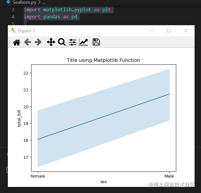
# 画线图
sns.lineplot(x="sex", y="total_bill", data=data)
# 使用 Matplotlib 设置标题
plt.title('Title using Matplotlib Function')
plt.show()
输出:
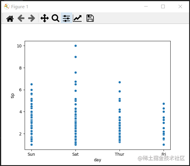
散点图
散点图是使用scatterplot() 方法绘制的。这类似于 Matplotlib,但需要额外的参数数据。
# 导包
import seaborn as sns
import matplotlib.pyplot as plt
import pandas as pd

# 读取数据库
data = pd.read_csv("tips.csv")

sns.scatterplot(x='day', y='tip', data=data,)
plt.show()
输出:
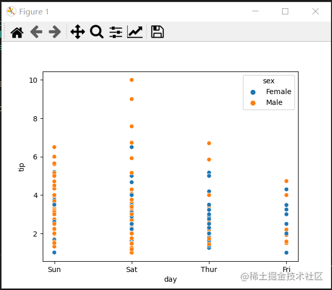
你会发现在使用 Matplotlib 时,如果你想根据sex为这个图的每个点着色会很困难。 但在散点图中,它可以在色调参数的帮助下完成。
例子:
# 导包
import seaborn as sns
import matplotlib.pyplot as plt
import pandas as pd

# 读取数据库
data = pd.read_csv("tips.csv")

sns.scatterplot(x='day', y='tip', data=data,
			hue='sex')
plt.show()
输出:
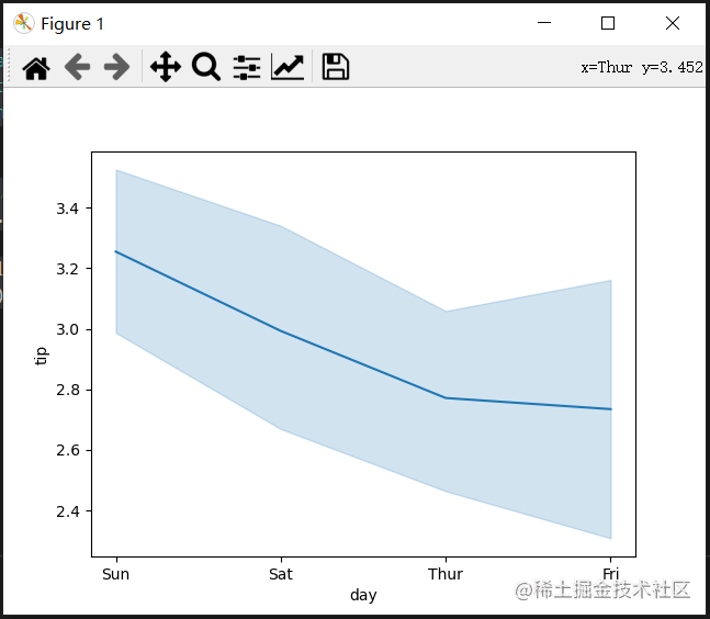
线图
Seaborn 中的 Line Plot 使用 lineplot() 方法绘制。 在这种情况下,我们也可以只传递 data 参数。
示例:
# 导包
import seaborn as sns
import matplotlib.pyplot as plt
import pandas as pd


# 读取数据库
data = pd.read_csv("tips.csv")

sns.lineplot(x='day', y='tip', data=data)
plt.show()
输出:
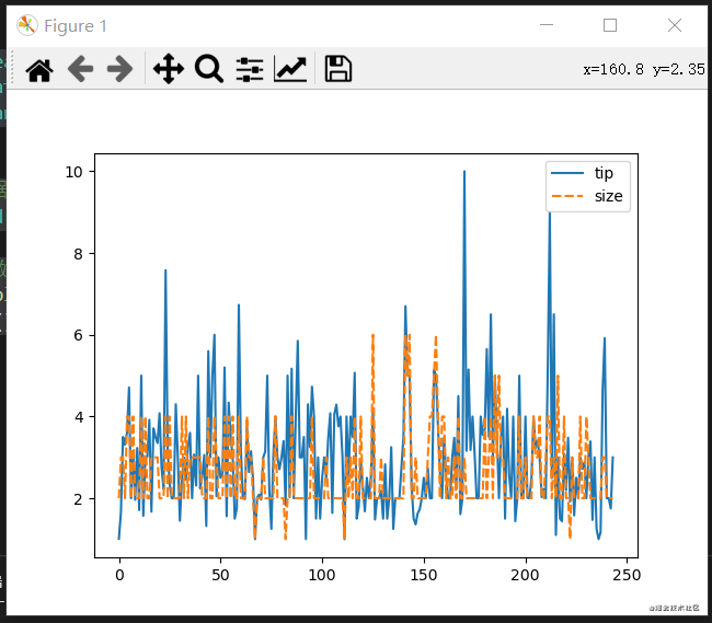
示例 2:
# 导包
import seaborn as sns
import matplotlib.pyplot as plt
import pandas as pd


# 读取数据库
data = pd.read_csv("tips.csv")

# 仅使用数据属性
sns.lineplot(data=data.drop(['total_bill'], axis=1))
plt.show()
输出:
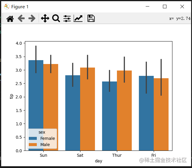
条形图
Seaborn 中的条形图可以使用barplot()方法.
例子:
# 导包
import seaborn as sns
import matplotlib.pyplot as plt
import pandas as pd


# 读取数据库
data = pd.read_csv("tips.csv")

sns.barplot(x='day',y='tip', data=data,
			hue='sex')

plt.show()
输出:
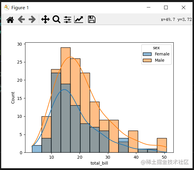
直方图
Seaborn 中的直方图可以使用histplot() 函数绘制。
例子:
# 导包
import seaborn as sns
import matplotlib.pyplot as plt
import pandas as pd


# 读取数据库
data = pd.read_csv("tips.csv")

sns.histplot(x='total_bill', data=data, kde=True, hue='sex')

plt.show()
输出:
在浏览完所有这些绘图后,您一定已经注意到,使用 Seaborn 自定义绘图比使用 Matplotlib 容易得多。 它也是基于 matplotlib 构建的,那么我们也可以在使用 Seaborn 时使用 matplotlib 函数。下一节我们继续谈第三个库——Bokeh

- 点赞
- 收藏
- 关注作者
评论(0)