Google earth engine(GEE)——绘制直方图histogram

很多朋友可能喜欢在GEE中直接进行某些数据的统计和出图,所以今天我们就来讲讲直方图的统计和绘制。
首先看看主要用到的GEE当中的方法:
ui.Chart.image.histogram(image, region, scale, maxBuckets, minBucketWidth, maxRaw, maxPixels)
Generates a Chart from an image. Computes and plots histograms of the values of the bands in the specified region of the image.
- X-axis: Histogram buckets (of band value).//恒后一般是你的波段
- Y-axis: Frequency (number of pixels with a band value in the bucket).//相应波段的频率
Returns a chart.
Arguments:
image (Image):
The image to generate a histogram from.
region (Feature|FeatureCollection|Geometry, optional):
The region to reduce. If omitted, uses the entire image.
scale (Number, optional):
The pixel scale used when applying the histogram reducer, in meters.
maxBuckets (Number, optional):
The maximum number of buckets to use when building a histogram; will be rounded up to a power of 2.
构建直方图时使用的最大桶数,也就是列数;将四舍五入到 2 的幂。
minBucketWidth (Number, optional):
The minimum histogram bucket width, or null to allow any power of 2.
最小直方条宽度,或 null 以允许任何 2 的幂。
maxRaw (Number, optional):
The number of values to accumulate before building the initial histogram.
在构建初始直方图之前要累积的值的数量。
maxPixels (Number, optional):
If specified, overrides the maximum number of pixels allowed in the histogram reduction. Defaults to 1e6.
如果指定,则覆盖直方图缩减中允许的最大像素数。默认为 1e6
Returns: ui.Chart
此外还有一个功能要说:
setOptions(options)用于设置你要选择的什么图形,并由很多参数可以设置
DEPRECATED: Use ui.Chart.* instead.目前用这个替代
Sets options used to style this chart.
Returns a new Chart with the passed-in options.
Arguments:
this:chart (Chart):
The Chart instance.
options (Object):
An object defining chart style options such as:
- title (string) The title of the chart.
标题(字符串)图表的标题
- colors (Array) An array of colors used to draw the chart. Its format should follow the Google Visualization API's
颜色(数组)用于绘制图表的颜色数组。其格式应遵循 Google Visualization API 的选项:
options: https://developers.google.com/chart/interactive/docs/customizing_charts
可以将下面的颜色换成
colors: ['#e0440e', '#e6693e', '#ec8f6e', '#f3b49f', '#f6c7b6']
还可以设置长宽:
 width: 400,
 height: 240,
Returns: Chart
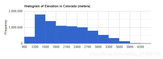
这次用到的数据主要是DEM数据,而且以矩形的形式圈定了一块范围,最后分别统计不同高程处的影像数量。代码很简单:
-
var elevation = ee.Image('CGIAR/SRTM90_V4');
-
var colorado = ee.Geometry.Rectangle({
-
coords: [-109.05, 37, -102.05, 41],
-
geodesic: false
-
});
-
-
// 生成直方图数据. 设置直方图每一条的宽度是多少,或者是2的N次方
-
-
var histogram = ui.Chart.image.histogram({
-
image: elevation,
-
region: colorado,
-
scale: 200,
-
minBucketWidth: 300
-
});
-
histogram.setOptions({
-
width: 400,
-
height: 240,
-
title: 'Histogram of Elevation in Colorado (meters)'
-
colors: ['#e0440e', '#e6693e', '#ec8f6e', '#f3b49f', '#f6c7b6']
-
});
-
-
print(histogram);
-
-
Map.addLayer(elevation.clip(colorado));
-
Map.setCenter(-107, 39, 6);
这是选择的美国科罗拉多州的DEM看起来不清晰,因为没有使用相应的色调进行描绘
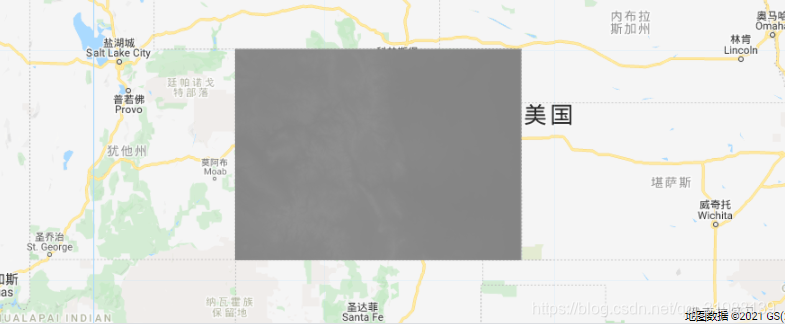
换了色彩之后是这样的
文章来源: blog.csdn.net,作者:此星光明2021年博客之星云计算Top3,版权归原作者所有,如需转载,请联系作者。
原文链接:blog.csdn.net/qq_31988139/article/details/118968923

- 点赞
- 收藏
- 关注作者
评论(0)