使用 HTML 和 CSS 的玻璃态登录表单(含免费完整源码)

直接跳到末尾 获取完整源码
在本文中,我将带着大家展示如何使用 HTML 和 CSS 代码创建 玻璃态登录表单。你可以将任何简单的设计转换为玻璃态设计。为此,只需要更改一点代码。首先使用 background-color semi-transparent 比如
rgba (255,255,255,0.13)。其次,我们需要使用backdrop-filter: blur (10px)来模糊背景。最后需要使用边框来增强其美感。
@[TOC](❤️使用 HTML 和 CSS 的玻璃态登录表单❤️)
🎪 在线演示地址
https://haiyong.site/lanqiao/13.html
你可以观看现场演示以了解它是如何工作的。如果你想使用 HTML 和 CSS 代码创建玻璃态登录表单,请按照以下教程进行操作。
正如你在上面的演示中看到的那样,它的构建就像一个普通的登录表单。在网页上创建了两个彩色圆圈。
🥇 第 1 步:设计网页
我使用下面的少量 CSS 代码设计了网页。这里我使用了黑色作为网页的背景色。
*,
*:before,
*:after{
    padding: 0;
    margin: 0;
    box-sizing: border-box;
}
body{
    background-color: #080710;
}
输出:

🥈 第 2 步:在背景中创建两个彩色圆圈
我使用以下 HTML 和 CSS 代码在该页面上创建了两个彩色圆圈。虽然这两个圆圈不是设计的一部分,但我创建了这两个圆圈来设计背景。但是,在这种情况下,你可以使用任何其他图像。
这个圆的宽度和高度为 200 像素,并且使用了 50% 的边框半径使其完全圆形。位置:绝对化,使其保持在同一个位置。
<div class="background">
   <div class="shape"></div>
   <div class="shape"></div>
</div>
.background{
    width: 430px;
    height: 520px;
    position: absolute;
    transform: translate(-50%,-50%);
    left: 50%;
    top: 50%;
}
.background .shape{
    height: 200px;
    width: 200px;
    position: absolute;
    border-radius: 50%;
}
使用下面的 CSS 代码,我分别设计了两者并使用了不同的颜色。我在第一个球体的背景中使用了蓝色绿色渐变。在第二个圆圈的情况下,我使用了红色黄色的渐变色。
.shape:first-child{
    background: linear-gradient(
        #1845ad,
        #23a2f6
    );
    left: -80px;
    top: -80px;
}
.shape:last-child{
    background: linear-gradient(
        to right,
        #ff512f,
        #f09819
    );
    right: -30px;
    bottom: -80px;
}
输出:

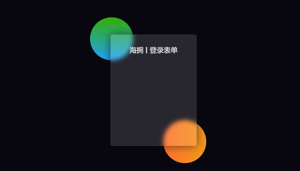
📰 第 3 步:创建玻璃态登录表单的基本结构
我们使用以下 HTML 和 CSS 代码创建了此登录表单的基本结构。这个玻璃态效果登录表单的宽度为 400px 和高度为 520px.
我在这里使用了背景颜色半透明。Border-radius: 10px用来让四个角变得有点圆。如果你观看演示,你将了解此登录表单背景中的颜色有点模糊。为此使用backdrop-filter: blur (10px)。
<form>

</form>
form{
    height: 520px;
    width: 400px;
    background-color: rgba(255,255,255,0.13);
    position: absolute;
    transform: translate(-50%,-50%);
    top: 50%;
    left: 50%;
    border-radius: 10px;
    backdrop-filter: blur(10px);
    border: 2px solid rgba(255,255,255,0.1);
    box-shadow: 0 0 40px rgba(8,7,16,0.6);
    padding: 50px 35px;
}
form *{
    font-family: 'Poppins',sans-serif;
    color: #ffffff;
    letter-spacing: 0.5px;
    outline: none;
    border: none;
}
输出:

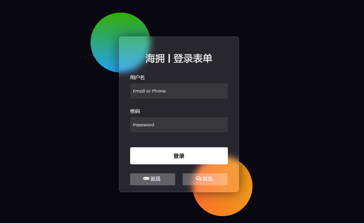
📲 第 4 步:向表单添加标题
现在使用这些代码我在表单中创建了一个标题。我使用了font-size: 32px来增加该标题的文本大小,并使用 text-align: center 将文本保持在中间。
<h3>海拥 | 登录表单</h3>
form h3{
    font-size: 32px;
    font-weight: 500;
    line-height: 42px;
    text-align: center;
}
输出:
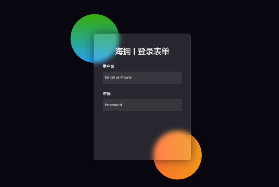
🎯 第 5 步:创建用于输入的输入位置
使用下面的代码,我创建了一个用于输入电子邮件 ID 和密码的地方。为此,我使用了 HTML 的输入功能。我使用了 50px 高度的输入框并使用了半透明的背景色。
<label for="username">用户名</label>
   <input type="text" placeholder="Email or Phone" id="username">

 <label for="password">密码</label>
   <input type="password" placeholder="Password" id="password">
label{
    display: block;
    margin-top: 30px;
    font-size: 16px;
    font-weight: 500;
}
input{
    display: block;
    height: 50px;
    width: 100%;
    background-color: rgba(255,255,255,0.07);
    border-radius: 3px;
    padding: 0 10px;
    margin-top: 8px;
    font-size: 14px;
    font-weight: 300;
}
::placeholder{
    color: #e5e5e5;
}
输出:
🏆 第 6 步:在玻璃态登录表单中添加登录按钮
现在我在Glassmorphism 登录表单中创建了一个登录按钮。此登录按钮没有特定大小。
我已经使用填充来给出这个大小。此按钮的背景颜色为全白,并font-size: 18px使用 。
<button>登录</button>
button{
    margin-top: 50px;
    width: 100%;
    background-color: #ffffff;
    color: #080710;
    padding: 15px 0;
    font-size: 18px;
    font-weight: 600;
    border-radius: 5px;
    cursor: pointer;
}
输出:

🍺 第 7 步:创建两个社交按钮
我在最后创建了两个社交媒体按钮。两个按钮的长度为150px,背景颜色为半透明。
这里我使用了我使用font-awesome的CDN链接激活的图标。
<div class="social">
   <a href="http://haiyong.site/moyu">
   	<div class="go"><i class="fas fa-gamepad"></i>游戏</div>
   </a>
   <a href="http://haiyong.site/contact">
   	<div class="fb"><i class="far fa-comments"></i>联系</div>
   	</a>
 </div>
.social{
  margin-top: 30px;
  display: flex;
}
.social div{
  background: red;
  width: 150px;
  border-radius: 3px;
  padding: 5px 10px 10px 5px;
  background-color: rgba(255,255,255,0.27);
  color: #eaf0fb;
  text-align: center;
}
.social div:hover{
  background-color: rgba(255,255,255,0.47);
}
.social .co{
  margin-left: 25px;
}
.social i{
  margin-right: 4px;
}
输出:
到此我们借助 HTML 和 CSS 创建的玻璃态登录表单已经完成了。
🛬 wuhu ! 起飞 !
希望通过本文,你已经学会了如何使用 HTML 和 CSS 制作的玻璃态登录表单。我之前使用 HTML、CSS 和 JavaScript 制作了更多类型的小工具,如果你愿意,可以查看这些设计。

- 点赞
- 收藏
- 关注作者
评论(0)