【愚公系列】2022年03月 微信小程序-进度条的使用

【摘要】 前言进度条展示操作的当前进度,进度条使用场景:在操作需要较长时间才能完成时,为用户显示该操作的当前进度和状态。当一个操作会打断当前界面,或者需要在后台运行,且耗时可能超过 2 秒时;当需要显示一个操作完成的百分比时。小程序进度条属性介绍:属性类型默认值必填说明最低版本percentnumber否百分比0~1001.0.0show-infobooleanfalse否在进度条右侧显示百分比1....
前言
进度条展示操作的当前进度,进度条使用场景:
- 在操作需要较长时间才能完成时,为用户显示该操作的当前进度和状态。
- 当一个操作会打断当前界面,或者需要在后台运行,且耗时可能超过 2 秒时;
- 当需要显示一个操作完成的百分比时。
小程序进度条属性介绍:
| 属性 | 类型 | 默认值 | 必填 | 说明 | 最低版本 |
|---|---|---|---|---|---|
| percent | number | 否 | 百分比0~100 | 1.0.0 | |
| show-info | boolean | false | 否 | 在进度条右侧显示百分比 | 1.0.0 |
| border-radius | number/string | 0 | 否 | 圆角大小 | 2.3.1 |
| font-size | number/string | 16 | 否 | 右侧百分比字体大小 | 2.3.1 |
| stroke-width | number/string | 6 | 否 | 进度条线的宽度 | 1.0.0 |
| color | string | #09BB07 | 否 | 进度条颜色(请使用activeColor) | 1.0.0 |
| activeColor | string | #09BB07 | 否 | 已选择的进度条的颜色 | 1.0.0 |
| backgroundColor | string | #EBEBEB | 否 | 未选择的进度条的颜色 | 1.0.0 |
| active | boolean | false | 否 | 进度条从左往右的动画 | 1.0.0 |
| active-mode | string | backwards | 否 | backwards: 动画从头播;forwards:动画从上次结束点接着播 | 1.7.0 |
| duration | number | 30 | 否 | 进度增加1%所需毫秒数 | 2.8.2 |
| bindactiveend | eventhandle | 否 | 动画完成事件 | 2.4.1 |
一、progress
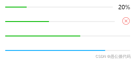
1.普通进度条
<view class="progress-box">
  <progress percent="20" show-info stroke-width="3"/>
</view>

<view class="progress-box">
  <progress percent="40" active stroke-width="3" />
  <icon class="progress-cancel" type="cancel"></icon>
</view>

<view class="progress-box">
  <progress percent="60" active stroke-width="3" />
</view>

<view class="progress-box">
  <progress percent="80" color="#10AEFF" active stroke-width="3" />
</view>
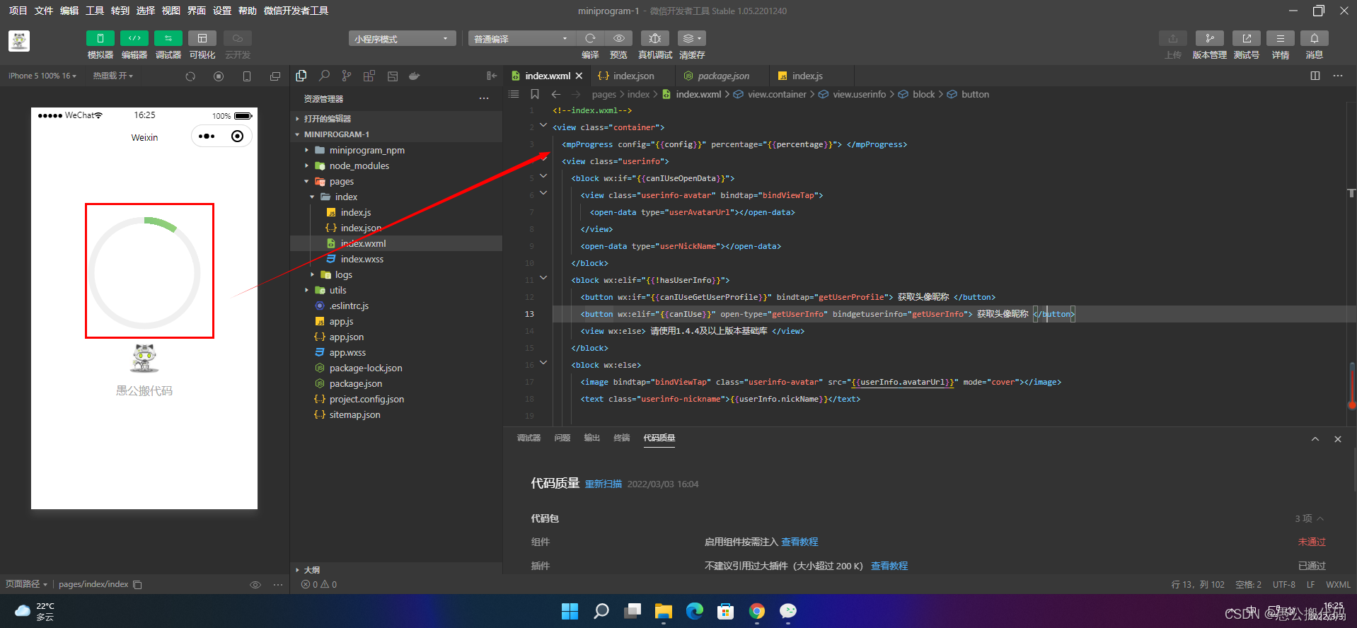
2.圆形进度条
2.1 组件的形式使用
使用第三方组件,在项目根目录下执行命令:
npm install mp-progress --save
在需要使用的页面中配置新增mp-progress的组件定义:
"usingComponents": {
  "mpProgress": "mp-progress/dist/component/mp-progress"
}
在页面data中定义对应的数据,config参数的使用方法和之前api调用的时候完全相同,canvasSize默认是{ width: 400, height: 400 },这种方式不同的是不需要传参数target: this,同时新增percentage(进度条的百分比):
Page({
  data: {
    config: {
      canvasSize: {
        width: 400,
        height: 400
      },
      percent: 100,
      barStyle: [{width: 20, fillStyle: '#f0f0f0'}, {width: 20, animate: true, fillStyle: [{position: 0, color: '#56B37F'}, {position: 1, color: '#c0e674'}]}],
      needDot: true,
      dotStyle: [{r: 20, fillStyle: '#ffffff', shadow: 'rgba(0,0,0,.15)'}, {r: 10, fillStyle: '#56B37F'}]
    },
    percentage: 0
  }
});
页面使用
<mpProgress config="{{config}}" percentage="{{percentage}}"></mpProgress>
该方式遵从双向绑定数据的原则,当页面改变percentage,mp-progress会自动更新视图
2.2 API的形式使用
import MpProgress from 'mp-progress';
// 初始化
// 注意:在wepy中必须在onReady里调用
const mprogress = new MpProgress({
  target: this,
  canvasId: 'progress',
  canvasSize: {width: 400, height: 400},
  barStyle: [{width: 12, fillStyle: '#f0f0f0'}, {width: 12, fillStyle: [{position: 0, color: '#56B37F'}, {position: 1, color: '#c0e674'}]}]
});

// 开始绘制进度,60代表60%
mprogress.draw(60);
使用
<canvas class="canvas" type="2d" id="progress"></canvas>
其他使用方式可以看github:https://github.com/lucaszhu2zgf/mp-progress

【声明】本内容来自华为云开发者社区博主,不代表华为云及华为云开发者社区的观点和立场。转载时必须标注文章的来源(华为云社区)、文章链接、文章作者等基本信息,否则作者和本社区有权追究责任。如果您发现本社区中有涉嫌抄袭的内容,欢迎发送邮件进行举报,并提供相关证据,一经查实,本社区将立刻删除涉嫌侵权内容,举报邮箱:
cloudbbs@huaweicloud.com
- 点赞
- 收藏
- 关注作者
评论(0)