HTML+CSS+JS实现美女照片3D立方体旋转特效

【摘要】 🍅 作者主页:Java李杨勇 🍅 简介:Java领域优质创作者🏆、Java李杨勇公号作者✌ 简历模板、学习资料、面试题库、技术互助【关注我,都给你】🍅 欢迎点赞 👍 收藏 ⭐留言 📝 效果演示: 文末获取源码 代码目录:主要代码实现:CSS样式:body { /*background: url(../img/preview.png) ;*/ max-wid...
🍅 作者主页:
🍅 简介:Java领域优质创作者🏆、Java李杨勇公号作者✌ 简历模板、学习资料、面试题库、技术互助【关注我,都给你】
🍅 欢迎点赞 👍 收藏 ⭐留言 📝
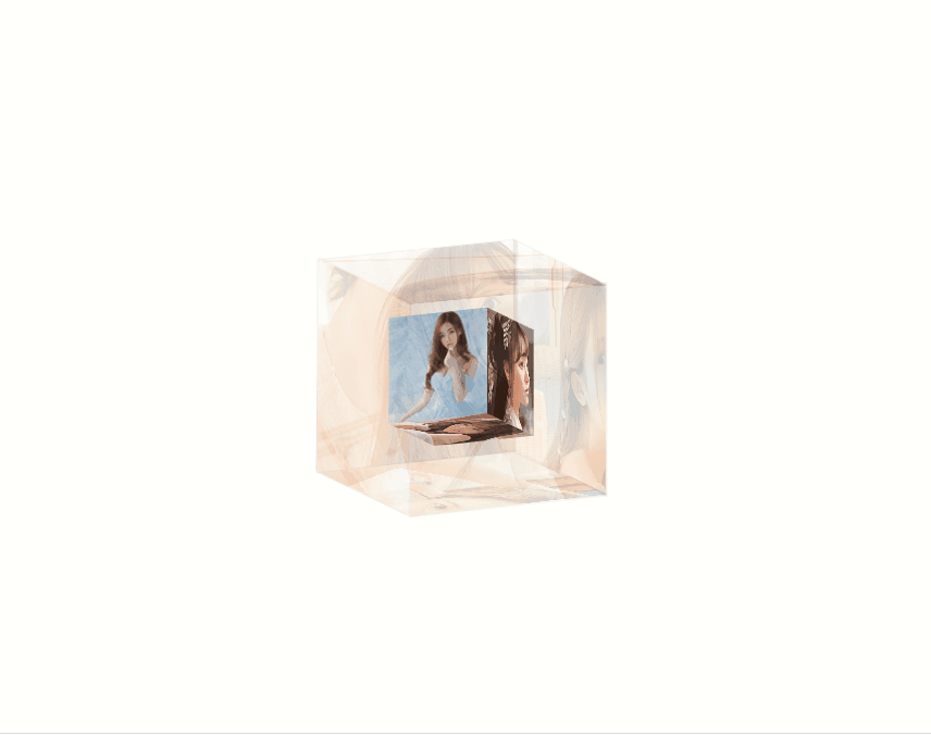
效果演示: 文末获取源码
代码目录:
主要代码实现:
CSS样式:
HTML代码 :
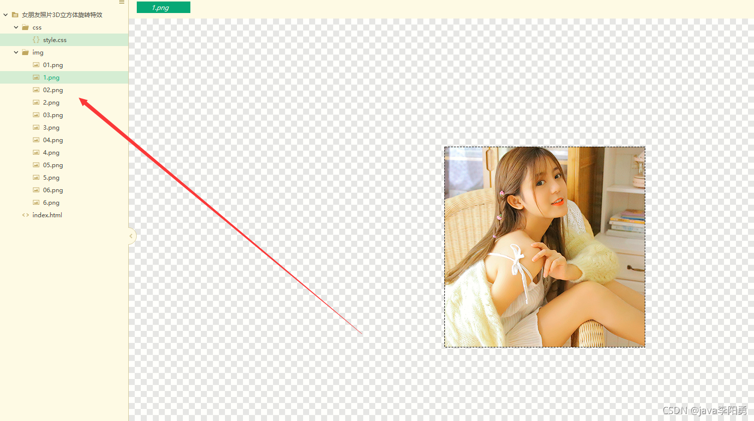
上面的图片文件需要引入
源码获取
大家可以点赞、收藏、关注、评论我啦 、查看或下方微信公众号获取~!
打卡 文章 更新 44 / 100天
精彩推荐更新中:

【声明】本内容来自华为云开发者社区博主,不代表华为云及华为云开发者社区的观点和立场。转载时必须标注文章的来源(华为云社区)、文章链接、文章作者等基本信息,否则作者和本社区有权追究责任。如果您发现本社区中有涉嫌抄袭的内容,欢迎发送邮件进行举报,并提供相关证据,一经查实,本社区将立刻删除涉嫌侵权内容,举报邮箱:
cloudbbs@huaweicloud.com
- 点赞
- 收藏
- 关注作者
评论(0)