HarmonyOS之组件布局的创建和使用

【摘要】
一、组件与布局
HarmonyOS 提供了Ability 和 AbilitySlice 两个基础类,一个有界面的 Ability 可以由一个或多个 AbilitySlice 构成,AbilitySlic...
一、组件与布局
- HarmonyOS 提供了Ability 和 AbilitySlice 两个基础类,一个有界面的 Ability 可以由一个或多个 AbilitySlice 构成,AbilitySlice 主要用于承载单个页面的具体逻辑实现和界面 UI,是应用显示、运行和跳转的最小单元。
- AbilitySlice 通过 setUIContent 为界面设置布局。
- AbilitySlice 的 UI 接口:
| 接口声明 | 接口描述 |
|---|---|
| setUIContent(ComponentContainer root) | 设置界面入口,root为界面组件树根节点 |
- 组件需要进行组合,并添加到界面的布局中。在 Java UI 框架中,提供了两种编写布局的方式:
-
- 在代码中创建布局:用代码创建 Component 和 ComponentContainer 对象,为这些对象设置合适的布局参数和属性值,并将 Component 添加到 ComponentContainer 中,从而创建出完整界面。
-
- 在 XML 中声明 UI 布局:按层级结构来描述 Component 和 ComponentContainer 的关系,给组件节点设定合适的布局参数和属性值,代码中可直接加载生成此布局。
- 这两种方式创建出的布局没有本质差别,在 XML 中声明布局,在加载后同样可在代码中对该布局进行修改。
二、组件分类
- 根据组件的功能,可以将组件分为布局类、显示类、交互类三类,如下表所示:
| 组件类别 | 组件名称 | 功能描述 |
|---|---|---|
| 布局类 | PositionLayout、DirectionalLayout、StackLayout、DependentLayout、TableLayout、AdaptiveBoxLayout | 提供了不同布局规范的组件容器,例如以单一方向排列的DirectionalLayout、以相对位置排列的DependentLayout、以确切位置排列的PositionLayout等 |
| 显示类 | Text、Image、Clock、TickTimer、ProgressBar | 提供了单纯的内容显示,例如用于文本显示的Text,用于图像显示的Image等 |
| 交互类 | TextField、Button、Checkbox、RadioButton/RadioContainer、Switch、ToggleButton、Slider、Rating、ScrollView、TabList、ListContainer、PageSlider、PageFlipper、PageSliderIndicator、Picker、TimePicker、DatePicker、SurfaceProvider、ComponentProvider | 提供了具体场景下与用户交互响应的功能,例如Button提供了点击响应功能,Slider提供了进度选择功能等 |
三、代码创建布局
① 创建组件
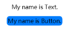
- 开发如下图所示界面,需要添加一个 Text 组件和 Button 组件。由于两个组件从上到下依次居中排列,可以选择使用竖向的 DirectionalLayout 布局来放置组件。
- 代码创建布局需要在 AbilitySlice 中分别创建组件和布局,并将它们进行组织关联。
- 创建如下组件:
- 声明组件:
Button button = new Button(getContext());
- 1
- 设置组件大小:
	button.setWidth(ComponentContainer.LayoutConfig.MATCH_CONTENT);
	button.setHeight(ComponentContainer.LayoutConfig.MATCH_CONTENT);
- 1
- 2
- 设置组件属性:
	button.setText("My name is Button.");
	button.setTextSize(50);
- 1
- 2
② 创建布局并使用
- 声明布局:
DirectionalLayout directionalLayout = new DirectionalLayout(getContext());
- 1
- 设置布局大小:
	directionalLayout.setWidth(ComponentContainer.LayoutConfig.MATCH_PARENT);
	directionalLayout.setHeight(ComponentContainer.LayoutConfig.MATCH_PARENT);
- 1
- 2
- 设置布局属性:
directionalLayout.setOrientation(Component.VERTICAL);
- 1
- 将组件添加到布局中(视布局需要对组件设置布局属性进行约束):
directionalLayout.addComponent(button);
- 1
- 将布局添加到组件树中:
setUIContent(directionalLayout);
- 1
③ 示例代码
- 示例代码如下:
	public class ExampleAbilitySlice extends AbilitySlice {
	    @Override
	    public void onStart(Intent intent) {
	        super.onStart(intent);
	        // 声明布局
	        DirectionalLayout directionalLayout = new DirectionalLayout(getContext());
	        // 设置布局大小
	        directionalLayout.setWidth(ComponentContainer.LayoutConfig.MATCH_PARENT);
	        directionalLayout.setHeight(ComponentContainer.LayoutConfig.MATCH_PARENT);
	        // 设置布局属性
	        directionalLayout.setOrientation(Component.VERTICAL);
	        directionalLayout.setPadding(32, 32, 32, 32);

	        Text text = new Text(getContext());
	        text.setText("My name is Text.");
	        text.setTextSize(50);
	        text.setId(100);
	        // 为组件添加对应布局的布局属性
	        DirectionalLayout.LayoutConfig layoutConfig = new DirectionalLayout.LayoutConfig(ComponentContainer.LayoutConfig.MATCH_CONTENT, ComponentContainer.LayoutConfig.MATCH_CONTENT);
	        layoutConfig.alignment = LayoutAlignment.HORIZONTAL_CENTER;
	        text.setLayoutConfig(layoutConfig);

	        // 将Text添加到布局中
	        directionalLayout.addComponent(text);

	        // 类似的添加一个Button
	        Button button = new Button(getContext());
	        layoutConfig.setMargins(0, 50, 0, 0);
	        button.setLayoutConfig(layoutConfig);
	        button.setText("My name is Button.");
	        button.setTextSize(50);
	        ShapeElement background = new ShapeElement();
	        background.setRgbColor(new RgbColor(0, 125, 255));
	        background.setCornerRadius(25);
	        button.setBackground(background);
	        button.setPadding(10, 10, 10, 10);
	        button.setClickedListener(new Component.ClickedListener() {
	            @Override
	            // 在组件中增加对点击事件的检测
	            public void onClick(Component component) {
	                // 此处添加按钮被点击需要执行的操作
	            }
	        });
	        directionalLayout.addComponent(button);

	        // 将布局作为根布局添加到视图树中
	        super.setUIContent(directionalLayout);
	    }
	}
- 1
- 2
- 3
- 4
- 5
- 6
- 7
- 8
- 9
- 10
- 11
- 12
- 13
- 14
- 15
- 16
- 17
- 18
- 19
- 20
- 21
- 22
- 23
- 24
- 25
- 26
- 27
- 28
- 29
- 30
- 31
- 32
- 33
- 34
- 35
- 36
- 37
- 38
- 39
- 40
- 41
- 42
- 43
- 44
- 45
- 46
- 47
- 48
- 49
- 根据以上步骤创建组件和布局后的界面显示就可以实现上图中的效果。其中,代码示例中为组件设置了一个按键回调,在按键被按下后,应用会执行自定义的操作。
- 在代码示例中,可以看到设置组件大小的方法有两种:
-
- 通过 setWidth/setHeight 直接设置宽高。
-
- 通过 setLayoutConfig 方法设置布局属性来设定宽高。
- 这两种方法的区别是后者还可以增加更多的布局属性设置,例如:使用“alignment”设置水平居中的约束。另外,这两种方法设置的宽高以最后设置的作为最终结果。它们的取值一致,可以是以下取值:
-
- 具体以像素为单位的数值。
-
- MATCH_PARENT:表示组件大小将扩展为父组件允许的最大值,它将占据父组件方向上的剩余大小。
-
- MATCH_CONTENT:表示组件大小与它内容占据的大小范围相适应。
四、XML 创建布局
① XML 布局
- XML 声明布局的方式更加简便直观。每一个 Component 和 ComponentContainer 对象大部分属性都支持在 XML 中进行设置,它们都有各自的XML属性列表。某些属性仅适用于特定的组件,例如:只有 Text 支持“text_color”属性,但不支持该属性的组件,如果添加了该属性,该属性则会被忽略。具有继承关系的组件子类将继承父类的属性列表,Component 作为组件的基类,拥有各个组件常用的属性,比如:ID、布局参数等。
ohos:id="$+id:text"
- 1
- 在 XML 中使用此格式声明一个对开发者友好的 ID,它会在编译过程中转换成一个常量。尤其在 DependentLayout 布局中,组件之间需要描述相对位置关系,描述时要通过 ID 来指定对应组件。
- 布局中的组件通常要设置独立的 ID,以便在程序中查找该组件。如果布局中有不同组件设置了相同的 ID,在通过 ID 查找组件时会返回查找到的第一个组件,因此尽量保证在所要查找的布局中为组件设置独立的 ID 值,避免出现与预期不符合的问题。
- 布局参数:
	ohos:width="20vp"
	ohos:height="10vp"
- 1
- 2
- 与代码中设置组件的宽度和高度类似,在 XML 中它们的取值可以是:
-
- 具体的数值:10(以像素为单位)、10vp(以屏幕相对像素为单位)。
-
- match_parent:表示组件大小将扩展为父组件允许的最大值,它将占据父组件方向上的剩余大小。
-
- match_content:表示组件大小与它的内容占据的大小范围相适应。
② 创建 XML 布局文件
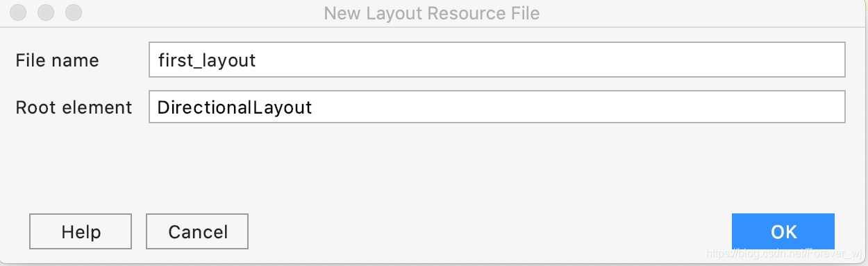
- 在 DevEco Studio 的“Project”窗口,打开“entry > src > main > resources > base”,右键点击“layout”文件夹,选择“New > Layout Resource File”,命名为“first_layout”。
- 打开新创建的 first_layout.xml 布局文件,修改其中的内容,对布局和组件的属性和层级进行描述。
	<?xml version="1.0" encoding="utf-8"?>
	<DirectionalLayout
	    xmlns:ohos="http://schemas.huawei.com/res/ohos"
	    ohos:width="match_parent"
	    ohos:height="match_parent"
	    ohos:orientation="vertical"
	    ohos:padding="32">
	    <Text
	        ohos:id="$+id:text"
	        ohos:width="match_content"
	        ohos:height="match_content"
	        ohos:layout_alignment="horizontal_center"
	        ohos:text="My name is Text."
	        ohos:text_size="25fp"/>
	    <Button
	        ohos:id="$+id:button"
	        ohos:margin="50"
	        ohos:width="match_content"
	        ohos:height="match_content"
	        ohos:layout_alignment="horizontal_center"
	        ohos:text="My name is Button."
	        ohos:text_size="50"/>
	</DirectionalLayout>
- 1
- 2
- 3
- 4
- 5
- 6
- 7
- 8
- 9
- 10
- 11
- 12
- 13
- 14
- 15
- 16
- 17
- 18
- 19
- 20
- 21
- 22
- 23
③ 加载 XML 布局
- 在代码中需要加载 XML 布局,并添加为根布局或作为其他布局的子 Component。
	package com.example.myapplication.slice;

	import com.example.myapplication.ResourceTable;
	import ohos.aafwk.ability.AbilitySlice;
	import ohos.aafwk.content.Intent;
	import ohos.agp.colors.RgbColor;
	import ohos.agp.components.*;
	import ohos.agp.components.element.ShapeElement;

	public class ExampleAbilitySlice extends AbilitySlice {
	    @Override
	    public void onStart(Intent intent) {
	        super.onStart(intent);
	        // 加载XML布局作为根布局
	        super.setUIContent(ResourceTable.Layout_first_layout);
	        Button button = (Button) findComponentById(ResourceTable.Id_button);
	        if (button != null) {
	            // 设置组件的属性
	            ShapeElement background = new ShapeElement();
	            background.setRgbColor(new RgbColor(0, 125, 255));
	            background.setCornerRadius(25);
	            button.setBackground(background);

	            button.setClickedListener(new Component.ClickedListener() {
	                @Override
	                // 在组件中增加对点击事件的检测
	                public void onClick(Component component) {
	                    // 此处添加按钮被点击需要执行的操作
	                }
	            });
	        }
	    }
	}
- 1
- 2
- 3
- 4
- 5
- 6
- 7
- 8
- 9
- 10
- 11
- 12
- 13
- 14
- 15
- 16
- 17
- 18
- 19
- 20
- 21
- 22
- 23
- 24
- 25
- 26
- 27
- 28
- 29
- 30
- 31
- 32
- 33
文章来源: blog.csdn.net,作者:Serendipity·y,版权归原作者所有,如需转载,请联系作者。
原文链接:blog.csdn.net/Forever_wj/article/details/118154668

【版权声明】本文为华为云社区用户转载文章,如果您发现本社区中有涉嫌抄袭的内容,欢迎发送邮件进行举报,并提供相关证据,一经查实,本社区将立刻删除涉嫌侵权内容,举报邮箱:
cloudbbs@huaweicloud.com
- 点赞
- 收藏
- 关注作者
评论(0)