【Flutter】Flutter 布局组件 ( Wrap 组件 | Expanded 组件 )

【摘要】
文章目录
一、Wrap 组件二、Expanded 组件三、完整代码示例四、相关资源
一、Wrap 组件
Wrap 组件 : 该组件是可换行的水平线性布局组件 , 与...
一、Wrap 组件
Wrap 组件 : 该组件是可换行的水平线性布局组件 , 与 Row 组件间类似 , 但是可以换行 ;
class Wrap extends MultiChildRenderObjectWidget {
  /// Creates a wrap layout.
  ///
  /// By default, the wrap layout is horizontal and both the children and the
  /// runs are aligned to the start.
  ///
  /// The [textDirection] argument defaults to the ambient [Directionality], if
  /// any. If there is no ambient directionality, and a text direction is going
  /// to be necessary to decide which direction to lay the children in or to
  /// disambiguate `start` or `end` values for the main or cross axis
  /// directions, the [textDirection] must not be null.
  Wrap({
    Key key,
    this.direction = Axis.horizontal,
    this.alignment = WrapAlignment.start,
    this.spacing = 0.0, // 水平方向间距
    this.runAlignment = WrapAlignment.start,
    this.runSpacing = 0.0, // 垂直方向间距
    this.crossAxisAlignment = WrapCrossAlignment.start,
    this.textDirection,
    this.verticalDirection = VerticalDirection.down,
    List<Widget> children = const <Widget>[], // 子组件集合
  }) : super(key: key, children: children);
}
- 1
- 2
- 3
- 4
- 5
- 6
- 7
- 8
- 9
- 10
- 11
- 12
- 13
- 14
- 15
- 16
- 17
- 18
- 19
- 20
- 21
- 22
- 23
- 24
Wrap 组件用法 :
- 设置水平间距 : spacing 字段 ;
- 设置垂直间距 : runSpacing 字段 ;
- 设置布局中的子组件 : children 字段 ;
// 可自动换行的水平线性布局
Wrap(
  // 设置水平边距
  spacing: 间距值 ( double 类型 ),
  // 设置垂直间距
  runSpacing: 间距值 ( double 类型 ),
  children: <Widget>[
  	设置若干子组件
  ]
)
- 1
- 2
- 3
- 4
- 5
- 6
- 7
- 8
- 9
- 10
代码示例 : Chip 组件用法参考 【Flutter】StatelessWidget 组件 ( CloseButton 组件 | BackButton 组件 | Chip 组件 ) 博客 ;
// 可自动换行的水平线性布局
Wrap(
  // 设置水平边距
  spacing: 40,
  // 设置垂直间距
  runSpacing: 10,
  children: <Widget>[
    Chip(
      // 设置主体标签文本
      label: Text("宋江"),
      // 设置左侧圆形头像
      avatar: CircleAvatar(
        // 设置背景颜色
        backgroundColor: Colors.green.shade600,
        child: Text("宋"),
      ),
    ),
    Chip(
      // 设置主体标签文本
      label: Text("卢俊义"),
      // 设置左侧圆形头像
      avatar: CircleAvatar(
        // 设置背景颜色
        backgroundColor: Colors.green.shade600,
        child: Text("卢"),
      ),
    ),
    Chip(
      // 设置主体标签文本
      label: Text("吴用"),
      // 设置左侧圆形头像
      avatar: CircleAvatar(
        // 设置背景颜色
        backgroundColor: Colors.green.shade600,
        child: Text("吴"),
      ),
    ),
    Chip(
      // 设置主体标签文本
      label: Text("公孙胜"),
      // 设置左侧圆形头像
      avatar: CircleAvatar(
        // 设置背景颜色
        backgroundColor: Colors.green.shade600,
        child: Text("公孙"),
      ),
    ),
    Chip(
      // 设置主体标签文本
      label: Text("关胜"),
      // 设置左侧圆形头像
      avatar: CircleAvatar(
        // 设置背景颜色
        backgroundColor: Colors.green.shade600,
        child: Text("关"),
      ),
    ),
  ],
),
- 1
- 2
- 3
- 4
- 5
- 6
- 7
- 8
- 9
- 10
- 11
- 12
- 13
- 14
- 15
- 16
- 17
- 18
- 19
- 20
- 21
- 22
- 23
- 24
- 25
- 26
- 27
- 28
- 29
- 30
- 31
- 32
- 33
- 34
- 35
- 36
- 37
- 38
- 39
- 40
- 41
- 42
- 43
- 44
- 45
- 46
- 47
- 48
- 49
- 50
- 51
- 52
- 53
- 54
- 55
- 56
- 57
- 58
- 59
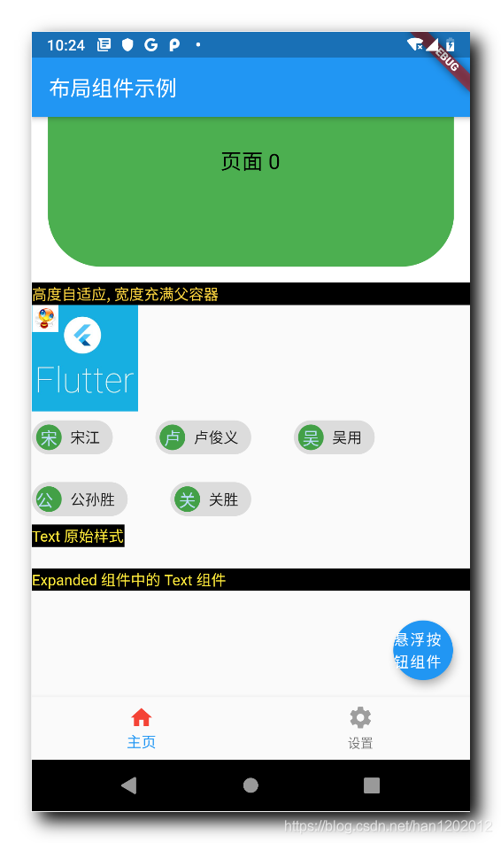
运行效果 :

二、Expanded 组件
Expanded 组件 : 该组件可以自动识别父容器的方向 , 在垂直或水平方向上填充剩余空间 ;
class Expanded extends Flexible {
  /// Creates a widget that expands a child of a [Row], [Column], or [Flex]
  /// so that the child fills the available space along the flex widget's
  /// main axis.
  const Expanded({
    Key key,
    int flex = 1,
    @required Widget child,
  }) : super(key: key, flex: flex, fit: FlexFit.tight, child: child);
}
- 1
- 2
- 3
- 4
- 5
- 6
- 7
- 8
- 9
- 10
Expanded 组件 在 Row 组件 中会自动填充水平方向上的剩余空间 ;
Expanded 组件 在 Column 组件 中会自动填充垂直方向上的剩余空间 ;
代码示例 :
// 普通样式的 Row
Row(
  children: <Widget>[
    Container(
      // 背景设置成黑色
      decoration: BoxDecoration(
        color: Colors.black,
      ),
      // 字体设置成黄色
      child: Text(
        "Text 原始样式",
        style: TextStyle(color: Colors.yellow),
      ),
    ),
  ],
),
// 空行
SizedBox(
  width: 10,
  height: 20,
),
// 使用了 Exoanbded 组件的 Row
Row(
  children: <Widget>[
    Expanded(
      child: Container(
        // 背景设置成黑色
        decoration: BoxDecoration(
          color: Colors.black,
        ),
        // 字体设置成黄色
        child: Text(
          "Text 原始样式",
          style: TextStyle(color: Colors.yellow),
        ),
      ),
    ),
  ],
),
// 空行
- 1
- 2
- 3
- 4
- 5
- 6
- 7
- 8
- 9
- 10
- 11
- 12
- 13
- 14
- 15
- 16
- 17
- 18
- 19
- 20
- 21
- 22
- 23
- 24
- 25
- 26
- 27
- 28
- 29
- 30
- 31
- 32
- 33
- 34
- 35
- 36
- 37
- 38
- 39
- 40
执行效果 :
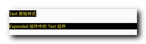
第一个组件是 Row 中没有使用 Expanded 组件的情况 ;
第二个组件是 Row 中使用了 Expanded 组件的情况 ;
三、完整代码示例
完整代码示例 :
import 'package:flutter/material.dart';
class LayoutPage extends StatefulWidget {
@override
_LayoutPageState createState() => _LayoutPageState();
}
class _LayoutPageState extends State<LayoutPage> {
/// 当前被选中的底部导航栏索引
int _currentSelectedIndex = 0;
// This widget is the root of your application.
@override
Widget build(BuildContext context) {
// 文本组件样式 , 可以设置给 Text 文本组件
// 设置字体大小 20, 颜色红色
TextStyle textStyle = TextStyle(fontSize: 20, color: Colors.red);
return MaterialApp(
title: '布局组件示例',
theme: ThemeData(
primarySwatch: Colors.blue,
),
home: Scaffold(
// 顶部标题栏
appBar: AppBar(title: Text('布局组件示例'),),
// 底部导航栏 BottomNavigationBar 设置
// items 可以设置多个 BottomNavigationBarItem
bottomNavigationBar: BottomNavigationBar(
// 设置当前选中的底部导航索引
currentIndex: _currentSelectedIndex,
// 设置点击底部导航栏的回调事件 , index 参数是点击的索引值
onTap: (index){
// 回调 StatefulWidget 组件的 setState 设置状态的方法 , 修改当前选中索引
// 之后 BottomNavigationBar 组件会自动更新当前选中的选项卡
setState(() {
// 改变 int _currentSelectedIndex 变量的状态
_currentSelectedIndex = index;
});
},
// 条目
items: [
// 设置底部导航栏条目, 每个条目可以设置一个图标
BottomNavigationBarItem(
// 默认状态下的图标
icon: Icon(Icons.home, color: Colors.grey,),
// 激活状态下的图标
activeIcon: Icon(Icons.home, color: Colors.red,),
// 设置标题
title: Text("主页")
),
// 设置底部导航栏条目, 每个条目可以设置一个图标
BottomNavigationBarItem(
// 默认状态下的图标
icon: Icon(Icons.settings, color: Colors.grey,),
// 激活状态下的图标
activeIcon: Icon(Icons.settings, color: Colors.red,),
// 设置标题
title: Text("设置")
)
],),
// 设置悬浮按钮
floatingActionButton: FloatingActionButton(
onPressed: (){
print("悬浮按钮点击");
},
child: Text("悬浮按钮组件"),
),
// Container 容器使用
body:
_currentSelectedIndex == 0 ?
// 刷新指示器组件
RefreshIndicator(
// 显示的内容
child: ListView(
children: <Widget>[
Container( // 对应底部导航栏设置选项卡
// 设置容器的装饰器 , BoxDecoration 是最常用的装饰器
// 可以自行查看 BoxDecoration 中可以设置的属性
decoration: BoxDecoration(color: Colors.white),
// 设置 child 子组件居中方式, 居中放置
alignment: Alignment.center,
// 子组件, 子组件设置为一个 Column 组件
child: Column(
// Column 子组件, 这里设置 Text 文本组件
children: <Widget>[
Text("主页面选项卡, 下拉刷新"),
// 水平方向排列的线性布局
Row(
children: <Widget>[
// 原始图片, 用于对比
Image.network("https://img-blog.csdnimg.cn/20210301145757946.png",
width: 100,
height: 100,
),
// 圆形裁剪组件 , 将 child 布局裁剪成圆形
ClipOval(
// 使用 SizedBox 组件约束布局大小
child: SizedBox(
width: 100,
height: 100,
// 使用 SizedBox 约束该 Image 组件大小
child: Image.network("https://img-blog.csdnimg.cn/20210301145757946.png"),
),
),
Padding(
// 设置内边距 5
padding: EdgeInsets.all(15),
// 方形裁剪组件 , 将组件裁剪成方形
child: ClipRRect(
// 设置裁剪圆角, 四个角设置半径为 10 的圆角
borderRadius: BorderRadius.all(Radius.circular(10)),
// 修改透明度组件 , 这里设置 50% 透明度
child: Opacity(
opacity: 0.5,
// 设置 100x100 大小的图片组件
child: Image.network("https://img-blog.csdnimg.cn/20210301145757946.png",
width: 100,
height: 100,
),
),
),
),
],
),
// 设置一个布局容器 , 用于封装 PageView 组件
Container(
// 设置高度
height: 200,
// 设置边距
margin: EdgeInsets.all(15),
// 设置装饰, 背景深橙色
decoration: BoxDecoration(
color: Colors.white
),
// 设置子组件 PageView 的裁剪组件
child:
PhysicalModel(
color: Colors.transparent,
// 设置圆角半径 15
borderRadius: BorderRadius.circular(50),
// 设置裁剪行为 , 抗锯齿
clipBehavior: Clip.antiAlias,
// 设置 PageView 组件
child:
PageView(
// 设置 PageView 中封装的若干组件
children: <Widget>[
// 第一个页面组件
Container(
// 设置居中方式 , 居中显示
alignment:Alignment.center,
// 设置装饰器 , 绿色背景
decoration: BoxDecoration(color: Colors.green),
// 显示的主要文字
child: Text("页面 0", style: TextStyle(fontSize: 20, color: Colors.black),),
),
// 第二个页面组件
Container(
// 设置居中方式 , 居中显示
alignment:Alignment.center,
// 设置装饰器 , 绿色背景
decoration: BoxDecoration(color: Colors.red),
// 显示的主要文字
child: Text("页面 1", style: TextStyle(fontSize: 20, color: Colors.white),),
),
// 第三个页面组件
Container(
// 设置居中方式 , 居中显示
alignment:Alignment.center,
// 设置装饰器 , 绿色背景
decoration: BoxDecoration(color: Colors.black),
// 显示的主要文字
child: Text("页面 2", style: TextStyle(fontSize: 20, color: Colors.yellow),),
),
],
),
),
),
],
),
),
Container(
child: Column(
children: <Widget>[
// 水平/垂直方向平铺组件
FractionallySizedBox(
// 设置宽度充满父容器
widthFactor: 1,
// 要设置的水平 / 垂直方向的平铺操作的组件
child: Container(
decoration: BoxDecoration(color: Colors.black),
child: Text(
"高度自适应, 宽度充满父容器",
style: TextStyle(color: Colors.amberAccent),
),
),
)
],
),
),
// 帧布局
Stack(
children: <Widget>[
Image.network("https://img-blog.csdnimg.cn/20210301145757946.png",
width: 100,
height: 100,
),
// 设置组件位置在 Stack 的相对位置
Positioned(
left: 0, // 距离右侧 0 距离
top: 0, // 距离底部 0 距离
// 设置约束的组件位置
child: Image.network("https://img-blog.csdnimg.cn/20210228180808133.png",
width: 25,
height: 25,
),
),
],
),
// 可自动换行的水平线性布局
Wrap(
// 设置水平边距
spacing: 40,
// 设置垂直间距
runSpacing: 10,
children: <Widget>[
Chip(
// 设置主体标签文本
label: Text("宋江"),
// 设置左侧圆形头像
avatar: CircleAvatar(
// 设置背景颜色
backgroundColor: Colors.green.shade600,
child: Text("宋"),
),
),
Chip(
// 设置主体标签文本
label: Text("卢俊义"),
// 设置左侧圆形头像
avatar: CircleAvatar(
// 设置背景颜色
backgroundColor: Colors.green.shade600,
child: Text("卢"),
),
),
Chip(
// 设置主体标签文本
label: Text("吴用"),
// 设置左侧圆形头像
avatar: CircleAvatar(
// 设置背景颜色
backgroundColor: Colors.green.shade600,
child: Text("吴"),
),
),
Chip(
// 设置主体标签文本
label: Text("公孙胜"),
// 设置左侧圆形头像
avatar: CircleAvatar(
// 设置背景颜色
backgroundColor: Colors.green.shade600,
child: Text("公孙"),
),
),
Chip(
// 设置主体标签文本
label: Text("关胜"),
// 设置左侧圆形头像
avatar: CircleAvatar(
// 设置背景颜色
backgroundColor: Colors.green.shade600,
child: Text("关"),
),
),
],
),
// 普通样式的 Row
Row(
children: <Widget>[
Container(
// 背景设置成黑色
decoration: BoxDecoration(
color: Colors.black,
),
// 字体设置成黄色
child: Text(
"Text 原始样式",
style: TextStyle(color: Colors.yellow),
),
),
],
),
// 空行
SizedBox(
width: 10,
height: 20,
),
// 使用了 Exoanbded 组件的 Row
Row(
children: <Widget>[
Expanded(
child: Container(
// 背景设置成黑色
decoration: BoxDecoration(
color: Colors.black,
),
// 字体设置成黄色
child: Text(
"Expanded 组件中的 Text 组件",
style: TextStyle(color: Colors.yellow),
),
),
),
],
),
// 空行
SizedBox(
width: 10,
height: 100,
),
],
),
// 刷新时回调的方法
// 列表发生下拉操作时, 回调该方法
// 该回调是 Future 类型的
onRefresh: _refreshIndicatorOnRefresh,
)
:
Container( // 对应底部导航栏设置选项卡
// 设置容器的装饰器 , BoxDecoration 是最常用的装饰器
// 可以自行查看 BoxDecoration 中可以设置的属性
decoration: BoxDecoration(color: Colors.white),
// 设置 child 子组件居中方式, 居中放置
alignment: Alignment.center,
// 子组件, 子组件设置为一个 Column 组件
child: Column(
// Column 子组件, 这里设置 Text 文本组件
children: <Widget>[
Text("设置页面选项卡")
],
),
) , // 该设置与 _currentSelectedIndex == 0? 相对应, ?: 三目运算符
),
);
}
/// RefreshIndicator 发生下拉操作时, 回调该方法
/// 该方啊是一个异步方法 , 在方法体前添加 async 关键字
Future<Null> _refreshIndicatorOnRefresh() async{
// 暂停 500 ms , 使用 await 关键字实现
// 在这 500 ms 之间 , 列表处于刷新状态
// 500 ms 之后 , 列表变为非刷新状态
await Future.delayed(Duration(milliseconds: 500));
return null;
}
}
- 1
- 2
- 3
- 4
- 5
- 6
- 7
- 8
- 9
- 10
- 11
- 12
- 13
- 14
- 15
- 16
- 17
- 18
- 19
- 20
- 21
- 22
- 23
- 24
- 25
- 26
- 27
- 28
- 29
- 30
- 31
- 32
- 33
- 34
- 35
- 36
- 37
- 38
- 39
- 40
- 41
- 42
- 43
- 44
- 45
- 46
- 47
- 48
- 49
- 50
- 51
- 52
- 53
- 54
- 55
- 56
- 57
- 58
- 59
- 60
- 61
- 62
- 63
- 64
- 65
- 66
- 67
- 68
- 69
- 70
- 71
- 72
- 73
- 74
- 75
- 76
- 77
- 78
- 79
- 80
- 81
- 82
- 83
- 84
- 85
- 86
- 87
- 88
- 89
- 90
- 91
- 92
- 93
- 94
- 95
- 96
- 97
- 98
- 99
- 100
- 101
- 102
- 103
- 104
- 105
- 106
- 107
- 108
- 109
- 110
- 111
- 112
- 113
- 114
- 115
- 116
- 117
- 118
- 119
- 120
- 121
- 122
- 123
- 124
- 125
- 126
- 127
- 128
- 129
- 130
- 131
- 132
- 133
- 134
- 135
- 136
- 137
- 138
- 139
- 140
- 141
- 142
- 143
- 144
- 145
- 146
- 147
- 148
- 149
- 150
- 151
- 152
- 153
- 154
- 155
- 156
- 157
- 158
- 159
- 160
- 161
- 162
- 163
- 164
- 165
- 166
- 167
- 168
- 169
- 170
- 171
- 172
- 173
- 174
- 175
- 176
- 177
- 178
- 179
- 180
- 181
- 182
- 183
- 184
- 185
- 186
- 187
- 188
- 189
- 190
- 191
- 192
- 193
- 194
- 195
- 196
- 197
- 198
- 199
- 200
- 201
- 202
- 203
- 204
- 205
- 206
- 207
- 208
- 209
- 210
- 211
- 212
- 213
- 214
- 215
- 216
- 217
- 218
- 219
- 220
- 221
- 222
- 223
- 224
- 225
- 226
- 227
- 228
- 229
- 230
- 231
- 232
- 233
- 234
- 235
- 236
- 237
- 238
- 239
- 240
- 241
- 242
- 243
- 244
- 245
- 246
- 247
- 248
- 249
- 250
- 251
- 252
- 253
- 254
- 255
- 256
- 257
- 258
- 259
- 260
- 261
- 262
- 263
- 264
- 265
- 266
- 267
- 268
- 269
- 270
- 271
- 272
- 273
- 274
- 275
- 276
- 277
- 278
- 279
- 280
- 281
- 282
- 283
- 284
- 285
- 286
- 287
- 288
- 289
- 290
- 291
- 292
- 293
- 294
- 295
- 296
- 297
- 298
- 299
- 300
- 301
- 302
- 303
- 304
- 305
- 306
- 307
- 308
- 309
- 310
- 311
- 312
- 313
- 314
- 315
- 316
- 317
- 318
- 319
- 320
- 321
- 322
- 323
- 324
- 325
- 326
- 327
- 328
- 329
- 330
- 331
- 332
- 333
- 334
- 335
- 336
- 337
- 338
- 339
- 340
- 341
- 342
- 343
- 344
- 345
- 346
- 347
- 348
- 349
- 350
- 351
- 352
- 353
- 354
- 355
- 356
- 357
- 358
- 359
- 360
- 361
- 362
- 363
- 364
- 365
- 366
- 367
- 368
- 369
- 370
- 371
- 372
- 373
- 374
- 375
- 376
- 377
- 378
- 379
- 380
- 381
- 382
- 383
- 384
- 385
- 386
- 387
- 388
- 389
- 390
- 391
- 392
- 393
- 394
- 395
- 396
- 397
- 398
- 399
- 400
- 401
- 402
- 403
- 404
- 405
- 406
- 407
- 408
- 409
- 410
- 411
- 412
- 413
- 414
- 415
- 416
- 417
- 418
运行效果展示 :
四、相关资源
参考资料 :
- Flutter 官网 : https://flutter.dev/
- Flutter 开发文档 : https://flutter.cn/docs ( 强烈推荐 )
- 官方 GitHub 地址 : https://github.com/flutter
- Flutter 中文社区 : https://flutter.cn/
- Flutter 实用教程 : https://flutter.cn/docs/cookbook
- Flutter CodeLab : https://codelabs.flutter-io.cn/
- Dart 中文文档 : https://dart.cn/
- Dart 开发者官网 : https://api.dart.dev/
- Flutter 中文网 ( 非官方 , 翻译的很好 ) : https://flutterchina.club/ , http://flutter.axuer.com/docs/
- Flutter 相关问题 : https://flutterchina.club/faq/ ( 入门阶段推荐看一遍 )
博客源码下载 :
-
GitHub 地址 : https://github.com/han1202012/flutter_cmd ( 随博客进度一直更新 , 有可能没有本博客的源码 )
-
博客源码快照 : https://download.csdn.net/download/han1202012/15484718 ( 本篇博客的源码快照 , 可以找到本博客的源码 )
文章来源: hanshuliang.blog.csdn.net,作者:韩曙亮,版权归原作者所有,如需转载,请联系作者。
原文链接:hanshuliang.blog.csdn.net/article/details/114271961

【版权声明】本文为华为云社区用户转载文章,如果您发现本社区中有涉嫌抄袭的内容,欢迎发送邮件进行举报,并提供相关证据,一经查实,本社区将立刻删除涉嫌侵权内容,举报邮箱:
cloudbbs@huaweicloud.com
- 点赞
- 收藏
- 关注作者
评论(0)