【Flutter】StatefulWidget 组件 ( PageView 组件 )

【摘要】
文章目录
一、PageView 组件二、PageView 组件完整代码示例三、 相关资源
一、PageView 组件
PageView 组件构造函数 : 构造函数中...
一、PageView 组件
PageView 组件构造函数 : 构造函数中的可选参数就是 PageView 组件的所有可设置选项 ;
class PageView extends StatefulWidget {

  PageView({
    Key key,
    this.scrollDirection = Axis.horizontal,
    this.reverse = false,
    PageController controller,
    this.physics,
    this.pageSnapping = true,
    this.onPageChanged,
    List<Widget> children = const <Widget>[],
    this.dragStartBehavior = DragStartBehavior.start,
    this.allowImplicitScrolling = false,
    this.restorationId,
    this.clipBehavior = Clip.hardEdge,
  }) : assert(allowImplicitScrolling != null),
       assert(clipBehavior != null),
       controller = controller ?? _defaultPageController,
       childrenDelegate = SliverChildListDelegate(children),
       super(key: key);
}
- 1
- 2
- 3
- 4
- 5
- 6
- 7
- 8
- 9
- 10
- 11
- 12
- 13
- 14
- 15
- 16
- 17
- 18
- 19
- 20
- 21
PageView 组件 children 设置 : children 字段设置其要滑动切换的各个页面组件 ; 一般使用 Container 封装复杂的组件 ;
代码示例 : 下面的代码就是 PageView 中设置了三个滑动切换的组件 , 都是 Container 组件 , 每个 Container 都设置的居中方式 , 装饰器 , 显示的子组件 Text ;
                    // 设置一个布局容器 , 用于封装 PageView 组件
                    Container(
                      // 设置高度
                      height: 200,
                      // 设置边距
                      margin: EdgeInsets.only(top: 10),
                      // 设置装饰, 背景深橙色
                      decoration: BoxDecoration(
                        color: Colors.deepOrange
                      ),
                      // 设置子组件 PageView
                      child: PageView(
                        // 设置 PageView 中封装的若干组件
                        children: <Widget>[
                          // 第一个页面组件
                          Container(
                            // 设置居中方式 , 居中显示
                            alignment:Alignment.center,
                            // 设置装饰器 , 绿色背景
                            decoration: BoxDecoration(color: Colors.green),
                            // 显示的主要文字
                            child: Text("页面 0", style: TextStyle(fontSize: 20, color: Colors.black),),
                          ),

                          // 第二个页面组件
                          Container(
                            // 设置居中方式 , 居中显示
                            alignment:Alignment.center,
                            // 设置装饰器 , 绿色背景
                            decoration: BoxDecoration(color: Colors.red),
                            // 显示的主要文字
                            child: Text("页面 1", style: TextStyle(fontSize: 20, color: Colors.white),),
                          ),

                          // 第三个页面组件
                          Container(
                            // 设置居中方式 , 居中显示
                            alignment:Alignment.center,
                            // 设置装饰器 , 绿色背景
                            decoration: BoxDecoration(color: Colors.black),
                            // 显示的主要文字
                            child: Text("页面 2", style: TextStyle(fontSize: 20, color: Colors.yellow),),
                          ),

                        ],
                      ),
                    ),
- 1
- 2
- 3
- 4
- 5
- 6
- 7
- 8
- 9
- 10
- 11
- 12
- 13
- 14
- 15
- 16
- 17
- 18
- 19
- 20
- 21
- 22
- 23
- 24
- 25
- 26
- 27
- 28
- 29
- 30
- 31
- 32
- 33
- 34
- 35
- 36
- 37
- 38
- 39
- 40
- 41
- 42
- 43
- 44
- 45
- 46
- 47
二、PageView 组件完整代码示例
完整代码示例 :
import 'package:flutter/material.dart';
class StatefulWidgetPage extends StatefulWidget {
@override
_StatefulWidgetPageState createState() => _StatefulWidgetPageState();
}
class _StatefulWidgetPageState extends State<StatefulWidgetPage> {
/// 当前被选中的底部导航栏索引
int _currentSelectedIndex = 0;
// This widget is the root of your application.
@override
Widget build(BuildContext context) {
// 文本组件样式 , 可以设置给 Text 文本组件
// 设置字体大小 20, 颜色红色
TextStyle textStyle = TextStyle(fontSize: 20, color: Colors.red);
return MaterialApp(
title: 'StatefulWidgetPage 组件示例',
theme: ThemeData(
primarySwatch: Colors.blue,
),
home: Scaffold(
// 顶部标题栏
appBar: AppBar(title: Text('StatefulWidgetPage 组件示例'),),
// 底部导航栏 BottomNavigationBar 设置
// items 可以设置多个 BottomNavigationBarItem
bottomNavigationBar: BottomNavigationBar(
// 设置当前选中的底部导航索引
currentIndex: _currentSelectedIndex,
// 设置点击底部导航栏的回调事件 , index 参数是点击的索引值
onTap: (index){
// 回调 StatefulWidget 组件的 setState 设置状态的方法 , 修改当前选中索引
// 之后 BottomNavigationBar 组件会自动更新当前选中的选项卡
setState(() {
// 改变 int _currentSelectedIndex 变量的状态
_currentSelectedIndex = index;
});
},
// 条目
items: [
// 设置底部导航栏条目, 每个条目可以设置一个图标
BottomNavigationBarItem(
// 默认状态下的图标
icon: Icon(Icons.home, color: Colors.grey,),
// 激活状态下的图标
activeIcon: Icon(Icons.home, color: Colors.red,),
// 设置标题
title: Text("主页")
),
// 设置底部导航栏条目, 每个条目可以设置一个图标
BottomNavigationBarItem(
// 默认状态下的图标
icon: Icon(Icons.settings, color: Colors.grey,),
// 激活状态下的图标
activeIcon: Icon(Icons.settings, color: Colors.red,),
// 设置标题
title: Text("设置")
)
],),
// 设置悬浮按钮
floatingActionButton: FloatingActionButton(
onPressed: (){
print("悬浮按钮点击");
},
child: Text("悬浮按钮组件"),
),
// Container 容器使用
body:
_currentSelectedIndex == 0 ?
// 刷新指示器组件
RefreshIndicator(
// 显示的内容
child: ListView(
children: <Widget>[
Container( // 对应底部导航栏设置选项卡
// 设置容器的装饰器 , BoxDecoration 是最常用的装饰器
// 可以自行查看 BoxDecoration 中可以设置的属性
decoration: BoxDecoration(color: Colors.white),
// 设置 child 子组件居中方式, 居中放置
alignment: Alignment.center,
// 子组件, 子组件设置为一个 Column 组件
child: Column(
// Column 子组件, 这里设置 Text 文本组件
children: <Widget>[
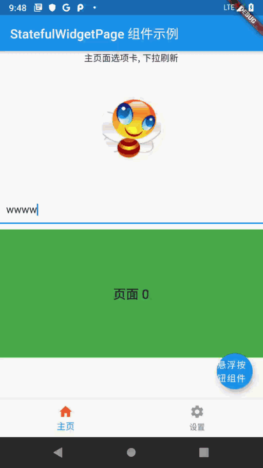
Text("主页面选项卡, 下拉刷新"),
// 图片组件 , 从网络中加载一张图片
Image.network(
// 图片地址
"https://img-blog.csdnimg.cn/20210228180808133.png",
// 图片宽度
width: 200,
// 图片高度
height: 200,
),
// 输入框组件
TextField(
// 设置输入框样式
decoration: InputDecoration(
// 设置内容边距, 左右边距为 10, 上下边距为 0
contentPadding: EdgeInsets.fromLTRB(10, 0, 10, 0),
// 设置的提示文案信息
hintText: "提示信息",
// 设置提示文案样式
hintStyle: TextStyle(fontSize: 20, color: Colors.grey),
),
),
// 设置一个布局容器 , 用于封装 PageView 组件
Container(
// 设置高度
height: 200,
// 设置边距
margin: EdgeInsets.only(top: 10),
// 设置装饰, 背景深橙色
decoration: BoxDecoration(
color: Colors.deepOrange
),
// 设置子组件 PageView
child: PageView(
// 设置 PageView 中封装的若干组件
children: <Widget>[
// 第一个页面组件
Container(
// 设置居中方式 , 居中显示
alignment:Alignment.center,
// 设置装饰器 , 绿色背景
decoration: BoxDecoration(color: Colors.green),
// 显示的主要文字
child: Text("页面 0", style: TextStyle(fontSize: 20, color: Colors.black),),
),
// 第二个页面组件
Container(
// 设置居中方式 , 居中显示
alignment:Alignment.center,
// 设置装饰器 , 绿色背景
decoration: BoxDecoration(color: Colors.red),
// 显示的主要文字
child: Text("页面 1", style: TextStyle(fontSize: 20, color: Colors.white),),
),
// 第三个页面组件
Container(
// 设置居中方式 , 居中显示
alignment:Alignment.center,
// 设置装饰器 , 绿色背景
decoration: BoxDecoration(color: Colors.black),
// 显示的主要文字
child: Text("页面 2", style: TextStyle(fontSize: 20, color: Colors.yellow),),
),
],
),
),
],
),
),
],
),
// 刷新时回调的方法
// 列表发生下拉操作时, 回调该方法
// 该回调是 Future 类型的
onRefresh: _refreshIndicatorOnRefresh,
)
:
Container( // 对应底部导航栏设置选项卡
// 设置容器的装饰器 , BoxDecoration 是最常用的装饰器
// 可以自行查看 BoxDecoration 中可以设置的属性
decoration: BoxDecoration(color: Colors.white),
// 设置 child 子组件居中方式, 居中放置
alignment: Alignment.center,
// 子组件, 子组件设置为一个 Column 组件
child: Column(
// Column 子组件, 这里设置 Text 文本组件
children: <Widget>[
Text("设置页面选项卡")
],
),
) , // 该设置与 _currentSelectedIndex == 0? 相对应, ?: 三目运算符
),
);
}
/// RefreshIndicator 发生下拉操作时, 回调该方法
/// 该方啊是一个异步方法 , 在方法体前添加 async 关键字
Future<Null> _refreshIndicatorOnRefresh() async{
// 暂停 500 ms , 使用 await 关键字实现
// 在这 500 ms 之间 , 列表处于刷新状态
// 500 ms 之后 , 列表变为非刷新状态
await Future.delayed(Duration(milliseconds: 500));
return null;
}
}
- 1
- 2
- 3
- 4
- 5
- 6
- 7
- 8
- 9
- 10
- 11
- 12
- 13
- 14
- 15
- 16
- 17
- 18
- 19
- 20
- 21
- 22
- 23
- 24
- 25
- 26
- 27
- 28
- 29
- 30
- 31
- 32
- 33
- 34
- 35
- 36
- 37
- 38
- 39
- 40
- 41
- 42
- 43
- 44
- 45
- 46
- 47
- 48
- 49
- 50
- 51
- 52
- 53
- 54
- 55
- 56
- 57
- 58
- 59
- 60
- 61
- 62
- 63
- 64
- 65
- 66
- 67
- 68
- 69
- 70
- 71
- 72
- 73
- 74
- 75
- 76
- 77
- 78
- 79
- 80
- 81
- 82
- 83
- 84
- 85
- 86
- 87
- 88
- 89
- 90
- 91
- 92
- 93
- 94
- 95
- 96
- 97
- 98
- 99
- 100
- 101
- 102
- 103
- 104
- 105
- 106
- 107
- 108
- 109
- 110
- 111
- 112
- 113
- 114
- 115
- 116
- 117
- 118
- 119
- 120
- 121
- 122
- 123
- 124
- 125
- 126
- 127
- 128
- 129
- 130
- 131
- 132
- 133
- 134
- 135
- 136
- 137
- 138
- 139
- 140
- 141
- 142
- 143
- 144
- 145
- 146
- 147
- 148
- 149
- 150
- 151
- 152
- 153
- 154
- 155
- 156
- 157
- 158
- 159
- 160
- 161
- 162
- 163
- 164
- 165
- 166
- 167
- 168
- 169
- 170
- 171
- 172
- 173
- 174
- 175
- 176
- 177
- 178
- 179
- 180
- 181
- 182
- 183
- 184
- 185
- 186
- 187
- 188
- 189
- 190
- 191
- 192
- 193
- 194
- 195
- 196
- 197
- 198
- 199
- 200
- 201
- 202
- 203
- 204
- 205
- 206
- 207
- 208
- 209
- 210
- 211
- 212
- 213
- 214
- 215
- 216
- 217
- 218
- 219
- 220
- 221
- 222
- 223
- 224
运行效果展示 :
三、 相关资源
参考资料 :
- Flutter 官网 : https://flutter.dev/
- Flutter 开发文档 : https://flutter.cn/docs ( 强烈推荐 )
- 官方 GitHub 地址 : https://github.com/flutter
- Flutter 中文社区 : https://flutter.cn/
- Flutter 实用教程 : https://flutter.cn/docs/cookbook
- Flutter CodeLab : https://codelabs.flutter-io.cn/
- Dart 中文文档 : https://dart.cn/
- Dart 开发者官网 : https://api.dart.dev/
- Flutter 中文网 ( 非官方 , 翻译的很好 ) : https://flutterchina.club/ , http://flutter.axuer.com/docs/
- Flutter 相关问题 : https://flutterchina.club/faq/ ( 入门阶段推荐看一遍 )
博客源码下载 :
-
GitHub 地址 : https://github.com/han1202012/flutter_cmd ( 随博客进度一直更新 , 有可能没有本博客的源码 )
-
博客源码快照 : https://download.csdn.net/download/han1202012/15500147 ( 本篇博客的源码快照 , 可以找到本博客的源码 )
文章来源: hanshuliang.blog.csdn.net,作者:韩曙亮,版权归原作者所有,如需转载,请联系作者。
原文链接:hanshuliang.blog.csdn.net/article/details/114240467

【版权声明】本文为华为云社区用户转载文章,如果您发现本社区中有涉嫌抄袭的内容,欢迎发送邮件进行举报,并提供相关证据,一经查实,本社区将立刻删除涉嫌侵权内容,举报邮箱:
cloudbbs@huaweicloud.com
- 点赞
- 收藏
- 关注作者
评论(0)