Android Button及其子类

开局一张图

本文旨在介绍Button和他的子类。

Button
Button 用户可以点击或长按等操作的用户界面元素,具有正常状态和点击状态,Button 继承自 TextView ,所以可以使用 TextView 的那些属性。
实际开发中,无非是对按钮的几个状态做相应的操作,比如:按钮按下的时候 用一种颜色,弹起又一种颜色,或者按钮不可用的时候一种颜色这样。
实例
咱们来写有1个基础版Button,2个进阶版Button。
基础版Button
在布局文件中添加一个Button
-
<Button
-
android:id="@+id/btn_1"
-
android:layout_width="match_parent"
-
android:layout_height="wrap_content"
-
android:text="基本Button" />
不仅样式丑陋而且文字显示为大写BUTTON。
进阶版Button
在基础版Button上新增一些xml属性。
1.在res/drawable目录下新建文件 bg_btn_frame_gradient.xml
-
<?xml version="1.0" encoding="utf-8"?>
-
<shape xmlns:android="http://schemas.android.com/apk/res/android">
-
<!--radius四个圆角统一设置,也可以单独对某一个圆角设置。例:topLeftRadius-->
-
<corners android:radius="8dp"/>
-
<!--边框宽度width、颜色color-->
-
<stroke android:width="1dp" android:color="@color/color_ff0000" />
-
<gradient
-
android:startColor="@color/color_188FFF"
-
android:centerColor="@color/color_FF773D"
-
android:endColor="@color/color_ff0000"
-
android:type="linear"
-
/>
-
</shape>
2.在res/drawable目录下新建文件 bg_btn_selector_bg.xml
-
<?xml version ="1.0" encoding ="utf-8"?>
-
<selector xmlns:android="http://schemas.android.com/apk/res/android">
-
<!--简单版仅颜色,直接设置android:radius="8dp"无效-->
-
<!--未点击显示颜色-->
-
<item android:drawable="@color/color_FF773D" android:state_pressed="false" />
-
<!--点击显示颜色-->
-
<item android:drawable="@color/color_188FFF" android:state_pressed="true" />
-
-
<!--复杂版带圆角-->
-
<!--未点击显示颜色-->
-
<item android:state_pressed="false">
-
<shape>
-
<solid android:color="@color/color_FF773D" />
-
<corners android:radius="8dp" />
-
</shape>
-
</item>
-
<!--点击显示颜色-->
-
<item android:state_pressed="true">
-
<shape>
-
<solid android:color="@color/color_188FFF" />
-
<corners android:radius="8dp" />
-
</shape>
-
</item>
-
</selector>
3.修改布局文件添加两个Button
-
<Button
-
android:id="@+id/btn_2"
-
android:layout_width="match_parent"
-
android:layout_height="wrap_content"
-
android:layout_marginTop="@dimen/dimen_20"
-
android:background="@drawable/bg_btn_frame_gradient"
-
android:padding="@dimen/dimen_10"
-
android:text="背景色渐变的Button"
-
android:textAllCaps="false"
-
android:textColor="@color/white"
-
android:textSize="@dimen/text_size_18" />
-
-
<Button
-
android:id="@+id/btn_3"
-
android:layout_width="match_parent"
-
android:layout_height="wrap_content"
-
android:layout_marginTop="@dimen/dimen_20"
-
android:background="@drawable/bg_btn_selector_bg"
-
android:onClick="btn3OnClick"
-
android:padding="@dimen/dimen_10"
-
android:textAllCaps="false"
-
android:text="带按下效果的Button"
-
android:textColor="@color/white"
-
android:textSize="@dimen/text_size_18" />
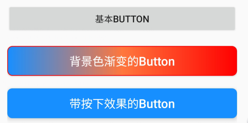
咱们看运行效果
xml小结
此时已经完成了上面的效果图。 我们将 Button 的 android:background 属性设置为该 drawable 资源即可轻松实现按下 按钮时不同的按钮颜色或背景
-
btn_2因为直接使用drawable,并且未使用selector。所以无点击效果。不管点击还是未点击「始终显示渐变色」。
StateListDrawable 是 Drawable 资源的一种,可以根据不同的状态,设置不同的图片效果,关键节点 < selector >
-
btn_3使用了selector,对item标签下android:state_pressed进行不同状态的设置背景色和圆角。根据控件是否被按下展示(color_FF773D/color_188FFF)
交互事件
Button的核心还是在于和用户的交互,否则使用TextView即可。
1.Activity 实现 View.OnClickListener方法
-
public class ButtonActivity extends AppCompatActivity implements View.OnClickListener {
-
private Button btn_1;
-
@Override
-
protected void onCreate(Bundle savedInstanceState) {
-
super.onCreate(savedInstanceState);
-
setContentView(R.layout.view_button);//加载布局文件
-
initViewButton();
-
}
-
private void initViewButton(){
-
btn_1 = findViewById(R.id.btn_1);
-
btn_1.setOnClickListener(this);
-
}
-
-
@Override
-
public void onClick(View v) {
-
switch (v.getId()){
-
case R.id.btn_1:
-
Toast.makeText(this,"btn_1点击事件",Toast.LENGTH_SHORT).show();
-
break;
-
default:
-
break;
-
}
-
}
-
}
2.在布局文件中声明
-
给button添加 android:onClick="btn3OnClick"属性
- 在activity中添加对应名称的方法,满足以下条件
-
方法的修饰符是 public;
-
返回值是 void 类型;
-
-
//不需要关联控件
-
public void btn3OnClick(View view){
-
Toast.makeText(this,"btn_3点击事件",Toast.LENGTH_SHORT).show();
-
}
3.匿名内部类实现
附送一个长按匿名内部类,需要注意的是「onLongClick」返回「false」会继续「执行onClick事件」,如果返回true,则不执行onClick事件。
-
btn_2.setOnClickListener(new View.OnClickListener() {
-
@Override
-
public void onClick(View v) {
-
Toast.makeText(ButtonActivity.this,"btn_2点击事件",Toast.LENGTH_SHORT).show();
-
}
-
});
-
btn_2.setOnLongClickListener(new View.OnLongClickListener() {
-
@Override
-
public boolean onLongClick(View v) {
-
Toast.makeText(ButtonActivity.this,"btn_2长按点击事件",Toast.LENGTH_SHORT).show();
-
return false;
-
}
-
});
4.内部类实现
-
//使用
-
btn_1.setOnClickListener(new MyOnClickListener());
-
//内部类实现OnClickListener接口
-
class MyOnClickListener implements View.OnClickListener{
-
-
@Override
-
public void onClick(View v) {
-
Toast.makeText(ButtonActivity.this,"btn_1点击事件MyOnClickListener",Toast.LENGTH_SHORT).show();
-
}
-
}
交互事件小结
-
Button的setOnClickListener优先级比xml中android:onClick高,如果同时设置点击事件,只有setOnClickListener有效。
-
TextView也可以实现onClick事件,如果部分Button使用麻烦可以考虑使用TextView来代替。
Button显示字母大写
解决方案:设置属性android:textAllCaps="false"即可解决
Button设置backgroud无效
解决方案:默认的颜色设置来自于res/values/themes.xml。
将里面的主题parent="Theme.MaterialComponents.DayNight.DarkActionBar"改为(其他主题也可以)parent="Theme.MaterialComponents.DayNight.DarkActionBar.Bridge"。
Button点击文字变色
方法一
定义一个drawable文件,代码如下:
-
<?xml version="1.0" encoding="utf-8"?>
-
<selector xmlns:android="http://schemas.android.com/apk/res/android">
-
<item android:state_pressed="true" android:color="@color/white"></item>
-
<item android:color="@color/black"></item>
-
</selector>
方法二
1.首先你要在你的color文件下加入几个你需要的色值,注意不同的是不是一般的color标签,而是drawable标签,代码如下:
-
<?xml version="1.0" encoding="utf-8"?>
-
<resources>
-
<color name="color_ff0000">#ff0000</color>
-
<drawable name="drawable_color_black">#000000</drawable>
-
<drawable name="drawable_color_white">#FFFFFF</drawable>
-
</resources>
2.定义一个drawable文件,就和正常的selector文件差不多,唯一的区别就是把drawable字段变成color在里面引入你刚刚定义的颜色,代码如下:
-
<?xml version="1.0" encoding="utf-8"?>
-
<selector xmlns:android="http://schemas.android.com/apk/res/android">
-
<item android:state_focused="false" android:state_enabled="true" android:state_pressed="false"
-
android:color="@drawable/drawable_color_black" />
-
<item android:state_enabled="false" android:color="@drawable/drawable_color_black" />
-
<item android:state_pressed="true" android:color="@drawable/drawable_color_white" />
-
<item android:state_focused="true" android:color="@drawable/drawable_color_white" />
-
</selector>
把drawable文件设置为textColor选项就可以了。
以上就是本文Button的全部内容,咱们下面看看他的子类。
RadioButton
RadioButton 单选按钮,继承自 Button,所以拥有 Button 的所有公开属性和方法RadioButton 只有两个状态,选中与未选中,所以也就只有一个属性是最重要的,那就是 android:checked(设置或获取 RadioButton 的选中状态)。
实例
在布局文件中添加RadioButton
-
<RadioButton
-
android:id="@+id/rb_red"
-
android:layout_width="wrap_content"
-
android:layout_height="wrap_content"
-
android:text="红色"
-
android:textColor="@color/color_ff0000"
-
android:textSize="@dimen/text_size_18" />
在Activity中添加一个 OnCheckedChangeListener 事件处理器
-
rb_red.setOnCheckedChangeListener(new CompoundButton.OnCheckedChangeListener() {
-
@Override
-
public void onCheckedChanged(CompoundButton buttonView, boolean isChecked) {
-
//isChecked用于判断 RadioButton 是否选中
-
if(isChecked){
-
MLog.e("选中");
-
}else{
-
MLog.e("未选中");
-
}
-
}
-
});
「isChecked」 用于判断RadioButton是否选中。
咱们看运行效果

然后你会发现 只能选中不能取消,说好的单选按钮,怎么成了选择按钮,并且效果图上同时选择了两种颜色。这只能说明我们实现了单选按钮,而不能说我们实现了单选功能。
实现单选功能的方案
-
1.通过代码进行判断来取消其他按钮的选中状态。
-
2.引入RadioGroup
RadioGroup 单选按钮组
RadioGroup 用于将几个 RadioButton 组在一起形成单选按钮组,实现单选功能,也就是选中一个,会取消其它选项的选中。
RadioGroup 初始化时可以所有选项都未选中,但一旦选中了就没办法取消不选中某个了,除非手动调用 clearCheck() 方法。
如果想改变 RadioGroup 里 RadioButton 的排列方式,可以使用属性 android:orientation。
在布局文件中添加控件
新增1个RadioGroup和2个RadioButton,要为每个 RadioButton 添加一个 id,不然单选功能会生效
-
<RadioGroup
-
android:id="@+id/rg"
-
android:layout_width="wrap_content"
-
android:layout_height="wrap_content"
-
android:layout_gravity="center_horizontal"
-
android:orientation="horizontal">
-
-
<RadioButton
-
android:id="@+id/rb_liangpi"
-
android:layout_width="wrap_content"
-
android:layout_height="wrap_content"
-
android:text="凉皮"
-
android:textSize="@dimen/text_size_18" />
-
-
<RadioButton
-
android:id="@+id/rb_roujiamo"
-
android:layout_width="wrap_content"
-
android:layout_height="wrap_content"
-
android:text="肉夹馍"
-
android:textSize="@dimen/text_size_18" />
-
</RadioGroup>
在Activity中添加一个 OnCheckedChangeListener 事件处理器
这个OnCheckedChangeListener「来自RadioGroup」,而不是RadioButton的CompoundButton.OnCheckedChangeListener。
-
rg.setOnCheckedChangeListener(new RadioGroup.OnCheckedChangeListener() {
-
@Override
-
public void onCheckedChanged(RadioGroup group, int checkedId) {
-
if(checkedId==R.id.rb_liangpi){
-
MLog.e("选择了凉皮");
-
}else{
-
MLog.e("选择了肉夹馍");
-
}
-
}
-
});
咱们看运行效果
如此单选按钮功能就实现了,下面咱们看看他的兄弟CheckBox(复选框)。
CheckBox
CheckBox 复选框,除了从 Button 继承而来的属性外,没有自己的属性,但从 CompoundButton 继承了一个属性 android:checked 用于表示是否选中。
可以把多个 CheckBox 放在一起实现同时选中多项,但是,它们之间没有任何关系,一个的选中并不会影响另一个选中或者不选中。
实例
在布局文件中添加几个CheckBox
-
<LinearLayout
-
android:layout_width="match_parent"
-
android:layout_height="wrap_content"
-
android:orientation="vertical">
-
-
<CheckBox
-
android:id="@+id/cb_yan"
-
android:layout_width="wrap_content"
-
android:layout_height="wrap_content"
-
android:checked="true"
-
android:text="加盐"
-
android:textSize="@dimen/text_size_18" />
-
-
<CheckBox
-
android:id="@+id/cb_cu"
-
android:layout_width="wrap_content"
-
android:layout_height="wrap_content"
-
android:text="加醋"
-
android:textSize="@dimen/text_size_18" />
-
-
<CheckBox
-
android:id="@+id/cb_lajiao"
-
android:layout_width="wrap_content"
-
android:layout_height="wrap_content"
-
android:text="加辣椒"
-
android:textSize="@dimen/text_size_18" />
-
</LinearLayout>
在Activity中为每个CheckBox添加一个 OnCheckedChangeListener 事件处理器
-
cb_cu.setChecked(true);
-
cb_yan.setOnCheckedChangeListener(this);
-
cb_cu.setOnCheckedChangeListener(this);
-
cb_lajiao.setOnCheckedChangeListener(this);
-
-
@Override
-
public void onCheckedChanged(CompoundButton buttonView, boolean isChecked) {
-
switch (buttonView.getId()){
-
case R.id.cb_yan:
-
if(isChecked){
-
MLog.e("选中加盐");
-
}else{
-
MLog.e("未选中加盐");
-
}
-
break;
-
case R.id.cb_cu:
-
if(isChecked){
-
MLog.e("选中加醋");
-
}else{
-
MLog.e("未选中加醋");
-
}
-
break;
-
case R.id.cb_lajiao:
-
if(isChecked){
-
MLog.e("选中加辣椒");
-
}else{
-
MLog.e("未选中加辣椒");
-
}
-
break;
-
}
-
}
咱们看运行效果
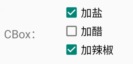
然后你会发现它们之间没有任何关系,一个的选中并不会影响另一个选中或者不选中。都是「一个独立的个体」。
如此CheckBox功能就实现了,下面咱们看看他的兄弟Switch(开关)。
Switch
-
Switch 继承自 Button 和 CompoundButton,所以拥有它们的属性、方法和事件;
-
Switch和ToggleButton一样,都允许我们在两个状态之间切换,有点类似于现在流行的滑动解锁;
-
Switch 有别于 ToggleButton 的地方,就是外观上会同时显示 「开」 和 「关」 的文本,有利于引导用户操作,比如 ToggleButton 在开的时候只会显示开的文本,但点一下会发生什么是未知的,但 Switch 就不一样了,很明切告诉你,你点了之后会发生什么。
Switch的XML属性

实例
在布局文件中添加Switch
-
<Switch
-
android:id="@+id/switch_power"
-
android:layout_width="wrap_content"
-
android:layout_height="50dp"
-
android:textOn="同意"
-
android:textOff="不同意"
-
android:text="权限"
-
android:showText="true"
-
android:checked="true"
-
android:textSize="@dimen/text_size_18" />
在Activity中为Switch添加 OnCheckedChangeListener 事件处理器
-
switch_power.setOnCheckedChangeListener(new CompoundButton.OnCheckedChangeListener() {
-
@Override
-
public void onCheckedChanged(CompoundButton buttonView, boolean isChecked) {
-
if(isChecked){
-
MLog.e("已同意");
-
}else{
-
MLog.e("未同意");
-
}
-
}
-
});
咱们看运行效果

如果你对原生的按钮不爽,那你就自定义 Switch 外观,我们可以属性 android:track 和 android:thumb 定制 Switch 的背景图片和滑块图片
不过要注意,每个图片都有两种状态,开 和 关,而且有个比较坑的地方,就是图片资源多大,Switch 就多大,如果需要改变,就要通过 Java 获得 Drawable 对象,然后对大小进行修改。
如此Switch功能就实现了,下面咱们看看他的兄弟ToggleButton(开关按钮)。
ToggleButton
ToggleButton (开关按钮) 允许我们在两个状态之间切换,有点类似于灯的开关。 ToggleButton 和 Switch 一样都继承自 CompoundButton ,所以都有 Button 的属性和方法,又有 CompoundButton 的属性 android:checked
实例
在布局文件中添加ToggleButton
-
<ToggleButton
-
android:id="@+id/tb_power"
-
android:text="Power"
-
android:textOn="开灯"
-
android:textOff="关灯"
-
android:checked="true"
-
android:layout_width="wrap_content"
-
android:layout_height="wrap_content" />
-
-
<ToggleButton
-
android:id="@+id/tb_power2"
-
android:text="Power"
-
android:textOn="开灯"
-
android:textOff="关灯"
-
android:layout_width="wrap_content"
-
android:layout_height="wrap_content" />
在Activity中为Switch添加 OnCheckedChangeListener 事件处理器
-
tb_power.setOnCheckedChangeListener(this);
-
tb_power2.setOnCheckedChangeListener(this);
-
case R.id.tb_power:
-
case R.id.tb_power2:
-
if(isChecked){
-
MLog.e(buttonView.getId()+"打开");
-
}else{
-
MLog.e(buttonView.getId()+"关闭");
-
}
-
break;
咱们看运行效果

以上就是本文的全部内容,希望对大家学习Android Button及其子类有所帮助和启发。
文章来源: shuaici.blog.csdn.net,作者:帅次,版权归原作者所有,如需转载,请联系作者。
原文链接:shuaici.blog.csdn.net/article/details/117778155

- 点赞
- 收藏
- 关注作者
评论(0)