值得把玩的各色CSS气泡!【精通CSS100例】

【摘要】 最简单的三角气泡 实现思路:使用一个::before和::after,对两个设置边框,最后边框的效果就是三角形,一个三角形的边框颜色div一致,两一个则是白色,整好覆盖在上方。 代码 .bubble-box { position: relative; border: 2px solid #409eff; border-radius: 5p...
最简单的三角气泡
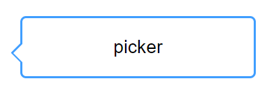
实现思路:
使用一个::before和::after,对两个设置边框,最后边框的效果就是三角形,一个三角形的边框颜色div一致,两一个则是白色,整好覆盖在上方。
代码
      .bubble-box {
        position: relative;
        border: 2px solid #409eff;
        border-radius: 5px;
        width: 200px;
        height: 50px;
        line-height: 50px;
        text-align: center;

      }
      .bubble-box::before {
        position: absolute;
        right: 100%;
        top: 50%;
        margin: -5px 0 0px;
        border: 10px solid transparent;
        border-right-color: #409eff;
        content: "";
      }
      .bubble-box::after {
        position: absolute;
        right: 100%;
        top: 50%;
        margin-top: -3px;
        border: 8px solid transparent;
        border-right-color: #fff;
        content: "";
      }
斜三角形气泡
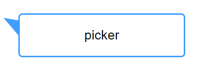
实现逻辑
还是使用::after,使用它制作一个直角三角形
然后使用transform进行角度的倾斜达到效果。
  .bubble-box {
        position: relative;
        border: 2px solid #409eff;
        border-radius: 5px;
        width: 200px;
        height: 50px;
        line-height: 50px;
        text-align: center;
      }
      .bubble-box::after {
        content: "";
        position: absolute;
        border:10px solid transparent;
        border-top-color: #409eff;
        border-right-color: #409eff;
        right: 100%;
        top: 10%;
        transform: skewY(10deg);
      }
拖尾气泡
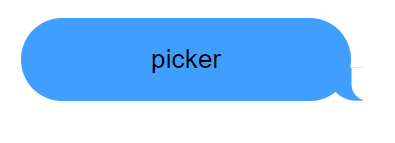
实现思路
仔细观察图片:首先可以看到右下角的拖尾是有弧度的,在CSS中最简单实现弧度的方法:
就是对元素的圆角进行操作,只需要对两条边同时操作,即可产生效果。
border-bottom-left-radius: 15px 15px;

然后的话,拖尾是比较小的,并没有图示的大,这个时候再简单的方法,就是在上面加一层白色的div,覆盖掉其中的一部分。
<!DOCTYPE html>
<html lang="en">
  <head>
    <meta charset="UTF-8" />
    <meta http-equiv="X-UA-Compatible" content="IE=edge" />
    <meta name="viewport" content="width=device-width, initial-scale=1.0" />
    <title>Document</title>
    <style>
      .bubble-box {
        position: relative;
        text-align: center;
        width: 200px;
        height: 50px;
        line-height: 50px;
        background-color: #409eff;
        border-radius: 25px;

      }
      .bubble-box::before {
            content: "";
            position: absolute;
            z-index: -1;
            bottom: -2px;
            right: -8px;
            height: 20px;
            border-right: 20px solid #409eff;
            border-bottom-left-radius: 15px 15px;
            -webkit-transform: translate(0, -2px);
      }
      .bubble-box::after {
        content: "";
        position: absolute;
        z-index: 1;
        bottom: -2px;
        right: -56px;
        width: 26px;
        height: 20px;
        background: white;
        border-bottom-left-radius: 10px;
        -webkit-transform: translate(-30px, -2px);
      }
    </style>
  </head>
  <body style="padding: 100px">
    <div class="bubble-box">picker</div>
  </body>
</html>

【声明】本内容来自华为云开发者社区博主,不代表华为云及华为云开发者社区的观点和立场。转载时必须标注文章的来源(华为云社区)、文章链接、文章作者等基本信息,否则作者和本社区有权追究责任。如果您发现本社区中有涉嫌抄袭的内容,欢迎发送邮件进行举报,并提供相关证据,一经查实,本社区将立刻删除涉嫌侵权内容,举报邮箱:
cloudbbs@huaweicloud.com
- 点赞
- 收藏
- 关注作者
评论(0)