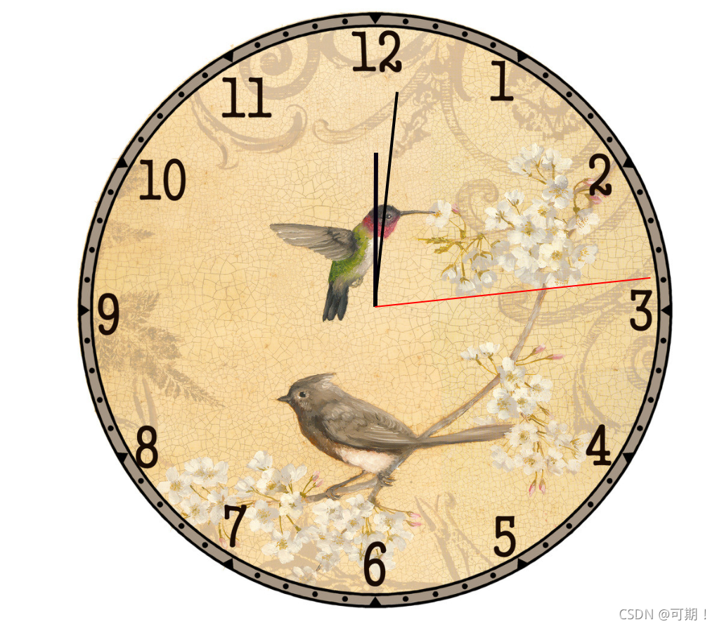
css3制作百鸟时钟

【摘要】 css动画效果
初出茅庐,我们一起进步!!!
css3制作
<!DOCTYPE html>
<html lang="en">
<head>
    <meta charset="UTF-8">
    <meta http-equiv="X-UA-Compatible" content="IE=edge">
    <meta name="viewport" content="width=device-width, initial-scale=1.0">
    <title>白鸟时钟</title>
    <style>
        .wap{
            width: 700px;
            height: 700px;
            background-image: url('./hour.png');
            border-radius: 50%;
            background-size: cover;
            position: relative;
            margin: 0 auto;
        }
        .wap > div{
            position: absolute;
            top: 0;
            bottom: 0;
            left: 0;
            right: 0;
            margin: auto;
        }
        .hour-wap{
            width: 50%;
            height: 50%;
            /* background-color: rgb(245, 242, 242); */
            animation: run 4320s infinite;
            transition: inherit;
        }
        .hour{
            width: 5px;
            height: 50%;
            background-color: rgb(6, 1, 14);
            margin: 0 auto;
        }
        .two-wap{
            width: 70%;
            height: 70%;
            /* background-color: rgb(245, 242, 242); */
            animation: run 360s steps(60) infinite;
            transition: inherit;
        }
        .two{
            width: 3px;
            height: 50%;
            background-color: black;
            margin: 0 auto;
        }
        .third-wap{
            width: 90%;
            height: 90%;
            /* background-color: rgb(245, 242, 242); */
            animation: run 6s steps(60) infinite;
            transition: inherit;
        }
        .third{
            width: 2px;
            height: 50%;
            background-color: red;
            margin: 0 auto;
        }
        @keyframes run{
            from{
                transform: rotateZ(0);
            }
            to{
                transform: rotateZ(360deg);
            }
        }
    </style>
</head>
<body>
    <div class="wap">
        <div class="hour-wap">
            <div class="hour"></div>
        </div>
        <div class="two-wap">
            <div class="two"></div>
        </div>
        <div class="third-wap">
            <div class="third"></div>
        </div>
    </div>
</body>
</html>

【声明】本内容来自华为云开发者社区博主,不代表华为云及华为云开发者社区的观点和立场。转载时必须标注文章的来源(华为云社区)、文章链接、文章作者等基本信息,否则作者和本社区有权追究责任。如果您发现本社区中有涉嫌抄袭的内容,欢迎发送邮件进行举报,并提供相关证据,一经查实,本社区将立刻删除涉嫌侵权内容,举报邮箱:
cloudbbs@huaweicloud.com
- 点赞
- 收藏
- 关注作者
评论(0)