炫彩流光按钮 CSS

【摘要】 炫彩流光按钮 写在前面你若要喜爱你自己的价值,你就得给世界创造价值。——歌德 效果图 HTML代码<div class="box"> <button class="btn">button</button></div> 实现过程给按钮添加一个渐变的背景颜色将背景的大小放大到原来的若干倍,可以自己设定,这样做是为了让渐变的效果更明显,同时后续实现流光的效果给字体设置text-sh...
炫彩流光按钮
写在前面
你若要喜爱你自己的价值,你就得给世界创造价值。——歌德
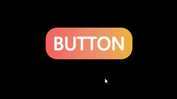
效果图
HTML代码
<div class="box">
        <button class="btn">button</button>
</div>
实现过程
- 给按钮添加一个渐变的背景颜色
- 将背景的大小放大到原来的若干倍,可以自己设定,这样做是为了让渐变的效果更明显,同时后续实现流光的效果
- 给字体设置text-shadow属性,多设置几个可以增加亮度
- 当鼠标经过时,实现流光的效果,通过动画改变背景的位置来实现,相当于拖动背景,让按钮显示不一样的颜色
- 当鼠标经过时添加光晕的效果,通过伪元素,建一个比原先按钮大一点的盒子,先利用透明度为0隐藏起来,当鼠标经过时,改变透明度为1,同时设置filter属性,添加模糊距离,从而实现光晕的效果
CSS代码
@keyframes move {
    0% {
        background-position: 0%;
    }
    100% {
        background-position: 100%;
    }
}
.btn {
    position: relative;
    width: 300px;
    height: 110px;
    color: white;
    line-height: 80px;
    font-size: 60px;
    font-family: sans-serif;
    text-transform: uppercase;
    text-align: center;
    border-radius: 40px;
    background: linear-gradient(90deg,rgb(242, 97, 94),rgb(234, 150, 104),rgb(251, 200, 2),rgb(174, 9, 43),rgb(108, 40, 243),rgb(212, 4, 128),rgb(85, 132, 206));
    background-size: 400%;
    border: none;
    outline: none;
    text-shadow: 0 0 3px white,
                    0 0 3px white,
                    0 0 3px white;
    z-index: 1;
}
.btn:hover {
    animation: move 2s linear alternate infinite;
}
.btn::before {
    content: '';
    position: absolute;
    top: -5px;
    left: -5px;
    width: 310px;
    height: 120px;
    background: linear-gradient(90deg,rgb(242, 97, 94),rgb(234, 150, 104),rgb(251, 200, 2),rgb(174, 9, 43),rgb(108, 40, 243),rgb(212, 4, 128),rgb(85, 132, 206));
    background-size: 400%;
    opacity: 0;
    border-radius: 45px;
    transition: .6s;
    z-index: -1;
}
.btn:hover::before {
    filter: blur(10px);
    opacity: 1;
    animation: move 2s linear alternate infinite;
}
完整代码
<!DOCTYPE html>
<html lang="en">
<head>
    <meta charset="UTF-8">
    <meta http-equiv="X-UA-Compatible" content="IE=edge">
    <meta name="viewport" content="width=device-width, initial-scale=1.0">
    <title>炫彩流光</title>
    <style>
        @keyframes move {
            0% {
                background-position: 0%;
            }
            100% {
                background-position: 100%;
            }
        }
        * {
            margin: 0;
            padding: 0;
        }
        body {
            background-color: black;
        }
        .box {
            width: 400px;
            height: 400px;
            margin: 100px auto;
        }
        .btn {
            position: relative;
            width: 300px;
            height: 110px;
            color: white;
            line-height: 80px;
            font-size: 60px;
            font-family: sans-serif;
            text-transform: uppercase;//转为大写字母
            text-align: center;
            border-radius: 40px;
            background: linear-gradient(90deg,rgb(242, 97, 94),rgb(234, 150, 104),rgb(251, 200, 2),rgb(174, 9, 43),rgb(108, 40, 243),rgb(212, 4, 128),rgb(85, 132, 206));
            background-size: 400%;
            border: none;
            outline: none;
            text-shadow: 0 0 3px white,
                            0 0 3px white,
                            0 0 3px white;
            z-index: 1;
        }
        .btn:hover {
            animation: move 2s linear alternate infinite;
        }
        .btn::before {
            content: '';
            position: absolute;
            top: -5px;
            left: -5px;
            width: 310px;
            height: 120px;
            background: linear-gradient(90deg,rgb(242, 97, 94),rgb(234, 150, 104),rgb(251, 200, 2),rgb(174, 9, 43),rgb(108, 40, 243),rgb(212, 4, 128),rgb(85, 132, 206));
            background-size: 400%;
            opacity: 0;
            border-radius: 45px;
            transition: .6s;
            z-index: -1;
        }
        .btn:hover::before {
            filter: blur(10px);
            opacity: 1;
            animation: move 2s linear alternate infinite;
        }
    </style>
</head>
<body>
    <div class="box">
        <button class="btn">button</button>
    </div>
</body>
</html>
End
以上就是炫彩流光按钮的全部内容了
先相信自己,然后别人才会相信你。——罗曼·罗兰

【声明】本内容来自华为云开发者社区博主,不代表华为云及华为云开发者社区的观点和立场。转载时必须标注文章的来源(华为云社区)、文章链接、文章作者等基本信息,否则作者和本社区有权追究责任。如果您发现本社区中有涉嫌抄袭的内容,欢迎发送邮件进行举报,并提供相关证据,一经查实,本社区将立刻删除涉嫌侵权内容,举报邮箱:
cloudbbs@huaweicloud.com
- 点赞
- 收藏
- 关注作者
评论(0)