鸿蒙开发(10)---Switch组件

【摘要】
目录
Switch组件创建Switch组件用代码设置其交互样式监听事件
Switch组件
对于这个组件,Android开发并没有直接提供,但IOS开发中是有UISwitch的。鸿蒙的Switch组件与它的效果差不多。
本篇,将详细介绍Switch组件的使用规则。
创建Switch组件
首先,我们通过XML布局文件来创建一个Switch组件。示...
Switch组件
对于这个组件,Android开发并没有直接提供,但IOS开发中是有UISwitch的。鸿蒙的Switch组件与它的效果差不多。
本篇,将详细介绍Switch组件的使用规则。
创建Switch组件
首先,我们通过XML布局文件来创建一个Switch组件。示例代码如下:
<Switch ohos:id="$+id:test_switch" ohos:layout_alignment="horizontal_center" ohos:top_margin="20vp" ohos:height="60vp" ohos:width="120vp" ohos:text_state_on="开启" ohos:text_state_off="关闭" ohos:text_size="20vp" ohos:marked="false"/>
- 1
- 2
- 3
- 4
- 5
- 6
- 7
- 8
- 9
- 10
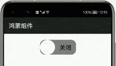
运行之后,交互效果如下:
这里,有几个属性需要注意:
| 属性 | 含义 |
|---|---|
| text_state_on | 开启按钮时的文字 |
| text_state_off | 关闭按钮时的文字 |
| marked | 默认按钮是开启还是关闭 |
| track_element | 轨迹样式 |
| thumb_element | thumb样式 |
| check_element | 状态标志样式 |
用代码设置其交互样式
这里,我们可以直接通过graphic的shape文件设置后面这3个样式属性。但因为这个组件功能简单,我们来详细通过代码实现样式交互。
示例如下:
public class MainAbilitySlice extends AbilitySlice{ private Switch aSwitch; HiLogLabel label=new HiLogLabel(HiLog.LOG_APP, 0x00201, "TAG"); @Override public void onStart(Intent intent) { super.onStart(intent); super.setUIContent(ResourceTable.Layout_ability_main); this.aSwitch=(Switch)findComponentById(ResourceTable.Id_test_switch); // 开启状态下滑块的样式 ShapeElement elementThumbOn = new ShapeElement(); elementThumbOn.setShape(ShapeElement.OVAL); elementThumbOn.setRgbColor(RgbColor.fromArgbInt(0xFF1E90FF)); elementThumbOn.setCornerRadius(50); // 关闭状态下滑块的样式 ShapeElement elementThumbOff = new ShapeElement(); elementThumbOff.setShape(ShapeElement.OVAL); elementThumbOff.setRgbColor(RgbColor.fromArgbInt(0xFFFFFFFF)); elementThumbOff.setCornerRadius(50); // 开启状态下轨迹样式 ShapeElement elementTrackOn = new ShapeElement(); elementTrackOn.setShape(ShapeElement.RECTANGLE); elementTrackOn.setRgbColor(RgbColor.fromArgbInt(0xFF87CEFA)); elementTrackOn.setCornerRadius(50); // 关闭状态下轨迹样式 ShapeElement elementTrackOff = new ShapeElement(); elementTrackOff.setShape(ShapeElement.RECTANGLE); elementTrackOff.setRgbColor(RgbColor.fromArgbInt(0xFF808080)); elementTrackOff.setCornerRadius(50); //设置轨迹交互样式 this.aSwitch.setTrackElement(trackElementInit(elementTrackOn, elementTrackOff)); //设置滑块交互样式 this.aSwitch.setThumbElement(thumbElementInit(elementThumbOn, elementThumbOff)); } private StateElement trackElementInit(ShapeElement on, ShapeElement off){ StateElement trackElement = new StateElement(); trackElement.addState(new int[]{ComponentState.COMPONENT_STATE_CHECKED}, on); trackElement.addState(new int[]{ComponentState.COMPONENT_STATE_EMPTY}, off); return trackElement; } private StateElement thumbElementInit(ShapeElement on, ShapeElement off) { StateElement thumbElement = new StateElement(); thumbElement.addState(new int[]{ComponentState.COMPONENT_STATE_CHECKED}, on); thumbElement.addState(new int[]{ComponentState.COMPONENT_STATE_EMPTY}, off); return thumbElement; }
}
- 1
- 2
- 3
- 4
- 5
- 6
- 7
- 8
- 9
- 10
- 11
- 12
- 13
- 14
- 15
- 16
- 17
- 18
- 19
- 20
- 21
- 22
- 23
- 24
- 25
- 26
- 27
- 28
- 29
- 30
- 31
- 32
- 33
- 34
- 35
- 36
- 37
- 38
- 39
- 40
- 41
- 42
- 43
- 44
- 45
- 46
- 47
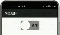
运行之后,效果如首图所示。
监听事件
Switch组件大多用于App的设置当中,一般都只有两个选择。所以,我们需要监听其到底是开启还是关闭。
示例代码如下:
this.aSwitch.setCheckedStateChangedListener(new AbsButton.CheckedStateChangedListener() { // 回调处理Switch状态改变事件 @Override public void onCheckedChanged(AbsButton button, boolean isChecked) { }
});
- 1
- 2
- 3
- 4
- 5
- 6
- 7
这里的isChecked值,就能获取到Switch组件的选择状态,然后再做进一步的操作。
文章来源: liyuanjinglyj.blog.csdn.net,作者:李元静,版权归原作者所有,如需转载,请联系作者。
原文链接:liyuanjinglyj.blog.csdn.net/article/details/117789599
【版权声明】本文为华为云社区用户转载文章,如果您发现本社区中有涉嫌抄袭的内容,欢迎发送邮件进行举报,并提供相关证据,一经查实,本社区将立刻删除涉嫌侵权内容,举报邮箱:
cloudbbs@huaweicloud.com
- 点赞
- 收藏
- 关注作者
评论(0)