八十七、CSS水平垂直居中的布局方式

@Author:Runsen
| 2020/11/30、 周一、今天又是奋斗的一天。 |
水平居中
通过margin: 0 auto; text-align: center实现CSS水平居中。行内元素的水平居中:text-align:center;
text-align属性是针对 内联元素居中得属性设置,对于块状元素使用margin:0 auto;来控制水平居中
inline-block+ text-algin 属性配合使用
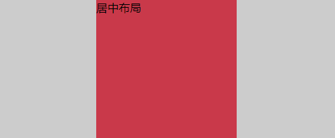
水平居中布局的第一种解决方案是对父元素进行text-align: center;,对子元素进行display: inline-block;
<head>
  <meta charset="UTF-8">
  <meta name="viewport" content="width=device-width, initial-scale=1.0">
  <meta http-equiv="X-UA-Compatible" content="ie=edge">
  <title>水平居中布局的第一种解决方案</title>
  <style> #parent { width: 100%; height: 200px; background: #ccc; /* text-align属性:是为文本内容设置对齐方式 * left:左对齐 * center:居中对齐 * right:右对齐 */ text-align: center; } #child { width: 200px; height: 200px; background: #c9394a; /* display属性: * block:块级元素 * inline:内联元素(text-align属性有效) * width和height属性是无效的 * inline-block:行内块级元素(块级+内联) * width和height属性是有效的 */ display: inline-block; /* text-align: left是对子级元素文本内容设置对齐方式,默认会使用父级元素的center居中对齐 */ text-align: left; }
  </style>
</head>

<body>
  <!-- 定义父级元素父级元素 -->
  <div id="parent"> <!-- 定义子级元素 --> <div id="child">居中布局</div>
  </div>
</body>
- 1
- 2
- 3
- 4
- 5
- 6
- 7
- 8
- 9
- 10
- 11
- 12
- 13
- 14
- 15
- 16
- 17
- 18
- 19
- 20
- 21
- 22
- 23
- 24
- 25
- 26
- 27
- 28
- 29
- 30
- 31
- 32
- 33
- 34
- 35
- 36
- 37
- 38
- 39
- 40
- 41
- 42
- 43
- 44
- 45
- 46
- 47
子元素block和margin属性配合使用
子元素block和margin属性配合使用:display: block和margin: 0 auto;
margin:0 auto有时候会失效
最好的办法就是给子元素设置:display:block,然后margin:0 auto生效。
margin:0 auto的理解是,上下边距为0,左右边距为auto(auto是自动调整大小)
在浏览器中div如果没有设置宽度,那么宽度自动为浏览器的宽度,这是给div设置宽度后,div会靠左显示,margin:0 atuo就是为了填充右侧的空白空间。
margin:0 auto但是对于绝对定位的元素就会失效;因为绝对定位以后就脱离了父级盒子,只能以父级为参考进行定位,你可以理解为绝对定位以后就浮在了父级上面,所以margin中auto就没有了参考值,如果绝对定位以后还想居中,可以left:50%;margin-left:负的盒子宽度的一半即可
<head>
  <style> #parent { /* 必须设置width的属性 */ width: 100%; height: 200px; background: #ccc; } #child { width: 200px; height: 200px; background: #c9394a; /* display的值为table和block */ /* display: block;  div默认是display: block;*/ /* margin属性:外边距 * 一个值 - 上右下左 * 二个值 - 第一个表示上下,第二个表示左右 * auto - 表示根据浏览器自动分配 * 三个值 - 第一个表示上,第二个表示左右,第三个表示下 * 四个值 - 上右下左 */ margin: 0 auto; /* position: absolute; 子元素绝对定位 margin: 0 auto;就会失效*/ }
  </style>
</head>

<body>
  <!-- 定义父级元素 -->
  <div id="parent"> <!-- 定义子级元素 --> <div id="child">居中布局</div>
  </div>
</body>
- 1
- 2
- 3
- 4
- 5
- 6
- 7
- 8
- 9
- 10
- 11
- 12
- 13
- 14
- 15
- 16
- 17
- 18
- 19
- 20
- 21
- 22
- 23
- 24
- 25
- 26
- 27
- 28
- 29
- 30
- 31
- 32
- 33
- 34
- 35
- 36
- 37
absolute+transform属性配合使用 (针对绝对定位)
margin:0 auto但是对于绝对定位的元素就会失效,如果绝对定位以后还想居中,可以left:50%;margin-left:负的盒子宽度的一半即可,其实也可以使用transform: translateX(-50%);,就是向左偏移。
<head>
  <style> #parent { width: 100%; height: 200px; background: #ccc; /* 开启定位 */ position: relative; } #child { width: 300px; height: 200px; background: #c9394a; /* 当把当前元素设置为绝对定位之后: * 如果父级元素没有开启定位的话,当前元素是相对于页面定位的 * 如果父级元素开启了定位的话,当前元素是相对于父级元素定位的 */ position: absolute; left: 50%; transform: translateX(-50%); }
  </style>
</head>

<body>
  <!-- 定义父级元素 -->
  <div id="parent"> <!-- 定义子级元素 --> <div id="child"></div>
  </div>
</body>
- 1
- 2
- 3
- 4
- 5
- 6
- 7
- 8
- 9
- 10
- 11
- 12
- 13
- 14
- 15
- 16
- 17
- 18
- 19
- 20
- 21
- 22
- 23
- 24
- 25
- 26
- 27
- 28
- 29
- 30
- 31
- 32
- 33
- 34
display: flex 和justify-content( 弹性布局)
利用弹性布局(flex),实现水平居中,其中justify-content 用于设置弹性盒子元素在主轴(横轴)方向上的对齐方式,本例中设置子元素水平居中显示。
<head>
  <style> #parent { width: 100%; height: 200px; background: #ccc; /* 弹性布局 */ display: flex; justify-content: center; /* align-items:center; 是实现垂直居中 */ } #child { width: 300px; height: 200px; background: #c9394a; }
  </style>
</head>

<body>
  <!-- 定义父级元素 -->
  <div id="parent"> <!-- 定义子级元素 --> <div id="child"></div>
  </div>
</body>
- 1
- 2
- 3
- 4
- 5
- 6
- 7
- 8
- 9
- 10
- 11
- 12
- 13
- 14
- 15
- 16
- 17
- 18
- 19
- 20
- 21
- 22
- 23
- 24
- 25
- 26
- 27
- 28
- 29
垂直居中
verticle-align:middle和display: table-cell;
通过vertical-align:middle实现CSS垂直居中是最常使用的方法,但是有一点需要格外注意,vertical生效的前提是元素的display:inline-block。
<head>
  <meta charset="UTF-8">
  <meta name="viewport" content="width=device-width, initial-scale=1.0">
  <meta http-equiv="X-UA-Compatible" content="ie=edge">
  <title>垂直居中布局的第一种解决方案</title>
  <style> #parent { width: 200px; height: 600px; background: #ccc; /* display属性: * table:设置当前元素为<table>元素 * table-cell:设置当前元素为<td>元素(单元格) */ display: table-cell; /* vertical-align属性:用于设置文本内容的垂直方向对齐方式 * top:顶部对齐 * middle:居中对齐 * bottom:底部对齐 */ vertical-align: middle; } #child { width: 200px; height: 200px; background: #c9394a; }
  </style>
</head>

<body>
  <!-- 定义父级元素 -->
  <div id="parent"> 居中布局 <!-- 定义子级元素 --> <div id="child"></div>
  </div>
</body>
- 1
- 2
- 3
- 4
- 5
- 6
- 7
- 8
- 9
- 10
- 11
- 12
- 13
- 14
- 15
- 16
- 17
- 18
- 19
- 20
- 21
- 22
- 23
- 24
- 25
- 26
- 27
- 28
- 29
- 30
- 31
- 32
- 33
- 34
- 35
- 36
- 37
- 38
- 39
- 40
- 41
绝对定位的解决方法
绝对定位的垂直居中,就是把left变成了top,把translateX变成了translateY
<head>
  <style> #parent { width: 200px; height: 600px; background: #ccc; position: relative; } #child { width: 200px; height: 200px; background: #c9394a; position: absolute; top: 50%; transform: translateY(-50%) }
  </style>
</head>

<body>
  <!-- 定义父级元素 -->
  <div id="parent"> <!-- 定义子级元素 --> <div id="child"></div>
  </div>
</body>
- 1
- 2
- 3
- 4
- 5
- 6
- 7
- 8
- 9
- 10
- 11
- 12
- 13
- 14
- 15
- 16
- 17
- 18
- 19
- 20
- 21
- 22
- 23
- 24
- 25
- 26
- 27
- 28
- 29
display: flex 和justify-content( 弹性布局)
display: flex 和justify-content( 弹性布局)在加上一个align-items:center;就可以实现垂直居中
。
居中布局
居中布局就是将上面的方法合在一起,最常见的就是水平选择子元素block和margin属性配合使用,垂直居中选择verticle-align:middle和display: table-cell;
<head>
  <meta charset="UTF-8">
  <meta name="viewport" content="width=device-width, initial-scale=1.0">
  <meta http-equiv="X-UA-Compatible" content="ie=edge">
  <title>居中布局的第一种解决方案</title>
  <style> #parent { width: 1000px; height: 600px; background: #ccc; /* <td> */ display: table-cell; vertical-align: middle; } #child { width: 200px; height: 200px; background: #c9394a; /* <table> */ display: block; margin: 0 auto; }
  </style>
</head>

<body>
  <!-- 定义父级元素 -->
  <div id="parent"> <!-- 定义子级元素 --> <div id="child"></div>
  </div>
</body>
- 1
- 2
- 3
- 4
- 5
- 6
- 7
- 8
- 9
- 10
- 11
- 12
- 13
- 14
- 15
- 16
- 17
- 18
- 19
- 20
- 21
- 22
- 23
- 24
- 25
- 26
- 27
- 28
- 29
- 30
- 31
- 32
- 33
- 34
弹性布局(flex)和绝对定位布局将上面的代码合并即可。
参考:https://www.imooc.com/learn/1189。一课全面掌握主流CSS布局
文章来源: maoli.blog.csdn.net,作者:刘润森!,版权归原作者所有,如需转载,请联系作者。
原文链接:maoli.blog.csdn.net/article/details/110408490

- 点赞
- 收藏
- 关注作者
评论(0)