网站开发进阶(五十七)纯CSS画的基本图形(矩形、圆形、三角形、多边形、爱心、八卦等)

【摘要】 正方形
#square {
 width: 100px;
 height: 100px;
 background: red;
}
12345
长方形
#rectangle {
 width: 200px;
height: 100px;
background: red;
 }
12345
圆形
.circle {
width: 100px;
...
正方形

#square {
width: 100px;
height: 100px;
background: red;
}
- 1
- 2
- 3
- 4
- 5
长方形

#rectangle {
width: 200px;
height: 100px;
background: red;
}
- 1
- 2
- 3
- 4
- 5
圆形

.circle {
 width: 100px;
 height: 100px;
 background: red;
 border-radius: 50px;
}
- 1
- 2
- 3
- 4
- 5
- 6
椭圆

.oval { width: 200px; height: 100px; background: red; border-radius: 100px / 50px;
}
- 1
- 2
- 3
- 4
- 5
- 6
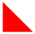
上三角

.triangle-up { width: 0; height: 0; border-left: 50px solid transparent; border-right: 50px solid transparent; border-bottom: 100px solid red;
}
- 1
- 2
- 3
- 4
- 5
- 6
- 7
下三角

#triangle-down { width: 0; height: 0; border-left: 50px solid transparent; border-right: 50px solid transparent; border-top: 100px solid red;
}
- 1
- 2
- 3
- 4
- 5
- 6
- 7
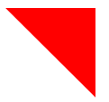
左上三角

.triangle-topleft { width: 0; height: 0; border-top: 100px solid red; border-right: 100px solid transparent;
}
- 1
- 2
- 3
- 4
- 5
- 6
右上三角
#triangle-topright { width: 0; height: 0; border-top: 100px solid red; border-left: 100px solid transparent; }
- 1
- 2
- 3
- 4
- 5
- 6
- 7
左下三角
#triangle-bottomleft { width: 0; height: 0; border-bottom: 100px solid red; border-right: 100px solid transparent;
}
- 1
- 2
- 3
- 4
- 5
- 6
右下三角

#triangle-bottomright { width: 0; height: 0; border-bottom: 100px solid red; border-left: 100px solid transparent;
}
- 1
- 2
- 3
- 4
- 5
- 6
左三角
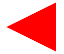
#triangle-left { width: 0; height: 0; border-top: 50px solid transparent; border-right: 100px solid red; border-bottom: 50px solid transparent;
}
- 1
- 2
- 3
- 4
- 5
- 6
- 7
右三角

#triangle-right { width: 0; height: 0; border-top: 50px solid transparent; border-left: 100px solid red; border-bottom: 50px solid transparent;
}
- 1
- 2
- 3
- 4
- 5
- 6
- 7
平行四边形

.parallelogram { width: 150px; height: 100px; margin-left:20px; transform: skew(20deg); background: red;
}
- 1
- 2
- 3
- 4
- 5
- 6
- 7
梯形

.trapezoid { border-bottom: 100px solid red; border-left: 50px solid transparent; border-right: 50px solid transparent; height: 0; width: 100px;
}
- 1
- 2
- 3
- 4
- 5
- 6
- 7
六角星

.star-six { position: relative; width: 0; height: 0; border-left: 50px solid transparent; border-right: 50px solid transparent; border-bottom: 100px solid red;
}
.star-six:after {
  content: ""; position: absolute; top: 30px; left: -50px; width: 0; height: 0; border-left: 50px solid transparent; border-right: 50px solid transparent; border-top: 100px solid red;
}
- 1
- 2
- 3
- 4
- 5
- 6
- 7
- 8
- 9
- 10
- 11
- 12
- 13
- 14
- 15
- 16
- 17
- 18
- 19
五角星

.star-five { position: relative; margin: 50px 0; display: block; color: red; width: 0px; height: 0px; border-right: 100px solid transparent; border-bottom: 70px solid red; border-left: 100px solid transparent; transform: rotate(35deg);
}
.star-five:before { content: ''; position: absolute; top: -45px; left: -65px; border-bottom: 80px solid red; border-left: 30px solid transparent; border-right: 30px solid transparent; height: 0; width: 0; display: block; transform: rotate(-35deg);
}
.star-five:after { content: '';
  position: absolute; display: block; color: red; top: 3px; left: -105px; width: 0px; height: 0px; border-right: 100px solid transparent; border-bottom: 70px solid red; border-left: 100px solid transparent; transform: rotate(-70deg);
}
- 1
- 2
- 3
- 4
- 5
- 6
- 7
- 8
- 9
- 10
- 11
- 12
- 13
- 14
- 15
- 16
- 17
- 18
- 19
- 20
- 21
- 22
- 23
- 24
- 25
- 26
- 27
- 28
- 29
- 30
- 31
- 32
- 33
- 34
- 35
- 36
- 37
- 38
- 39
五角大楼

.pentagon { position: relative; width: 54px; border-width: 50px 18px 0; border-style: solid; border-color: red transparent;
}
.pentagon:before { content: ""; position: absolute; height: 0; width: 0; top: -85px; left: -18px; border-width: 0 45px 35px; border-style: solid; border-color: transparent transparent red;
}
- 1
- 2
- 3
- 4
- 5
- 6
- 7
- 8
- 9
- 10
- 11
- 12
- 13
- 14
- 15
- 16
- 17
- 18
六边形

.hexagon { position: relative; width: 100px; height: 55px; background: red;
}
.hexagon:before { content: ""; position: absolute; top: -25px; left: 0; width: 0; height: 0; border-left: 50px solid transparent; border-right: 50px solid transparent; border-bottom: 25px solid red;
}
.hexagon:after { content: ""; position: absolute; bottom: -25px; left: 0; width: 0; height: 0; border-left: 50px solid transparent; border-right: 50px solid transparent; border-top: 25px solid red;
}
- 1
- 2
- 3
- 4
- 5
- 6
- 7
- 8
- 9
- 10
- 11
- 12
- 13
- 14
- 15
- 16
- 17
- 18
- 19
- 20
- 21
- 22
- 23
- 24
- 25
- 26
- 27
- 28
八角形

.octagon { position: relative; width: 100px; height: 100px; background: red;
}
.octagon:before { content: ""; position: absolute; top: 0; left: 0; border-bottom: 29px solid red; border-left: 29px solid #eee; border-right: 29px solid #eee; width: 42px; height: 0;
}
.octagon:after { content: ""; position: absolute; bottom: 0; left: 0; border-top: 29px solid red; border-left: 29px solid #eee; border-right: 29px solid #eee; width: 42px; height: 0;
}
- 1
- 2
- 3
- 4
- 5
- 6
- 7
- 8
- 9
- 10
- 11
- 12
- 13
- 14
- 15
- 16
- 17
- 18
- 19
- 20
- 21
- 22
- 23
- 24
- 25
- 26
- 27
- 28
爱心

.heart { position: relative; width: 100px; height: 90px;
}
.heart:before, .heart:after { position: absolute; content: ""; left: 50px; top: 0; width: 50px; height: 80px; background: red; border-radius: 50px 50px 0 0; transform: rotate(-45deg);
  transform-origin: 0 100%;
}
.heart:after { left: 0; transform: rotate(45deg); transform-origin :100% 100%;
}
- 1
- 2
- 3
- 4
- 5
- 6
- 7
- 8
- 9
- 10
- 11
- 12
- 13
- 14
- 15
- 16
- 17
- 18
- 19
- 20
- 21
- 22
无穷大符号

.infinity { position: relative; width: 212px; height: 100px;
}
.infinity:before, .infinity:after { content: ""; position: absolute; top: 0; left: 0; width: 60px; height: 60px; border: 20px solid red; border-radius: 50px 50px 0 50px; transform: rotate(-45deg);
}
.infinity:after { left: auto; right: 0;
  border-radius: 50px 50px 50px 0; transform: rotate(45deg);
}
- 1
- 2
- 3
- 4
- 5
- 6
- 7
- 8
- 9
- 10
- 11
- 12
- 13
- 14
- 15
- 16
- 17
- 18
- 19
- 20
- 21
- 22
鸡蛋

.egg { display:block; width: 126px; height: 180px; background-color: red; -webkit-border-radius: 63px 63px 63px 63px / 108px 108px 72px 72px; border-radius: 50% 50% 50% 50% / 60% 60% 40% 40%;
}
- 1
- 2
- 3
- 4
- 5
- 6
- 7
- 8
食逗人(Pac-Man)

.pacman { width: 0px; height: 0px; border-right: 60px solid transparent; border-top: 60px solid red; border-left: 60px solid red; border-bottom: 60px solid red; border-top-left-radius: 60px; border-top-right-radius: 60px; border-bottom-left-radius: 60px; border-bottom-right-radius: 60px;
}
- 1
- 2
- 3
- 4
- 5
- 6
- 7
- 8
- 9
- 10
- 11
- 12
提示对话框

.talkbubble { position: relative; width: 120px; height: 80px; background: red; border-radius: 10px;
}
.talkbubble:before { content:""; position: absolute; right: 100%; top: 26px; width: 0; height: 0; border-top: 13px solid transparent; border-right: 26px solid red; border-bottom: 13px solid transparent;
}
- 1
- 2
- 3
- 4
- 5
- 6
- 7
- 8
- 9
- 10
- 11
- 12
- 13
- 14
- 15
- 16
- 17
- 18
12角星

.burst-12 { background: red; width: 80px; height: 80px; position: relative; text-align: center;
}
.burst-12:before, .burst-12:after { content: ""; position: absolute; top: 0; left: 0; height: 80px; width: 80px; background: red;
}
.burst-12:before { transform: rotate(30deg);
}
.burst-12:after { transform: rotate(60deg);
}
- 1
- 2
- 3
- 4
- 5
- 6
- 7
- 8
- 9
- 10
- 11
- 12
- 13
- 14
- 15
- 16
- 17
- 18
- 19
- 20
- 21
- 22
钻石

.cut-diamond { border-style: solid; border-color: transparent transparent red transparent; border-width: 0 25px 25px 25px; height: 0; width: 50px; position: relative; margin: 20px 0 50px 0;
}
.cut-diamond:after { content: ""; position: absolute; top: 25px; left: -25px; width: 0; height: 0; border-style: solid; border-color: red transparent transparent transparent; border-width: 70px 50px 0 50px;
}
- 1
- 2
- 3
- 4
- 5
- 6
- 7
- 8
- 9
- 10
- 11
- 12
- 13
- 14
- 15
- 16
- 17
- 18
- 19
- 20
阴阳八卦

.yin-yang { position: relative; width: 96px; height: 48px; background: #eee; border-color: red; border-style: solid; border-width: 2px 2px 50px 2px; border-radius: 100%;
}
.yin-yang:before { content: ""; position: absolute; top: 50%; left: 0; background: #eee; border: 18px solid red; border-radius: 100%; width: 12px; height: 12px;
}
.yin-yang:after { content: ""; position: absolute; top: 50%; left: 50%; background: red; border: 18px solid #eee; border-radius:100%; width: 12px; height: 12px;
}
- 1
- 2
- 3
- 4
- 5
- 6
- 7
- 8
- 9
- 10
- 11
- 12
- 13
- 14
- 15
- 16
- 17
- 18
- 19
- 20
- 21
- 22
- 23
- 24
- 25
- 26
- 27
- 28
- 29
- 30
- 31
- 32
文章来源: shq5785.blog.csdn.net,作者:No Silver Bullet,版权归原作者所有,如需转载,请联系作者。
原文链接:shq5785.blog.csdn.net/article/details/105619236

【版权声明】本文为华为云社区用户转载文章,如果您发现本社区中有涉嫌抄袭的内容,欢迎发送邮件进行举报,并提供相关证据,一经查实,本社区将立刻删除涉嫌侵权内容,举报邮箱:
cloudbbs@huaweicloud.com
- 点赞
- 收藏
- 关注作者
评论(0)