Flutter布局

在Android中,通过XML编写布局,但在Flutter中,只可以使用widget树来编写布局。排列其他widget的columns、 rows、 grids和其他布局。
Flutter布局
-
- 1.单个子元素的布局widget
-
- 1.1.Container
- 1.2. Align
- 1.3.AspectRatiot
- 1.4. Baseline
- 1.5.ConstrainedBox
- 1.6.Center
- 1.7. Expanded
- 1.8. Padding
- 1.9. FittedBox
- 1.10. FractionallySizedBox
- 1.11. IntrinsicHeight
- 1.12. IntrinsicWidth
- 1.13. LimitedBox
- 1.14. Offstage
- 1.15. OverflowBox
- 1.16. SizedBox
- 1.17. SizedOverflowBox
- 1.18. Transform
- 1.19. CustomSingleChildLayout
- 2.多个子元素的布局widget
1.单个子元素的布局widget
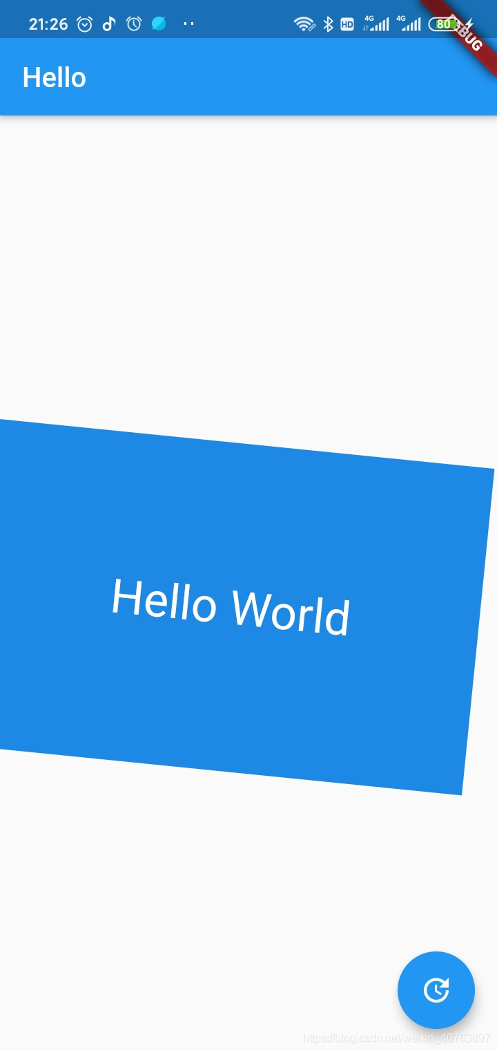
1.1.Container
一个拥有绘制、定位、调整大小的 widget。
Container( constraints: BoxConstraints.expand( height: Theme.of(context).textTheme.headline4.fontSize * 1.1 + 200.0, ), padding: const EdgeInsets.all(8.0), color: Colors.blue[600], alignment: Alignment.center, child: Text('Hello World', style: Theme.of(context) .textTheme .headline4 .copyWith(color: Colors.white)), transform: Matrix4.rotationZ(0.1), ),
- 1
- 2
- 3
- 4
- 5
- 6
- 7
- 8
- 9
- 10
- 11
- 12
- 13
- 14
1.2. Align
在容器内部对齐元素
Container(// 定义一个容器 height: 220.0,// 容器高 width: 220.0,// 容器宽 color: Colors.blue[50],// 背景颜色 child: Align(// 子元素对齐设置 alignment: Alignment.topRight, // 右上角,也可以指定对齐具体的位置Alignment(0.2, 0.6) child: FlutterLogo( // 子元素为Flutter的logo图片 size: 60, ), ), ),
- 1
- 2
- 3
- 4
- 5
- 6
- 7
- 8
- 9
- 10
- 11

1.3.AspectRatiot
可以根据给定的纵横比,显示元素,元素的宽系占满整个容器,元素的高则根据纵横比来计算。
Container( height: 220.0, width: 220.0, color: Colors.blue[50], child: AspectRatio(aspectRatio: 1.2,child: FlutterLogo(),) ), ),
- 1
- 2
- 3
- 4
- 5
- 6
- 7

1.4. Baseline
根据子项的基线对它们的位置进行定位的widget。一般文字排版的时候,可能会用到它。它的作用是根据child的baseline,来调整child的位置。例如两个字号不一样的文字,希望底部在一条水平线上,就可以使用这个控件,是一个非常基础的控件。

new Row( mainAxisAlignment: MainAxisAlignment.spaceBetween, children: <Widget>[ new Baseline( baseline: 50.0, baselineType: TextBaseline.alphabetic, child: new Text( 'TjTjTj', style: new TextStyle( fontSize: 20.0, textBaseline: TextBaseline.alphabetic, ), ), ), new Baseline( baseline: 50.0, baselineType: TextBaseline.alphabetic, child: new Container( width: 30.0, height: 30.0, color: Colors.red, ), ), new Baseline( baseline: 50.0, baselineType: TextBaseline.alphabetic, child: new Text( 'RyRyRy', style: new TextStyle( fontSize: 35.0, textBaseline: TextBaseline.alphabetic, ), ), ), ], ),
- 1
- 2
- 3
- 4
- 5
- 6
- 7
- 8
- 9
- 10
- 11
- 12
- 13
- 14
- 15
- 16
- 17
- 18
- 19
- 20
- 21
- 22
- 23
- 24
- 25
- 26
- 27
- 28
- 29
- 30
- 31
- 32
- 33
- 34
- 35
- 36
Abc
1.5.ConstrainedBox
对其子项施加附加约束的widget。如果你想你的widget有最小的高度,那么就可以用ConstrainedBox widget来约束它。
ConstrainedBox( constraints: BoxConstraints(minHeight: 50.0), child: Card( child: Text("hello Y"), ), ),
- 1
- 2
- 3
- 4
- 5
- 6
1.6.Center
将其子widget居中显示在自身内部的widget
Center(
	child:Text("hello world"),
	),
- 1
- 2
- 3
1.7. Expanded
扩展Row、Column或Flex的child,这个child会填充满剩下的所有可用空间
Widget build(BuildContext context) {
  return Scaffold( appBar: AppBar( title: Text('Expanded Column Sample'), ), body: Center( child: Column( children: <Widget>[ Container( color: Colors.blue, height: 100, width: 100, ), Expanded( child: Container( color: Colors.amber, width: 100, ), ), Container( color: Colors.blue, height: 100, width: 100, ), ], ), ),
  );
}
- 1
- 2
- 3
- 4
- 5
- 6
- 7
- 8
- 9
- 10
- 11
- 12
- 13
- 14
- 15
- 16
- 17
- 18
- 19
- 20
- 21
- 22
- 23
- 24
- 25
- 26
- 27
- 28
- 29
又如:
Widget build(BuildContext context) {
  return Scaffold( appBar: AppBar( title: Text('Expanded Row Sample'), ), body: Center( child: Row( children: <Widget>[ Expanded( flex: 2, child: Container( color: Colors.amber, height: 100, ), ), Container( color: Colors.blue, height: 100, width: 50, ), Expanded( flex: 1, child: Container( color: Colors.amber, height: 100, ), ), ], ), ),
  );
}
- 1
- 2
- 3
- 4
- 5
- 6
- 7
- 8
- 9
- 10
- 11
- 12
- 13
- 14
- 15
- 16
- 17
- 18
- 19
- 20
- 21
- 22
- 23
- 24
- 25
- 26
- 27
- 28
- 29
- 30
- 31
- 32
1.8. Padding
一个widget, 会给其子widget添加指定的填充 。
Padding( padding: EdgeInsets.all(8.0), child: const Card(child: const Text('Hello World!')), ),
- 1
- 2
- 3
- 4
1.9. FittedBox
按自己的大小调整其子widget的大小和位置。FittedBox组件的作用是对child组件进行缩放和对齐方式的设置。
// fittedBox
import 'package:flutter/material.dart';

class FittedBoxLearn extends StatelessWidget {
  @override
  Widget build(BuildContext context) { return new Scaffold( appBar: AppBar( title: Text('FittedBox'), ), body: Center( child: Container( width: 300, height: 400, decoration: BoxDecoration( border: Border.all(), ), // 根据内部child伸缩填充父容器 child: FittedBox( // 填充方式 比如contain 尽可能大,同时仍然将源完全包含在目标框中。  还有cover、fill、fitWidth、fitHeight等方式 fit: BoxFit.contain, // 对齐方式 alignment: Alignment(0, 0), child: Container( color: Colors.blueAccent, width: 30, height: 30, ) ), ), ));
  }
}
- 1
- 2
- 3
- 4
- 5
- 6
- 7
- 8
- 9
- 10
- 11
- 12
- 13
- 14
- 15
- 16
- 17
- 18
- 19
- 20
- 21
- 22
- 23
- 24
- 25
- 26
- 27
- 28
- 29
- 30
- 31
- 32
- 33
- 34
- 35
- 36
1.10. FractionallySizedBox
百分比布局。FractionallySizedBox控件会根据现有空间,来调整child的尺寸,所以说child就算设置了具体的尺寸数值,也不起作用。FractionallySizedBox的布局行为主要跟它的宽高因子两个参数有关,当参数为null或者有具体数值的时候,布局表现不一样。当然,还有一个辅助参数alignment,作为对齐方式进行布局。
当设置了具体的宽高因子,具体的宽高则根据现有空间宽高 * 因子,有可能会超出父控件的范围,当宽高因子大于1的时候;
当没有设置宽高因子,则填满可用区域。
/**
 * 百分比布局,SizeBox直接通过width,height限制子控件;FractionallySizedBox通过百分比限制
 * const FractionallySizedBox({
 *   Key key,
 *   this.alignment = Alignment.center,
 *   this.widthFactor,//宽度因子,乘以宽度就是组件最后的宽
 *   this.heightFactor,
 *   Widget child,
 *   })
 */
  Container( width: 100.0, height: 100.0, color: Colors.blue, child: FractionallySizedBox( widthFactor: 0.5, heightFactor: 1.5, child: Container( width: 100.0, height: 100.0, color: Colors.red, ), ), ),
- 1
- 2
- 3
- 4
- 5
- 6
- 7
- 8
- 9
- 10
- 11
- 12
- 13
- 14
- 15
- 16
- 17
- 18
- 19
- 20
- 21
- 22
- 23
- 24
1.11. IntrinsicHeight
一个widget,它将它的子widget的高度调整其本身实际的高度。IntrinsicHeight的作用是调整child到固定的高度。应用尽量少用,用多会影响效率。
new IntrinsicHeight(
  child: new Row( mainAxisAlignment: MainAxisAlignment.spaceBetween, children: <Widget>[ new Container(color: Colors.blue, width: 100.0), new Container(color: Colors.red, width: 50.0,height: 50.0,), new Container(color: Colors.yellow, width: 150.0), ],
  ),
);
- 1
- 2
- 3
- 4
- 5
- 6
- 7
- 8
- 9
- 10
1.12. IntrinsicWidth
一个widget,它将它的子widget的宽度调整其本身实际的宽度。跟IntrinsicHeight类似,一个是调整高度,一个是调整宽度。同样是会存在效率问题,能别使用就尽量别使用。
IntrinsicWidth不同于IntrinsicHeight,它包含了额外的两个参数,stepHeight以及stepWidth。而IntrinsicWidth的布局行为跟这两个参数相关。
当stepWidth不是null的时候,child的宽度将会是stepWidth的倍数,当stepWidth值比child最小宽度小的时候,这个值不起作用;
当stepWidth为null的时候,child的宽度是child的最小宽度;
当stepHeight不为null的时候,效果跟stepWidth相同;
当stepHeight为null的时候,高度取最大高度。
new Container(
  color: Colors.green,
  padding: const EdgeInsets.all(5.0),
  child: new IntrinsicWidth( stepHeight: 450.0, stepWidth: 300.0, child: new Column( children: <Widget>[ new Container(color: Colors.blue, height: 100.0), new Container(color: Colors.red, width: 150.0, height: 100.0), new Container(color: Colors.yellow, height: 150.0,), ], ),
  ),
)
- 1
- 2
- 3
- 4
- 5
- 6
- 7
- 8
- 9
- 10
- 11
- 12
- 13
- 14
- 15
1.13. LimitedBox
一个当其自身不受约束时才限制其大小的盒子
Row( children: <Widget>[ Container( color: Colors.red, width: 100.0, ), LimitedBox( maxWidth: 150.0, child: Container( color: Colors.blue, width: 250.0, ), ), ], ),
- 1
- 2
- 3
- 4
- 5
- 6
- 7
- 8
- 9
- 10
- 11
- 12
- 13
- 14
- 15
1.14. Offstage
一个布局widget,可以控制其子widget的显示和隐藏。
Column( children: <Widget>[ new Offstage( offstage: offstage, child: Container(color: Colors.blue, height: 100.0), ), ], ),
- 1
- 2
- 3
- 4
- 5
- 6
- 7
- 8
1.15. OverflowBox
对其子项施加不同约束的widget,它可能允许子项溢出父级。
Container( color: Colors.green, width: 200.0, height: 200.0, padding: const EdgeInsets.all(5.0), child: OverflowBox( alignment: Alignment.topLeft, maxWidth: 300.0, maxHeight: 500.0, child: Container( color: Color(0x33FF00FF), width: 400.0, height: 400.0, ), ), ),
- 1
- 2
- 3
- 4
- 5
- 6
- 7
- 8
- 9
- 10
- 11
- 12
- 13
- 14
- 15
- 16
1.16. SizedBox
一个特定大小的盒子。这个widget强制它的孩子有一个特定的宽度和高度。如果宽度或高度为NULL,则此widget将调整自身大小以匹配该维度中的孩子的大小。
Container( color: Colors.green, padding: const EdgeInsets.all(5.0), child: SizedBox( width: 200.0, height: 200.0, child: Container( color: Colors.blue, width: 100.0, height: 300.0, ), ), ),
- 1
- 2
- 3
- 4
- 5
- 6
- 7
- 8
- 9
- 10
- 11
- 12
- 13
1.17. SizedOverflowBox
一个特定大小的widget,但是会将它的原始约束传递给它的孩子,它可能会溢出。
Container( color: Colors.green, alignment: Alignment.topRight, width: 200.0, height: 200.0, padding: EdgeInsets.all(5.0), child: SizedOverflowBox( size: Size(100.0, 200.0), child: Container(color: Colors.red, width: 200.0, height: 100.0,), ), ),
- 1
- 2
- 3
- 4
- 5
- 6
- 7
- 8
- 9
- 10
- 11
1.18. Transform
在绘制子widget之前应用转换的widget。
Center( child: Transform( transform: Matrix4.rotationZ(0.3), child: Container( color: Colors.blue, width: 100.0, height: 100.0, ), ), ),
- 1
- 2
- 3
- 4
- 5
- 6
- 7
- 8
- 9
- 10
1.19. CustomSingleChildLayout
一个自定义的拥有单个子widget的布局widget。由于SingleChildLayoutDelegate是一个抽象类,我们需要单独写一个继承自它的delegate,来进行相关的布局操作。下面例子中是一个固定尺寸的布局。
Container( color: Colors.blue, padding: const EdgeInsets.all(5.0), child: CustomSingleChildLayout( delegate: FixedSizeLayoutDelegate(Size(200.0, 200.0)), child: Container( color: Colors.red, width: 100.0, height: 300.0, ), ), ),
...
class FixedSizeLayoutDelegate extends SingleChildLayoutDelegate {
  FixedSizeLayoutDelegate(this.size); final Size size; @override
  Size getSize(BoxConstraints constraints) => size; @override
  BoxConstraints getConstraintsForChild(BoxConstraints constraints) { return new BoxConstraints.tight(size);
  } @override
  bool shouldRelayout(FixedSizeLayoutDelegate oldDelegate) { return size != oldDelegate.size;
  }
}
- 1
- 2
- 3
- 4
- 5
- 6
- 7
- 8
- 9
- 10
- 11
- 12
- 13
- 14
- 15
- 16
- 17
- 18
- 19
- 20
- 21
- 22
- 23
- 24
- 25
- 26
- 27
- 28
- 29
- 30
- 31
2.多个子元素的布局widget
2.1. Row
在水平方向上排列子widget的列表。
Row( children: <Widget>[ Expanded( child: Container( color: Colors.red, padding: EdgeInsets.all(5.0), ), flex: 1, ), Expanded( child: Container( color: Colors.yellow, padding: EdgeInsets.all(5.0), ), flex: 2, ), Expanded( child: Container( color: Colors.blue, padding: EdgeInsets.all(5.0), ), flex: 1, ), ], ),
- 1
- 2
- 3
- 4
- 5
- 6
- 7
- 8
- 9
- 10
- 11
- 12
- 13
- 14
- 15
- 16
- 17
- 18
- 19
- 20
- 21
- 22
- 23
- 24
- 25
2.2. Column
在垂直方向上排列子widget的列表。
Column( children: <Widget>[ Expanded( child: Container( color: Colors.red, padding: EdgeInsets.all(5.0), ), flex: 1, ), Expanded( child: Container( color: Colors.yellow, padding: EdgeInsets.all(5.0), ), flex: 2, ), Expanded( child: Container( color: Colors.blue, padding: EdgeInsets.all(5.0), ), flex: 1, ), ], ),
- 1
- 2
- 3
- 4
- 5
- 6
- 7
- 8
- 9
- 10
- 11
- 12
- 13
- 14
- 15
- 16
- 17
- 18
- 19
- 20
- 21
- 22
- 23
- 24
- 25
2.3.Stack
可以允许其子widget简单的堆叠在一起。
Stack( children: <Widget>[ Container( width: 100, height: 100, color: Colors.red, ), Container( width: 90, height: 90, color: Colors.green, ), Container( width: 80, height: 80, color: Colors.blue, ), ], ),
- 1
- 2
- 3
- 4
- 5
- 6
- 7
- 8
- 9
- 10
- 11
- 12
- 13
- 14
- 15
- 16
- 17
- 18
- 19
Stack( children: <Widget>[ Container( width: 250, height: 250, color: Colors.white, ), Container( padding: EdgeInsets.all(5.0), alignment: Alignment.bottomCenter, decoration: BoxDecoration( gradient: LinearGradient( begin: Alignment.topCenter, end: Alignment.bottomCenter, colors: <Color>[ Colors.black.withAlpha(0), Colors.black12, Colors.black45 ], ), ), child: Text( "Foreground Text", style: TextStyle(color: Colors.white, fontSize: 20.0), ), ), ], ),
- 1
- 2
- 3
- 4
- 5
- 6
- 7
- 8
- 9
- 10
- 11
- 12
- 13
- 14
- 15
- 16
- 17
- 18
- 19
- 20
- 21
- 22
- 23
- 24
- 25
- 26
- 27
- 28
2.4.IndexedStack
从一个子widget列表中显示单个孩子的Stack。IndexedStack继承自Stack,它的作用是显示第index个child,其他child都是不可见的。所以IndexedStack的尺寸永远是跟最大的子节点尺寸一致。
IndexedStack( index: 1, alignment: const Alignment(0.6, 0.6), children: [ CircleAvatar( backgroundImage: AssetImage('images/pic.jpg'), radius: 100.0, ), Container( decoration: BoxDecoration( color: Colors.black45, ), child: Text( 'Mia B', style: TextStyle( fontSize: 20.0, fontWeight: FontWeight.bold, color: Colors.white, ), ), ), ], ),
- 1
- 2
- 3
- 4
- 5
- 6
- 7
- 8
- 9
- 10
- 11
- 12
- 13
- 14
- 15
- 16
- 17
- 18
- 19
- 20
- 21
- 22
- 23
2.5.GridView
GridView在移动端上非常的常见,就是一个滚动的多列列表。GridView的布局行为不复杂,本身是尽量占满空间区域,布局行为上完全继承自ScrollView。
GridView.count( //水平子Widget之间间距 crossAxisSpacing: 10.0, //垂直子Widget之间间距 mainAxisSpacing: 30.0, //GridView内边距 padding: EdgeInsets.all(10.0), //一行的Widget数量 crossAxisCount: 2, //子Widget宽高比例 childAspectRatio: 2.0, children: List.generate( 100, (index) { return Center( child: Text( 'Item $index', style: Theme.of(context).textTheme.headline, ), ); }, ), ),
- 1
- 2
- 3
- 4
- 5
- 6
- 7
- 8
- 9
- 10
- 11
- 12
- 13
- 14
- 15
- 16
- 17
- 18
- 19
- 20
- 21
- 22
- 23
2.6.Flow
一个实现流式布局算法的widget
import 'package:flutter/material.dart';

void main() => runApp(FlowApp());

class FlowApp extends StatelessWidget {
  @override
  Widget build(BuildContext context) { return MaterialApp( home: Scaffold( appBar: AppBar( title: const Text('Flow Example'), ), body: FlowMenu(), ), );
  }
}

class FlowMenu extends StatefulWidget {
  @override
  _FlowMenuState createState() => _FlowMenuState();
}

class _FlowMenuState extends State<FlowMenu> with SingleTickerProviderStateMixin {
  AnimationController menuAnimation;
  IconData lastTapped = Icons.notifications;
  final List<IconData> menuItems = <IconData>[ Icons.home, Icons.new_releases, Icons.notifications, Icons.settings, Icons.menu,
  ]; void _updateMenu(IconData icon) { if (icon != Icons.menu) setState(() => lastTapped = icon);
  } @override
  void initState() { super.initState(); menuAnimation = AnimationController( duration: const Duration(milliseconds: 250), vsync: this, );
  } Widget flowMenuItem(IconData icon) { final double buttonDiameter = MediaQuery.of(context).size.width / menuItems.length; return Padding( padding: const EdgeInsets.symmetric(vertical: 8.0), child: RawMaterialButton( fillColor: lastTapped == icon ? Colors.amber[700] : Colors.blue, splashColor: Colors.amber[100], shape: CircleBorder(), constraints: BoxConstraints.tight(Size(buttonDiameter, buttonDiameter)), onPressed: () { _updateMenu(icon); menuAnimation.status == AnimationStatus.completed ? menuAnimation.reverse() : menuAnimation.forward(); }, child: Icon( icon, color: Colors.white, size: 45.0, ), ), );
  } @override
  Widget build(BuildContext context) { return Container( child: Flow( delegate: FlowMenuDelegate(menuAnimation: menuAnimation), children: menuItems.map<Widget>((IconData icon) => flowMenuItem(icon)).toList(), ), );
  }
}

class FlowMenuDelegate extends FlowDelegate {
  FlowMenuDelegate({this.menuAnimation}) : super(repaint: menuAnimation); final Animation<double> menuAnimation; @override
  bool shouldRepaint(FlowMenuDelegate oldDelegate) { return menuAnimation != oldDelegate.menuAnimation;
  } @override
  void paintChildren(FlowPaintingContext context) { double dx = 0.0; for (int i = 0; i < context.childCount; ++i) { dx = context.getChildSize(i).width * i; context.paintChild( i, transform: Matrix4.translationValues( dx * menuAnimation.value, 0, 0, ), ); }
  }
}
- 1
- 2
- 3
- 4
- 5
- 6
- 7
- 8
- 9
- 10
- 11
- 12
- 13
- 14
- 15
- 16
- 17
- 18
- 19
- 20
- 21
- 22
- 23
- 24
- 25
- 26
- 27
- 28
- 29
- 30
- 31
- 32
- 33
- 34
- 35
- 36
- 37
- 38
- 39
- 40
- 41
- 42
- 43
- 44
- 45
- 46
- 47
- 48
- 49
- 50
- 51
- 52
- 53
- 54
- 55
- 56
- 57
- 58
- 59
- 60
- 61
- 62
- 63
- 64
- 65
- 66
- 67
- 68
- 69
- 70
- 71
- 72
- 73
- 74
- 75
- 76
- 77
- 78
- 79
- 80
- 81
- 82
- 83
- 84
- 85
- 86
- 87
- 88
- 89
- 90
- 91
- 92
- 93
- 94
- 95
- 96
- 97
- 98
- 99
- 100
- 101
- 102
- 103
- 104
- 105
- 106
- 107
- 108
- 109
2.7.Wrap
可以在水平或垂直方向多行显示其子widget。
Wrap( spacing: 8.0, // gap between adjacent chips runSpacing: 4.0, // gap between lines children: <Widget>[ Chip( avatar: CircleAvatar(backgroundColor: Colors.blue.shade900, child: Text('AH')), label: Text('Hamilton'), ), Chip( avatar: CircleAvatar(backgroundColor: Colors.blue.shade900, child: Text('ML')), label: Text('Lafayette'), ), Chip( avatar: CircleAvatar(backgroundColor: Colors.blue.shade900, child: Text('HM')), label: Text('Mulligan'), ), Chip( avatar: CircleAvatar(backgroundColor: Colors.blue.shade900, child: Text('JL')), label: Text('Laurens'), ), ], ),
- 1
- 2
- 3
- 4
- 5
- 6
- 7
- 8
- 9
- 10
- 11
- 12
- 13
- 14
- 15
- 16
- 17
- 18
- 19
- 20
- 21
- 22
2.8.Table
为其子widget使用表格布局算法的widget。
new Table( border: new TableBorder.all(width: 1.0,color: Colors.purpleAccent), children: <TableRow>[ new TableRow( children: <Widget>[ new TableCell( child: new Center( child: new Text('设置1'), ), ), new TableCell( child: new Center( child: new Text('设置2'), ), ), new TableCell( child: new Center( child: new Text('设置3'), ), ), new TableCell( child: new Center( child: new Text('设置4'), ), ), ], ), new TableRow( children: <Widget>[ new TableCell( child: new Center( child: new Text('设置1'), ), ), new TableCell( child: new Center( child: new Text('设置2'), ), ), new TableCell( child: new Center( child: new Text('设置3'), ), ), new TableCell( child: new Center( child: new Text('设置4'), ), ), ], ), ], ),
- 1
- 2
- 3
- 4
- 5
- 6
- 7
- 8
- 9
- 10
- 11
- 12
- 13
- 14
- 15
- 16
- 17
- 18
- 19
- 20
- 21
- 22
- 23
- 24
- 25
- 26
- 27
- 28
- 29
- 30
- 31
- 32
- 33
- 34
- 35
- 36
- 37
- 38
- 39
- 40
- 41
- 42
- 43
- 44
- 45
- 46
- 47
- 48
- 49
- 50
- 51
- 52
- 53
2.9.ListView
可滚动的列表控件。ListView是最常用的滚动widget,它在滚动方向上一个接一个地显示它的孩子。在纵轴上,孩子们被要求填充ListView。
(1)ListTile
Flutter提供的ListTile很好用了,提供了许多常见的列表 item 样式,如左图标、右图标、标题、副标题等。
const ListTile({ Key key, this.leading, this.title, this.subtitle, this.trailing, this.isThreeLine = false, this.dense, this.contentPadding, this.enabled = true, this.onTap, this.onLongPress, this.selected = false,
  })
- 1
- 2
- 3
- 4
- 5
- 6
- 7
- 8
- 9
- 10
- 11
- 12
- 13
- 14
(2)先创建title、icon、subtitle的数据源,以及获取ListTile的方法
Widget buildListData(BuildContext context, String titleItem, Icon iconItem, String subTitleItem) { return new ListTile( leading: iconItem, title: new Text( titleItem, style: TextStyle(fontSize: 18), ), subtitle: new Text( subTitleItem, ), trailing: new Icon(Icons.keyboard_arrow_right), // 创建点击事件 onTap: () { showDialog( context: context, builder: (BuildContext context) { return new AlertDialog( title: new Text( 'ListViewAlert', style: new TextStyle( color: Colors.black54, fontSize: 18.0, ), ), content: new Text('您选择的item内容为:$titleItem'), ); }, ); }, );
  } List<String> titleItems = <String>[ 'keyboard', 'print', 'router', 'pages', 'zoom_out_map', 'zoom_out', 'youtube_searched_for', 'wifi_tethering', 'wifi_lock', 'widgets', 'weekend', 'web', '图accessible', 'ac_unit',
  ]; List<Icon> iconItems = <Icon>[ new Icon(Icons.keyboard), new Icon(Icons.print), new Icon(Icons.router), new Icon(Icons.pages), new Icon(Icons.zoom_out_map), new Icon(Icons.zoom_out), new Icon(Icons.youtube_searched_for), new Icon(Icons.wifi_tethering), new Icon(Icons.wifi_lock), new Icon(Icons.widgets), new Icon(Icons.weekend), new Icon(Icons.web), new Icon(Icons.accessible), new Icon(Icons.ac_unit),
  ]; List<String> subTitleItems = <String>[ 'subTitle: keyboard', 'subTitle: print', 'subTitle: router', 'subTitle: pages', 'subTitle: zoom_out_map', 'subTitle: zoom_out', 'subTitle: youtube_searched_for', 'subTitle: wifi_tethering', 'subTitle: wifi_lock', 'subTitle: widgets', 'subTitle: weekend', 'subTitle: web', 'subTitle: accessible', 'subTitle: ac_unit',
  ];
- 1
- 2
- 3
- 4
- 5
- 6
- 7
- 8
- 9
- 10
- 11
- 12
- 13
- 14
- 15
- 16
- 17
- 18
- 19
- 20
- 21
- 22
- 23
- 24
- 25
- 26
- 27
- 28
- 29
- 30
- 31
- 32
- 33
- 34
- 35
- 36
- 37
- 38
- 39
- 40
- 41
- 42
- 43
- 44
- 45
- 46
- 47
- 48
- 49
- 50
- 51
- 52
- 53
- 54
- 55
- 56
- 57
- 58
- 59
- 60
- 61
(3)绑定列表
绑定列表有四种方式,默认方式、ListView.builder、ListView.separated、 ListView.custom。
(I)默认方式
先创建包含ListTile的List数组:
List<Widget> _list = new List();
for (int i = 0; i < titleItems.length; i++) {
  _list.add(buildListData(context, titleItems[i], iconItems[i], subTitleItems[i]));
}
- 1
- 2
- 3
- 4
若每个item下有分割线,则使用ListTile的divideTiles()方法在每个ListTile之间添加水平间距:
var divideTiles = ListTile.divideTiles(context: context, tiles: _list).toList();
- 1
绑定:
body: new Scrollbar(
  // 默认写法
  child: new ListView( // 无分割线 children: _list, // 有分割线 // children: divideTiles,
  ),
),
- 1
- 2
- 3
- 4
- 5
- 6
- 7
- 8
- 9
(II)ListView.builder
body: new Scrollbar(
  // ListView.builder写法  child: new ListView.builder( // 无分割线 itemBuilder: (context, item) { return buildListData(context, titleItems[item], iconItems[item], subTitleItems[item]); }, // 绑定item // 有分割线 itemBuilder: (context, item) { return new Container( child: new Column( children: <Widget>[ buildListData(context, titleItems[item], iconItems[item], subTitleItems[item]), new Divider() ], ), ); }, itemCount: iconItems.length, // 数据长度
  ),
),
- 1
- 2
- 3
- 4
- 5
- 6
- 7
- 8
- 9
- 10
- 11
- 12
- 13
- 14
- 15
- 16
- 17
- 18
- 19
- 20
- 21
- 22
- 23
- 24
(III)ListView.separated
ListView.separated方法与ListView.builder类似,不过可直接通过separatorBuilder设置分隔符,更加方便。
body: new Scrollbar(
  child: new ListView.separated( itemBuilder: (context, item) { return buildListData(context, titleItems[item], iconItems[item], subTitleItems[item]); }, separatorBuilder: (BuildContext context, int index) => new Divider(),  // 分割线 itemCount: iconItems.length
  ),
),
- 1
- 2
- 3
- 4
- 5
- 6
- 7
- 8
- 9
(IV)ListView.custom
自定义childrenDelegate 当然我们可以对ListView中的child进行自己需要的操作:
/**
 * 继承SliverChildBuilderDelegate  可以对列表的监听
 */
class MyChildrenDelegate extends SliverChildBuilderDelegate {
  MyChildrenDelegate( Widget Function(BuildContext, int) builder, { int childCount, bool addAutomaticKeepAlive = true, bool addRepaintBoundaries = true,
  }) : super(builder, childCount: childCount, addAutomaticKeepAlives: addAutomaticKeepAlive, addRepaintBoundaries: addRepaintBoundaries); ///监听 在可见的列表中 显示的第一个位置和最后一个位置
  @override
  void didFinishLayout(int firstIndex, int lastIndex) { print('firstIndex: $firstIndex, lastIndex: $lastIndex');
  } ///可不重写,重写不能为null  默认是true  添加进来的实例与之前的实例是否相同 相同返回true 反之false
  @override
  bool shouldRebuild(SliverChildBuilderDelegate oldDelegate) { // TODO: implement shouldRebuild print("oldDelegate$oldDelegate"); return super.shouldRebuild(oldDelegate);
  }
}
- 1
- 2
- 3
- 4
- 5
- 6
- 7
- 8
- 9
- 10
- 11
- 12
- 13
- 14
- 15
- 16
- 17
- 18
- 19
- 20
- 21
- 22
- 23
- 24
- 25
- 26
- 27
- 28
- 29
绑定:
  ///listView custom 构建
  Widget listViewLayoutCustom(list) { return ListView.custom( itemExtent: 40.0, childrenDelegate: MyChildrenDelegate( (BuildContext context, int i) { return new Container( child: new Row( mainAxisAlignment: MainAxisAlignment.spaceEvenly, children: <Widget>[ new Text( "${list[i].name}", style: new TextStyle(fontSize: 18.0, color: Colors.red), ), new Text( "${list[i].age}", style: new TextStyle(fontSize: 18.0, color: Colors.green), ), new Text( "${list[i].content}", style: new TextStyle(fontSize: 18.0, color: Colors.blue), ), ], )); }, childCount: list.length, ), cacheExtent: 0.0, );
  }
}
- 1
- 2
- 3
- 4
- 5
- 6
- 7
- 8
- 9
- 10
- 11
- 12
- 13
- 14
- 15
- 16
- 17
- 18
- 19
- 20
- 21
- 22
- 23
- 24
- 25
- 26
- 27
- 28
- 29
- 30
- 31
2.10.ListBody
ListBody是一个不常直接使用的控件,一般都会配合ListView或者Column等控件使用。ListBody的作用是按给定的轴方向,按照顺序排列子节点。在主轴上,子节点按照顺序进行布局,在交叉轴上,子节点尺寸会被拉伸,以适应交叉轴的区域。在主轴上,给予子节点的空间必须是不受限制的(unlimited),使得子节点可以全部被容纳,ListBody不会去裁剪或者缩放其子节点。
Flex( direction: Axis.vertical, children: <Widget>[ ListBody( mainAxis: Axis.vertical, reverse: false, children: <Widget>[ Container(color: Colors.red, width: 50.0, height: 50.0,), Container(color: Colors.yellow, width: 50.0, height: 50.0,), Container(color: Colors.green, width: 50.0, height: 50.0,), Container(color: Colors.blue, width: 50.0, height: 50.0,), Container(color: Colors.black, width: 50.0, height: 50.0,), ], )], ),
- 1
- 2
- 3
- 4
- 5
- 6
- 7
- 8
- 9
- 10
- 11
- 12
- 13
- 14
- 15
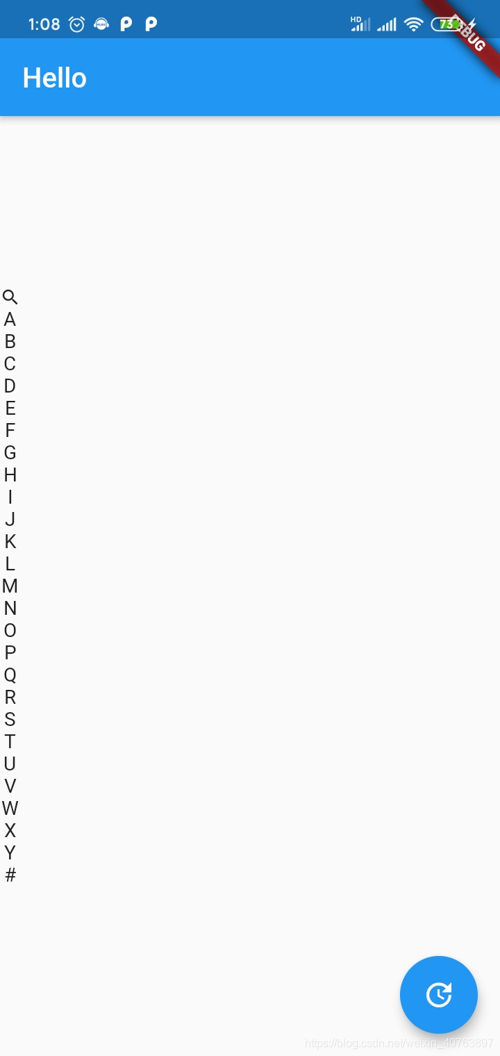
2.11.LayoutBuilder
构建一个可以依赖父窗口大小的widget树。
LayoutBuilder( builder: (context,constraints){ context为父级上下文 constraints.biggest.height; 获取组件在父组件所能设置的最大高度 contraints.maxWidth; 获取父组件宽度,高度同理 return 组件 } )
- 1
- 2
- 3
- 4
- 5
- 6
- 7
- 8
- 9
- 10
示例:
LayoutBuilder( builder: (context,constraints){ final endHeight=constraints.biggest.height; return GestureDetector( onVerticalDragDown: (text){ //当点击时会获取点击坐标 print(endHeight); print(constraints.maxHeight); print(constraints.maxWidth); }, onVerticalDragEnd: (text){ print(text); }, onVerticalDragCancel: (){ print("取消"); }, child: Column( crossAxisAlignment: CrossAxisAlignment.center, mainAxisAlignment: MainAxisAlignment.center, children: <Widget>[ Icon(Icons.search,size: 15,), GestureDetector( child:Text('A') , onTap: (){ scroll.animateTo(312, duration: Duration(milliseconds: 200), curve: Curves.easeIn); }, ), GestureDetector( child:Text('B') , onTap: (){ scroll.animateTo(478, duration: Duration(milliseconds: 200), curve: Curves.easeIn); }, ), GestureDetector( child:Text('C') , onTap: (){ scroll.animateTo(575, duration: Duration(milliseconds: 200), curve: Curves.easeIn); }, ), GestureDetector( child:Text('D') , onTap: (){ scroll.animateTo(741, duration: Duration(milliseconds: 200), curve: Curves.easeIn); }, ), Text('E'), Text('F'), Text('G'), Text('H'), Text('I'), Text('J'), Text('K'), Text('L'), Text('M'), Text('N'), Text('O'), Text('P'), Text('Q'), Text('R'), Text('S'), Text('T'), Text('U'), Text('V'), Text('W'), Text('X'), Text("Y"), Text("#") ], ), ); }, ),
- 1
- 2
- 3
- 4
- 5
- 6
- 7
- 8
- 9
- 10
- 11
- 12
- 13
- 14
- 15
- 16
- 17
- 18
- 19
- 20
- 21
- 22
- 23
- 24
- 25
- 26
- 27
- 28
- 29
- 30
- 31
- 32
- 33
- 34
- 35
- 36
- 37
- 38
- 39
- 40
- 41
- 42
- 43
- 44
- 45
- 46
- 47
- 48
- 49
- 50
- 51
- 52
- 53
- 54
- 55
- 56
- 57
- 58
- 59
- 60
- 61
- 62
- 63
- 64
- 65
- 66
- 67
- 68
- 69
- 70
- 71
- 72
2.12.CustomMultiChildLayout
之前单节点布局控件中介绍过一个类似的控件——CustomSingleChildLayout,都是通过delegate去实现自定义布局,只不过这次是多节点的自定义布局的控件,通过提供的delegate,可以实现控制节点的位置以及尺寸。
CustomMultiChildLayout提供的delegate可以控制子节点的布局,具体在如下几点:
可以决定每个子节点的布局约束条件;
可以决定每个子节点的位置;
可以决定自身的尺寸,但是自身的自身必须不能依赖子节点的尺寸。
可以看到,跟CustomSingleChildLayout的delegate提供的作用类似,只不过CustomMultiChildLayout的稍微会复杂点。
class MyMultiLayoutDelegate extends MultiChildLayoutDelegate {
  MyMultiLayoutDelegate(); static const String title = 'title';
  static const String description = 'description'; @override
  void performLayout(Size size) { final BoxConstraints constraints = new BoxConstraints(maxWidth: size.width); final Size titleSize = layoutChild(title, constraints); positionChild(title, new Offset(0.0, 0.0)); final double descriptionY = titleSize.height; layoutChild(description, constraints); positionChild(description, new Offset(0.0, descriptionY));
  } @override
  bool shouldRelayout(MyMultiLayoutDelegate oldDelegate) => false;
}

 Container( width: 200.0, height: 100.0, color: Colors.yellow, child: CustomMultiChildLayout( delegate: MyMultiLayoutDelegate(), children: <Widget>[ LayoutId( id: MyMultiLayoutDelegate.title, child: new Text("This is title", style: TextStyle(fontSize: 20.0, color: Colors.black)), ), LayoutId( id: MyMultiLayoutDelegate.description, child: new Text("This is description", style: TextStyle(fontSize: 14.0, color: Colors.red)), ), ], ), ),
- 1
- 2
- 3
- 4
- 5
- 6
- 7
- 8
- 9
- 10
- 11
- 12
- 13
- 14
- 15
- 16
- 17
- 18
- 19
- 20
- 21
- 22
- 23
- 24
- 25
- 26
- 27
- 28
- 29
- 30
- 31
- 32
- 33
- 34
- 35
- 36
- 37
- 38
- 39
- 40
- 41
- 42
文章来源: blog.csdn.net,作者:WongKyunban,版权归原作者所有,如需转载,请联系作者。
原文链接:blog.csdn.net/weixin_40763897/article/details/108125932

- 点赞
- 收藏
- 关注作者
评论(0)